
The Unforeseen Dangers of Automated Responsive Image Cropping
Description
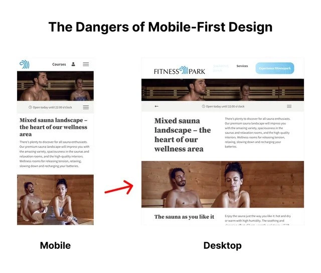
An image demonstrating a potential pitfall of mobile-first web design, captioned 'The Dangers of Mobile-First Design'. It presents a side-by-side comparison of a 'Fitness Park' website on mobile and desktop. The mobile version shows a vertically-oriented photo of a man and a woman sitting separately in a sauna. The desktop version, designed for a wider viewport, uses the same image but crops it horizontally for a banner. A red arrow highlights the transformation. This automated cropping reframes the scene entirely, placing the man from the original photo right next to another man (who was in the background of the original) creating an unintentionally intimate and humorous composition. The original woman is mostly cropped out. The meme serves as a cautionary tale for web developers and UX/UI designers, illustrating how responsive design without proper art direction for different breakpoints can lead to awkward and contextually altered visuals. It highlights the failure of relying on a simple 'center-crop' logic for complex images




Comments
7Comment deleted
This is a classic case of `background-position: center center;` playing matchmaker. The algorithm saw an opportunity for a new composition and just went for it, proving that even CSS can have a chaotic neutral alignment
Mobile-first is fine - until your `object-fit: cover;` at the 1440 px breakpoint upgrades the hero image to an HR ticket. Could someone please add `focal-point: safe-for-work;` to the design tokens?
When your product owner says "just make it responsive" and now HR wants to discuss why the wellness page has become the most visited internal resource since the company directory
Ah yes, mobile-first design: where your perfectly crafted vertical stack becomes a horizontal game of Tetris that nobody asked for. This is what happens when you optimize for the 375px viewport and then just pray to the CSS gods that `flex-wrap` will save you at 1920px. The real danger isn't mobile-first - it's mobile-only thinking. Senior devs know that 'mobile-first' doesn't mean 'mobile-only-then-add-media-queries-and-hope', yet here we are, with content floating in the middle of a desktop layout like a div that lost its way home. The irony? We spent decades fighting table layouts, only to recreate the same rigid thinking with responsive frameworks. Pro tip: if your desktop layout looks like someone just stretched a phone screen with a rolling pin, you've missed the 'design' part of responsive design
Proof that “center center; object-fit: cover” is not a content strategy - the desktop breakpoint just filed an HR ticket
Mobile-first with object-fit: cover - phones get zen landscapes, desktops deliver the full-frontal fitness reveal at min-width: 1024px
Mobile-first means marketing uploads a 9:16 hero to the CMS and object-fit: cover performs avant‑garde art direction at 1920px - ship picture/srcset with focal points or enjoy your P1 brand review