Skip to content
DevMeme
3249 of 7435
Client-Specified Banner Dimensions
Stakeholders Clients Post #3572, on Aug 21, 2021 in TG

Client-Specified Banner Dimensions

Why is this Stakeholders Clients meme funny?

Level 1: Measuring With Hands

This is like asking someone how big to make a poster, and they hold up their hands instead of using a ruler. It is funny because the helper needs exact measurements, but the customer gives a vague picture and expects the helper to magically know the right size.

Level 2: From Gesture to CSS

For a website, height and width are not just casual descriptions. They affect layout, image cropping, loading performance, and whether text overlaps on smaller screens. The visible chat labels Altura and Largura point at those two basic dimensions, but the pictures do not provide numbers.

That is why the meme is about client expectations and requirements ambiguity. A client may know what they want the banner to feel like, but not know how to express it in web terms. A frontend developer has to translate that into CSS rules, image sizes, responsive breakpoints, and sometimes design trade-offs.

For example, "wide banner" might mean a full-width hero on desktop, a cropped image on mobile, or a fixed ad-style rectangle. Those are different implementations. Without clearer requirements, the developer has to guess, then revise when the guess does not match the client's mental picture. The funny part is that the hand gesture is absurd, but the workflow it represents is extremely normal.

Level 3: Finger-Span Requirements

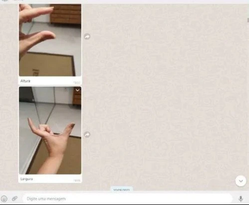
The setup from the post is: "Me: what size do you want the banner on your website? Client:" The image answers with two chat photos of hand gestures labeled:

Altura

and:

Largura

Those Portuguese labels mean height and width, but the real punchline is measurement by vibes. The client is not giving pixels, aspect ratio, breakpoint behavior, content constraints, safe areas, or even a rough screen context. They are giving hand geometry over chat. Every frontend developer has met this requirement format: not wrong enough to reject instantly, not precise enough to implement without becoming a mind reader.

The deep irritation is that web banners are rarely a single size anymore. A banner may need to work across desktop, tablet, mobile, retina screens, CMS image crops, localized copy, dark mode, ad slots, lazy loading, and containers that change width depending on navigation state. "Make it about this tall and this wide" sounds simple until the designer asks why the headline wraps, marketing swaps in a longer campaign phrase, and the client views it on a phone from 2018. At that point, the hand gesture has become a production incident with fingers.

This meme sits right in requirements gathering, UX/UI, and responsive design pain. Stakeholders often describe outcomes visually because that is how they experience the product. Developers need constraints because that is how browsers render it. The gap between those two worlds is where ambiguous tickets are born. A good team turns the gesture into an actual specification: minimum and maximum height, aspect ratio, focal point behavior, allowed cropping, breakpoints, and examples of accepted layouts. A tired team implements the gesture, ships it, and waits for the inevitable "can we make it pop more but smaller?" message.

Description

The image is a blurry chat screenshot, likely from WhatsApp, showing two stacked photo messages on the left and an empty conversation area on the right. The top photo shows a hand making a small pinch gesture and is labeled "Altura"; the lower photo shows a hand with fingers spread and dangling cords or strings and is labeled "Largura". At the bottom, the message field reads "Digite uma mensagem". With the metadata setup, "Me: what size do you want the banner on your website? Client:", the joke is that vague hand gestures replace actual pixel, aspect-ratio, or responsive-layout requirements.

Comments

22
Anonymous ★ Top Pick Nothing says responsive design like an acceptance criterion measured in finger-span units.
  1. Anonymous ★ Top Pick

    Nothing says responsive design like an acceptance criterion measured in finger-span units.

  2. @pyproman 4y

    I though the picture was just the word "Yes"

  3. @uk_rop 4y

    Yes

  4. @UQuark 4y

    ThIs IS eNgLiSh oNlY chAnNel pLeasE prOVIde tRanSlaTion Or pOst EnGliSh MeMes

    1. @anatoli26 4y

      Height / width

  5. @SamsonovAnton 4y

    Given that most [desktop] displays today are 24" or so, with 1920x1080 resolution, such an estimation makes sense actually.

    1. @Vintego 4y

      Found a web designer

    2. @slnt_opp 4y

      Where is the data from?

      1. @SamsonovAnton 4y

        Manual estimation. 🤘🤙

      2. @newmankrr 4y

        https://gs.statcounter.com/screen-resolution-stats

        1. @slnt_opp 4y

          I don't have doubts about fullHD being leader, but 24" :)

          1. @RiedleroD 4y

            also I wouldn't call 8% "most" desktops

            1. @RiedleroD 4y

              fun fact: one of the three monitors I own is 1920x1080, the others are 1680x1050 and the third one is 4:3, but I don't remember its resolution. Probably 1024x768 though

        2. @ZgGPuo8dZef58K6hxxGVj3Z2 4y

          Where the hell is CSS?

          1. @RiedleroD 4y

            ctrl+f5 is calling, it wants to reload your css

            1. @RiedleroD 4y

              oh well it's a mobile browser, nvm then

              1. @ZgGPuo8dZef58K6hxxGVj3Z2 4y

                Rip Mobile features

                1. @ZgGPuo8dZef58K6hxxGVj3Z2 4y

                  Something went pretty wrong it doesnt help when I restart the browser or refresh the page

                  1. @RiedleroD 4y

                    bruh

                  2. @RiedleroD 4y

                    maybe try entering desktop mode

                    1. @ZgGPuo8dZef58K6hxxGVj3Z2 4y

                      Nope but all other sites work

                      1. @RiedleroD 4y

                        F

Use J and K for navigation