Frontend’s Impossible Tradeoff Triangle
Why is this Frontend meme funny?
Level 1: The Wobbly Table
Imagine building a table that must fit every room, hold heavy things, and never wobble on any floor. You can make two of those easy, but getting all three perfect takes a lot more work. The meme is funny because frontend developers spend days making websites look simple for everyone else.
Level 2: Three Hard Promises
The triangle names three common goals in WebDevelopment.
Responsive design means a site changes shape to fit different screen sizes. A navigation bar might become a menu button on mobile, cards might stack instead of sitting side by side, and text needs to stay readable without overlapping.
Compatibility means the site works across different browsers and devices. A CSS feature may work in one browser but need a fallback in another. A touchscreen device may handle hover states differently from a laptop. Fonts, scrollbars, video playback, and form controls can all behave slightly differently.
Performance means the site feels fast. Images should not be huge, JavaScript bundles should not be wasteful, animations should not stutter, and the page should become usable quickly.
The meme says "choose 2" because improving one goal often makes another harder. For example:
.grid {
display: grid;
grid-template-columns: repeat(auto-fit, minmax(18rem, 1fr));
}
That kind of layout can be responsive and clean, but older browser support, content edge cases, and performance testing still need attention. Junior developers often discover that making a page look good on their own laptop is only the first checkpoint. The real test is whether it still behaves on other screens, browsers, content lengths, and network speeds.
Level 3: Triangle Of Tears
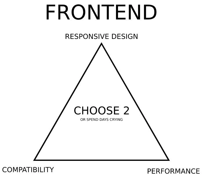
The diagram states the frontend bargain with brutal minimalism:
FRONTEND
RESPONSIVE DESIGN
COMPATIBILITY
PERFORMANCE
CHOOSE 2
OR SPEND DAYS CRYING
The humor works because every experienced Frontend developer has watched these goals sabotage each other in slow motion. ResponsiveDesign means the interface adapts across phones, tablets, laptops, high-DPI displays, split-screen windows, zoom levels, and whatever layout width appears inside an embedded webview. BrowserCompatibility means that same interface behaves consistently across Chromium, Firefox, Safari, mobile Safari, older enterprise browsers, browser extensions, privacy modes, and devices with graphics drivers that appear to have been assembled during a lunch break. Performance means all of that still loads quickly, scrolls smoothly, avoids layout shifts, and does not turn a budget Android phone into a hand warmer.
The triangle's "choose 2" is not mathematically strict, but it is emotionally accurate. Each corner applies pressure to the others:
| If You Prioritize | You Often Pay With |
|---|---|
| Responsive design | More CSS branches, more layout testing, more edge cases |
| Compatibility | Polyfills, fallbacks, duplicated code paths, older APIs |
| Performance | Fewer abstractions, stricter asset budgets, less visual indulgence |
The real pain comes from combinatorics. A layout bug is rarely "the page is broken." It is "the sticky footer overlaps the checkout button only on iOS Safari, only after rotating from landscape to portrait, only when the user has increased text size, only with a translated label that is 40 percent longer than English." That is not a bug report; that is a dungeon generated by CSS, product requirements, and reality.
Modern frontend tooling promised relief and delivered a bigger toolbox. CSS Grid and Flexbox made layout more powerful, but power means more ways to express a wrong assumption. Frameworks make state and rendering more structured, but hydration, bundle splitting, and client-side routing can create their own WebPerformanceMetrics problems. Design systems improve consistency, until a one-off marketing page needs a "tiny exception" that becomes a second design system wearing a fake mustache.
The text "OR SPEND DAYS CRYING" is the veteran punchline because high-quality frontend work is invisible when done well. Users do not thank you because the button stayed tappable at 375px wide. Product managers rarely celebrate that you avoided a 300ms input delay. Stakeholders just see "the page works." Meanwhile, the developer remembers the three-day excavation through media queries, safe-area insets, font rendering, browser quirks, and one position: sticky rule that behaved like it had unresolved personal issues.
Description
A minimalist white image shows a black triangle labeled as a frontend constraint diagram. Large text at the top says "FRONTEND," with "RESPONSIVE DESIGN" above the triangle peak, "COMPATIBILITY" at the bottom left, and "PERFORMANCE" at the bottom right. In the center, the diagram says "CHOOSE 2" with smaller text underneath reading "OR SPEND DAYS CRYING." The meme captures the familiar frontend engineering tradeoff where making a UI responsive, fast, and consistently compatible across browsers and devices can become a multi-day debugging exercise.
Comments
4Comment deleted
The triangle is accurate because the fourth corner, "works in Safari," exists in a different geometry.
I think we can choose all options, why not? Comment deleted
You can, and you will fail at all of them. Comment deleted
Just like in every other project: Speed - Quality - Price Choose 2, the other is out of option then Comment deleted