
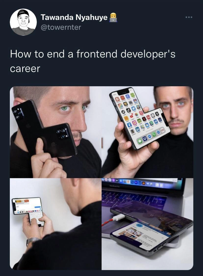
Hardware-induced UX chaos ends a frontend developer's career instantly
Description
Screenshot of a tweet in dark-mode Twitter UI. Display name reads “Tawanda Nyahuye” with handle “@towernter” and a laptop-emoji. Tweet text says: “How to end a frontend developer's career.” Below the tweet, a four-panel collage shows bizarre smartphone orientations: (1) a man holds a phone to his ear but the camera bump is at the bottom, implying the screen is mounted upside-down inside the chassis; (2) he presents a phone whose home screen is diagonally split, displaying rows of app icons at conflicting angles; (3) he types on a phone held sideways, where the on-screen keyboard and message thread are rotated 90° relative to the hardware buttons; (4) a phone is half-inserted under a MacBook, its display still on, with the notch overlaid on the laptop’s track-pad area. Each visual intentionally violates orientation, safe-area, and viewport expectations, satirizing the nightmares responsive-design, device-fragmentation, and CSS media queries inflict on frontend engineers



Comments
6Comment deleted
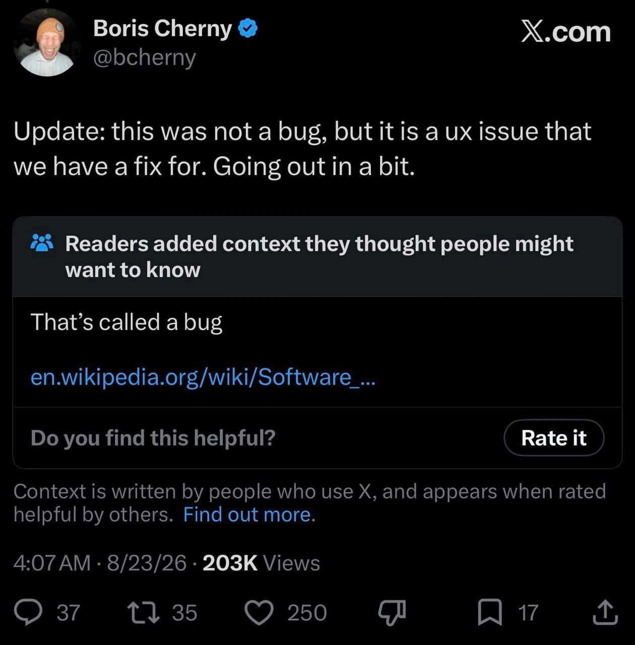
Our new device supports portrait, landscape, and “Escher” mode - orientationchange fires on every tilt, safe-area-inset returns imaginary numbers, and PM logs it as a one-line CSS fix
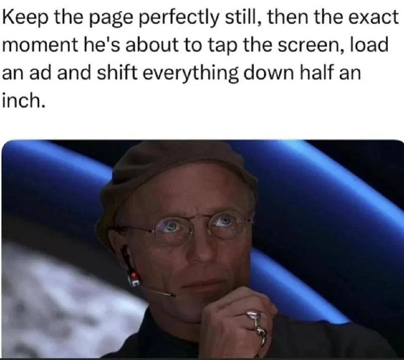
The real nightmare isn't testing on all these devices - it's explaining to the PM why the CSS grid that works perfectly everywhere suddenly thinks it's 1999 on the iPad their CEO uses
The modern frontend developer's descent into madness: starts with 'mobile-first', ends with a desk full of devices running BrowserStack in parallel while praying that one obscure Android 8 device with a notch doesn't break the entire layout in production. The real kicker? After testing on 47 devices, the CEO will still view it on their ancient iPad Mini and ask why the button is 2 pixels off
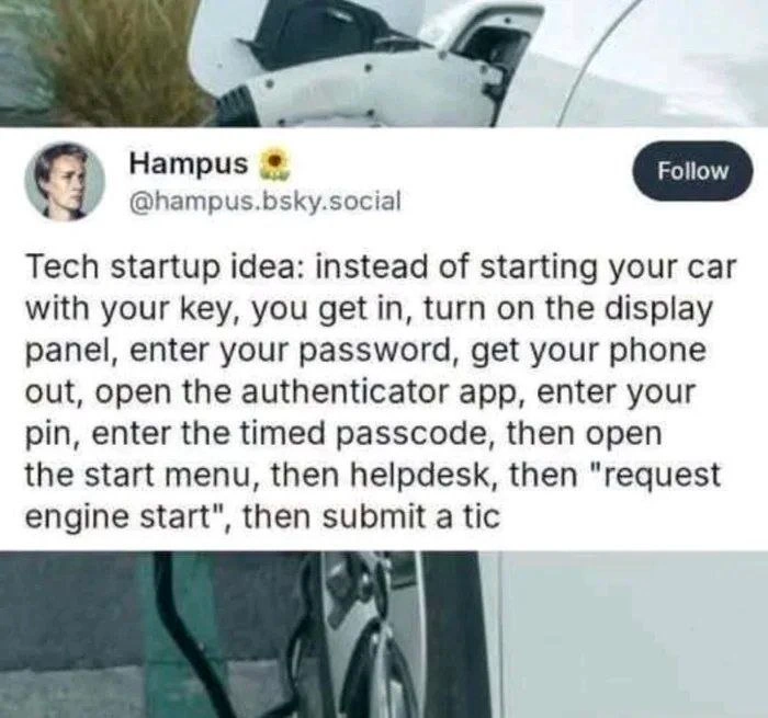
PM: “Just make it responsive.” Me: “Cool - after I reconcile env(safe-area-inset-*) with dvh, set viewport-fit=cover, and prove our layout survives a QA engineer rotating a notched phone like a Kubernetes liveness probe.”
That phone turns “safe area” into a distributed-systems problem - every edge is a potential partition
Emulator lied, iPhone didn't - viewport meta tags weep during live client demos