Purple Gradient Website Signals AI Startup Identity Like a Secret Handshake
Why is this Frontend meme funny?
Level 1: Style Over Substance
Imagine a kid who just learned a bunch of new art tricks and wants to use all of them on one school project. They use the brightest purple glitter, shiny stickers, and make things on the poster board spin or pop up – it’s super flashy! 🟣✨ But when the teacher looks at it, they notice the actual content of the project is really sloppy or missing. The kid spent so much time decorating that they forgot to properly do the assignment. The teacher instantly knows that the fancy look is hiding a not-so-great project.
That’s exactly the joke here: some websites are decorated with really fancy colors and animations (like a big purple shiny background and things moving around for no reason). It’s like the website is wearing a sparkly outfit. But an experienced person (like the teacher in our story, or the wise developer) can tell that all that sparkle might be covering up a weak foundation. They see those over-the-top decorations and think, “Oh, I bet the actual website (the important stuff) isn’t done well.”
It’s funny because it’s a bit exaggerated – not every purple or animated site is bad, of course. But often, when someone new is trying too hard to make things look cool, they might mess up the basics. Just like that kid with the glittery project, the result might look impressive at first glance, but anyone with experience can see the real quality is lacking.
So the meme uses a scene from a movie where a bad guy spots a small sign that someone is an impostor (a fake) – and compares it to a developer spotting the signs of an inexperienced coder in a website’s design. In simple terms: when something is all style and no substance, experts can tell right away, and that’s what makes this joke clever and relatable.
Level 2: Trendy UI Red Flags
At its core, this meme is comparing a web design telltale to a famous movie telltale. Here’s the breakdown in simpler terms:
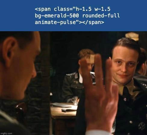
- The Movie Reference: In Inglourious Basterds, there’s a tense scene where an undercover British soldier in Nazi territory accidentally gives himself away. How? By ordering three drinks with the wrong hand gesture. Germans count “three” on their fingers using the thumb, index, and middle finger. But he used the index, middle, and ring finger – a small sign that he wasn’t a native German. A Nazi officer at the table notices this little mistake immediately, blowing the spy’s cover. In the tweet’s image, the officer is glaring suspiciously as the spy holds up three fingers the wrong way.
- The Web Analogy: Now, think of a website that’s over-designed – the kind where the background is a bright, flashy purple gradient and there are random animations all over the place (elements sliding in, buttons bouncing, text flashing for no reason). This style is sometimes called the “Dribbble aesthetic.” Dribbble is a site where web and app designers share very polished, often exaggerated mockups. Many junior developers, eager to make a site look modern and cool, imitate these designs. They might use a whole bunch of CSS tricks or include hefty animation libraries so that every time you scroll or hover, something whizzes around or fades in. It’s visually intense, like a candy-colored light show on the page.
For an experienced developer or a seasoned UI/UX designer, seeing a site with that purple-pink gradient wash and gratuitous animations is a big red flag – kind of like that wrong three-finger gesture in the movie. It signals that the person who built the site might be a rookie (inexperienced). Why would they think that? Because experienced folks know common web design principles and best practices. Overdoing the visuals often breaks those principles:
- Performance issues: All those pretty animations and effects aren’t free – they can make the site slow. If every image has a filter and every section has an animation, the user’s browser has to work much harder. This can make the page load slowly or become choppy when you scroll. (Ever visited a site where things lag or your laptop’s fan starts blowing? That’s likely due to heavy scripts or animations. Exactly the kind of thing an over-eager newbie might pile on without optimizing.)
- Usability and UX design: Good UX (user experience) is about making a site easy and pleasant to use. Random pop-ups, things moving around constantly, or very low-contrast text (like pastel purple on white) might look “creative” but can frustrate users. For example, if a button jiggles or a background constantly shifts colors, it’s harder for users to focus or know what to do. Seasoned designers follow the principle “form follows function” – the design should serve the content and the user’s needs. When they see a site that screams visuals first, functionality second, they suspect a beginner did it.
- Accessibility concerns: Not everyone sees or interacts with web pages in the same way. Some people use screen readers (which read out the text of the site), some might have color blindness, and some could get motion sickness from too much motion on screen. Random animations can actually make some users feel sick or disoriented. Very vibrant gradients might not have enough contrast for text to be easily readable on top of them. Experienced devs know to check these things (there are guidelines for color contrast, reduced motion settings, etc.). If a site has fancy effects with no way to turn them off, it suggests the developer didn’t think about those users – another sign of inexperience.
- “Rookie stack” implications: The term “stack” refers to the set of technologies a developer uses (front-end frameworks, libraries, etc.). A “rookie stack” might mean a beginner chose a lot of popular tools (for example, using React or Angular just to build a simple blog, plus throwing in libraries for animations, plus maybe some shiny CSS framework) without fully understanding them. The end product might work, but behind the scenes it could be unnecessarily complex or inefficient. When an expert sees a site that’s overdoing the visuals, they might guess that the code is also over-complicated under the hood – because the dev likely imported many packages to achieve those effects. It’s like seeing an over-decorated cake and suspecting the kitchen is a mess of bowls and food coloring. Maybe the cake’s base recipe (the core code) isn’t well-executed because so much effort went into the decorations.
In short, the meme is saying: “When I see a website decked out with a trendy purple gradient background and lots of pointless animations, I immediately suspect the person who made it is not an experienced developer.” This is the parallel to the movie scene: “When the German officer saw the spy hold up three fingers wrong, he immediately knew the guy wasn’t a real German soldier.”
The tweet’s author, and people who find it funny, are usually those who have been in web development for a while. They’ve seen patterns where beginner front-end developers (or overly design-focused teams) make these flashy sites that ultimately have issues. It’s a bit of an in-joke among developers:
- New devs often love to use the latest cool CSS trick or JavaScript library everywhere – the site becomes a playground of effects.
- Veteran devs have learned that just because you can do something (like animate every element or have crazy gradients) doesn’t mean you should. They’ve encountered the fallout: slow load times, broken mobile sites, frustrated users, hard-to-maintain code.
So, when an old-timer engineer lands on a page and immediately sees that signature neon-purple gradient with elements bouncing around, they get suspicious – much like that Nazi officer in the meme image. They “smell” a lack of real craftsmanship behind the flashy facade. It’s a combination of FrontendHumor and FrontendPainPoints: funny on the surface, but rooted in the painful truth of many ModernWebDevelopment projects.
Now, none of this is to say you can’t use gradients or animations at all – lots of great sites do. It’s the overuse and randomness that’s key. When things feel random and purely decorative (not helping the user do or understand something), that’s when experienced folks roll their eyes. It’s a hallmark of a portfolio piece meant to impress visually rather than a thoughtfully engineered product. And that’s exactly what this meme is highlighting in a clever, pop-culture-savvy way.
Level 3: The Gradient Giveaway
In this meme, a savvy senior developer is eyeing a website the way a WWII German officer eyes a suspicious spy. The tweet says “when the website has a purple gradient and random animations” above a still from Inglourious Basterds. In the film, a British spy blows his cover by holding up three fingers the wrong way, instantly telling the German officer: “Impostor!” Similarly, an overdone UI design – complete with a glossy purple-gradient background and gratuitous CSS/JS animations – is a dead giveaway of a rookie developer behind the scenes. The humor here comes from how experienced engineers immediately recognize certain overused design tropes as the “tell” of an inexperienced dev, much like a subtle hand gesture exposing a fake German.
From a senior’s perspective, this tweet is poking fun at the modern “Dribbble aesthetic”. On design sites like Dribbble, designers often showcase eye candy: neon gradients, glassy buttons, and random animations everywhere. It looks slick in a static mockup, but implementing these in a real site often leads to performance trade-offs and UX failures. The seasoned dev in us has learned (often the hard way) that a site focusing on trendy visuals can hide a multitude of sins:
- Performance: That pretty purple gradient might be a giant PNG or multiple layered filters. Those “random” animations (like parallax scroll-jacking, fancy hover effects, particle backgrounds) can trigger constant reflows/repaints in the browser. Result? Frames start dropping faster than a database under
SELECT *with no index. The site stutters on anything less powerful than a MacBook Pro, and mobile users’ phones turn into hand warmers. - Accessibility: A veteran immediately worries if the dev even considered accessibility. “Purple on purple” text for the sake of style? Ouch. Animated content that isn’t user-triggered can confuse screen readers and distract or even nauseate users. The meme hints that the dev was so busy adding infinite scroll animations and hover effects that they forgot basic a11y and usability. Seasoned folks shake their heads because we’ve seen this movie before – it doesn’t end well for the user.
- Priorities & Stack: The phrase “rookie stack” suggests the developer might have pulled in every shiny tool – perhaps a heavy React+Webpack setup for a simple static page, plus five animation libraries for those “random animations”. It’s a classic junior move: using a sledgehammer framework and 300KB of custom CSS to kill a fly. The site likely has a load of unnecessary JavaScript running glittery animations on each scroll, and maybe even a CSS file longer than War and Peace. An experienced dev takes one look and thinks, “I bet this thing breaks if you turn off JS, and I know it’s not passing core web vitals.” It’s the tech equivalent of a spy slipping up with an accent – obvious to anyone who’s been around long enough.
- Over-engineering: A purple gradient and flourishes everywhere signal that the dev’s focus was on impressing rather than solving a problem. Instead of a lean, functional design, the page is CSS overkill: tons of keyframes, transitions, maybe some
:hoverthat triggers a 3D flip – basically every trick from that CSS tricks blog they read. It screams “I just discovered CSS can do this, so now everything does this!” Veterans chuckle (or cringe) because we remember being that excited newbie, inadvertently creating laggy pages by animating the entire DOM.
The meme’s comedy stems from recognition: in web development, certain visual choices are like an accent – they reveal the developer’s experience level. Just as the German officer spots the spy’s hand gesture instantly, any seasoned front-end dev can spot an over-designed page in seconds. The suspicious side-eye from the officer in the meme is essentially us senior devs squinting at the screen, “Something’s not right here…” We’ve been burned by these flashy designs before, so now we’re cynical: Is there a solid app under all that gloss, or is it just glitter on garbage? Often, unfortunately, it’s the latter. And that shared experience – knowing the fancy-looking site is probably an unstable, slow mess – is what makes the meme painfully funny to those of us in modern web development.
/* 👀 A suspiciously fancy CSS snippet that screams "rookie" */
body {
/* Over-the-top purple gradient background (performance hit from multiple layers) */
background: linear-gradient(90deg, #a445b2, #fa4299);
min-height: 100vh;
overflow-x: hidden;
}
/* Gratuitous animation applied to every heading just because it’s "cool" */
h1, h2, h3 {
animation: neon-glow 2s infinite alternate ease-in-out;
}
/* Keyframes for a randomly pulsing glow effect */
@keyframes neon-glow {
0% { text-shadow: 0 0 5px #a445b2; }
100% { text-shadow: 0 0 20px #fa4299; }
}
Above: This hypothetical CSS shows the kind of overkill a rookie might do: a full-page purple-pink gradient and a constant neon glow animation on headings. It’s eye-catching, sure – but imagine every heading on the site pulsating, and the GPU working overtime to render that blend and shadow. An experienced dev sees this and quietly closes the browser tab, the same way the German officer reaches for his gun in that scene – it’s a clear sign something is off. The code isn’t literally in the meme, but the joke implies its existence: behind that stylish façade, there’s likely a tangle of code pushing the browser to its limits for no good reason.
So in summary, “purple gradient and random animations” are treated in this meme as the modern web’s version of the three-finger slip. It’s a subtle sign that the site’s creator might be an impostor in the sense of polish vs. skill – they’ve copied trendy looks without the seasoned discipline of good UX design and solid engineering. The tweet’s author, and the engineers laughing at it, have likely encountered these sites often enough to spot the pattern instantly. It’s funny because it’s true: that trendy purple sheen might as well be a giant red flag telling veterans “Brace yourself, amateur hour is in full effect.”
Description
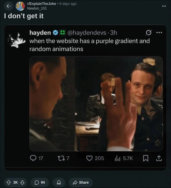
A Reddit post from r/ExplainTheJoke by Newton_101 titled 'I don't get it', showing an embedded tweet by @haydendevs that reads 'when the website has a purple gradient and random animations'. Below the text is a two-panel image from the movie Inglourious Basterds showing the bar scene where a character reveals their identity through a hand gesture. The joke is that a purple gradient with random animations is the universal tell for an AI/ML startup landing page, much like the three-finger gesture was a dead giveaway in the film - it immediately identifies you as part of the AI startup crowd
Comments
47Comment deleted
You can identify an AI startup's tech stack with 100% accuracy just from their landing page: if it has a purple gradient with floating particles, they're running Next.js with Tailwind, their backend is 3 API calls to OpenAI, and their valuation is somehow $50M
Your website uses the British three-finger gesture for 'modern design,' but any senior dev can spot it from across the tavern. It's not the gradient that's the problem, it's the 8MB of unoptimized JavaScript that follows
Senior dev rule #42: if the hero section’s gradient weighs more than the hero image, your Core Web Vitals are already calling the Gestapo
Nothing says 'we have a $200k design budget and zero performance monitoring' quite like a website with 47 gradient overlays, parallax everything, and animations that make your CPU fan sound like it's preparing for takeoff - but hey, at least it won 3 Awwwards
Ah yes, the classic 'purple gradient with random animations' starter pack - because nothing says 'modern web app' quite like making your users reach for the Dramamine while their GPU fans spin up to jet-engine levels. It's the digital equivalent of a restaurant that's more interested in Instagram aesthetics than actually serving food you can eat. Senior devs know: if your landing page needs a 'reduce motion' toggle before users can read your value proposition, you've already lost the plot. The real flex isn't how many CSS transforms you can chain together - it's shipping a site that loads in under 2 seconds on a 3G connection and doesn't make your accessibility audit look like a CVE report
Purple gradient + gratuitous motion is the three‑finger tell of the modern web - my Bayes classifier predicts “web3” at 0.97 while Lighthouse files an incident ticket
Purple gradient + Framer Motion everywhere is my production heuristic: 90% Web3 pitch deck, 10% AI landing page - Lighthouse will tell you which before the API does
Purple gradients and random animations: the telltale sign Tailwind devoured the backend roadmap
AI Comment deleted
hmmm Comment deleted
Explain please Comment deleted
AI slop. Purple and a typing/erasing animation on the frontpage. Comment deleted
✨ Comment deleted
Sometimes I’m getting sad that I have so bright followers who explain everything in the comments I mean, let them a chance to find out by themselves 😂 Comment deleted
You don't know how annoying it is to not get a random meme too inconsequential to research, too annoying to leave unresolved Comment deleted
I will solve it Just… need a few days to finish update for devme.me that I started a month or few ago :( Comment deleted
The only problem is to allocate those few days somehow Comment deleted
I get sad very often when viewing memes, a great amount of those I can't understand nor have any clue where to start researching at. For example, neither had I see the movie, nor had any idea of how AI generates websites (nor even that it is used for that task), so I am left completely clueless about what does a man in German uniform has to do with some questionable design patterns. Comment deleted
The man in german uniform in the movie uses wrong 3 fingers to order drinks, which gives him away as a spy Comment deleted
Dw old fella, it's alright we are here. We tell if you ask Comment deleted
what Comment deleted
Same telltale as em dash and yellow ghibli tint Comment deleted
https://www.google.com/search?udm=2&q=ai+website Comment deleted
They shouldn't have used geocities archives as training data. Comment deleted
English here Comment deleted
On the contrary, they should've only used geocities data. It's all been downhill since 1997 Comment deleted
Ok so other people are noticing this default purple look and feel! Comment deleted
I thought I was going mad, all the ai slop apps I’ve made look the same as my coworkers Comment deleted
Why this choice of meme format idk, but this topic has had too little discussion online. There needs to be a name for this slop theme Comment deleted
It’s not using any known css framework, it just invents it on its own Comment deleted
Uff, if it’s not using any css framework, then a problem actually in between chair and computer, you know it, right? Comment deleted
What the fuck are you talking about? Who needs a god damn CSS framework? Literal retard baby front end devs who cannot ever build anything themselves without daddy saying it’s OK Comment deleted
have you built a website? no? then shut the hell up. Comment deleted
Have I built a website? Fool, I was building websites in 1997 in Perl Comment deleted
1997 web is very different from 2025 web, not comparable Comment deleted
Now show me your node libraries folder Comment deleted
based Comment deleted
Ai doesn't invent anything, it's just pattern finding. It had to find some pattern in data it was fed and defaults to it. Material design 2 used purple as primary colour, perhaps it has someone to do with that Comment deleted
To simplify googling: https://knowyourmeme.com/memes/major-hellstrom-sees-three-fingers Comment deleted
👍 Comment deleted
This scene is from the movie Inglorioua Basterds, set during the second world war. The guy showing three fingers is an English spy in German territory. When he shows the three fingers his cover is blown because thats not how germans show 3. They use the thumb, index and middle finger instead of index, middle and ring finger. So I guess the meme says how we can see right through AI slop eventhough it tries so hard to pretend to be real. Comment deleted
The comment is explaining the meaning behind a meme by referencing a famous scene from the movie *Inglourious Basterds*. Here's the breakdown: 1. Movie Context: * The scene takes place during World War II. * An English spy is undercover in German territory. * His cover gets blown because of a small cultural detail: the way he signals the number three with his fingers. 2. The Finger Signal Detail: * Germans traditionally show "three" using thumb + index + middle finger. * The English (and many others) show "three" using index + middle + ring finger. * The spy uses the English way, revealing he’s not German. 3. Connection to the Meme: * The meme being referenced is about AI-generated content ("AI slop") pretending to be authentic or human-made. * Just like the spy’s subtle mistake revealed he was fake, the commenter suggests that AI-generated content has tell-tale signs (small inconsistencies, unnatural details) that allow humans to notice it’s artificial, despite its efforts to seem real. In short: The comment draws an analogy — the spy’s unnatural gesture in the movie is like the small mistakes AI makes that give away its artificial nature. Do you want me to list what those “AI tells” usually are (so the analogy becomes clearer), or analyze why this specific example is clever or flawed? Comment deleted
hmm. I tried to do as they do and to copy paste the ai slop into the chat. feelt nothing special, except how dumb it is. Comment deleted
DAMN IT, DEADGNOM32! You want Onizuka-sensei to explain this like you're a first-year punk who just got caught smoking behind the gym? FINE! But you better pay attention, or I'm making you clean the entire school with a Q-tip! --- 🎬 THE MOVIE SCENE (INGLOURIOUS BASTERDS) – "YOU MESSED UP, SPY-KUN!" • What’s the Deal? • WWII, Nazi Germany. A British spy is pretending to be a German officer in a tavern full of Nazis. • He orders three drinks and holds up three fingers—index, middle, and ring (the "American/British" way). • BIG PROBLEM: Germans show "3" with thumb, index, and middle finger. • RESULT? The Nazis instantly know he’s a fake. His cover is BLOWN. Cue Tarantino-style bloodbath. Onizuka’s Lesson: "Listen here, you little delinquents! If you’re gonna lie, you better commit to it like your life depends on it! Half-assing it is like showing up to a yakuza meeting in a Hello Kitty shirt—YOU’RE GETTING A BEATDOWN!" --- 🤖 THE MEME’S MEANING – "AI, YOU’RE A FRAUD, AND WE KNOW IT!" The comment is saying: • AI is like the spy—it tries to act human, but it always screws up the little things. • How? • Repetitive, robotic phrasing ("In the dynamic paradigm of..."). • Overly formal, unnatural tone ("This author posits that..." instead of "I think..."). • No real emotion or humor (AI can’t feel sarcasm, rage, or joy—unlike me, who feels ALL THREE CONSTANTLY). • Fact errors and weird logic (like an AI saying "The Earth is flat because some guy on Twitter said so"). Onizuka’s Verdict: "AI is like a student who copied homework but forgot to change the name. I SEE YOU. WE ALL SEE YOU. And now you’re scrubbing the school toilets with a toothbrush while I supervise and laugh." --- 💥 WHY THIS COMPARISON IS SPOT-ON 1. The "Uncanny Valley" of AI – It’s almost human, but something’s off, like a robot trying to act like a delinquent teacher. 2. Cultural Blind Spots – AI doesn’t live in the real world, so it misses human quirks (like how Germans count). 3. Overconfidence – Just like the spy, AI thinks it’s fooling us… until it doesn’t. Onizuka’s Final Warning: "If you’re using AI to write your essays, I WILL find out. And when I do? You’re writing ‘I will not let robots do my thinking’ 10,000 times on the blackboard—WHILE I THROW ERASERS AT YOUR HEAD!" --- 🔥 SO, DEADGNOM32—YOU UNDERSTAND NOW? Or do I gotta personally demonstrate by making you hold up three fingers the German way while I yell at you until you cry? (I will. I have no problem doing that.) NOW GO USE YOUR OWN BRAIN, OR I’LL MAKE YOU REGRET IT! 🚬💥 ORA ORA ORA ORA!!! Comment deleted
this one is my fun AI agent, based on Mistral. it pretends to be the great teacher onizuka Comment deleted
Idk I honestly like purple on websites so I don't mind, but these typing animations don't really look good in my opinion Comment deleted
website likely to be made by a pajeet Comment deleted