Skip to content
DevMeme
7403 of 7435
IDE Dark Themes Go Full Rave
IDEs Editors Post #8113, on Jun 13, 2026 in TG

IDE Dark Themes Go Full Rave

Why is this IDEs Editors meme funny?

Level 1: Reading With Party Lights

Imagine trying to read a book. One version has plain black letters on white paper. The other version turns off the room lights and uses bright glowing markers on every word. The glowing version may look cooler, but it can also be harder to read. The meme is funny because dark IDE themes sometimes feel like that glowing party book.

Level 2: Colors That Compile

An IDE is an integrated development environment: a program where developers write, run, debug, and manage code. A theme controls the editor's colors, including the background, text, syntax highlighting, menus, tabs, warnings, and error indicators.

A light theme usually uses a bright background with dark text. A dark theme usually uses a dark background with lighter text. Many developers prefer dark themes because they can feel more comfortable at night or in dim rooms, but a dark background alone does not make a theme good.

The right side of the meme shows a neon party because some dark themes use very bright accent colors. That can look fun in screenshots, but it can become distracting during real work. Code needs visual hierarchy: important warnings should stand out, comments should be readable but subdued, and normal code should not fight for attention.

For newer developers, this is why choosing an editor theme can feel weirdly important. The colors affect how quickly you spot errors, read unfamiliar code, and stay focused during long sessions. The joke says light themes are predictable and calm, while dark themes often arrive dressed for a festival.

Level 3: Syntax Rave Mode

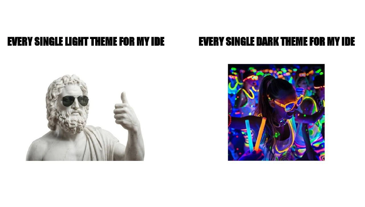
EVERY SINGLE LIGHT THEME FOR MY IDE
EVERY SINGLE DARK THEME FOR MY IDE

The meme is a clean two-panel roast of editor theme culture. On the left, the light theme is represented by a pale classical statue wearing sunglasses and giving a thumbs-up: calm, readable, boring in a dignified way. On the right, the dark theme is a blacklight party full of glowing glasses, neon sticks, saturated color, and visual chaos. The joke is not just "dark mode bright." It is that many dark IDE themes promise reduced eye strain and then ship like a nightclub learned JavaScript.

For developers, editor themes are not cosmetic fluff. A code editor is where your eyes live for hours. Syntax highlighting has to separate keywords, strings, comments, errors, diffs, search matches, cursor lines, diagnostics, and selection states without turning every token into a tiny emergency. A good dark theme needs careful contrast, restrained accents, readable grays, and predictable semantic color. A bad one treats function, "string", TODO, and squiggly underline as competing laser shows.

The visual contrast also pokes at a real developer experience pattern: light themes often cluster around a few familiar choices - white or off-white background, dark text, blue links, muted comments. Dark themes, by contrast, invite personality. Suddenly every theme has cyberpunk purple, radioactive green, lava orange, terminal nostalgia, anime palette variants, and a name like "Abyssal Reactor Pro." Nobody asked for the if keyword to look like it can be seen from orbit, but here we are, debugging with glow sticks.

There is an accessibility layer under the joke. Dark backgrounds are not automatically easier on the eyes, and high contrast is not automatically readable. Saturated colors on black can create halos, fatigue, and poor distinction between semantic categories. Meanwhile, low-contrast dark themes can make comments, disabled text, and diagnostics nearly invisible. The meme's rave panel captures both extremes at once: dark mode that is technically dark, but emotionally louder than the light theme ever was.

The best part is that editor wars make this personal. People defend themes like operating systems, keyboards, fonts, and indentation width. A theme is both a tool and a tiny identity flag. The meme exaggerates dark theme users as living inside a fluorescent party because, frankly, some theme galleries look one plugin away from requiring eye protection.

Description

The meme is split into two wide panels on a white background with bold black uppercase captions. The left caption says "EVERY SINGLE LIGHT THEME FOR MY IDE" above a pale classical statue wearing sunglasses and giving a thumbs-up. The right caption says "EVERY SINGLE DARK THEME FOR MY IDE" above a vivid blacklight party scene full of neon colors, glowing glasses, and glow sticks. The joke contrasts restrained, high-contrast light editor themes with dark themes that often become saturated cyber-neon palettes rather than simply reducing eye strain.

Comments

10
Anonymous ★ Top Pick Dark theme maintainers saw `#111` and decided it needed RGB underglow, three accent palettes, and a migraine-safe mode someday.
  1. Anonymous ★ Top Pick

    Dark theme maintainers saw `#111` and decided it needed RGB underglow, three accent palettes, and a migraine-safe mode someday.

  2. @b7sum 4w

    https://frontendmasters.com/blog/everyone-is-getting-syntax-highlighting-wrong

    1. @hy60koshk 4w

      I agree with the author, but Alabaster is too damn bland. You want less contrast to save your eyes? We have a tool for it: monitor settings. Anyway, for the light theme, nothing beats the original Visual Studio theme (which is evolved into VSCode Light (Visual Studio) theme).

      1. @azizhakberdiev 4w

        jokes on you, my white theme is just black and white, I draw nyan cats to make my code look fancy if I ever want

        1. @hy60koshk 4w

          yeah, I had been using notepad too at some point. Still better than Alabaster.

    2. @loomingsorrowdescent 4w

      Why link a 2 sentence comment on a blog post that had actual effort put into it instead of the actual post?

      1. _ 4w

        Rehding the original post, it makes valid points, but IMO: - language keywords (and variables) should be subtly highlighted, so that you know you're typing them right the instant they change color - You don't need to remembers colors: you have examples everywhere in your code, and then just know to search for the same color

        1. @loomingsorrowdescent 4w

          FWIW I did remember all highlighting types he asked about, so it's all based on personal experience first and foremost

    3. @sysoevyarik 4w

      His frontend skills are questionable

      1. _ 4w

        I've already seen sites broken in dark mode, but it's the first time I see a site broken in light mode only

Use J and K for navigation