Web Developers' Love for New Chrome UI
Why is this Frontend meme funny?
Level 1: Shiny New Toy
Imagine you have a favorite old toy that you’ve played with for a long time, but it’s a bit basic and not very exciting anymore. Then one day, a brand new, super shiny toy comes out – it’s bright, colorful, and just looks so cool. You instantly want to play with that new toy and kind of forget about your old toy, even though the old one was fine.
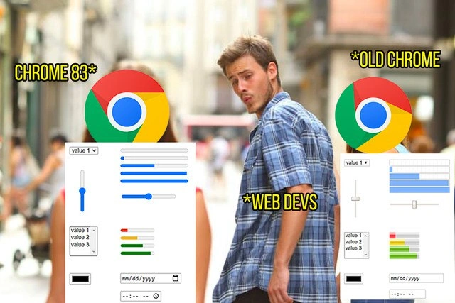
This picture is joking about that exact feeling, but with web browsers and developers. The “old toy” is an earlier version of a web browser (an app like Chrome that you use to view websites) with plain-looking buttons and sliders. The “new shiny toy” is the latest version of that browser (Chrome 83) that suddenly has really pretty buttons and sliders built in. The guy in the picture represents web developers, and he’s turning away from the old, boring browser version and reaching out for the new, shiny browser version.
In simple terms: web developers saw that the new Chrome made some things on web pages look nicer automatically, and they got really excited – so excited that the meme jokes they are “distracted” and forgetting about the older stuff. It’s funny because it’s an exaggeration of how people (not just developers, even all of us) often react to new, flashy improvements. Just like a kid getting starry-eyed over a new toy and dropping the old one, the developer in this meme is enamored with the new Chrome 83 features and momentarily ignoring the old Chrome. The humor comes from recognizing that little bit of childish excitement in grown-up professionals – we can’t help but love our shiny new toys!
Level 2: Front-End Eye Candy
This meme shows a classic scenario in WebDev where something new and visually appealing steals all the attention from something older and familiar. Let’s break down the characters and terms in the image and caption:
Web Devs – short for web developers (specifically frontend developers who build the parts of websites that users see and interact with). In the meme, “Web Devs” is the label on the distracted boyfriend character. It implies us, the developers, who are always looking at the latest tools or features in web development.
Old Chrome – refers to an older version of Google Chrome (the web browser). Chrome is given a version number for each release (e.g., 81, 82, 83...). “Old Chrome” here stands in for the versions before Chrome 83. The meme actually puts the Chrome logo over the girlfriend character’s face and labels it “Old Chrome,” and shows a screenshot of how form inputs looked in that older Chrome. Those old default form controls are the unstyled, generic ones we’ve seen for years: a gray slider, a basic dropdown with a dated-looking arrow, and a plain date input box (with the placeholder text “mm/dd/yyyy”). This represents the status quo that developers were used to but not very excited about.
Chrome 83 – this is the specific newer version of Chrome highlighted in the meme (released around mid-2020). The passing woman (the “temptation”) has the Chrome logo labeled "Chrome 83*" (with an asterisk for emphasis as used in the meme). Over her is a screenshot of the Chrome 83 redesigned form controls: a slick blue-colored range slider, an updated dropdown menu (with new styling and a nicer arrow icon), a color picker widget (showing a color selection field), and the same option list and date field but in a refreshed style. Essentially, Chrome 83 brought built-in visual improvements to standard HTML form elements.
Shiny new form controls – “Form controls” means the interactive elements in forms on webpages, like text fields, checkboxes, dropdown lists (
<select>menus), sliders (<input type="range">), date pickers (<input type="date">which pops up a calendar), color pickers (<input type="color">which opens a color selection tool), etc. Each web browser has default styles for these elements. “Shiny new form controls” implies that Chrome 83 updated these defaults to look more modern or “shiny.” In other words, without any custom styling by the website, Chrome 83’s controls look more attractive compared to older Chrome. The slider now has a bright blue track and a smoother design; the dropdown looks cleaner; the date picker and color picker have nicer interfaces. It’s like a fresh coat of paint on all the basic widgets users interact with in forms.
Now, why are Web Devs depicted as so captivated by this “Chrome 83” update? This is where the humor kicks in for anyone who does front-end work: front-end developers care a lot about how things look and behave for the user. Often they have to write custom CSS (Cascading Style Sheets, which is the language used to style HTML elements with colors, layouts, etc.) to make these form elements fit the design of their site or application. Different browsers have slightly different default styles, which leads to BrowserCompatibility headaches – ensuring that a button or input looks consistent in Chrome, Firefox, Safari, etc., can be tricky. For example, a simple slider might appear differently (size, color, etc.) in each browser. Frontend devs sometimes call these differences pain points, because they have to spend extra time fixing or normalizing styles.
So when Chrome 83 came along with improved native styles, it was like a little gift to developers. It means that at least in Chrome, those form controls will look nicer automatically, with less effort from the developer. The meme exaggerates this feeling by showing the developer (boyfriend) literally turning away from supporting “Old Chrome” in order to focus on the new pretty Chrome 83. In reality, most users get Chrome updates automatically, but the joke is about the mindset: developers often get very excited about new tech improvements. It also pokes fun at how developers can be quick to drop or ignore older technology as soon as something new and better-looking arrives. “Old Chrome” (the girlfriend) represents the older style that developers were stuck with and maybe bored of, while “Chrome 83” is the exciting new style catching their eye.
The distracted boyfriend meme format is a perfect comedic illustration of this dynamic. It’s widely recognized: a man with his girlfriend turns his head to stare at another girl walking by, and the girlfriend looks shocked or annoyed. People use this meme template to joke about switching loyalties or being distracted by a new obsession. Here, Chrome 83 is the new obsession (that shiny browser update), and Old Chrome is the thing being momentarily abandoned (the previous versions of Chrome that, until yesterday, developers had been working with). The text “Web Devs” on the boyfriend signals that it’s specifically web developers who are behaving this way in the joke.
In simpler terms, the meme says: “Web developers see the new Chrome 83 form features and get so excited, they act like they’ve forgotten all about the older Chrome versions.” It humorously captures a real feeling in Frontend development: the thrill of new features or improvements. Every time a browser releases something that makes web design easier or more elegant, you’ll see developers on forums and social media cheer about it. (Lots of posts like “OMG have you seen the new Chrome form controls? They look so good by default!”). It might seem like a small detail to others, but for the people who spend their days building web interfaces, it’s the little things that spark joy.
Finally, the meme hints at “abandoning support for older Chrome versions.” This is a wink at the concept of dropping support for outdated browsers or versions when new ones come out. In professional practice, developers usually have to ensure a site works on multiple browsers and not-too-old versions. But it’s often tempting to stop worrying about an old version once a new, improved one is widely available – especially if the new version fixes problems or looks better. For example, many developers historically couldn’t wait to stop supporting Internet Explorer because newer browsers like Chrome and Firefox made development so much easier. In this case, Chrome 83 is obviously better than Chrome 72 or 80 in terms of form UI, so the joke is a developer might be like, “Old Chrome? Never heard of her,” as soon as they see Chrome 83’s enhancements. It’s hyperbole, but it’s poking fun at that excitement.
In summary, Web Devs are portrayed as the distracted boyfriend, giddy about Chrome 83’s polished form controls (the “eye candy”), and shamelessly ignoring the older Chrome’s dull defaults. The meme is funny to people in web development because they recognize both the scenario (cool new browser feature gets attention) and the underlying truth: we all love a shiny new tool that makes our work easier or our websites look nicer, sometimes more than we’d like to admit!
Level 3: Dazzling Defaults
Chrome 83 introduced a much-awaited modernization of native form controls, causing quite a stir in the frontend community. On the surface, it’s just a visual refresh – the kind of browser default styling update that normally flies under the radar – but to seasoned Web Devs this was a big deal. Why? Because the appearance of basic HTML inputs (text fields, checkboxes, dropdowns, sliders, date pickers, etc.) has historically been stuck in a time warp. The Old Chrome (pre-83) rendered these controls in a plain, utilitarian style (think gray sliders, clunky dropdown arrows, and a very minimal date picker UI). It wasn’t wrong, but it was bland and inconsistent, often feeling out of place in modern web app designs. Developers would spend hours in CSS trying to override or finesse these default looks to match their site’s design language. This often meant wrestling with vendor-specific selectors and weird hacks to get consistent styling across browsers.
In Chrome 83, Google gave these native form controls a UI “glow-up” — a more modern, polished design out-of-the-box. Suddenly, the range slider had a slick blue track with a neat circular thumb instead of a drab gray bar. The <select> dropdown got a cleaner arrow icon and spacing. The color picker (<input type="color">) was more usable and integrated. Even the date picker (<input type="date">) sported a friendlier calendar interface. These might seem like small tweaks, but for front-end developers who have been manually theming every form element to avoid the 1990s PC look, this felt like a little victory. It’s as if Chrome’s engineers said, “We’ve got your back on basic UI aesthetics,” saving developers from some extra lines of CSS.
To appreciate the excitement, remember that customizing these form controls had long been a FrontendPainPoint. Some elements were notoriously hard to style uniformly. For example, previously if you wanted a custom-styled slider, you’d often use CSS tricks like removing the default appearance and styling pseudo-elements for each browser engine:
/* Before: heavy lifting to override default slider styles */
input[type=range] {
-webkit-appearance: none; /* Remove default WebKit (Chrome/Safari) style */
width: 100%;
}
input[type=range]::-webkit-slider-thumb {
background: #3498db; /* Custom thumb color */
}
input[type=range]::-moz-range-thumb {
background: #3498db; /* Firefox equivalent styling */
}
Every browser had its own quirks (WebKit vs. Gecko vs. Blink), forcing devs to write extra code just to achieve a consistent look. The BrowserCompatibility issues were real – a style that worked in Chrome might not in Firefox without those ::-moz- rules, etc. So, when Chrome 83 natively rolled out prettier controls, developers saw it as less CSS to maintain and a step toward cross-browser consistency (at least within Chrome’s large user base). One could almost hear a collective sigh of relief from dev teams: fewer CSS overrides for Chrome’s defaults and one less reason for clients to say “Why does this form look different here?”.
The meme nails this scenario using the classic distracted boyfriend format: Web Devs (the boyfriend) are shown blatantly turning attention towards Chrome 83 (the passing girl with shiny new UI) while ignoring Old Chrome (the girlfriend representing the older version’s drab controls). This exaggeration humorously captures a real temptation in web development: chasing the latest shiny thing. In practice, good developers balance new features with backward compatibility, but emotionally, it’s so satisfying to see a new tool or update that makes life easier or interfaces prettier. The meme plays on that feeling. BrowserWars aren’t only about JavaScript speed or new APIs – they’re also fought on UX polish and dev satisfaction. Chrome giving form elements a facelift is a tactical move: it delights developers (keeping them loyal to Chrome as a platform) and puts pressure on other browser vendors to not fall behind in base UX.
Of course, the humor also hints at the fickleness of developer attention. Frontend devs are somewhat infamous for “shiny object syndrome” – rapidly abandoning old tech or support for an older browser as soon as something new and appealing comes along. Here, the joke is that web devs might suddenly “abandon” support or concern for older Chrome versions simply because Chrome 83’s defaults look so good. It’s a tongue-in-cheek commentary: nobody would literally drop users on Chrome 80 overnight just for prettier sliders (especially since Chrome auto-updates for most users), but the emotion is that strong. Every major frontend update like this – whether it’s a new CSS framework, a hot WebDevelopment build tool, or in this case a browser UI overhaul – tends to dazzle developers. The meme captures that split-second abandonment of duty (old version = girlfriend) for the exciting new thing (Chrome 83 = the attractive stranger).
In summary, this meme resonates with experienced developers because it layers multiple inside jokes: the perennial struggle of styling form controls, the relief when a major browser finally addresses a long-standing issue, and the guilty thrill of wanting to ditch the old way immediately. It’s funny because it’s true – even if just for a moment, every frontend dev seeing Chrome 83’s shiny new form controls felt a bit like that distracted boyfriend. They know they should care about legacy support, but wow, that new default CSS candy is hard to ignore!
Description
A classic 'Distracted Boyfriend' meme format tailored for web developers. The boyfriend, labeled '*WEB DEVS*', is looking admiringly at a passing woman. This woman is labeled '*CHROME 83*' and is overlaid with the Google Chrome logo and a screenshot of sleek, modern-looking default HTML form controls (sliders, dropdowns, date pickers). The jealous girlfriend is labeled '*OLD CHROME*' and is also overlaid with the Chrome logo but features the older, more clunky and dated default form controls. The meme humorously captures the excitement of the web development community around the release of Chrome 83 in May 2020, which introduced a long-awaited visual refresh for native HTML form elements, making them look much better out-of-the-box and reducing the need for extensive custom styling
Comments
7Comment deleted
I've spent years of my life writing CSS resets and custom styles for date pickers. The Chrome 83 update felt like the browser finally apologized for its childhood
Chrome 83 ships modern form controls and every senior frontend dev hits “Merge” on the PR deleting 30 KB of ::-webkit-appearance hacks - three seconds before QA reminds them Safari still exists
The real betrayal is when you finally convince the enterprise client to drop IE11 support, only to discover their Chrome is pinned to version 49 because IT deployed it through Group Policy in 2016 and nobody remembers the admin password
The eternal struggle: Chrome 88's sleek native form controls are tempting, but you know somewhere in your analytics there's still that 2% of users on Chrome 63 who will see a broken mess. Meanwhile, your PM is asking why you're spending three sprints on 'just a date picker' when the design mockup made it look so simple
Chrome updates: refactoring the browser one gigabyte at a time - cleaner APIs, heavier heap
Chrome 83 refreshes native form controls and half our visual regression tests go red - turns out the browser is the biggest dependency we forgot to pin
Chrome 83 finally modernized native form controls; I deleted 3,000 lines of appearance: none and polyfills, then remembered the enterprise is stuck on Old Chrome - git revert and ship a feature flag named hope