Skip to content
DevMeme
3314 of 7435
Two Mugs of Pure Developer Pain: Unicode and CSS Edition
Frontend Post #3638, on Sep 3, 2021 in TG

Two Mugs of Pure Developer Pain: Unicode and CSS Edition

Why is this Frontend meme funny?

Level 1: Broken Heart, Broken Box

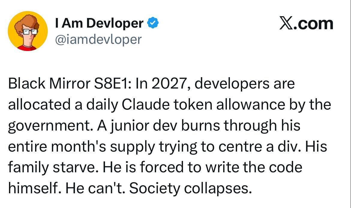
Imagine you’re making a fun poster, but a couple of things go wrong. First, you want to write “I love Unicode” and you try to draw a big heart ♥ to show love. But uh-oh – your red heart sticker is missing, so you just leave a blank square on the poster because you’ve got nothing to stick there. Now your poster says “I [empty box] Unicode.” It feels like the heart fell out and left a hole! That’s pretty silly, right?

Next, you try to decorate another part of your poster with a nice rectangle frame around the words “CSS IS AWESOME.” You draw a box, but you only manage to fit the word “CSS” inside the frame. The words “IS AWESOME” end up outside the box because your frame was too small or you stopped drawing too soon. Now it looks like the phrase is half inside a box and half hanging out – totally wrong and kind of funny to look at.

So in the end, you have a poster with a missing heart and a funky, too-small box. It’s like you tried to show something cool but it came out all goofy. That’s exactly why programmers laugh at those coffee mugs: one mug has a missing heart symbol (like a broken heart) and the other has a messed-up box around words. It reminds them of little mistakes computers make when they don’t have the right pieces (like the right font for a heart, or the right code for the box). It’s a funny way to say, “Oops! Things didn’t come out as planned!” Even if you don’t know anything about coding, you can see a heart is missing and a frame doesn’t fit – and that mix-up is the whole joke. It makes us giggle because we’ve all had moments where what we imagined and what actually happened didn’t line up, and sometimes it looks as silly as a broken heart and a broken box on a coffee mug.

Level 2: Missing Glyph & Misplaced Border

For those newer to coding, let’s break down why these mugs are funny. The left mug says “I □ Unicode.” That little empty square is what shows up when a character isn’t supported – it’s literally a missing glyph placeholder. Here, the mug most likely was meant to say “I ♥ Unicode” (as in I love Unicode), but instead of a heart symbol you see a blank box. Unicode is the universal system for encoding text in computers – it’s like a giant dictionary of every character from every language (plus emojis, symbols, you name it). But to actually see a Unicode character, you need a font that has a picture for it (a glyph). If the font you’re using doesn’t have the glyph for, say, the heart emoji, the computer can’t draw it. So it falls back to a generic symbol (often a square or a box with an X or question mark) as a placeholder. This is called font fallback. The idea is: “Hmm, my main font can’t show this character. Do I have another font that can? If not, I’ll show a default empty box so the user knows something should be here.” That’s exactly what happened on the mug – the heart didn’t print, and we got a square instead. It’s a classic UnicodeSupport issue. You might have seen something similar on websites as a little box or a weird question mark symbol when a special character isn’t working. Sometimes it’s because the page isn’t in the right encoding (like not using UTF-8), and other times it’s because the font doesn’t support that character. Developers have to deal with this a lot, especially when working with international text or emoji. They have to choose fonts or include fallback fonts that cover all the characters they need. Otherwise, users see those funny empty squares (often called “tofu” by devs because they look like little white tofu blocks). So, the first mug is basically a nerdy way of saying “Unicode is great, but only if your font supports it!” – which is a lesson every developer learns eventually.

Now, the right mug says “CSS IS AWESOME,” but look at how it’s printed: there’s a black outline (a border) drawn around the letters “CSS,” and the words “IS AWESOME” are outside that border. This looks just like a web page where the CSS didn’t quite do what the developer expected. CSS stands for Cascading Style Sheets, and it’s the language that controls how things look on a web page – colors, layouts, borders, fonts, all that design stuff. In CSS, every element on the page is treated as a box (this concept is known as the CSS box model). Normally, if you put a border on an element, that border should wrap around its content. For example, if you had <div>Hello World</div> and you gave that div a border, the border would form a rectangle around “Hello World.” But CSS has some tricky parts. If you only put part of your text inside an element with a border, or you use an inline element that doesn’t expand, you might end up with a border that only surrounds the first word or one line of text. It seems the mug’s design simulates a scenario where the word “CSS” was inside an element with a border, and “IS AWESOME” wasn’t inside that element. So the border became a little box just around “CSS” and didn’t include the rest of the phrase. It’s as if the developer wanted a nice box around the whole slogan but accidentally only boxed the first three letters. Oops! This is a css_box_model_fail we can chuckle at. It’s very relatable if you’ve ever tried to center something with CSS or make a neat layout, and it ended up looking totally wrong.

To visualize, imagine the HTML code was something like:

<span style="border: 1px solid black;">CSS</span> IS AWESOME

In a browser, that would display exactly like the mug: the word CSS with a little black rectangle around it, and the words “IS AWESOME” just continuing on normally outside the rectangle. The developer probably intended the border to encase the whole phrase, but because of the way the HTML/CSS was written, it only wrapped “CSS”. This kind of mistake is super common when you’re learning. Maybe you forgot to put a closing tag or you styled the wrong element. The result is a goofy-looking page, much like the goofy-looking mug.

So, why do developers find this funny? Because we’ve all been there. We’ve all had that moment where we expect something to look right, and then the browser shows us this absurd result. It’s equal parts frustrating and comical. The mugs turn these coding goof-ups into a visual gag. Even if you’re a junior dev or just learning, you can appreciate the joke once you know the context: one mug is about a missing character due to font/Unicode issues, and the other is about a misbehaving CSS layout. Frontend folks often joke that “CSS is Awesome” with an eye-roll, because while CSS is powerful, it can also be maddening when things don’t align or some element stubbornly refuses to style as expected. These mugs poke fun at that reality. And hey, it’s at the coffee station – a place where devs often vent about weird bugs. You could say these mugs are conversation starters for sharing war stories about “that one time the emoji wouldn’t render” or “the day I spent 5 hours debugging a CSS alignment issue.” It’s all part of the DeveloperExperience_DX learning curve. Now you know the secret behind the humor: it’s about font_fallback_issue on the left and a CSS box model blunder on the right. Armed with this knowledge, you too can nod knowingly (and maybe groan a little) when you see “I □ Unicode” or a mis-framed “CSS IS AWESOME” next time.

Level 3: Lost in Render

At the office coffee station, two innocent-looking mugs are delivering inside jokes only a seasoned front-end developer could fully appreciate. Unicode and CSS – two pillars of modern software – are being cheekily mocked in ceramic form. The first mug reads “I □ Unicode”, where the hollow square stands in place of a missing character. It’s as if the mug tried to say “I ♥ Unicode” but the heart glyph failed to render. Every senior dev instantly recognizes this as the notorious missing glyph placeholder, often called the “tofu” (because it looks like a little white tofu block). This happens when a font can’t display a specific Unicode character – the system falls back to a generic square symbol, effectively saying “I don’t know how to draw this character.” The joke here is deliciously ironic: professing “I love Unicode” while Unicode itself refuses to show the love. It’s a geeky jab at Unicode support issues that have haunted developers for ages – from garbled text in legacy systems to emoji showing up as ��� on old devices. In a world with over 143,000 Unicode characters, no single font includes them all. That empty square on the mug is the universal symbol for “font fallback failure,” a sight that has caused many a developer to groan. It’s a reminder of those bug reports about “weird boxes showing up instead of emojis” and the countless times we’ve asked “did we include the right font or character encoding?” The mug captures that frustration perfectly – an inside joke about how even a simple heart can go missing in the tangled world of character encodings.

Moving to the second mug: it declares “CSS IS AWESOME”, but visually something is very off. The letters “CSS” are enclosed by a thin black square (a printed border), while the words “IS AWESOME” awkwardly sit outside that box. To an experienced developer, this mug is practically screaming, “Look, a CSS box model bug in real life!” The layout is intentionally broken, mimicking a classic newbie CSS mistake or a stubborn layout quirk. It’s common front-end folklore that getting CSS to box things correctly can be a battle. That mis-sized border on the mug looks just like a <div> or <span> that didn’t expand to fit its content. Perhaps the designer applied a border to an inline element containing only “CSS”, so the box hugged those three letters and left the rest of the phrase hanging out. This is a nod to how the CSS box model works (or sometimes refuses to work). Every element on a web page is essentially a rectangular box, and CSS controls its size, border, padding, etc. But if you misunderstand how it flows or forget to include all the text inside the element, you’ll see exactly what’s on the mug: a border around only part of your content. Experienced devs have all encountered situations where a container’s border inexplicably doesn’t wrap all the text or images – maybe because of a float, an overflow:hidden, a missing closing tag, or using an inline vs block element incorrectly. It’s the kind of FrontendHumor you laugh at after debugging it at 2 AM. The phrase “CSS IS AWESOME” is printed in a way that drips with sarcasm – in theory CSS is awesome, but in practice it can drive you up the wall when things like this happen. Every senior developer remembers the DeveloperExperience_DX of wrangling with CSS: the mysterious gaps, the misaligned divs, the “why is my element 5px off in Firefox but fine in Chrome?” nightmares. This mug encapsulates that exasperation.

What makes these mugs extra clever is the blend of physical object with digital glitch. They’re coffee_mug_meme props acting out the exact bugs that torment coders. It’s a bit meta: you’re pouring your morning coffee and BAM – your mug confronts you with yesterday’s layout bug and that missing icon problem you fought last week. The humor hits close to home. Developers bond over these shared pain points. Character encoding issues and CSS box model fails are the “daily grind” (pun intended) of web development. Seeing them joked about on a coffee mug is cathartic. It says, “Yeah, we’ve all been there.” The veteran devs smirk because they recall spending hours hunting a stray charset setting or adding an extra CSS rule to fix a misbehaving box. The mugs are trolling us, but in a way that only someone who has suffered through these problems can really laugh at. It’s a gentle roast (like our coffee) of the tools we use every day: Unicode, which promises all the characters in the world but occasionally gives you a little square instead, and CSS, which promises to make things look pretty but sometimes makes a mess of the simplest layout. In the world of DeveloperMemes and coding humor, these cups hold up a mirror to our frustrations. And as any cynical veteran will tell you, sometimes you have to laugh so you don’t cry. At least this time, the bug isn’t in production – it’s safely contained on a mug by the coffee machine.

Description

The image displays two white ceramic mugs side-by-side, each featuring a classic, ironic developer joke. The mug on the left reads 'I ☐ UNICODE'. The square box, often called a 'tofu' character, is what appears when a system fails to render a specific Unicode character, in this case, likely intended to be a heart symbol (❤️). The humor lies in the mug itself failing to correctly display the character set it purports to love. The mug on the right has the words 'CSS IS AWESOME' printed inside a black rectangular border. However, the word 'AWESOME' is too long and overflows outside the bottom of the box, visually demonstrating a common and frustrating layout problem in CSS. Both mugs perfectly capture the ironic and often painful reality of working with seemingly simple technologies, a sentiment deeply understood by experienced developers who have battled both character encoding and stylesheet bugs

Comments

40
Anonymous ★ Top Pick One mug proves the frontend can't even render its own propaganda correctly, and the other proves the backend can't either. It's the full-stack experience in ceramic form
  1. Anonymous ★ Top Pick

    One mug proves the frontend can't even render its own propaganda correctly, and the other proves the backend can't either. It's the full-stack experience in ceramic form

  2. Anonymous

    Morning stand-up essentials: one mug reminding me the heart emoji is just a replacement glyph away, another proving the CSS box model still ignores my estimates - perfect symbolism for every feature that looked trivial at sprint planning

  3. Anonymous

    The real irony is that the 'CSS IS AWESOME' text actually fits perfectly in the box on this mug - clearly the manufacturer has better browser compatibility than most of our production environments

  4. Anonymous

    The 'CSS IS AWESOME' mug perfectly encapsulates every frontend developer's relationship with CSS: you confidently declare your mastery, then watch helplessly as content overflows its container despite your best intentions. Meanwhile, the Unicode heart proves that sometimes the most elegant solution is just using the right character encoding - though we all know someone on the team is still serving ISO-8859-1 and wondering why their hearts look like �

  5. Anonymous

    Frontend in two mugs: U+2764 fell through the font stack to tofu, and box-sizing: content-box let “AWESOME” overflow - basically our last prod CSS incident, but caffeinated

  6. Anonymous

    Unicode's CAP theorem: pick two from consistent glyphs, available characters, or partition-tolerant fonts

  7. Anonymous

    Front-end incident report: the heart became tofu because CP1252 beat UTF‑8, and the “awesome” escaped its container courtesy of content-box plus fixed height - works on my mug

  8. @PeGa041 4y

    want

  9. @sylfn 4y

    * "drink shit" — "no u"

  10. @sylfn 4y

    * huyak, not hujak

    1. @nuntikov 4y

      old transliteration. I remember letter й was translated as j in 00's

      1. @sylfn 4y

        14 competiting standards

        1. @p4vook 4y

          yeah I know a guy who knows a guy who created his own

      2. @p4vook 4y

        replied to zoomer 👍

    2. @evgvs 4y

      huâk

  11. @slxvx 4y

    What about Jeka?

    1. @sylfn 4y

      you mean Zheka?

      1. @Dobreposhka 4y

        looks like there's new name - Джека

      2. @slxvx 4y

        Ouch this hurts

        1. @sylfn 4y

          sh — zh (s — z) = ш — ж (с — з)

          1. @Dobreposhka 4y

            j is really don't needed

      3. @evgvs 4y

        žeka

        1. @sylfn 4y

          reading diacritics is a pain

          1. dev_meme 4y

            But hey, much easier when you know how actually initial word should be pronounced!

            1. @qtsmolcat 4y

              Meow!

              1. dev_meme 4y

                Nya!

                1. Deleted Account 4y

                  にゃ!

                  1. @RiedleroD 4y

                    I'm guessing this is "nya" in Japanese?

                    1. Deleted Account 4y

                      this is "nigger" in japanese

                      1. @RiedleroD 4y

                        liar

                      2. @sylfn 4y

                        ニガー is nigger in Japanese

                        1. Deleted Account 4y

                          ik

                        2. Deleted Account 4y

                          also ニーガ, not ニガー

                          1. Deleted Account 4y

                            nope, it isn't

                            1. Deleted Account 4y

                              need small tsu for that one, which i don't currently have

                              1. @sylfn 4y

                                you mean ニッガ?

                                1. Deleted Account 4y

                                  yes

                        3. @sylfn 4y

                          (Google translated; rikaichan says it is)

                    2. @sylfn 4y

                      it is.

                    3. Deleted Account 4y

                      yes

Use J and K for navigation