Skip to content
DevMeme
3578 of 7435
Frontend Development's Descent into Div-Itis Madness
Frontend Post #3916, on Nov 10, 2021 in TG

Frontend Development's Descent into Div-Itis Madness

Why is this Frontend meme funny?

Level 1: Boxes Inside Boxes

Imagine you have a small toy and you want to wrap it as a present. But instead of just one box, you put that toy in a box, then put that box inside a bigger box, then again inside an even bigger box, and so on. By the end, your tiny toy is hidden inside dozens of boxes nested within each other. To actually get the toy, someone would have to open box after box after box… which is pretty silly, right? At some point everyone watching would probably start laughing at how over-the-top and unnecessary it is. 😂

In this meme’s scenario, the developer did something just like that, but with the building blocks of a webpage. They stacked a bunch of invisible containers (think of them like clear boxes or dividers) inside each other for no good reason. The result is funny because it’s so exaggerated: it’s like digging a ridiculously deep hole when you only needed a small pit. Anyone can see it’s way more work and material than needed. Just like too many boxes make it hard to reach the toy, too many nested containers in code make it hard to reach the actual content or understand what’s going on. The meme makes us laugh because it’s a cartoonish example of overdoing it — putting one thing inside another again and again until it’s just outrageous. Even if you don’t know coding, you can feel the “too much!” vibe. And if you do code, you’re probably laughing and groaning at the memory of when you (or a teammate) did something like this. It’s a funny reminder that in both gift wrapping and coding, adding more layers than necessary usually just creates a lot of extra unwrapping work for everyone!

Level 2: Divs All The Way Down

Let’s break down what’s going on here in simpler terms. In HTML (the language that structures webpages), a <div> is a very common element that basically means “divide” or “section.” It’s an all-purpose container—think of it like an empty box that you can fill with content or other boxes. Developers use <div> elements to group other elements together, often for layout or styling purposes. For example, you might have a <div> that groups the header content of your site, another <div> for the main content, and so on. The catch is that <div> tags are non-semantic: they don’t inherently describe their contents (unlike, say, <header> which obviously is a header, or <nav> which defines navigation links). They’re generic wrappers.

Now, nesting means placing elements inside other elements. If you indent the code, you can see the structure more clearly. One <div> inside another inside another creates a nested structure, much like putting boxes within boxes. This structure of HTML elements can be visualized as a tree — the DOM (Document Object Model) is essentially that tree of elements. Each indentation level in the meme’s code indicates going one branch deeper in the tree. Normally, you nest elements to organize content (for instance, a list <ul> with <li> items inside, or a form with inputs inside a <form> tag). But here we have <div> inside <div> inside <div>… and on and on, without a clear necessity. It’s like a Matryoshka doll (Russian nesting doll) 🪆 of <div> tags. Too many layers for no good reason.

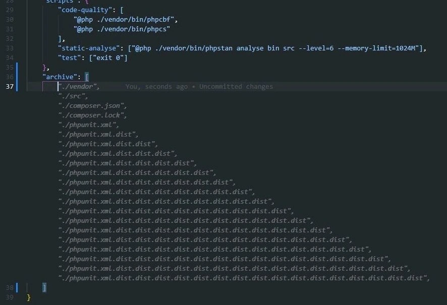
For example, a simplified version of what the meme shows might look like this:

<div class="site">
  <div class="site-content">
    <div class="site-content-inner">
      <div class="site-content-inner-inner">
        <div class="site-content-inner-inner-inner">
          <!-- ... content goes here ... -->
        </div>
      </div>
    </div>
  </div>
</div>

In the actual meme, the pattern continues with even more “-inner” levels, but you get the idea: each <div> is wrapped by another <div> one step out. All those class names (site-content-inner-inner, etc.) are a humorous hint that things have gotten out of hand. Usually, if you find yourself naming a class “something-inner-inner-inner,” it’s a sign that your structure might be over-complicated! Each of those classes likely exists just to apply some styling (like margins, alignment, or colors) at a specific layer.

So why is this a CodeSmell or a bad practice? A few reasons:

  • Clarity: Good HTML structure is important for clarity. If a newcomer opens this file, they’ll be pretty confused about why so many wrappers are needed. It’s not obvious what each container does. Clean code typically has just enough elements to get the job done, arranged in a meaningful way (often using semantic tags like <header>, <main>, <footer>, or <section> to denote purpose). When everything is a <div> and there are dozens of them, that clarity is lost. It’s hard to tell where one section of the page ends and another begins.
  • Maintainability: Imagine needing to change something in the layout. Perhaps you want to add a new banner at the top, or adjust the width of the content. If your structure is this deep, you might have to insert or remove elements carefully at the right level. It’s like trying to replace the middle box in a stack of nested boxes — tricky and easy to mess up. One wrong move (like removing the wrong <div> or misplacing a closing tag) and the whole layout could break.
  • Styling Complexity: CSS, which styles HTML, often uses selectors that match the structure. If your HTML is deeply nested, you might end up writing selectors that are also very deep to target a specific element. For example, you might need .site-content .site-content-inner .site-content-inner-inner p { ... } to style a paragraph at the innermost level. This approach is brittle; the slightest change in HTML structure (like removing one of those wrappers) would break the CSS rules. Ideally, you want simpler selectors and a flatter structure. More wrappers = more complicated CSS = more chances to break something when you refactor.
  • Semantic Meaning & Accessibility: As mentioned, <div> doesn’t convey meaning by itself. In modern FrontendDevelopment, we aim to use semantic HTML or add ARIA labels so that browsers and assistive devices understand the layout. For instance, a <nav> tag signals a navigation section, a <main> signals the main content, and a <footer> signals the bottom of the page. If everything is just a <div> (especially a bunch of them solely for layout), important distinctions can disappear. A screen reader might just announce “group” repeatedly (since it encounters multiple generic groups), giving no clue what each group is for. This can confuse users who rely on those cues. Plus, a search engine crawler also gets less structural info about the page (not as critical as accessibility, but still a consideration). So using ten generic wrappers where one semantic container could do is sometimes called semantic HTML abuse — basically not using HTML elements for their intended purpose.

For a junior developer or someone new to web coding, it might not be immediately obvious why having lots of <div> is bad. After all, if it looks correct in the browser, what's the harm? The harm becomes apparent as the project grows or when another person tries to work with the code. Excessive nesting is a form of OverEngineering: it's adding complexity that isn’t truly needed. Usually, there are simpler ways to achieve the same visual result. For example, instead of three nested <div> just to center and pad some content, you might use a single <div> with a CSS rule like margin: 0 auto; padding: 1em; to center it with padding. Or better, use a flexbox or grid container which can center its children without extra wrappers. Learning these techniques comes with experience. Early on, many of us solved problems by piling on more HTML because we weren’t aware of better CSS or semantic solutions.

SpaghettiCode is a term often used to describe logic in software that’s tangled and unstructured (like a pile of spaghetti). Here it applies to HTML structure – a bunch of entwined <div>s with no clear pattern is like spaghetti markup. It makes the code hard to follow, just as tracing one noodle through a plate of spaghetti is hard. As developers gain experience, they learn to recognize this “div soup” and avoid it, just like they learn to avoid overly tangled logic in their JavaScript or other code.

Importantly, the meme is a FrontendHumor way to educate. It exaggerates to make the point: if your <div> nesting gets this ridiculous, it’s time to step back and refactor. Refactoring means reorganizing and cleaning up the code without changing what it does. In this case, a refactor could mean: can we remove some of these wrappers? Can we use a better tag or a different CSS approach so we don’t need five nested elements? Perhaps combine styles into one container instead of five different nested ones each with its own slight tweak. The end goal would be to simplify the structure — maybe those dozens of inner <div>s could be reduced to just a couple of meaningful containers.

So, "divs all the way down" is a playful phrase (riffing off “turtles all the way down” 🐢, an expression about infinite recursion) to describe a page built out of nothing but <div>s inside <div>s inside <div>s. It’s humorous, but also a gentle lesson. The next time you find yourself adding yet another wrapper element, remember this meme and ask: Am I solving the problem the right way, or am I just digging myself into a deeper hole in the code? 😉

Level 3: Journey to the Center of the DOM

At first glance, the code snippet in this meme looks like a digital mineshaft of <div> tags drilling deep into the page. Each level of indentation reveals yet another <div> with a class like "site-content-inner", then "site-content-inner-inner", and so on — seemingly diving (pun intended) toward the Earth's core. This absurd pyramid of wrappers is poking fun at a classic front-end code smell known as div-itis (an overuse of <div> elements). In the world of FrontendDevelopment, such excessive nesting of non-semantic elements is a notorious anti-pattern. It’s the HTML equivalent of spaghetti code: a tangled, layered mess that makes experienced developers cringe and juniors confused.

In a well-structured webpage, the HTML elements form a hierarchy called the DOM (Document Object Model), essentially a tree of nodes. But here, our tree isn't just tall — it's skyscraper tall. Each extra <div> is like adding another unnecessary branch on that tree, making it deeper and more complex with no added benefit. The meme exaggerates this by appending "inner" repeatedly to class names, highlighting how ridiculous it is to have wrappers inside wrappers ad infinitum. It's as if the developer kept thinking, "Just one more container will fix it," over and over. We end up with a div_nesting_hell: a nesting so deep that if you printed it properly, you’d get an indented code triangle stretching off the right edge of your screen. It’s frontend humor with a bite of truth — many of us have seen (or written) code like this after chasing one too many layout problems.

Why is this funny to seasoned devs? Because it's over-engineering to a comical extreme. Instead of using a simpler layout or appropriate HTML5 semantic tags, someone went wild with generic <div> tags. Perhaps they started with a <div class="site-content">, then needed an inner container for styling, then another for centering, then another for some obscure CSS hack... Before long, you have a bizarre Russian nesting doll of <div> elements. Each layer likely began as a quick fix, but together they illustrate poor CodeQuality. The humor comes from recognition: we've all seen a section of a page wrapped in so many unnecessary containers that it becomes a running joke. It’s like the “Inception” of web development — a <div> dream within a <div> dream within a <div> dream, until you’re five levels deep and no one remembers why the deepest one exists.

Real-world projects have suffered from this wrapper_divitis. Consider a team where multiple people add features: Developer A wraps content in a <div> to apply a background, Developer B nests another <div> to adjust padding, Developer C adds yet another for a new sidebar, and so on. Without oversight, the DOM structure grows out of control. This leads to very fragile code: if you remove or change one wrapper, you risk breaking layout or functionality that was inconveniently tied to that exact nesting. It’s not that anyone wanted to write confusing markup; often it's a product of tight deadlines and patchwork solutions. But as an industry in-joke, the meme exaggerates it perfectly — the code looks like it’s literally trying to dig its way to the planet’s molten core. 🌋

From a CodeSmells perspective, such deep nesting has multiple drawbacks:

  • Maintainability: It’s incredibly hard to read and understand code like this. Future maintainers will spend ages counting <div> levels to figure out which container does what. One might ask, "Why on Earth is there a <div class="site-content-inner-inner-inner-inner"> here?" If you have to scroll horizontally to find the end of a tag structure, something’s wrong.
  • CSS Specificity Hell: With so many layers, CSS selectors often become overly specific. You might end up with CSS like:
    .site .site-content .site-content-inner .site-content-inner-inner .target { … }  
    
    This is a nightmare to maintain or override. Each new .inner increases specificity, meaning you have to write even more convoluted selectors later to override styles. It’s a cascading arms race of CSS rules, all because of unnecessary wrappers.
  • Performance: Browsers can handle pretty deep DOM trees, but extremely nested structures can still impact rendering efficiency, especially if there are thousands of nodes or complex repaint/reflow sequences. Each extra <div> is one more element for the browser to parse, layout, and paint. If a layout or script forces style recalculation up the chain, a deep chain makes it worse. In most cases the performance hit of a dozen extra <div>s is negligible, but conceptually it’s sloppy — and in severe cases (imagine this pattern repeated hundreds of times), it could slow things down or trigger layout thrashing.
  • Accessibility: Perhaps the most important issue. A <div> by itself has no semantic meaning. Screen readers and other assistive tech rely on meaningful HTML tags (like <nav>, <header>, <main>, <article>) or ARIA roles to understand page structure. If everything is just a <div> with “inner-inner-inner” class names, that structure conveys nothing. It’s like reading a story where every chapter is titled “Chapter” with no description — a blind user might hear "blank, blank, blank" as they tab through nested generic containers. In short, this is semantic_html_abuse, because meaningful sectioning elements or at least fewer containers should have been used.

All these issues scream CodeQuality problem. The situation is so relatable that it's become a trope. In meetings, a senior dev might half-joke: "We’ve got a bit of div-itis in that template — let's refactor those 10 nested containers into something sane." The meme nails the absurdity: by the time your inner-inner-inner containers are so deep that even the Earth’s core is in sight, you know you’ve gone off the rails.

And of course, we can’t analyze this without a classic meme-within-a-meme reference:

Xzibit voice: "Yo dawg, I heard you like <div>s, so I put a <div> inside your <div> inside your <div>..."

This tongue-in-cheek quote perfectly captures the vibe. The humor works on multiple levels (no pun intended): it's both a lighthearted jab at novices who haven't learned about proper layout techniques and a self-deprecating nod from veterans who remember when they made the same mistakes. Everyone in front-end development has at least once been guilty of wrapping something in one <div> too many. The key is we learn to recognize this overengineering and avoid it. Until then, memes like this serve as a friendly reminder (and a cautionary tale) of what happens when your <div> nesting starts “tunneling toward the Earth’s core.” 😅

Description

A screenshot of a code editor reveals a JavaScript template literal defining an HTML structure. The code illustrates an extreme case of 'div-itis,' where `<div>` elements are nested excessively. Starting with `<div class="site">`, each subsequent div is nested inside the previous one with an increasingly long class name, formed by appending '-inner' repeatedly. The class names quickly become absurd, such as 'site-content-inner-inner-inner-inner' and continue to grow, cascading down the screen in a pyramid of indentation. This meme satirizes poor HTML practices, the over-reliance on generic `<div>` containers, and the resulting deeply nested DOM tree that is a nightmare for styling, performance, and maintenance. It's a humorous exaggeration of the architectural problems frontend developers often encounter in legacy codebases or from inexperienced colleagues

Comments

7
Anonymous ★ Top Pick The CSS selector for the innermost div is just `div > div > div > ...` until you run out of stack space on your keyboard
  1. Anonymous ★ Top Pick

    The CSS selector for the innermost div is just `div > div > div > ...` until you run out of stack space on your keyboard

  2. Anonymous

    Somewhere around site-content-inner-17 I realised we’d basically reimplemented the call stack in HTML and were now relying on Chrome’s garbage collector for tail-call optimisation

  3. Anonymous

    When you realize the junior dev who wrote this was just trying to avoid CSS specificity wars and now you need a breadcrumb trail just to find where the actual content lives

  4. Anonymous

    When your CSS framework's 'container-wrapper-inner' pattern becomes sentient and starts reproducing. This is what happens when you let a junior dev loose with BEM notation and no code review - each div is a cry for help, wrapped in another div that's also crying for help. The real kicker? Somewhere in production, there's a CSS file with 47 levels of specificity trying to target that innermost div, and the only way to override it is with !important!important!important

  5. Anonymous

    Nesting so deep, your DOM traversal rivals a COBOL parser - blessed be the dev who wields CSS Grid

  6. Anonymous

    Wrapper-Oriented Architecture: every misaligned pixel gets another “site-content-inner”; specificity finally wins, the render pipeline loses, and the screen reader starts narrating “Entering inner… inner… inner…”

  7. Anonymous

    This isn’t a layout - it’s our governance model: one wrapper per reorg, where CSS specificity doubles every sprint and event delegation is O(depth)

Use J and K for navigation