Nested HTML Tables Inside Tables: The Frontend Developer's Nightmare
Why is this Frontend meme funny?
Level 1: Boxes Inside Boxes
Imagine you’re trying to organize your toys on the floor, but you don’t have any shelves or dividers. So you take some big cardboard boxes and arrange your toys in them in sections. Then, to keep those sections separate or make smaller groups, you put smaller boxes inside the big boxes. And if you want even more fine-grained sorting, you put even smaller boxes inside those small boxes. Pretty soon, you have boxes inside boxes inside boxes, just to organize a simple set of toys. It works, but it’s a very clumsy way to do it. Nowadays, you might just buy a proper shelf with compartments to organize things easily.
This meme is like that story. The “boxes” are the <table> elements in an old web page. People used to stack tables inside tables to lay out a webpage, because they didn’t have a better tool (like the shelf, which in web terms is modern CSS layout techniques). Seeing so many tables nested (like endless boxes inside boxes) is funny now because it feels overly complicated and old-fashioned. It makes older web developers laugh (or groan) because they remember that back in the day, that’s what we had to do. Younger folks might not understand why anyone would build a page that way—just like a kid today might not get why someone would use a bunch of boxes instead of a nice shelf. The humor comes from recognizing this awkward, ancient solution and being thankful that we have simpler, better ways to do things today.
Level 2: Nesting Nightmares
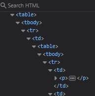
Let’s break down what’s happening for those newer to frontend development. The image shows a screenshot of a browser’s Developer Tools (DevTools) inspecting an HTML document. We see a deeply indented list of HTML tags: multiple <table>, <tbody>, <tr>, and <td> tags, one inside another, and finally a <p> (paragraph) tag way at the bottom. This structure is the page’s DOM tree (Document Object Model), essentially the hierarchy of elements that make up the webpage. What’s immediately obvious (and absurd) here is that the page layout is built by nesting HTML tables inside more tables, over and over.
In modern web development, you typically use CSS (Cascading Style Sheets) with <div>s or semantic elements (like <header>, <main>, <article>, etc.) to position content on a page. But in the early days of the web, CSS support was limited and inconsistent across browsers. So developers used what they knew every browser would render the same: HTML table elements. An HTML <table> is meant to display tabular data (think spreadsheets or a calendar), with <tr> for table rows and <td> for table cells (columns). However, table-based layout means using tables not for data, but to arrange the general layout of a webpage. For example, you might use a 2-column table to create a sidebar and content area. To further subdivide that content area, you’d nest another table inside the first table’s cell. Need another section inside that? Add another nested table. The result is what you see in the meme: nested_tables galore, forming a deep structural tree.
This was a common strategy around 1999, before modern CSS layouts were practical. Web developers would sometimes nest tables several layers deep to get the precise arrangement of text and images they wanted. Looking at such code now, it’s considered markup abuse – essentially using too many unnecessary HTML tags in ways they weren’t intended. It makes the HTML very hard to read or maintain. Each extra <table> makes the code more complex, a bit like adding more boxes inside boxes to achieve the right spacing. If you’ve learned web development recently, you’ve probably been taught to separate content (HTML) from presentation (CSS). But back then, these giant table structures were doing both at once: they held the content and defined the page’s layout in the HTML itself.
When the meme says “layout strategy still stuck in 1999,” it implies the developer of this page is using a very outdated technique. It’s as if they haven’t learned about CSS at all. Today, we have CSS Grid and Flexbox which let us create complex, responsive layouts with just a few lines of CSS and appropriately structured HTML. For instance, a modern approach to a multicolumn layout would involve something like:
.container {
display: grid;
grid-template-columns: 1fr 2fr;
}
and HTML like:
<div class="container">
<div class="sidebar">...</div>
<div class="main-content">...</div>
</div>
This achieves a two-column layout without any table. It’s clean and semantic. By contrast, the legacy approach might have been:
<table>
<tr>
<td class="sidebar">...</td>
<td class="main-content">...</td>
</tr>
</table>
And if the main content needed internal sections, you’d literally put another <table> inside that <td>. You can imagine how quickly it becomes a nesting nightmare as shown.
Now, what about those references like “quirks_mode_flashbacks” and “ie6_ptsd” in the tags? “Quirks mode” is a term from browser history. In the early 2000s, browsers had two modes: standards mode (for pages that followed the modern rules with a proper DOCTYPE) and quirks mode (for older pages that didn’t). Quirks mode basically tells the browser to behave like it’s 1999 again, emulating older, less standard behavior so those old pages (often table-based layouts) still display correctly. This meme’s table layout is exactly the kind of code that would run in quirks mode. Seeing it can give experienced devs “flashbacks” because it reminds them of debugging in that environment, where browsers acted odd to accommodate legacy sites.
And IE6 PTSD is a joking way to say that dealing with Internet Explorer 6 (a very old version of the IE browser, infamous among developers) was so traumatic that it left “scars.” IE6 was widely used in the early 2000s but had very poor standards support; developers often had to write ugly hacks or extra nested tables just to get things looking right. So if someone mentions “IE6 PTSD,” they mean “the memory of how painful it was to support IE6 still haunts me.”
So, putting it together: the meme is showing an extremely old-school method of building page layout with tables inside tables. It’s highlighting a FrontendHumor point that only those who’ve studied or worked with old web technologies might immediately recognize. Newer developers might find it puzzling: “Why on earth would anyone do that?” But once you know the history—that there was a time when this was the best (or only) reliable way to do layouts—it clicks. It becomes both funny and a little cringe-inducing. The message “If you don’t get it then you’re just too young, that’s ok” is basically comforting younger devs: Don’t worry if this looks bizarre; it just means you were lucky enough not to deal with it. It’s part of WebDevelopmentHistory that we now look back on and shake our heads, grateful for modern CSS. In summary, this meme is a nod to an outdated practice in frontend development, and understanding it is like a little rite of passage into knowing the history (and horror stories) of making websites.
Level 3: Tables All the Way Down
In the late 90s, web pages were often built like a series of Russian nesting dolls using <table> elements. The meme’s DOM screenshot is a perfect satire of legacy WebDev practices: a <table> containing a <tr> and <td> which in turn contains another <table> and so on, dozens of layers deep. This absurd nested table structure is the hallmark of a pre-CSS layout strategy. It’s humorous (and a bit horrifying) to seasoned front-end developers because it dredges up memories of table-based layout – an ancient technique where developers abused HTML tables to position everything on the page. In an era before modern CSS Grid or Flexbox, this was normal: you wanted a two-column layout? You’d create a 2x1 table. Need a sidebar inside that column? Nest another table within a cell. Each extra design element meant yet another <table> tucked inside its parent like a Matryoshka doll. Over time, the nesting could reach comic depths, just like in the screenshot. It’s table-ception, and yes, we always joked “we need to go deeper.”
This combination of elements is funny because it’s painfully real to any developer who’s had to maintain or refactor old enterprise web apps. The DevTools view with countless indented <table> and <td> tags triggers something akin to IE6 PTSD. Why? Because many of us spent years untangling these monstrous markup structures during modernization projects. We’ve seen pages where a simple text paragraph—like the <p>…</p> in the meme—was entombed five tables deep. It’s a textbook anti-pattern from the early Frontend days: using tables for layout was a hacky workaround that became common practice due to limited alternatives. The humor has an if-you-know-you-know quality; as the post says, if this sight doesn’t immediately make you cringe or laugh, you’re probably too young to have suffered through it. Seasoned devs share a camaraderie over this frontend pain point, swapping war stories of removing <table> nests the way archaeologists remove debris to free trapped fossils (except the fossils are 20-year-old HTML).
From a senior perspective, this meme is poking fun at TechHistory and the stubbornness of LegacySystems. It highlights how far web development has come. Back in 1999, CSS support was so spotty that table layouts were the only reliable way to achieve complex page designs consistently across Netscape and IE (each with their own quirks… shudders). Even after CSS improved, big companies often had huge legacy codebases full of these tables. Fixing them wasn’t trivial; it meant rewriting the entire layout code. So, many sites kept the old structure far into the 2000s, running in quirks mode to accommodate their ancient markup. Management would say, “It’s working, don’t touch it,” leaving developers to simply layer new features on top of the table spaghetti. This systemic issue—short-term fixes winning over long-term cleanup—meant some of us literally made a career out of ripping out tables and replacing them with <div>s and CSS. The meme nails this shared experience: the mix of nostalgia (“hey, I remember when all pages looked like this!”) and exasperation (“please, not this nightmare again!”). It’s funny because it’s true: that screenshot is basically a browser DevTools fossil exhibit, a reminder of the days when web layouts were a house of cards made of <td>s. Any dev who’s debugged a table-based layout that collapsed knows the dark humor here—one missing closing tag and the whole page would break, often at 2 AM on a deployment night. So we laugh, perhaps a bit cynically, at this relic of web development history. The meme combines FrontendHumor with a hint of horror, and those in the know share a collective groan-laugh and maybe a hushed “Thank goodness for CSS!”
<table>
<tbody>
<tr>
<td>
<table>
<tbody>
<tr>
<td>
<!-- Yes, another table inside... -->
<p>Finally, some content!</p>
</td>
</tr>
</tbody>
</table>
</td>
</tr>
</tbody>
</table>
(Above: A simplified example of the meme’s markup abuse. Each <table> is like a crude container for layout, an approach now considered anachronistic.)
The meme’s caption “When your layout strategy is still stuck in 1999” is a tongue-in-cheek senior engineer lament. It sarcastically implies that whoever wrote this code is frozen in time, ignoring decades of progress in web layout techniques. The image of the endlessly indented DOM tree encapsulates the Frontend Fail perfectly. For senior devs, the humor also comes from the dissonance between how we know we should build layouts today vs. what we sometimes still find in the wild. It’s an exaggeration that isn’t far from truth: some legacy enterprise portals or ancient CRM systems are still a labyrinth of tables, maintained by inertia and perhaps a single developer named Bob who’s been there since Y2K. Fixing it is harder than it looks because it requires convincing stakeholders to invest in a full rewrite (“Why redo it if it ain’t broke?”) and untangling logic often mixed directly into those table-ridden HTML files. So the situation perpetuates, and modern devs occasionally stumble upon these artifacts with equal parts amusement and dread. In summary, the meme resonates on multiple levels: it’s a hyperbolic nod to web development history, a shared joke about frontend pain points, and a gentle roast of anyone still coding like it’s the 90s.
Description
A screenshot of a browser DevTools Elements panel showing deeply nested HTML structure: a table containing a tbody, containing a tr, containing a td, containing another table, containing another tbody, containing another tr, containing a td, containing a p element with collapsed content, followed by a closing /td. The 'Search HTML' bar is visible at the top. This represents the classic anti-pattern of using nested HTML tables for layout, a practice common in early web development and legacy email templates that makes modern frontend developers recoil in horror
Comments
31Comment deleted
This HTML structure has more nesting levels than a Russian doll factory. Somewhere a CSS Grid is weeping, knowing it was born 20 years too late to save this page
This is the kind of HTML that makes you appreciate modern CSS, because the only 'responsive design' here was how quickly you responded with 'I quit' when asked to add a new column
Remember: every time you complain about CSS Grid, a senior dev quietly flashes back to debugging 8-level table nests with 1-pixel GIF spacers in IE6
After 20 years in the industry, I still have developers who insist tbody is optional because 'the browser adds it anyway' - the same folks who wonder why their CSS nth-child selectors are off by one and their JavaScript table.rows collection behaves mysteriously
Ah yes, the classic Russian nesting doll approach to HTML tables - because why use CSS Grid when you can make your DOM tree deeper than your call stack during that one recursive function you wrote at 3 AM? This is the kind of markup that makes accessibility auditors weep and causes browser rendering engines to question their life choices. It's like someone took 'separation of concerns' as a personal challenge to violate as spectacularly as possible. Fun fact: archaeologists have discovered similar structures in codebases from the Geocities era, perfectly preserved in their original horror
Nothing screams “enterprise” like a layout that’s a recursive <table>; responsiveness handled with colspan and hope
When DevTools shows table > tbody > tr > td > table, the real redesign debate isn’t Flexbox vs Grid - it’s whether the strangler‑fig can outlive the CMS contract signed in 2004
Nested tables: the layout recursion that predates Tailwind - and still haunts your enterprise monolith
I had to work on a government system like this in 2023. CSS was barely used outside of some element styling Comment deleted
Email code yay Comment deleted
nah we didn't do tbody tags back then. it was table > tr > td > table > tr > td all the way down. Comment deleted
Where is your <thead> at?! 🙈🙉🙊 Comment deleted
Yeah but I've seen many old websites using tables to lay the sections out in the website instead of positioning them with CSS. So they used tables inside tables inside tables... And this is just what it looks like when you inspect the page on a browser Comment deleted
Tbody gets automatically added to the dom by modern browsers. Even if it doesn’t exist in the source Comment deleted
Someone's coding an Excel sheet of Excel sheets Comment deleted
well, we didn't use tbody\thead\tfoot tags until... I think chrome? When it became a thing in html code? Comment deleted
Who remembers making a box shadow with a 3x3 table? Comment deleted
And every custom-styled button is a 3x3 table with img-s of borders Comment deleted
custom-styled button now: Comment deleted
nine patches were ahead of its time if you knew how to use the photoshop slice tool Comment deleted
golden era of web Comment deleted
then what do you use for displaying tables? Comment deleted
canvas Comment deleted
Jesus Christ! You should blur the image to avoid mental disorders Comment deleted
Literally only solution if you want your stuff to work on LEGACY legacy stuff Comment deleted
In fact table is not yet obsolete. And if you want a table, just use table, not a fancy css. Comment deleted
sadly it has a few quirks with relative positioning and overflow that makes it unsuitable even for table data if you want more fancy stuff in the cells than just text Comment deleted
I used this at my first year Always hate it Comment deleted
that's nothing. if you want to laugh (cry violently), inspect element the twitch chat input box it's like 25 divs deep iirc :) whole site is finest react spaghetti Comment deleted
even in react you can have 10 nested components that render one div in the end, that's just skill issue Comment deleted
I know it's a skill issue Comment deleted