The Unforeseen Dangers of Automated Responsive Image Cropping
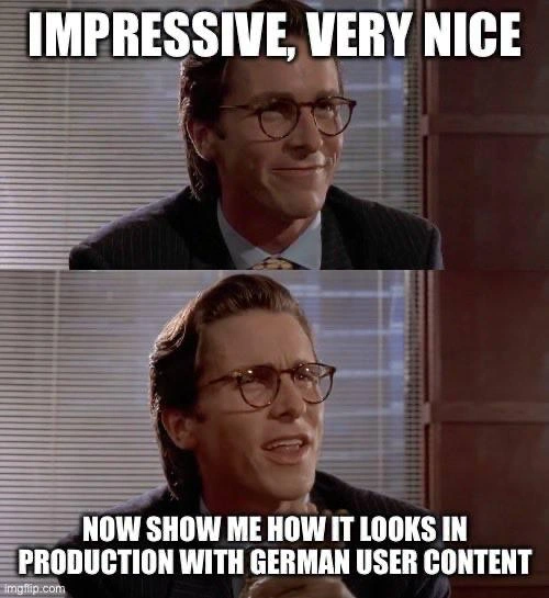
Why is this Frontend meme funny?
Level 1: Zoomed-Out Surprise
Imagine you have a big picture that you want to show to your friends. On your phone’s small screen, you zoom in to show just the nice part of the picture – maybe it’s a group photo and you focus on two friends who look great. Everything seems fine in that small view. But then you decide to show the same picture on your big TV. Uh-oh! 😳 Now the picture is huge, and it’s showing everything, including something silly or embarrassing at the edges that you didn’t notice before – like maybe someone in the background making a funny face or doing bunny ears behind your friends’ heads. Suddenly, that picture is a bit awkward to look at on the big screen, even though it was perfectly okay on the phone.
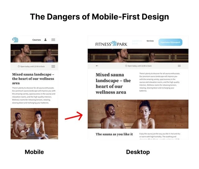
That’s exactly what happened in this joke. The website’s main photo looked okay on a small mobile phone screen. But when stretched out on a big desktop monitor, it accidentally showed a lot more skin than anyone expected – a real surprise! It’s like the website didn’t look in the mirror before going out on the big stage. This is funny to people who make websites because it reminds us of a simple rule: always check the whole picture. If you only look at the tiny preview (mobile view) and not the full poster (desktop view), you might miss something important (or embarrassing). In plain terms, the meme is joking that the website should have tried on its outfit in all sizes – small and large – to avoid a public surprise.
Level 2: One Size Doesn’t Fit All
Let’s break down what’s happening in simpler terms. This meme is about responsive web design, which is the practice of making websites look good on different devices (phones, tablets, laptops, big desktop screens, etc.). A core concept here is mobile-first design. Mobile-first means when web developers and designers create a site, they start with the mobile version (small screens) and then adjust the layout for larger screens. The idea is to ensure the most important content and a clean layout for the smallest screen, then progressively enhance it. It’s like first designing a business card (just the essentials) before designing a full poster (where you have more space to play with). Mobile-first is a widely accepted WebDesignPrinciple, since today a huge chunk of users are on their phones.
Now, onto the hero image. A hero image is that big banner picture you often see at the top of a webpage. It’s supposed to be eye-catching and convey the main message or mood of the site. In our case, the hero image is a photo from a sauna wellness center. On the Mobile view (the left screenshot), this hero image is shown in a portrait (vertical) orientation. The layout likely just scaled the image nicely to fit the narrow screen. We see the two people in the sauna comfortably – probably the website just let the image resize naturally or showed the center of the image. Nothing looks out of place.
But websites use something called CSS media queries to change styles at different screen widths. These widths are often called breakpoints. A breakpoint is like a cutoff where the site’s design shifts: maybe at 600px wide we go from a single-column layout to two columns, or at 1024px we show a bigger header, etc. In a mobile_first_design approach, you might have CSS like: “for screens 0px to 767px, use layout A (mobile); for 768px and above, use layout B (tablet/desktop)”. In our meme’s scenario, there’s presumably a breakpoint where the layout switches to “desktop mode.” At that point, the hero section might become wider and shorter (since desktops have more horizontal space but we often don’t want an enormous tall image taking up the whole screen).
The crux of the problem is how the image is being displayed in that desktop layout. Frontend developers have a couple of ways to place a hero image:
tag vs background-image: Sometimes the HTML will have an
<img src="sauna.jpg">which by default will scale and show the whole image as long as there’s room. Other times, developers put the image in CSS as a background on a container (like a div) and usebackground-size: cover.- Cover vs Contain:
background-size: covertells the browser “make sure this container is completely covered by the image, even if you have to cut some parts off.” This usually comes withbackground-position: centerwhich means it centers the image in the container.containwould instead ensure the whole image is always visible (no cropping) but that can leave empty space or borders. Most fancy full-width banners use cover because it looks nice and fills the screen edge-to-edge.
It appears the sauna site used a cover strategy for the hero image on desktop. They likely set a specific height for the hero area in the CSS for desktop. For example, the CSS might say something like: “if screen is at least 1024px wide, set hero section height to, say, 300px.” On mobile, maybe the hero was allowed to be taller or auto-sized to fit the portrait image nicely. But on desktop, a 300px-high, very wide box is a panoramic, shallow rectangle. For an image to fill that, the browser will zoom in on the center of the image and chop off top and bottom. Let’s visualize it in code:
/* Mobile-first hero styles */
.hero {
background: url('sauna-hero.jpg') center center / cover no-repeat;
height: auto; /* let the height adjust to image on small screens */
}
/* Desktop breakpoint: make hero a wide banner */
@media screen and (min-width: 1024px) {
.hero {
height: 300px; /* fixed shorter height for desktop banner */
/* The image still covers the area, cropping top & bottom */
}
}
In the above CSS, on a narrow mobile screen .hero might naturally extend taller (because height: auto lets it size according to content or perhaps the image’s aspect ratio). The image shows fully or at least doesn’t cut awkwardly. Once we hit 1024px, .hero is forced to a 300px tall box. The background: ... center/cover means the image will zoom/crop so that it fills that 300px tall, wide box entirely. If the original photo has people’s heads and a lot of vertical content, those heads could be out of the 300px window. The browser centers on the image midpoint (which was around chest level of the people, as the meme shows). So on desktop, you end up seeing from the shoulders down to maybe the hips of these sauna models – effectively topless chests taking up most of the banner, with their faces cut off! This is the responsive_image_fail the meme is pointing at.
Why is this funny to developers and UX folks? Because it’s a well-known pitfall: if you don’t carefully plan how an image will be cropped at different sizes (or if you don’t test it), you can end up with embarrassing or InconsistentUIs. It’s literally an inconsistency in user interface between devices – the mobile UI shows a dignified spa scene, the desktop UI accidentally looks like an inappropriate photo outtake. It’s a UX design lesson packed in humor. The term NSFW gets thrown around here: it stands for “Not Safe For Work,” meaning content (often nudity or racy images) you wouldn’t want popping up on your screen in a professional or public setting. The desktop version of the site unintentionally became NSFW-ish because of the way it was cropped.
For a junior developer or someone new to web design, the takeaway here is:
- Always test your designs on multiple screen sizes. Don’t assume that just because it looks good on your phone, it will look good on a big monitor. Responsive design needs careful checking at each breakpoint (and even in between, because weird things can happen at random widths too).
- Use the right responsive techniques for images. If one image can’t cleanly serve all aspect ratios, consider using different images or cropping strategies. There’s an HTML element
<picture>that lets you specify different images for different screen sizes (for example, a tall narrow photo for mobile, and a wider landscape crop for desktop). This is called responsive art direction – it gives you control to avoid exactly this kind of boob... er, blunder. - Think about focal points. Modern CSS allows an
object-positionorbackground-positionto adjust which part of the image stays visible. Some advanced image CDNs even let you define the focal point on the image (like “focus on the person’s face”). In this case, telling the desktop layout to focus the top of the image (where the heads are) instead of the center could have prevented the accidental decapitation and the NSFW vibe. - “One size fits all” is a myth in web design. What works for a small screen might not directly translate to a big screen without tweaks. Content might need reordering, images might need different crops, font sizes might need scaling, etc. Good WebDevelopment means handling those differences gracefully.
So, in summary for this level: The meme jokes about a responsive design snafu where a hero_image_cropping approach led to a very UXFailure on larger screens. It’s funny because it’s true – many of us in frontend have stories of something that looked great in one scenario but went embarrassingly wrong in another. Here it just happens to be a rather, shall we say, cheeky example. The lesson is real though: design responsibly when designing responsively!
Level 3: Breakpoint Exposure
At the highest technical level, this meme is a sly nod to responsive design gone wrong. We have a classic case of a mobile-first design philosophy colliding with real-world multi-device realities. The left side ("Mobile") shows a well-composed hero section on a sauna website: the topless patrons are tastefully framed, nothing scandalous visible. But on the right ("Desktop"), the CSS breakpoint kicks in – the layout expands, and suddenly our once-innocent hero image is cropped in a way that exposes a bit more than intended. The humor (and horror) comes from how a seemingly prudent design decision can backfire spectacularly when you don’t consider all viewports.
From a senior frontend perspective, what likely happened is an image cropping strategy that didn’t account for different aspect ratios. Perhaps the developer used background-size: cover or object-fit: cover on a fixed-height hero container. This technique is common: it ensures the image always fills the space, but it crops whatever doesn’t fit. On a narrow mobile screen (portrait orientation), the crop was fine – it showed the important part of the image (faces, upper bodies) quite nicely. On a wide desktop screen, however, the container became much shorter relative to its width (like a shallow panoramic banner). The CSS cover algorithm dutifully zoomed and centered the image to fill this wide box, inadvertently chopping off heads and lower sections. The center of the image – which in this case was around the models’ torsos – became the focal point. And voilà: a perfectly respectable spa advertisement turned into something resembling an NSFW scene because the crop on desktop literally turned into a “booby trap.” 🙈 (Pun absolutely intended by the meme creator.)
This touches on a key senior-level lesson: “mobile-first” doesn’t mean “mobile-only.” In modern web development, we often start designing for the smallest screen and progressively enhance for larger screens. It’s a solid approach (ensuring core content works on mobile), but as this meme shows, you must test at every breakpoint. Skipping desktop QA because “we nailed the mobile design” is asking for trouble. An experienced dev or UX designer has likely seen things like this in production – maybe not always risqué content, but important parts of an image getting awkwardly cut (heads missing, text chopped, key subject off-center) once the layout expands. It’s both a UX failure and a content strategy oversight. Users on large screens get an inconsistent (and in this case, inappropriate) experience compared to mobile users.
The humor has an extra layer if you’ve lived through a frantic team meeting about a production mishap. You can almost hear the panicked conversation:
Designer: “We definitely checked the mobile view, it looked gorgeous!”
Developer: “Our CSS is mobile-first, I assumed the image would just scale… I guess I didn’t see it on a big monitor.”
Manager: “Why is our site showing that on the office lobby display?!” 😱
It’s a perfect storm of FrontendHumor and UXFailures: a miscommunication between design intention and the responsive implementation. Senior devs know that to avoid such layout_breakpoint_issues, you often need to use responsive image techniques or explicit CSS adjustments. For instance, the <picture> element with different crops for mobile vs desktop could have saved the day (an approach known as art direction in responsive design). Alternatively, the CSS could change the background-position at certain breakpoints (e.g., focus on top of the image on desktop to keep heads in frame). But none of that was done here. Instead, we got a one-size-fits-all image that didn’t actually fit all. The result? A responsive_image_fail for the ages, immortalized in meme form. And like any good inside joke, it carries a real lesson: Always double-check your design at every size, or your hero image might turn into an unwitting villain on large screens.
Description
An image demonstrating a potential pitfall of mobile-first web design, captioned 'The Dangers of Mobile-First Design'. It presents a side-by-side comparison of a 'Fitness Park' website on mobile and desktop. The mobile version shows a vertically-oriented photo of a man and a woman sitting separately in a sauna. The desktop version, designed for a wider viewport, uses the same image but crops it horizontally for a banner. A red arrow highlights the transformation. This automated cropping reframes the scene entirely, placing the man from the original photo right next to another man (who was in the background of the original) creating an unintentionally intimate and humorous composition. The original woman is mostly cropped out. The meme serves as a cautionary tale for web developers and UX/UI designers, illustrating how responsive design without proper art direction for different breakpoints can lead to awkward and contextually altered visuals. It highlights the failure of relying on a simple 'center-crop' logic for complex images
Comments
7Comment deleted
This is a classic case of `background-position: center center;` playing matchmaker. The algorithm saw an opportunity for a new composition and just went for it, proving that even CSS can have a chaotic neutral alignment
Mobile-first is fine - until your `object-fit: cover;` at the 1440 px breakpoint upgrades the hero image to an HR ticket. Could someone please add `focal-point: safe-for-work;` to the design tokens?
When your product owner says "just make it responsive" and now HR wants to discuss why the wellness page has become the most visited internal resource since the company directory
Ah yes, mobile-first design: where your perfectly crafted vertical stack becomes a horizontal game of Tetris that nobody asked for. This is what happens when you optimize for the 375px viewport and then just pray to the CSS gods that `flex-wrap` will save you at 1920px. The real danger isn't mobile-first - it's mobile-only thinking. Senior devs know that 'mobile-first' doesn't mean 'mobile-only-then-add-media-queries-and-hope', yet here we are, with content floating in the middle of a desktop layout like a div that lost its way home. The irony? We spent decades fighting table layouts, only to recreate the same rigid thinking with responsive frameworks. Pro tip: if your desktop layout looks like someone just stretched a phone screen with a rolling pin, you've missed the 'design' part of responsive design
Proof that “center center; object-fit: cover” is not a content strategy - the desktop breakpoint just filed an HR ticket
Mobile-first with object-fit: cover - phones get zen landscapes, desktops deliver the full-frontal fitness reveal at min-width: 1024px
Mobile-first means marketing uploads a 9:16 hero to the CMS and object-fit: cover performs avant‑garde art direction at 1920px - ship picture/srcset with focal points or enjoy your P1 brand review