Skip to content
DevMeme
964 of 7435
Frontend Devs and Their 'Subtle' Animations
Frontend Post #1087, on Mar 3, 2020 in TG

Frontend Devs and Their 'Subtle' Animations

Why is this Frontend meme funny?

Level 1: Big Sword, Little Job

Imagine using a giant sword to cut a tiny piece of cake. 🍰 It would slice the cake, sure, but it’s obviously way too much and looks pretty silly. This meme is funny for the same reason: someone used an over-the-top, huge approach to do a very small, simple task. It’s like bringing a whole fire truck just to water a houseplant – it works, but everyone can see it’s ridiculous overkill. We can’t help but laugh because the effort is so out of proportion to the result, and it just feels absurd and goofy.

Level 2: Overkill for a Click

So, what’s going on here? We have a web developer (specifically a front-end dev) who wrote 300 lines of CSS code just to make one button do a fancy animation. For context, CSS stands for Cascading Style Sheets – it’s the language used to make websites look nice and stylish. CSS controls how buttons look, where things are on the page, colors, fonts – and yes, even animations like a button wiggle or fade-in. A button animation could be something like the button changing color when you hover, or maybe it slides a little when you click it. Normally, you can do simple animations with just a few lines of CSS. That’s why seeing “300 lines of CSS for button animation” is kind of shocking (and funny) – it’s like writing a whole book chapter just to describe a one-second action!

Over-engineering is the big concept being poked fun at here. Over-engineering means making something way more complicated than it needs to be. In this case, the dev overly complicated a UI effect. Maybe they thought, “Hey, let’s make this button super cool with spinny, bouncy effects and custom timing,” and they kept adding and adding to the CSS. Before they knew it, they had hundreds of lines – a textbook example of doing too much for a small result. It’s similar to when someone writes a really complex function in code to do something basic – experienced folks will say, “that’s over-engineered.” In front-end development, more code isn’t always better; it can mean more chances for bugs and harder maintenance.

Let’s break down the specific terms and why developers chuckle at this:

  • CSS Animations: CSS allows you to animate elements (like making a button move or change smoothly). Typically, you might use a CSS property like transition for simple things (e.g., smoothly change color on hover in 0.3 seconds), or @keyframes for more complex multi-step animations (like moving an element in a certain pattern). A simple hover animation might look like:
/* A simple CSS hover effect (just a few lines) */
button:hover {
  transform: scale(1.1);               /* make the button a bit larger */
  transition: transform 0.2s ease;     /* animate the size change smoothly */
}

The above is pretty straightforward: on hover, the button gently grows 10% bigger over 0.2 seconds. That’s maybe 2 lines of actual styling, and it already adds a nice effect.

  • CSS Bloat (Too Much CSS): Now imagine instead of 2 lines, the developer wrote a super elaborate animation. They might use @keyframes to define the button’s motion at many points (0%, 25%, 50%, etc.), maybe adding rotations, color changes, lots of stuff. That could balloon into dozens or hundreds of lines quickly. For example:
/* An over-engineered animation (imagine this continues for ~300 lines!) */
@keyframes wildButtonAnim {
  0%   { transform: translateY(0); }
  10%  { transform: translateY(-5px); }
  20%  { transform: translateY(0px); }
  30%  { transform: translateY(3px) rotate(2deg); }
  40%  { transform: translateY(0) rotate(-2deg); }
  /* ... and so on, possibly more keyframe steps ... */
  100% { transform: translateY(0); }
}
button:hover {
  animation: wildButtonAnim 1s ease-in-out;
  /* ...maybe more properties here... */
}

You can see how this could keep going. If they add more steps or other fancy effects (like changing color, scale, etc. at each step), and then include browser prefixes (-webkit-, -moz- versions of the keyframes for compatibility), the lines add up fast. This is an example of CSS bloat: a lot of CSS code for not a lot of benefit. “Bloat” just means it’s kind of inflated or too fat – basically more stuff than needed.

  • Spaghetti Code (or Spaghetti CSS): This term describes code that’s all tangled and messy, like a bowl of spaghetti. 😅 In CSS, you get spaghetti when you have a ton of rules that are very specific, maybe override each other, or are just all over the place without structure. If a single button’s styles span 300 lines, there’s a good chance that code isn’t neatly organized. It might be full of special cases and hacks. For a newcomer reading it, it’s super confusing – just like trying to follow one single noodle in a spaghetti bowl. It’s funny in the meme because anyone who has seen spaghetti code knows how ridiculous it can get, and here we’re joking that one button’s CSS turned into a whole tangled mess on its own.

  • Tech Debt: When the meme hints at “maintenance pain,” it’s touching on the idea of technical debt. This is a metaphor: like taking a shortcut in code that you’ll “pay for” later when it causes problems. Writing 300 lines for a button might have been the quick way for that dev to get a cool effect working (maybe they didn’t stop to simplify or think of a leaner method). But later on, another developer (or even the same one) will have to deal with that giant block of CSS. They’ll scratch their head and say, “Why is this so complicated?!” Fixing or updating it will be harder because of the unnecessary complexity. That extra difficulty later on is the “debt” that has to be paid. The meme makes it humorous, but it’s a real lesson: every unnecessarily complex thing we add to a project is like borrowing trouble for the future.

From a junior developer’s perspective, this meme is a gentle roast of a common learning curve. Early in our careers, it’s easy to get excited and maybe write more code than needed – especially in frontend work, where there are so many ways to achieve a visual result. Maybe the dev in the meme just discovered some cool CSS tricks and threw them all into that button for fun. We’ve all been there: you make something flashy, you’re proud, but a senior dev looks at it and goes “Uh, that’s a bit much for just a button.” 😅 It’s funny now because with experience you realize a simpler solution was possible.

In summary, the meme uses an absurd visual metaphor (a ridiculously giant sword in a casual setting) to highlight a coding truth: sometimes we put way too much effort (or code) into something small, and it’s both funny and problematic. For a junior dev, the takeaway is: keep things as simple as they need to be. If you find yourself writing hundreds of lines for a tiny feature, pause and rethink – besides being a potential joke in a meme, it might save you and your team a lot of headache!

Level 3: Supersized Stylesheet

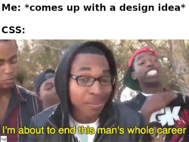
This meme slaps us with the sight of a frontend developer figuratively wielding an oversized weapon: hundreds of lines of CSS code, all for an innocent little button animation. The left panel’s absurdly long sword labeled “300 line of CSS for button animation” is basically a physical embodiment of code bloat. And the right panel’s grinning fast-food cashier tagged “Frontend dev”? That’s the developer who wrote this monstrous stylesheet, either oblivious to the overkill or ironically proud of it. It’s a comedic exaggeration of a scenario we know too well: using a massive chunk of code to achieve a tiny visual effect. The humor cuts deep for experienced devs because we’ve all encountered that one file or feature that got absurdly over-engineered.

In real projects, a button animation usually needs maybe a dozen lines of CSS at most. So seeing 300 lines is a giant red flag – it screams over-engineering. It’s like someone invented a whole new Cascading Style Sword instead of a simple CSS snippet. The meme exaggerates it to a giant ceiling-scraping sword for comedic effect, but the core issue is real. Why would a simple UI element end up with so much code? Likely because a developer got carried away with creativity (or struggled with CSS specificity hell) and kept bolting on more and more rules. Instead of a clean solution, they’ve forged an unwieldy blade of styles that’s as impractical as that cowboy’s sword in a Burger King.

Let’s break down why this is funny and cringe-worthy to seasoned devs:

  • Ludicrous Disproportion: The sword is hilariously out of proportion for the setting (a fast-food counter), just like 300 lines of CSS is overkill for a button. The visual joke nails the feeling: “Dude, was all that really necessary?!” It’s a senior-developer nightmare to open a file and find hundreds of lines where ten would do. We laugh, but also cry a little inside, recognizing this brand of madness.
  • Code Quality & Maintainability: A 300-line CSS animation isn’t just funny – it’s a maintainability nightmare. Imagine being the next dev who has to tweak that button’s style. You’d have to scroll through page after page of .button-sparkle:hover .inner span::after selectors, endless @keyframes definitions, and probably a minefield of !important flags. One simple change could break the whole thing. This is technical debt in the making: the original dev delivered a flashy effect (on time, perhaps), but at the cost of inscrutable, fragile code. It’s the kind of tech debt that haunts projects later – a quick fix that costs many hours down the road to untangle.
  • Performance and Bloat: Frontend veterans know that bloated CSS can slow down a site. 300 lines for one button means users’ browsers must load and parse all that CSS. Maybe it’s not a huge file on its own, but if every small feature is similarly overbuilt, the app becomes sluggish. It’s the digital equivalent of carrying a giant sword everywhere – it weighs you down. Senior devs find humor here because they’ve been tasked with “performance optimization” only to discover the issue was literally too much CSS doing too little.
  • Shared Pain of Spaghetti Code: The phrase “spaghetti code” comes up when code (or CSS) is tangled and unstructured. A massive style sheet for a little animation hints at copy-pasted rules, overly specific selectors fighting each other, and no clear structure – basically CSS spaghetti. Those who’ve maintained old stylesheets know the pain: you change one color and suddenly three other things break because of some 300-line chain reaction. This meme is funny because it’s too real – we’ve cleaned up that kind of mess before. The giant sword even looks tangled in the ceiling, much like bad CSS entangles the whole UI.

Now, how on Earth do you get 300 lines of CSS for a single button? 🤔 There are a few possible causes seasoned devs would suspect:

  • Excessive Keyframes: The dev might have handcrafted a super elaborate @keyframes animation sequence with dozens of steps. Each tiny step (0%, 5%, 10%, ... 100%) adds more lines. It’s like animating every frame of a cartoon by hand in CSS. Powerful, but if you’re not careful, you end up with an entire novel in your stylesheet.
  • Vendor Prefix Overload: Perhaps they wrote out every browser-specific prefix. For example, duplicating keyframes for -webkit- and -moz- and so on. That can easily triple the line count. It’s often automated by build tools nowadays, but if done manually, you’ll literally see the same 50 lines repeated for each browser. Talk about CSS bloat.
  • Layered Styles and Overrides: The developer might have multiple classes for different states (normal, hover, active, clicked) each with copious styles. Maybe they started with one approach, then overrode it with another class, then another, without deleting the old code. The result is all these layers of rules that technically achieve the final look but at the cost of being verbose and confusing.
  • Over-enthusiasm or Copy-Paste: Sometimes a dev (especially an eager junior or someone in love with visuals) might throw in every cool CSS trick they know. Shadows, transforms, blinks, color shifts – you name it, it’s in there. Or they pieced together code from multiple tutorials and examples, not fully integrating them – so the codebase contains a mishmash of styles, many doing nothing or duplicating each other. The meme’s sword isn’t just long, it’s also probably unwieldy – same with a mishmash CSS file.

The frontend dev in the meme (the cashier) is smiling, and you can almost imagine them saying, “Yeah, I built that,” while everyone else in line (the team or users) is thinking “why though?!”. The industry humor here is pointed at frontend culture: sometimes, front-end folks get a bad rap for using 10 frameworks or overdoing minor UI details. This image dials it up to eleven. It’s friendly fire within the dev community – frontend devs laughing at ourselves for the times we’ve gone full overkill on styling. It’s the “because we can” syndrome: CSS can do amazing things, from animations to shapes, but just like bringing a broadsword to a burger joint, a wise coder knows to match the tool to the task.

Ultimately, this meme highlights a classic software lesson in a goofy way: simpler is usually better. The experienced engineer chuckles because behind that giant CSS sword, they see a pile of code reviews, refactor tickets, and exasperated future devs asking “Who wrote this and why?!”. It’s both funny and a cautionary tale: just because you can write 300 lines for a button animation doesn’t mean you should. 😂

Description

A two-panel meme format. The left panel shows a person from behind, wearing an all-white suit and an extremely tall, comically oversized white hat, standing at the counter of a fast-food restaurant. Written vertically on the long hat is the text '300 line of CSS for button animation'. The right panel is a close-up of the fast-food employee behind the counter, who has a happy, appreciative expression on his face. This employee is labeled 'Frontend dev'. The meme humorously portrays the pride frontend developers take in creating complex and often excessive CSS animations for simple UI elements like buttons. The '300 lines of CSS' is a deliberate exaggeration to poke fun at the tendency to over-engineer visual details, a practice that is often seen as both impressive and ridiculous by fellow developers
Comments

7
Anonymous ★ Top Pick Product wants a simple button hover effect. The frontend dev spends two days creating a 300-line, keyframed, bezier-curved, GPU-accelerated masterpiece. It's not over-engineering, it's called 'demonstrating technical feasibility'
  1. Anonymous ★ Top Pick

    Product wants a simple button hover effect. The frontend dev spends two days creating a 300-line, keyframed, bezier-curved, GPU-accelerated masterpiece. It's not over-engineering, it's called 'demonstrating technical feasibility'

  2. Anonymous

    PO: “Can we add a subtle hover effect to the buy button?” Frontend dev: *commits a 300-line keyframe katana, doubling the critical-CSS chunk* - somewhere, Core Web Vitals just pulled the fire alarm

  3. Anonymous

    The same developer who spent three sprints perfecting that button animation will ship an API that returns 200 OK with {"error": "Internal Server Error"} in production

  4. Anonymous

    This perfectly captures the frontend developer's eternal struggle: spending three days architecting a 300-line CSS animation with cubic-bezier timing functions, transform matrices, and keyframe orchestration for a button hover effect that product management will inevitably ask to 'make simpler' in the next sprint. Meanwhile, the backend team shipped an entire microservice in the same timeframe, but hey, at least our button has that *chef's kiss* 60fps easing curve

  5. Anonymous

    If your “subtle” hover needs 300 lines, you didn’t ship a button - you accidentally built a rendering engine with a z-index problem and a Core Web Vitals budget you can’t afford

  6. Anonymous

    Product: "just a hover." Frontend: 300 lines of CSS, custom cubic-bezier, a Safari workaround, and will-change pinning it to the GPU; SRE: why did p95 TTI spike?

  7. Anonymous

    300 LOC for a button hover: 30 lines of magic, 270 ensuring it works in browsers we deprecated a decade ago

Use J and K for navigation