Skip to content
DevMeme
965 of 7435
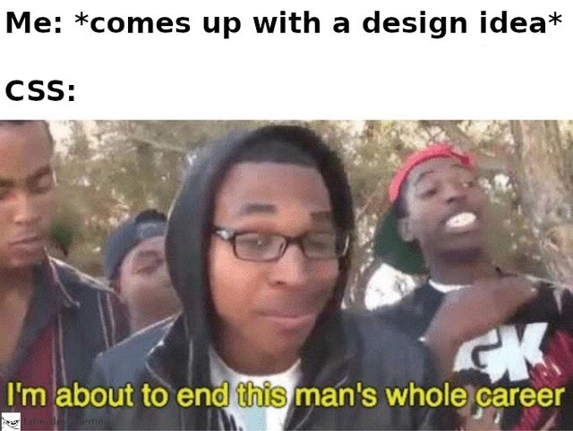
When a Design Idea Meets CSS
Frontend Post #1088, on Mar 3, 2020 in TG

When a Design Idea Meets CSS

Why is this Frontend meme funny?

Level 1: Expectations vs. Reality

Imagine you spent all afternoon building the tallest block tower you could, carefully placing each block exactly like your perfect plan. You’re proud and excited to show it off. But then your playful little sibling runs into the room during their own adventure and – crash! – knocks the whole tower down. All your hard work is scattered on the floor in an instant, and you’re left feeling shocked and frustrated. In this story, your beautiful block tower is like a neat website design you had in mind, and your rambunctious sibling is like the unpredictable stuff that happens when actually making that design work on a computer (that “stuff” is the CSS). The meme is joking that no matter how great your plan is, the wild nature of building things (in websites, the tricky CSS part) can come in and wreck it. It’s funny in a “oh no, that’s so true!” way – we laugh because we’ve all felt that sting when our plan meets reality, whether it’s a block tower toppled or a website layout all messed up. The good news: just like you can rebuild the tower (maybe on a higher table, away from your sibling!), a developer can fix the website. But in the moment of disaster, it really does feel like, “Wow, my nice idea just got totally ruined!”

Level 2: When CSS Attacks

This meme shows a scenario every beginner front-end developer learns to recognize. The top text says: “Me: comes up with a design idea followed by “CSS:”. On the bottom, there’s an image from a famous rap battle reaction meme where a guy boasts, “I’m about to end this man’s whole career.” Essentially, it jokes that when you try to implement your cool new website design, CSS (the styling language) will completely mess it up. The contrast is funny because the developer is optimistic about their design, and CSS is personified as this savage disrupter ready to roast that plan in epic fashion. It’s a bit of exaggerated FrontendHumor about how tricky implementing designs can be.

First, let’s break down CSS itself. CSS stands for Cascading Style Sheets – it’s the language that makes web pages look nice by adding colors, layouts, fonts, spacing, etc. Cascading means that rules can fall through layers: if two style rules conflict, there’s an order of priority (based on how specific the rule is, and the order in which it appears). This is where things often go haywire. For example, if you have a general rule that says “all buttons are green” and another rule that says “the special button in the navbar is gray,” the more specific rule (targeting that one button in the navbar) will win. CSS uses specificity to decide this: an ID-based selector like #navbar .button is stronger than a simple class selector .button. Newcomers often get tripped up by CSS specificity because it’s not immediately obvious why one style overrides another. You might write what looks like a correct CSS rule, but nothing happens, simply because another rule with higher specificity (or an !important flag) is taking precedence. That can be really frustrating until you learn how specificity works.

Now, the meme implies your nice design will meet “chaotic reality.” What kind of chaos are we talking about? One example is layout breakage. You might carefully plan a layout – say a sidebar next to a content area – but if the CSS isn’t done exactly right, the layout can break. Maybe the sidebar ends up below the content instead of beside it, or some box is weirdly stretched. A common cause used to be forgetting to clear floats (in older layout techniques), or misusing flexbox properties in modern layouts, leading to elements not lining up as expected. It’s like you thought you built a sturdy structure, but one wrong move and it tumbles out of order.

Another common issue is something called margin collapse. Margins are the space outside elements (like the gap between paragraphs or sections). If you put a top margin on one element and a bottom margin on the element above it, you’d expect the total spacing to be sum of both. But CSS sometimes “collapses” them – instead of adding, one margin merges into the other. For a beginner, this is super confusing: “Where did my spacing go? I gave each 20px, why am I not seeing 40px?” The browser is doing that by design (for complex historical reasons), but to you it feels like the browser is ignoring your instructions. So your cleanly spaced design idea can suddenly have either too little or too much gap, making it look wrong.

Cross-browser quirks add another layer of chaos. Different web browsers (Chrome, Firefox, Safari, Edge, etc.) might show the same CSS a bit differently. For instance, one browser might have default padding on a <button> element and another doesn’t. Or one might interpret a flexbox rule in an odd way that the others don’t. Back in March 2020 (around when this meme was posted), developers still often had to support Internet Explorer in addition to modern browsers, and IE was notorious for not following modern CSS standards perfectly. You’d have a page looking perfect in Chrome, and then open it in IE11 and boom, elements are out of place or styles aren’t applied at all. This means a design that looked “pixel-perfect” (exactly like the design mock-up) in one browser could look broken in another. Frontend folks end up doing a lot of testing and use CSS resets or normalizers (CSS files that reset all browsers to consistent default styles) to mitigate these issues. But inevitably, there’s that one weird thing in Safari or that one mobile browser that “ends your design’s career” temporarily.

The meme’s punchline uses hyperbole – obviously, a CSS bug won’t literally end anyone’s career. It’s jokingly referencing how a developer might feel when their beautiful design is utterly wrecked by unforeseen CSS issues. You spend hours on a concept, and then one stray CSS rule or a difficult-to-find bug makes the page look awful. It can be demoralizing. You might jokingly say “CSS ended my career” while taking a short despair break, then you get back to debugging. This dark comedic exaggeration is common in DeveloperHumor: we make fun of our own struggles to cope with them. The rap battle meme image (with the crowd going wild in the background) emphasizes how brutal and one-sided this feels – CSS completely “destroys” the newbie’s plan, and even the crowd (fellow devs) are like “oooooh!” in sympathy and amusement.

In more straightforward terms, the meme resonates because design implementation is often harder than it looks. A designer might give you a pristine mockup (picture) of a website and say, “Let’s make it look exactly like this.” As a newer front-end dev you think, “Sure, I’ll write the HTML/CSS and it’ll look identical.” But then you encounter all these little CSS realities: your elements don’t line up perfectly, the font doesn’t render exactly the same across devices, that responsive design (mobile vs desktop) requires lots of tweaking, etc. It’s a learning moment. You realize building a pixel-perfect UI involves dealing with countless tiny details and odd behaviors. Over time, you learn tricks to tame CSS – things like using consistent base styles, understanding the CSS box model deeply, maybe using flexbox or grid for layout (which help avoid some older problems), and structuring your CSS with methodologies (like BEM or utility-first) to avoid specificity wars. But no matter your experience, some new CSS issue will pop up eventually and humble you.

So, the meme is a lighthearted warning: Don’t underestimate CSS. That simple “make it look like the pretty design” task can turn into a battle. It’s poking fun at the css_vs_design struggle. Front-end developers share this kind of content as an inside joke, because everyone who writes CSS has experienced the frustration. You can almost hear the “Super Hot Fire” guy (CSS in this case) telling the overconfident developer, “Nah, implementing that is not gonna be as easy as you think. Watch me wreck it.” And then all the other devs (the crowd) go wild because they relate so hard – they’ve all had their careers momentarily “ended” by an unruly stylesheet.

Level 3: The Cascade Strikes Back

No matter how pristine your UI design concept is, seasoned front-end devs know that the reality of CSS can dismantle it in seconds. This meme perfectly captures that universal Frontend truth: you come up with a clean layout idea, and CSS responds with the legendary burn, "I'm about to end this man's whole career." It's referencing the Super Hot Fire rap battle meme to dramatize how brutally our styling dreams can be crushed. Why is this so funny (and painfully real) to experienced developers? Because we’ve all been there – elegant specs on paper, then chaotic carnage in the browser.

At the heart of this humor is the notorious CSS cascade and specificity. In theory, the cascade is a beautiful mechanism that lets multiple style rules combine and override each other based on priority. In practice, it often feels like a treacherous game of one-upmanship between styles. Imagine you define a nice simple rule for your site, but somewhere else a more specific selector or an !important flag is lurking, ready to overpower your work. For example:

/* My simple design rule */
.button { background: green; color: white; }

/* Some other CSS loaded later with a more specific selector */
#navbar .button { background: gray; }  /* ID selector outranks the simpler rule, turning the button gray */

In a perfect world, styles wouldn’t conflict. But in real projects, you might be integrating third-party widgets, CSS frameworks, or legacy styles. All it takes is one overly specific rule like #navbar .button or a forgotten !important to create a specificity showdown. Suddenly, your carefully chosen green button turns dull gray, and you’re left wondering why your CSS isn’t “listening” to you. This escalating fight – adding more classes, then IDs, then !important to win – is the hallmark of a CSS specificity arms race. It’s both hilarious and horrifying how quickly a simple design can devolve into a tangle of override upon override.

Then there’s margin collapse – a classic CSS quirk that has ended many a developer’s bliss. You meticulously spaced out your sections with margins, only to find that adjacent vertical margins collapse into one another. The result? Either giant unexpected gaps or no gap at all, as if the browser just shrugged and said “two margins here? Nah, just one.” That perfect spacing you showed your designer can evaporate due to a little-known rule in CSS geometry. An experienced dev will chuckle (or sigh) remembering the first time they had two <div>s whose margins merged like ghosts, leaving them scratching their head at the layout breakage.

And of course, cross-browser inconsistencies are the bane of every UI engineer’s existence. You finally get the page looking pixel-perfect in Chrome, but then QA opens it in Safari or Firefox (or gasp IE/Edge) and the layout is bizarrely off. Maybe it’s a flexbox bug where a flex container refuses to center in Safari, or an older Internet Explorer ignoring max-width, causing your neat grid to explode into an ugly column. Each browser has its own rendering engine (Blink, WebKit, Gecko, etc.), each with subtle differences and default styles. Senior devs carry scars from debugging things like the Internet Explorer 10 flexbox min-height bug or the famous IE6 three-pixel jog. It’s funny in retrospect – how one browser’s quirk can end your design’s career during a demo – but at the time it’s pure panic.

To really drive it home, here are a few battle stories that make this meme hit so hard for veterans:

  • The Specificity Arms Race: One CSS rule says buttons are blue, another more specific one (maybe from that old corporate style sheet) says buttons are red. They duke it out in cascading order until someone drops the nuke: !important. The result? A messy trail of !important all over your stylesheet, and a dev muttering “this is fine” while everything burns.
  • Margin Collapse Mysteries: You add a margin-top: 20px to a heading and a margin-bottom: 20px to the element above it. You expected 40px of space, but surprise – you only see 20px! The margins collapsed together. It’s like building spacing with Lego blocks only for two bricks to fuse into one; totally counter-intuitive unless you know the CSS rules.
  • Layout Jenga with Floats: Before Flexbox and Grid, we floated elements for layouts. It worked... until it didn’t. One un-cleared float and the whole page could shift or collapse, kind of like removing the wrong Jenga block and toppling the tower. A simple two-column design idea could end in chaos if the clearfix wasn’t in place – a reality check for anyone who thought their layout was stable.
  • Z-Index and Stacking Context Surprises: You meticulously design a dropdown menu or modal window that should appear on top of everything. In practice, it stubbornly hides behind some other element. CSS is essentially saying, “Oh, you wanted that front-and-center? Too bad, it’s trapped in a stacking context.” This invisible rule can make a dev feel like their career (or at least their day) is about to end, as the fix requires deep dives into positioning and stacking contexts that beg the question “why is this so hard?”
  • Responsive Design “Fail” Moments: On desktop, your clean design idea looks gorgeous. But then you check on a small mobile screen and elements overlap, text overflows out of its box, or that neat three-column layout becomes an accordion of misaligned pieces. Responsive CSS is supposed to gracefully adapt, but one misused percentage width or an untested breakpoint, and your design goes off the rails. Cue the CSS: I’m about to ruin everything moment as you scramble to patch it.

Each of these is a rite of passage in Frontend development. We laugh at memes like this because they’re developer humor born from real pain. The juxtaposition of a confident “I have a great idea!” with CSS’s chaotic smackdown is both absurd and relatable. It highlights the gap between UX design ideals and the harsh implementation details. Seasoned devs have learned (the hard way) that a “simple” design can hide a labyrinth of CSS pitfalls. The meme exaggerates it as ending your career (tongue-in-cheek, of course), poking fun at how a tiny styling bug at 2 AM can make even an expert feel utterly defeated. In short, the humor lands because it’s a cathartic acknowledgment: no one, not even the pros, escapes the chaos of CSS unscathed. We’ve all had those "CSS vs. the developer" battles, and seeing it summed up in one savage meme is both hilarious and a little traumatic. 😅

Description

This meme uses the popular 'I'm about to end this man's whole career' format to humorously depict the struggles of frontend development. The top text reads, 'Me: *comes up with a design idea*'. Below it, the label 'CSS:' points to the main image. The image features a man in a black hoodie and glasses, looking confidently at the camera, with the subtitle 'I'm about to end this man's whole career' printed in yellow at the bottom. The joke lies in personifying Cascading Style Sheets (CSS) as an antagonist that actively thwarts a developer's creative designs. It speaks to the universal experience of web developers who conceive of a perfect layout, only to face immense frustration when trying to implement it due to CSS's complexities, quirks, and browser inconsistencies, turning a simple idea into a prolonged battle with code

Comments

7
Anonymous ★ Top Pick The fastest way to humble a confident developer is to ask them to vertically align an element in CSS on the first try without looking anything up
  1. Anonymous ★ Top Pick

    The fastest way to humble a confident developer is to ask them to vertically align an element in CSS on the first try without looking anything up

  2. Anonymous

    Figma hands me an 8-point grid; CSS responds with margin-collapse, a Safari flexbox regression, and a reminder that chaos engineering isn’t just for Kubernetes

  3. Anonymous

    After 20 years in this industry, I've learned that CSS doesn't break your design - it just reveals that your mental model of the box model, stacking contexts, and containing blocks was a beautiful lie you've been telling yourself since 2004

  4. Anonymous

    CSS is the only language where you can spend three hours centering a div, finally get it working, add one more element, and watch your entire layout commit seppuku. It's like playing Jenga with box models - one wrong move with margin-collapse or z-index stacking context, and suddenly your carefully architected design is rendering in another dimension. Senior devs know: the real skill isn't writing CSS, it's predicting which innocent property change will trigger the cascade apocalypse

  5. Anonymous

    Pitch a bold UI; CSS replies with stacking contexts, subpixel rounding, and the reminder that z-index 9999 still loses to a positioned ancestor

  6. Anonymous

    CSS isn’t a stylesheet, it’s a conflict‑resolution protocol; specificity causes priority inversion, !important is root access, and Safari is the Byzantine node

  7. Anonymous

    CSS specificity: the only cascade where inheritance feels like a hostile takeover

Use J and K for navigation