The Perennial Designer vs. Developer Handoff Conflict
Why is this Frontend meme funny?
Level 1: Missing Puzzle Pieces
Imagine your friend draws a beautiful, detailed picture and wants you to copy it exactly. But here’s the catch: they only show you the picture for a moment and give you just a part of it to keep – say, the top half of the drawing – and nothing else. You do your best to recreate the whole image from that little bit of information. Later, when you show your version to your friend, they get really upset and shout, “This isn’t the same as my drawing!” You’re left thinking, “Well, I only had this one piece to go on!”
That’s exactly what this meme is about, but with making a website. The designer is like the friend who wanted an exact copy of their art (the website to look just like their design). The developer is like you, who tried to make that copy with only a small part of the puzzle. The designer is yelling because the website isn’t pixel-perfect (a perfect twin of the design), and the developer (like a confused cat at the dinner table) is sitting there thinking, “How could I have gotten it right when I didn’t have all the pieces?” It’s funny in a way because we can all understand that frustration: you can’t expect a perfect puzzle if half the pieces were missing from the start!
Level 2: Pixel Perfect vs Reality
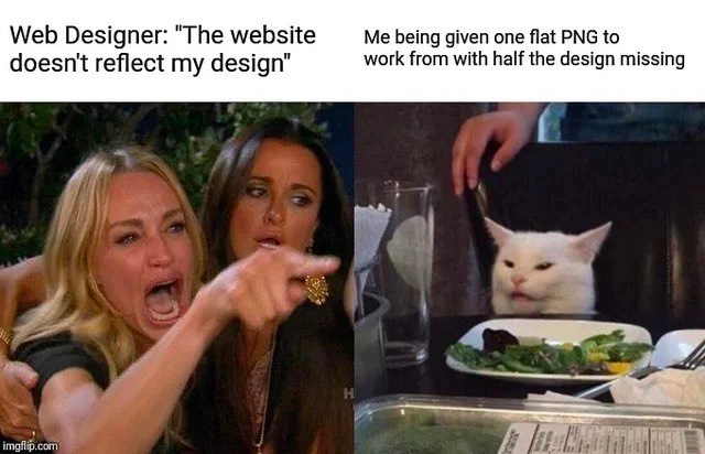
For a newer developer or someone outside the field, let’s break down what’s happening in this meme. It uses the famous “Woman Yelling at Cat” format: on the left, we see a Web Designer angrily shouting "The website doesn't reflect my design!" On the right, we have a white cat (a popular meme cat named Smudge) sitting at a dinner table looking confused and annoyed, with the caption "Me being given one flat PNG to work from with half the design missing." In simpler terms, the person on the left is the designer complaining the website isn’t an exact copy of their artwork, and the cat on the right represents the developer who had to build the site with very limited resources (basically just a single image of the design).
Now, pixel-perfect means the designer wants the website to look exactly the same as their design mockup – every element aligned just right, all colors, fonts, and spacing identical, as if someone took a screenshot of the design and that’s the website. Achieving that requires precise details. In professional teams, a designer usually hands off a design with specifications: for example, "The heading text is 32px in font size, the color is pure black #000000, the button should be this exact shade of blue, with 8px rounded corners," etc. Sometimes they provide a design file that developers can inspect, or even a live prototype. Modern design tools like Figma, Sketch, or Adobe XD have modes where a developer can click on a text or shape and see its properties (font name, size, color code, spacing). There are also collaboration platforms (like Zeplin or InVision) specifically made to smooth this design-to-code handoff – they ensure the developer isn’t guessing values by providing the exact specs.
However, in the scenario depicted by the meme, it sounds like the developer received just one PNG image of the design. A PNG (Portable Network Graphics) is an image file format – like JPEG or GIF – often used for high-quality screenshots or graphics. When we say a flattened PNG, we mean it’s a single-layer image: all the text, shapes, and components the designer created have been merged into one flat picture. The developer can’t click on a PNG to see what font was used or copy the text; it’s as if you took a photo of a painting – you can see the painting, but you don’t have the original stencils or color codes the artist used.
Imagine being that developer: you’re told to make a website that matches a picture. But “half the design missing” implies that even that picture wasn’t complete. Perhaps the designer only gave the desktop layout but no mobile layout, or only the homepage design but not the subpages. Or maybe certain elements in the provided image were incomplete or just a visual, without telling what happens when you interact with them. This is a common miscommunication issue in projects: you get requirements that are ambiguous or incomplete (only part of the story is given), yet you’re expected to deliver a perfect result. It’s a huge collaboration challenge in many teams, especially between designers and developers.
Let’s decode the captions in an easy way:
- Web Designer (yelling): She’s essentially saying, “The site you built doesn’t look like the picture I gave you at all! It’s not what I designed!” This implies the designer had a certain look in mind (likely meticulously crafted in a design program), and when they saw the actual website, it differed in appearance. Designers use the term “doesn’t reflect my design” to mean the implementation is off – maybe fonts are wrong, spacing is different, or some graphics are missing/wrong. They’re frustrated because they wanted a pixel-perfect translation of their work into a live website.
- Me (the developer, as the cat): The cat’s blank, slightly annoyed look and the caption explain why the site isn’t identical – the developer only had “one flat PNG” to go on, and half of the design details weren’t provided. In other words, “You expected perfection, but you only gave me this one image (and it didn’t even cover everything). What did you expect?!” The cat (developer) isn’t yelling back; he’s just sitting there, possibly in disbelief or resignation. That matches a developer’s feeling of being blamed for something that wasn’t fully their fault.
Let’s clarify why a flat PNG is such a handicap for a developer:
- With an image file, the developer cannot easily get exact measurements or styles. For instance, if the designer’s image shows a header text, the developer doesn’t automatically know if it’s 30px tall or 36px, or what font or line spacing was used – the dev might have to guess or use a pixel ruler tool to measure the picture. This is like trying to trace a drawing without the original stencil.
- The developer also won’t know about any interactive elements. Maybe in the design, a menu looks a certain way, but what happens when you hover or click? Should there be a dropdown? Should a button change color when pressed? A static image can’t show those, and if the designer didn’t explicitly provide that info, the developer might just implement basic default behaviors. Then the designer later says, “That’s not the hover effect I wanted!” – but how was the dev to know?
- Half the design missing could mean the designer only gave a partial mockup. For example, only the homepage was fully designed, and the inner pages were not visually designed at all – the designer might have assumed the developer would “just know” to carry the same style through, or maybe they planned to design those later but the dev needed to start coding already. This is actually pretty common in fast-paced projects or when communication is poor: the team starts building from incomplete designs. The developer in the meme probably had to make up the missing pieces on their own (like decide how a form should look because the provided design PNG didn’t include a form, etc.), which inevitably leads to differences from what the designer might have wanted.
For a junior front-end developer, this meme is a light-hearted warning: always try to get clear requirements and assets. If you’re handed just an image and told “make it like this,” it’s okay (and wise) to ask for more details – fonts, colors, sizes, and any missing screens or states. Tools can help; for instance, you can open the PNG in an editor and measure things, but that’s extra work and can be error-prone. Communication with the designer or project manager can save a lot of trouble: often the designer doesn’t realize the developer needs explicit values or separate assets. They might assume the image alone is self-explanatory (which it rarely is). This meme resonates because many of us didn’t ask those questions early on, built the page as best we could, and then got feedback like, “Hmm, this looks off from my design,” leading to a frustrating back-and-forth.
In essence, Pixel Perfect vs Reality here means the ideal outcome (pixel-perfect match) versus what really happens when the process is flawed. The designer’s ideal is that the website is indistinguishable from their Photoshop or Figma design. The reality for the developer is that with incomplete info, the site is going to have differences – not necessarily because the developer is bad at their job, but because the spec was incomplete. The meme exaggerates it with the woman screaming and the cat looking bewildered, which is funny because it puts a meme-famous dramatic spin on what’s usually a tense but quiet slack message or JIRA ticket exchange in real life.
By understanding both sides, a junior dev can learn an important lesson in collaboration: building a great UI is a team effort between design and development. The “angry designer and confused dev” scenario is avoidable with better communication – but when it does happen, at least we have memes like this to vent our shared frustration! 😸🎨💻
Level 3: Flattened Expectations
At the senior developer level, this meme hits on a painfully familiar scenario: pixel-perfect design demands meet inadequate design handoff. The left panel’s furious Web Designer yelling “The website doesn't reflect my design” and the right panel’s blank-faced cat (the developer) captures the classic designer-dev gap. The humor comes from how absurdly common this Frontend pain point is: a designer expects the implemented website to exactly match (down to each pixel) their envisioned UI, yet they only provided the developer with a single flattened PNG image – often an export or screenshot – with crucial details missing.
In real projects, a flattened image (like a .png file) is essentially a picture of the design where all layers and information are merged. It's not an interactive design spec or a UI kit; it's just one flat snapshot. When a developer is given such limited input, it's a recipe for frustration: there’s no easy way to extract the exact font sizes, padding, color codes, or responsive behaviors from a flat image. The web designer in the meme is effectively throwing the design “over the wall” – a one-way handoff with minimal collaboration – and then getting upset when the result isn’t a pixel-perfect clone of their mockup. This is a textbook example of design handoff problems and requirements ambiguity in action.
Why is this so relatable? Experienced front-end devs know that implementing a UX/UI design from just a picture is like playing detective. Without a proper style guide or design specs, we end up squinting at the PNG, measuring distances with browser dev tools or design software, and guessing a lot. Did the designer use a 16px or 18px font for that header? Is that spacing 20px or 24px? If the design assets (like icons or logos) aren’t provided separately, we might even have to extract them from the image – which feels like reverse-engineering the design. It's no wonder the final website “doesn't reflect” the design perfectly; half the design details were never communicated! The collaboration challenge here is that designers and developers often speak different languages and use different tools. If they don't meet in the middle (for example, by using handoff tools like Zeplin, Figma Inspect, or sharing detailed specs), the developer ends up essentially rebuilding the design by eye. And as any seasoned dev will tell you with a sigh, eyeballing it is not a reliable development strategy.
This meme is also poking fun at the idea of “pixel-perfect vs. reality.” In theory, pixel-perfect means every element on the website is identical to the design comp – a noble goal inherited from print design and early web days where layouts were static. In reality, modern web UIs must adapt to different screen sizes, browsers, and dynamic content, so chasing absolute pixel perfection can be a futile exercise. Senior devs have war stories of designers filing bug tickets like “This border is 1px too light” or “The spacing here is 5px off compared to the mockup,” when often the mockup was just an approximation to begin with or didn’t specify those nuances. Here, the designer’s fury is funny because it highlights the imbalance: the dev was expected to magically intuit all those unspecified details from one image. The Developer Experience (DX) suffering here is almost tangible – we’ve got an angry stakeholder on one side and incomplete inputs on the other.
Let’s break down what the developer (the cat) likely didn’t receive in this situation, causing the disconnect:
- Exact dimensions & spacing: No reference for exact pixel distances. The dev might've used best guesses (e.g., 20px margin here, 15px padding there). The designer, however, probably had very specific spacings in mind which they never explicitly shared.
- Font specifications: The PNG shows text, but it doesn’t tell you the font family, size, or weight. Is it Open Sans 16px bold, or Arial 18px medium? The developer might have to guess or use a browser inspector to measure – and a 2px difference in font size can make the designer yell "It’s off!".
- Color values: A flattened image doesn’t provide HEX/RGB codes. The dev might pick what looks like the same color (e.g., sampling a color from the PNG), but without the exact code, slight variations happen. “That button is a slightly different shade of blue than my design” is a common designer gripe – even though the dev had no way to know it was supposed to be
#3B82F6exactly. - Interactive states & behaviors: The PNG likely shows a static view (say, the default state of the UI). But what about hover effects, active states, dropdowns, mobile responsiveness, or error messages? Those half of the design missing are all the scenarios not captured in a single image. The dev probably improvised these or used defaults (e.g., no special hover style because none was provided). When the designer sees the deployed site, they might think "This doesn’t follow my design!" – but they never delivered those parts of the design in the first place.
- Multiple pages or components: Sometimes “half the design missing” is literal – maybe only the homepage was designed in detail, and other pages were just sketched or left to the developer’s imagination. The meme’s cat has a half-eaten salad in front of it, which is oddly appropriate: the developer got a half-finished feast of design assets. They had to fill in the blanks for a complete meal (website) and are now being scolded for not matching the original recipe.
The result? The developer sits there like Smudge the Cat, bewildered and a bit indignant, thinking: “How can you expect a perfect match when I had so little to work with?” Meanwhile, the designer is livid because their vision isn’t realized. This is a failure of communication more than competence. As a seasoned dev, you recognize that the real culprit is the throw-over-the-wall workflow – where design and engineering work in silos rather than collaboratively. The meme perfectly captures that absurdity with humor: the dramatic yelling vs. silent stare exaggerates the emotional shock on both sides.
In short, the meme is funny to developers because it dramatises a daily Developer Pain Point: being expected to deliver pixel-perfect results with far-from-perfect input. It’s a knowing laugh at the collaboration pitfalls in many teams. As the saying goes in dev circles, “Garbage in, garbage out” – if the only input is a flat PNG (garbage in, in terms of info richness), you can’t expect a faithful, nuanced implementation (garbage out) on the first try. Yet designers (and often managers or clients) sometimes assume that one static image is all that’s needed to convey an interactive, pixel-perfect product.
To illustrate the developer’s predicament in code, imagine trying to recreate the design with CSS purely by eyeballing that PNG:
/* Trying to implement styles with incomplete info from a flat PNG */
.hero-title {
font-family: "Helvetica, sans-serif"; /* guessed from the image (could be wrong) */
font-size: 32px; /* looked roughly ~32px in the PNG */
color: #333333; /* sampled a dark gray from the PNG */
margin: 24px 0 16px 0; /* eyeballed spacing between elements */
}
.button {
background-color: #4A90E2; /* picked a blue that seems close */
padding: 10px 20px; /* guessing padding because spec not provided */
/* :hover state? No clue, so leaving it default */
}
Comments in code illustrate the guessing game. The developer isn’t confident these choices match the designer’s intention – they’re making educated guesses. When the designer later yells "this isn’t what I designed!", the developer can only shrug like that cat: they did the best they could with the information on hand.
All in all, frontend developers find this meme hilarious and exasperating because it’s so true to life. It shines a light on the importance of clear communication and proper design-to-development handoff. Without those, you get a lot of finger-pointing (or in this case, woman-pointing) and blank stares. The meme’s popularity (using the well-known “Woman Yelling at Cat” template) stems from the collective experience: virtually every dev has been the cat at some point, and every designer has felt like the frustrated woman when their vision doesn’t appear on the site as expected. It’s a comical reminder that building software is a team sport – and when one side only provides half the info, the other side can’t score a perfect goal.
Description
This image utilizes the well-known 'Woman Yelling at a Cat' meme format to depict a classic point of friction in web development. The meme consists of two panels. The left panel shows a reality TV star, Taylor Armstrong, yelling and pointing, with the caption 'Web Designer: "The website doesn't reflect my design"'. The right panel shows Smudge the Cat looking bewildered and slightly annoyed behind a plate of salad, with the caption 'Me being given one flat PNG to work from with half the design missing'. The humor stems from the disconnect between the designer's expectations and the developer's reality. A 'flat PNG' is a static image file with no layers, dimensions, font information, or interaction details, making it a notoriously poor format for handing off a complex web design for implementation. The meme perfectly captures the developer's frustration at being blamed for inaccuracies when they were provided with incomplete and inadequate source materials, forcing them to guess at the missing details
Comments
7Comment deleted
Receiving a single PNG for a design handoff is the designer's way of saying 'I trust your psychic abilities to correctly guess all the hover states, responsive breakpoints, and font families.'
“Happy to hit pixel-perfect - just email me the Figma link, the responsive breakpoints, the component states, and the design tokens you accidentally compressed into that single PNG’s RGB channels.”
"I've implemented your design perfectly - it matches the PNG exactly at 1920x1080, in Chrome, on my monitor, at 100% zoom, with no user interactions, assuming the user never scrolls."
The eternal frontend paradox: designers deliver a single flattened PNG with no spacing specs, no color values, no font weights, no interaction states, and somehow expect you to reverse-engineer their entire design system while maintaining pixel-perfect fidelity across 47 viewport breakpoints. Meanwhile, you're sitting there like that confused cat, wondering if you should just inspect element on their Figma screenshot or start guessing hex values like it's 2008 again
Designers hand off PNGs like undocumented APIs: flat, opaque, and guaranteed to break your build
Nothing says “design system” like a single 1440px PNG - no tokens, no breakpoints, and apparently hover is a state of mind
Designer hands over one flat PNG and says “make it responsive.” Cool - time to reverse‑engineer breakpoints, design tokens, and hover states from a screenshot like a forensic CSS autopsy