The Invisible Success of Dark Mode Shadows
Why is this Frontend meme funny?
Level 1: No Light, No Shadow
It’s like you painted a picture with a dark pencil on black paper – you worked hard on all the details, but when you show it in a dark room, no one can tell what you did. In simple terms, the joke is that the developer made something fancy (pretty shadows behind boxes on the screen) to make the app look nice, but then they turned the lights off (made the app background very dark). With the lights off, those pretty shadows disappeared! The developer is feeling frustrated, kind of how you’d feel if you wore your coolest black designs on a black T-shirt and then realized nobody can see them. It’s funny because the developer got exactly what they wanted (a super dark theme for the app), but that success made another cool thing they added invisible – so they ended up complaining about their own achievement, just like a rich artist jokingly complaining that life is too good.
Level 2: Dark Mode Dilemma
Let’s break down what’s happening in simpler terms. This meme is about UI design problems in a dark-themed app. It specifically references Material Design shadows and a dark mode UI. If those sound like buzzwords, here’s what they mean:
Dark mode (in an app or website) means the background and overall color scheme are dark (usually black or deep gray), and the text or icons are light-colored. It’s the opposite of the classic black text on white background. Dark mode is popular because it can be easier on the eyes at night and it gives a sleek look. Think of apps like Twitter or Discord when you switch to their dark theme – the background goes nearly black.
Material Design is a design language created by Google. One of its features is using shadows to show depth. In real life, objects cast shadows to show they’re above a surface; Material Design mimics that for on-screen elements. For example, a floating button might have a tiny shadow below it, suggesting it’s “hovering” above the app background. These are often implemented in code with CSS
box-shadowproperties (for web) or elevation attributes (for Android apps). A typical CSS drop shadow might look like:.card { background: #FFFFFF; /* white card */ /* a subtle shadow: x-offset, y-offset, blur radius, color */ box-shadow: 0 2px 4px rgba(0, 0, 0, 0.3); }This would create a faint dark blurry edge below the card, visible against a light background.
Why shadows disappear in dark mode: Shadows are usually dark gray or black with some transparency. They rely on the background behind them being lighter. In dark mode, the background itself might be black or very dark. If you put a black semi-transparent shadow on a black background, you won’t see it at all. It’s like drawing with a black marker on black paper – the drawing is there, but black-on-black has no contrast, so your eyes can’t pick it out. In our CSS example above, if we change the card’s background to a dark color but keep the same shadow:
.card.dark-theme { background: #121212; /* dark card background */ box-shadow: 0 2px 4px rgba(0, 0, 0, 0.3); /* same shadow definition */ }Now the
rgba(0,0,0,0.3)shadow (which is a 30% opaque black) is being cast onto a #121212 nearly-black backdrop. The shadow virtually disappears, because a 30% black on top of a black background still just looks black. The card might as well have no shadow – it will appear flat against the background.“Painstakingly added” shadows: As a developer or designer, adding these shadows isn’t always one-click. You often have to tweak how strong the shadow is, how blurred it is, maybe add multiple layers of shadows for a more realistic effect. You might follow design specs that say things like “Elevation 4 = 2px 4px 6px rgba(0,0,0,0.2)” and so on. It can feel tedious adjusting those values and making sure they look good. So if you spent time doing this for dozens of elements, you’d be proud to see the nice subtle depth in light mode. The meme emphasizes fancy material shadows to show the developer really put effort into it.
The disappointment: When you switch your app to dark mode (perhaps with a toggle or automatically with system settings), you suddenly notice those efforts are invisible. All cards and buttons look like they’re on the same flat layer because the shadows can’t be seen. It’s a bit of a facepalm moment. This is not just theoretical – many new developers have run into this. For instance, a junior frontend dev might implement a cool card design from a tutorial (with shadows on a white background). Later, when enabling a dark theme, they’re puzzled: “Why do my cards look so plain?” Then it hits them – the shadow’s there in code, but visually it’s lost due to the dark background.
Contrast and visibility: In UX/UI design (and also in accessibility), contrast is key. Contrast is the difference in color or brightness between an object and its background. High contrast makes things easy to see (like black text on a white screen). Low contrast makes things hard to see (like dark gray text on a black screen). In our case, the shadow vs. background has such low contrast that it’s effectively invisible. Contrast ratios are often mentioned in accessibility guidelines (typically for text readability), but the principle applies to decorative elements like shadows too. You generally want enough contrast so users can actually perceive the UI element. If not, it might as well not be there.
How designers handle this: Real-world design systems actually account for dark themes. For example, Material Design’s guidelines for dark theme suggest using either lighter shadows or altering the surface colors. Some solutions include:
- Using a lighter shadow color in dark mode (like a semi-transparent white shadow or a colored glow) to simulate the depth effect against a dark background.
- Adding a soft border or outline around elements in dark mode. For example, a card might have a 1px outline of a slightly lighter gray than the background, just to differentiate it.
- Slightly raising the brightness of the card background itself relative to the main background. If the card is a tiny bit lighter, its edges are naturally visible even without a shadow.
These adjustments ensure that even in a dark interface, you can tell elements apart and see what’s on top of what.
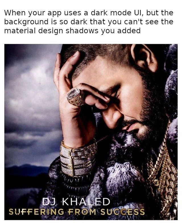
Now, understanding all this, the meme’s joke becomes clear: The developer did what they were supposed to do (add shadows for good UI design), and also did what users often request (provide dark mode). But because of the way colors and contrast work, the combination led to an unintended outcome. It’s a lighthearted poke at how working in frontend can sometimes feel like chasing your own tail — fix one thing, break another visually. The caption is written in that DeveloperHumor tone that anyone who’s toggled a theme can chuckle at. It says: “When your app uses a dark mode UI, but the background is so dark that you can’t see the material design shadows you added.” Any UI designer or frontend developer instantly visualizes this situation and likely recalls a time they said, “Whoops, our interface is basically shadowless in dark mode. Back to the drawing board!” It’s equal parts funny and frustrating, which is basically the definition of FrontendHumor.
Level 3: Suffering from CSS
The meme hits on a classic FrontendPainPoints scenario with a heavy dose of UX irony. Imagine diligently following Material Design guidelines – you add those subtle, elegant material design shadows to give your app’s UI a sense of depth and hierarchy. In a normal (light) theme, these shadows create a pleasing contrast, making cards and buttons pop from the background. But then comes DarkMode (the much-requested feature to offer a dark theme UI for users’ tired eyes). You toggle your app to a sleek dark mode UI – only to discover all the beautiful shadows you painstakingly crafted have effectively disappeared. It’s a perfect “suffering from success” moment: you implemented a modern, desirable feature (dark mode success 🎉), and now you’re suffering because it nullified another detail you were proud of.
In technical terms, this is a shadow visibility issue caused by poor contrast elevation. Material Design’s whole elevation concept relies on shadows (usually dropshadows) to indicate layers. These shadows are typically a semi-transparent black blur drawn beneath an element. On a light background, a black shadow (even at 5-20% opacity) is visible as a greyed edge, clearly delineating raised components. But on a near-black background (common in dark themes, often #121212 or pure black #000000), that same shadow is almost the same color as its surroundings. The result? The shadow blends in completely, and the element looks flat against the dark backdrop. You’ve essentially lost all visual elevation cues. The situation is painfully relatable: it’s as if the darkness literally “overshadows” your shadows! (Yes, the irony writes itself.)
This combination of elements is funny to developers and designers because it satirizes a real-world UI/UX challenge. It’s poking fun at how we sometimes chase two ideals that conflict with each other:
- Ideal 1: Follow the design system (e.g. Material Design) to the letter, including adding fancy shadow effects for polish.
- Ideal 2: Provide a stylish dark mode, because users love it and it’s easier on the eyes (and honestly, dark mode is just cool).
Individually, each is a best practice in modern frontend design. But together? Surprise! One best practice can unintentionally sabotage another. Senior developers and designers nod knowingly here: this is an example of the countless edge cases you discover only after implementation. The meme exaggerates the frustration by using the famous “DJ Khaled – Suffering From Success” album cover. DJ Khaled is pictured lamenting dramatically with his gold jewelry and fur coat — meaning he’s absurdly upset about having too much success. In parallel, a developer who got everything right (dark mode works! shadows added!) ends up frustrated by their very success: the dark theme is so perfectly dark that it nullified the shadows. It’s a tongue-in-cheek way to say “even when we win, we lose.”
From a broader perspective, this highlights a common pattern in software development: solving one problem can expose another. Here it’s a UX/UI pattern clash. The humor lands because any experienced frontend developer can recall a similar scenario:
- You spend hours perfecting a tiny detail of the interface (like a gradient, border, or shadow) for visual appeal.
- Then a new requirement or environment (dark mode, high contrast mode, a different display) comes along that completely negates that detail.
It’s a shared pain and anti-pattern: not testing design changes in all modes. The unspoken lesson (and why seasoned devs smirk) is “Always check your work in dark mode, high contrast, etc., because something will inevitably be off.” In large organizations, this exact issue might lead to some post-mortem discussion or a late-night design patch:
- Perhaps the design system team forgot to specify alternate shadows for dark themes.
- The developers implemented dark mode as an afterthought, copying the same CSS values from light theme.
- No one noticed during QA because under bright office conditions or on high-brightness monitors, the shadows were barely discernible anyway.
Fixing this isn’t always trivial. You might think: “Just use lighter-colored shadows in dark mode.” But then you venture into new territory — a white shadow (which is essentially a glow) can make elements look like they’re emitting light, which breaks the intended aesthetic. Some frameworks solve this by using elevation overlays in dark themes (e.g., adding a subtle semi-transparent white on top of cards rather than beneath). Others add thin border strokes or adjust the background tone of cards to be slightly lighter than the base background, so the difference is visible. Each solution has trade-offs: too much contrast and the dark theme isn’t truly dark anymore, too little and you’re back to invisible shadows. It’s a delicate balancing act between UXDesign principles and aesthetic consistency.
Historically, even Google’s own apps went through this pain when introducing dark themes. Early Material Design specs were very light-theme centric – shadows assumed a light background. When material_design_shadows met dark_mode_ui in later guidelines, designers had to revisit the drawing board to maintain depth cues. Many of us remember apps shipping “dark mode beta” where certain elements just looked oddly flat or missing – exactly this joke. It’s both comforting and comical to see that even the pros dealt with it. The meme encapsulates that moment of “Are you kidding me?!” that a developer feels upon realizing an entire evening spent fine-tuning shadows was essentially for nothing in dark mode. It’s a relatable mix of frustration and humor that the developer community loves to share with a wink. After all, if we don’t laugh at these things, we might just cry (into our dark-mode IDEs where, thankfully, our tears also blend in 😂).
Description
A 'DJ Khaled Suffering from Success' meme. The image is the album cover for DJ Khaled's 'Suffering from Success,' showing him looking down despairingly while adorned with heavy gold chains and diamond jewelry. The caption above the image reads, 'When your app uses a dark mode UI, but the background is so dark that you can't see the material design shadows you added.' The humor lies in the irony of achieving a desired feature (a sleek, true-black dark mode) that simultaneously nullifies the effort put into another feature (the subtle elevation and depth cues from Material Design's shadows). It's a classic 'first-world problem' for frontend and UI developers, perfectly capturing a scenario of being defeated by one's own success
Comments
7Comment deleted
My UI is so successfully dark, my box-shadows are now just entries in the CSS file whispering tales of a z-index they once knew. It's the vantablack of technical debt
Spent two sprints perfecting the 4-8-16 dp elevation ramp - flip on dark mode in QA and every nuance merges into #000; turns out my shadows and my career trajectory share the same contrast ratio
Spending three sprints perfecting elevation shadows only to watch them vanish into the void of #000000 is the design systems equivalent of implementing microservices for a todo app
Ah yes, the classic dark mode paradox: spending hours perfecting your Material Design elevation system with meticulously calculated shadow spreads and blur radii, only to realize your `box-shadow: 0 2px 4px rgba(0,0,0,0.2)` is essentially rendering black shadows on a `#121212` background. It's like being a master sculptor working in obsidian at midnight - technically impressive craftsmanship that nobody will ever see. The real 'suffering from success' is when your design system passes all the automated tests but fails the human eye test, and you're left debating whether to compromise your elevation tokens or add those controversial colored shadows that make the design purists weep
Shipped OLED true-black to save 0.3% battery; now 24dp of Material elevation renders as a concept doc - suffering from success
Material shadows in pure black dark mode: essential for depth by day, ghosts by night - elevation's Heisenberg principle
We optimized for “true black” so aggressively that our elevation system is just box-shadow: none - with better branding