The Binary Fallacy of 'Working' Code, Exposed by CSS
Why is this Frontend meme funny?
Level 1: Not Just On/Off
Think of a simple light bulb. Someone might say a lamp is either on or off – it’s either shining brightly or it's dark. But if you’ve ever seen a flickering bulb, you know it’s not so clear-cut. Sometimes the lamp is kind of on: it’s flickering or glowing dimly. It’s not fully lit, but it’s not completely dark either. In other words, it’s in an in-between state.
This meme is joking about that kind of situation, but with coding. The first person says, “code either works or it doesn’t,” which is like saying the lamp is either on or off. The reply basically says, “Ha, you only think that because you’ve never dealt with CSS.” CSS is the stuff that makes websites look nice (colors, layout, etc.). And working with CSS is a bit like dealing with that flickering light — a website might not look perfect, but it’s not totally broken either. Maybe most of the page looks right, but one part is a little messed up (like text is out of place or a button looks weird). It didn’t just all fail and go blank; it’s partially there, partially not how you wanted.
So the joke is playing on the idea that someone inexperienced thinks everything in coding is black-or-white (just on or off, works or broken). But those of us who have tried to make a web page look exactly right know it’s not always so simple. There’s a whole grey area where things “sort of” work. It’s funny because it’s true – anyone who’s struggled with a stubborn web page design will smile and think, “Yep, been there. It’s not just on/off with CSS!”
Level 2: Works on My Browser
The meme is pointing out a classic frontend problem in a humorous way. It quotes someone saying, “code either works or it doesn’t,” and then adds the punchline: “— Someone who never did CSS before.” In simpler terms, it's joking that only a person with no experience in CSS would believe software is always a clear-cut success or failure. Why? Because front-end web development (the stuff that happens in your browser) often doesn’t give such black-and-white outcomes, especially when it comes to CSS.
Let's break down CSS a bit. CSS stands for Cascading Style Sheets. It's the language that controls how a webpage looks – the layouts, colors, fonts, spacing, all the pretty (or not so pretty) stuff you see on the site. Now, the word "Cascading" is key. It means that styles can come from many sources and pile on top of each other (for example: a browser’s default style, an external stylesheet, an inline style on an element). When multiple style rules affect the same thing, there are rules about which one wins. This is where specificity comes in. Specificity is like the weight or priority of a CSS rule – for instance, an ID-based selector (#header p { ... }) has more weight than a class-based selector (.main-content p { ... }). If two rules conflict, the one with higher specificity generally wins. There’s also the cascading order (the later rules can override earlier ones if they have the same specificity).
For someone new to web dev, it might sound a bit abstract, but the consequence is straightforward: you might write a CSS rule that should do something, but another rule you wrote elsewhere (or that came from a library or browser default) overrules it. Your code is there, it’s being loaded, but it's not having the effect you expected because another style took precedence. This feels like the code “didn’t work,” but in truth it's a CSS specificity issue. There’s no error message to warn you – the browser just silently chose the other rule.
Another thing new developers learn is that different browsers can behave differently. Cross-browser CSS issues are a real headache. For example, you might design a beautiful webpage and it looks perfect in Google Chrome (a popular browser). Then you open the same page in Mozilla Firefox or Apple’s Safari or (gasp) old Internet Explorer, and suddenly some elements are out of place or the typography looks off. Each browser has its own engine for rendering CSS, and while they all follow the official standards most of the time, there are subtle differences and sometimes bugs or missing features. A classic beginner surprise: you use a CSS property that isn't supported in an older browser. There’s no crash or obvious alert – that browser just ignores that one line of CSS. The page still loads, but maybe without that fancy feature. In the meme's terms, does that mean the code “doesn’t work”? If you were expecting, say, a semi-transparent background (backdrop-filter or an advanced grid layout), and one browser simply doesn't do it, the site is not broken per se, but it sure isn't doing what you intended in that browser. It’s not a binary pass/fail situation; it’s partially working.
Browser quirks are another culprit. Historically, web browsers had quirks – non-standard behaviors or default styles – that made web pages render differently. You might hear old-timers joke about "quirks mode" or the CSS hacks needed for IE6. Even in modern times, browsers have default CSS (user agent stylesheets) that can add their own margins, line-heights, etc. If a new developer isn’t aware, they might be puzzled why there’s extra space around an <h1> heading (answer: the browser gave it a default margin). It might "work" on one browser where you unknowingly tested and adjusted, but then “not work” on another where the defaults differ. That’s why we have things like CSS resets/normalizers – to make all browsers start from a consistent base.
We also have layout edge cases that can surprise you. As a junior dev you might be proud that you got a layout looking nice with CSS. But then you add a bit more content or view it on a smaller screen, and suddenly elements jump to weird places or overflow out of their containers. Maybe you absolutely positioned something and it overlaps when the container grows, or you floated an element and didn't clear it, causing its parent container to collapse height (a classic float bug). The page still loads (so "the code runs"), but the layout is now broken or messy. It’s not like a code compile error that stops everything – it’s an awkward, partial failure you have to troubleshoot.
In contrast, if you write a Python or Java program with a mistake, it often just crashes or throws an exception immediately. It's obvious that it "doesn't work." With CSS, a mistake or omission usually means the page still shows up, but parts of it look wrong. The outcome exists on a spectrum. This is why the meme resonates with developers: front-end folks have all encountered a scenario where a design was almost right except for one section that looked off in a certain case. To someone who’s only written back-end code or simple scripts, that concept of a "half-working" state might be foreign. They expect that if code has an error, nothing works. But web UIs gracefully degrade – only the faulty piece is missing or altered, and everything else continues.
So, the comment “code either works or it doesn’t” misses the nuance that web development (especially CSS styling) often involves shades of gray. In the context of developer humor, this meme sits squarely in FrontendHumor: it’s poking fun at the painful learning curve of CSS. Pretty much every web developer has had a moment where they said “Why is my code not doing what I expect? It’s not completely broken, but it’s definitely not right!” The punchline “someone who never did CSS before” is a gentle wink to say: "Anyone who has done CSS knows better!" In other words, once you’ve wrestled with CSS, you realize code can be “working” in one environment and simultaneously “not working” in another, or working in a partial way.
This community joke also fosters a bit of camaraderie. If you're new and you feel like you must be stupid because your CSS isn’t behaving, memes like this reassure you that even experienced devs face the same struggles. It’s a rite of passage to discover that CSS has a mind of its own. The term "CSS is haunted" gets tossed around jokingly because of those bizarre cases where you change one little thing and something unrelated breaks, or fix one browser and another acts up. Over time you learn the tricks: check for conflicting rules, test in multiple browsers, use debugging tools (like the inspector to see computed styles), and accept that visual perfection across all platforms is a challenge. But hey, that challenge is what makes front-end work both frustrating and fun. The meme manages to capture that entire experience in one snarky quote.
Level 3: Schrödinger's Styles
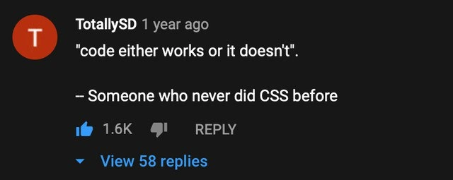
"code either works or it doesn't."
— Someone who never did CSS before
In the world of software, we often treat correctness as binary: a program either passes all tests or it fails; a function returns the expected result or it throws an error. But ask any battle-tested front-end engineer about styling a webpage and you'll get a wry laugh. This meme, formatted as a YouTube comment, highlights that the naive statement "code either works or it doesn't" completely ignores the reality of CSS. CSS (Cascading Style Sheets) is notorious for creating outcomes that are neither fully correct nor outright broken – a kind of Schrödinger's style state where a design can be simultaneously “working” and “not working” depending on your browser or context.
Why is that? Unlike a strict algorithm, CSS doesn't produce a simple pass/fail result; it defines a set of rules for browsers to cascade and interpret when rendering a page. Multiple style rules can conflict or overlap, and the final appearance emerges from the browser's rendering engine applying all those rules according to the cascade. The cascade (the "C" in CSS) determines which rules win out through specificity and source order. If one rule says a heading should be blue and another says it should be red, the browser has to decide – it's not a compile error, just a question of priority. This means you can write valid CSS that technically works (no syntax errors, the page loads) but the outcome isn’t what you expected. A more specific rule elsewhere might override your style, or a missing vendor-specific prefix means one browser ignores the rule. The result? Your code ran, the site is styled, but the design is off. Experienced devs know this feeling: the code is alive, but something is subtly wrong – thus the joke that CSS can feel haunted.
Consider browser quirks and inconsistencies. Web browsers are complex software with their own CSS layout engines (Chrome’s Blink, Firefox’s Gecko, etc.), and historically they haven’t all agreed on how to implement every CSS feature. A layout that looks pixel-perfect in Chrome could turn into a misaligned mess in an older version of Internet Explorer. Does that mean the code "doesn't work"? Not exactly – the CSS is still being applied, but due to cross-browser CSS differences or incomplete support, the end result diverges. Front-end veterans carry scars from these cross-browser battles. They remember the dark days of IE6, where a site would look great in standards-compliant browsers and utterly broken in IE's quirks mode. Even in modern times, slight differences persist – for example, form controls or default margins might render differently in Safari versus Chrome, causing a once-perfect layout to have small glitches.
And then there are CSS edge cases that defy the “either works or not” dichotomy. Perhaps you’ve encountered the infamous 1px off bug, where an element wraps to a new line on one machine but not another due to sub-pixel rounding. Or you add one more item to a flexbox container and suddenly the last item just… drops to a new row or overflows, even though everything almost fits. The page isn't completely broken – it mostly works – but it's clearly not right. In traditional code, a small mistake often causes a complete failure (an exception, a crash, a test case failing). In CSS, a small mistake or overlooked case often means the page still renders, but part of it looks wrong.
Specificity battles further complicate this. Imagine you write some CSS to make all paragraphs in .article text blue. Later on, another developer (or your past self in another file) wrote a rule targeting the same paragraphs but with an ID selector that turns them red. There’s no compiler yelling at you about a conflict. The browser silently decides the ID-based rule wins (higher specificity), and you’re left wondering why your blue text rule "isn't working". The code did run, but another piece of code trumped it. It’s not a simple on/off switch – it’s more like overlapping signals where the strongest signal wins. This can make styling feel unpredictable. No wonder many devs quip that CSS is haunted or that it stands for "Cascading Silently Failing Sheets"!
Even the way CSS handles errors defies a binary outcome. If a browser encounters an unrecognized property or an invalid value in CSS, it doesn’t throw a loud error and stop rendering. It just skips that line and moves on. Your page still appears, just without that particular style. For example:
.my-button {
border-radius: 8px; /* Modern browsers round the corners; old IE ignores this, leaving them square */
}
In modern browsers, the button gets nicely rounded corners. In older IE, the browser doesn’t understand border-radius, so it simply leaves the corners square without crashing or alerting. The code executes (the rest of the CSS still applies), but the visual effect is absent. So did the code “work”? The site is up and the button exists, but the style you wanted isn’t there – a half-success, half-failure. CSS is full of these ambiguous scenarios.
All of these factors mean that front-end developers live with a lot of gray areas. A layout might be 90% there but has one section misaligned; a CSS bug might only appear on an iPhone in landscape mode; a font might not load, causing a fallback font to disrupt the design. The meme nails this truth with deadpan humor: only someone blissfully unaware of CSS's quirks would say code either works or not. Seasoned devs know reality is messier. We’ve learned (often the hard way) that web development involves coaxing consistency out of many uncontrollable variables. It’s a shared pain point – hence the hearty developer humor response. A comment like that would get 1.6K likes and dozens of replies from developers swapping war stories of CSS that defied the binary logic, all nodding in agreement that yes, CSS can be an unpredictable beast. This collective understanding is exactly what the meme taps into: it’s funny because it’s true.
Description
A screenshot of a comment from a platform that appears to be YouTube, presented in dark mode. The commenter, 'TotallySD', posted '1 year ago'. The comment text reads: '"code either works or it doesn't". -- Someone who never did CSS before'. The comment has received 1.6K likes and has 58 replies. This meme humorously critiques the oversimplified, binary view that code is either functional or broken. The joke resonates deeply with web developers, especially those on the frontend, because CSS (Cascading Style Sheets) is notorious for its nuanced and often unpredictable behavior across different browsers and screen sizes. Unlike backend logic that might pass or fail a test, a CSS layout can be technically 'working' but visually broken in subtle ways, leading to endless tweaking and debugging. The meme serves as a validation for the struggles of frontend developers whose craft exists in a gray area far from simple true/false outcomes

Comments
7Comment deleted
For most programming, 'it works' is a boolean. For CSS, 'it works' is a temporary and fragile consensus between three different rendering engines, a dozen screen sizes, and the user's custom font settings
Backend code either passes or fails; CSS promises only eventual layout consistency - after three media queries, one !important, and a window resize under a full moon
After 20 years in tech, I've learned there are three states of code: works, doesn't work, and 'works perfectly except the submit button is 2 pixels off in Safari on iPhone 12 mini in landscape mode with dark mode enabled during a full moon.'
Ah yes, the classic binary worldview - before CSS teaches you about the quantum superposition of 'working', 'not working', and 'works perfectly in Chrome but explodes in Safari'. CSS is where deterministic thinking goes to die, one z-index layer at a time. It's Schrödinger's stylesheet: simultaneously correct and broken until observed in production across 47 different viewport widths
CSS’s CAP theorem: Cross-browser, Accessible, Pixel-perfect - pick two; the third is “eventually consistent” in Chrome at 100% zoom
CSS is our only ‘eventually consistent’ system - converges in Chrome, partitions in Safari, and hits split‑brain at 125% zoom
Backend: if(works) deploy(); CSS: if(works && !safari && width>1024px && no_zoom) maybeDeploy();