Skip to content
DevMeme
3420 of 7435
CSS Commits Flag Crimes
Frontend Post #3753, on Sep 27, 2021 in TG

CSS Commits Flag Crimes

Why is this Frontend meme funny?

Level 1: Wrong Instructions

This is like telling someone to draw a flag, but your instructions accidentally say, "Make the star part as thin as a ruler and stretch the stripes across everything else." They follow the instructions perfectly, and the result looks ridiculous. The joke is that CSS often feels like that: the computer obeys you, but what you wrote was not quite what you meant.

Level 2: The Browser Obeyed

CSS is the language used to style web pages. It controls colors, spacing, sizes, alignment, fonts, and layout. In a simple case, CSS might say that a box should be red, 200 pixels wide, and placed on the left.

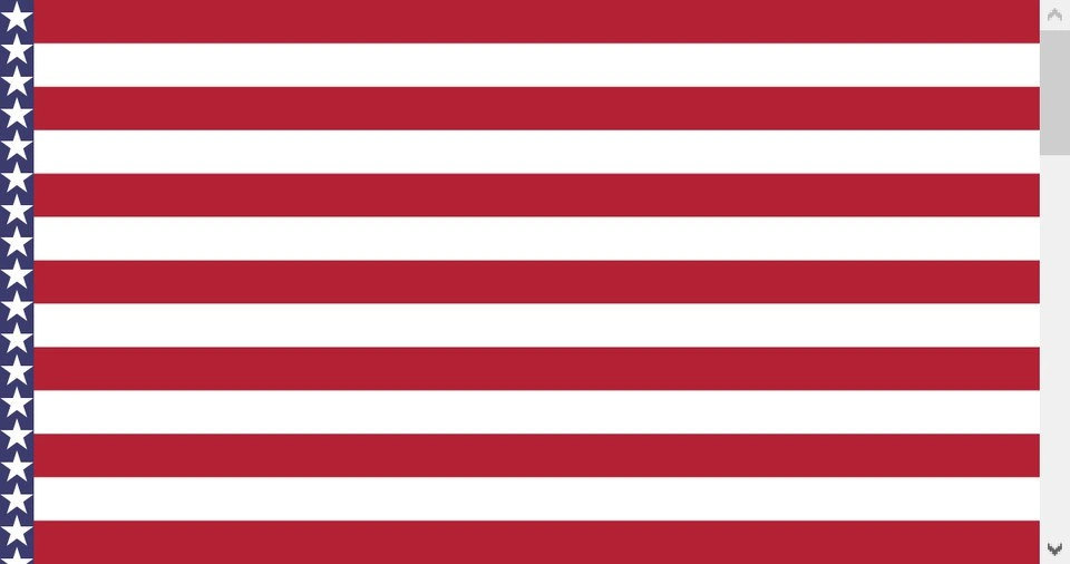
The image looks like someone tried to build or display a flag with CSS, but the layout rules made the blue star area far too narrow. The stripes are still horizontal and the stars are still visible, so the page is not completely broken. The problem is that the pieces are arranged in the wrong proportions.

This kind of bug can happen with:

  • Flexbox, when items stretch or shrink in unexpected ways
  • CSS Grid, when columns or rows are defined incorrectly
  • Percentage widths, when the parent element is not the size you assumed
  • Absolute positioning, when an element is anchored to the wrong container
  • Missing aspect-ratio constraints, when an image-like layout must preserve shape

That is why frontend debugging often means inspecting boxes rather than just reading code. The browser may be doing exactly what the CSS says, while the developer meant something else. The mismatch between "valid rules" and "correct design" is where the joke lives.

Level 3: Layout Treason

The image has no overlaid text, but the caption gives the setup:

When your css considered as terrorist

The visible result is a United States flag rendered wildly wrong: the red and white stripes stretch across the full width, while the blue field with stars has been squeezed into a skinny vertical strip on the far left. It is recognizable enough to identify the intended design, but broken enough that the joke immediately reads as CSS did something unforgivable.

This is classic frontend pain because CSS can produce a page that is technically valid while visually absurd. The browser did not crash. The DOM probably exists. The elements rendered. The screenshot may even pass a naive "is something on screen?" check. But the layout is semantically destroyed: the stars belong in a rectangular canton, not a vertical bookmark, and the proportions are the whole point of the object.

The meme hits a real gap between markup structure and layout behavior. A developer might create separate elements for stripes and a star field, then rely on position, width, height, display: flex, grid-template, or percentage sizing to put them together. One wrong parent dimension, missing box-sizing, unexpected align-items: stretch, bad absolute positioning, or confused aspect-ratio rule can turn a recognizable design into a national-symbol incident report.

Frontend engineers know this specific flavor of humiliation. CSS bugs are often not loud failures; they are quiet betrayals. A backend exception gives you a stack trace. A database constraint tells you which rule was violated. CSS just looks at your carefully nested elements and says, "I interpreted the cascade correctly. Perhaps you meant this flag to have a sidebar." Very helpful. Very normal. Nobody panic.

The distorted flag also captures why responsive design is harder than screenshots make it look. Layouts are not static pictures; they respond to viewport size, content length, font metrics, device pixel ratios, and inherited styles. Something that looks correct at one width can collapse at another if the relationships between elements are not explicit. Flags, logos, charts, dashboards, and form controls all punish vague sizing because their meaning depends on proportion.

The caption's exaggerated accusation works because CSS feels guilty even when it is following the rules. The language is declarative: you describe constraints and let the browser solve the layout. That is powerful, but it means the final result emerges from many interacting properties: cascade order, specificity, inheritance, formatting contexts, replaced elements, intrinsic sizes, and browser defaults. When those interactions go wrong, the output can feel less like a bug and more like the page found a legal loophole.

Description

The image shows a distorted version of the United States flag: red and white horizontal stripes fill most of the canvas, while the stars are squeezed into a narrow vertical blue strip on the far left instead of sitting in a rectangular canton. There is no overlaid text in the image itself, but the sibling metadata caption says, "When your css considered as terrorist." The joke is that a broken CSS layout has mangled a recognizable national symbol into something visibly wrong. For frontend engineers, it evokes the familiar pain of flex, grid, positioning, or sizing rules producing a layout that is technically rendered but semantically disastrous.

Comments

3
Anonymous ★ Top Pick Some layouts fail gracefully; this one fails with an incident report from the design system.
  1. Anonymous ★ Top Pick

    Some layouts fail gracefully; this one fails with an incident report from the design system.

  2. @qtsmolcat 4y

    T h i c c

  3. @azizhakberdiev 4y

    UAS

Use J and K for navigation