The CSS Centering 'Solution' to End All Solutions
Why is this Frontend meme funny?
Level 1: Put It in the Middle
Imagine you’re trying to hang a picture exactly in the center of a wall, but you’re not sure how best to do it. One person tells you to measure the same distance from each end of the wall. Someone else says to use a level to get the height just right in the middle. Another suggests using tape on all sides to guide your placement. In the end, you use every single method at once: you measure from the left and right, from the ceiling and floor, draw crosshair lines, use a level, glue, nails, and even some tape for good measure – all just to hang one picture in the middle. It’s total overkill, and it looks pretty silly, but hey, the picture is centered! In this meme, the developer did the same thing with code: they used every tool and trick available in CSS to center something on a webpage. It’s funny because you really only need one good method, but sometimes when you’re frustrated and not sure which one will work, you end up trying them all. The end result is a bit ridiculous, and that’s why it makes people laugh – we’ve all had moments where we throw everything at a simple problem just to finally get it right in the middle.
Level 2: Every Trick in the Book
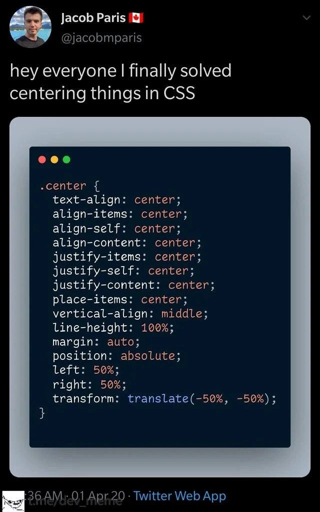
The meme shows a block of CSS code with a .center class that contains virtually every possible centering technique a web developer might know. To a newcomer in web development, this looks both confusing and funny – it’s like someone tried all the tricks in the book simultaneously. Let’s break down what each of these CSS properties actually does, and why there are so many ways to "center" things:
text-align: center;– This centers inline content (like text, images, or inline-block elements) horizontally within its parent block. For example, if you have a<p class="center">Hello</p>and apply this rule to the parent container, the text "Hello" will be centered between the left and right sides. This property is great for centering text, but it won’t vertically center anything, nor will it center a standalone block element on the page by itself.margin: auto;– Usingmargin: auto(typically on the left and right) is the go-to method to center a block element horizontally within a container. For it to work, the element usually needs a defined width (otherwise it will just stretch out). For instance, to center a<div>in the middle of the page, you might give the div a width (saywidth: 300px;) and then setmargin-left: auto; margin-right: auto;(or simplymargin: 0 auto;shorthand) – this makes the left and right margins automatically expand equally, pushing the div into the center. In the meme’s code,margin: auto;is listed (without specifying sides), which in CSS means all four margins are auto. That horizontally centers the element (if width is set), and also would attempt to vertically center within any available vertical space (though auto top/bottom margins only work in certain situations like flexible containers).vertical-align: middle;– Despite its name, this doesn’t arbitrarily center any element vertically on the page. It only has an effect on inline-level elements or table cells. For example, if you have an<img>next to some text, and you want the image to align vertically with the text’s middle (rather than the baseline), you’d usevertical-align: middleon the image. Or if you have content inside a table cell<td>,vertical-align: middlewill center that content top-to-bottom within the cell. Outside of those contexts, this property won’t do anything. Beginners often try to use it on a normal block element and get perplexed when nothing moves.line-height: 100%;– This one is a bit subtle. It’s not directly a centering property, but it can be used as a hack to vertically center text. If you have, say, a<div>of a certain fixed height and you put a single line of text in it, setting theline-heightequal to the container’s height will make that text sit vertically centered (because the text’s line box is as tall as the container). In the code,line-height: 100%;is probably intended to make a single line of text take up 100% of the container’s height, thus centering it vertically. However, using a percentage for line-height can be confusing – often you’ll see something likeline-height: 200px;if the container is 200px tall.100%would just match the current font size’s line-height by 100%, so unless it’s nested in a context where 100% equals the container height, this line might not do what the author expects. It’s another hint that this code is more for comedic effect than for actual use.align-items: center;– Now we get into modern CSS layout territory. This property is used on a flexbox container or grid container to center items along the cross-axis. In plain terms, if you have a flex container (by doingdisplay: flex;on a parent element),align-items: center;will align the child items in the perpendicular direction to the flex flow. Commonly, if your flex container is a row (horizontal direction),align-items: center;will vertically center the items within that row. If the flex container is a column (vertical stack),align-items: center;will horizontally center the items. In short,align-items: centercenters things vertically in a typical horizontal flex layout. It’s very useful for centering content inside a navigation bar or aligning icons next to text. But remember, it only works ifdisplay: flex(ordisplay: grid) is applied to the parent. In the.centerclass from the meme, they didn’t explicitly includedisplay: flex;– which is a funny oversight that underscores the point: the person just tossed in everything that said "center" without even the necessary context for some of them.justify-content: center;– This is the sibling to align-items. On a flex container,justify-contentcenters items along the main axis. If your flex container is a row,justify-content: center;will center items horizontally (left-to-right). If it’s a column flex, it will center items vertically (top-to-bottom). Essentially, for a typical use (row flex container), combiningjustify-content: center;withalign-items: center;will perfectly center the child elements both horizontally and vertically inside the container – a very common pattern for centering a single item or a group of items. The meme’s code includes both, which is exactly what you’d normally do in a flex container scenario (again, assumingdisplay: flex). For grid containers,justify-contenthas a similar role (controlling spacing of grid items horizontally if the grid is smaller than its container).align-self: center;– This property applies to an individual flex or grid item. If one particular item needs to be centered on the cross-axis (overriding the container’salign-itemsfor that one item), you can putalign-self: center;on that item. For example, if most items are top-aligned but you want one item to be centered vertically,align-selfcan adjust that single item. In the meme’s context, includingalign-self: center;in the.centerclass would mean if the.centerclass is applied to an item inside a flex or grid container, that item should center itself within the flex line or grid cell. It’s probably in the list because it has "align" and "center" in it – our overzealous centering hero wasn’t taking any chances!justify-self: center;– Similar idea to align-self, but for the main axis in a grid container. In CSS Grid, you can control an individual grid item’s alignment within its grid area usingjustify-self(horizontally) andalign-self(vertically). Sojustify-self: center;will center that one grid item left-to-right in the space it’s allowed (if the grid cell is wider than the item, for instance). Again, seeing it in this list is part of the “include everything” strategy.justify-items: center;– This one is specific to CSS Grid (and also works in multi-line flexbox contexts).justify-items: center;on a grid container will make all the grid items center themselves within their grid cells horizontally. It’s like telling every child, “center yourself within your own column.” This only has effect in Grid layout (flexbox doesn’t usejustify-itemsfor individual items; flex items usejustify-contenton the container ormargin: autotricks on the item for individual centering). In many cases, you might use eitherjustify-itemsorjustify-contentdepending on whether you want to center the content of each cell or the collective group of items.align-content: center;– Yet another related property, but this one only matters if you have extra space in the container with multiple lines of content. For example, if a flexbox has wrapped onto multiple rows, or a grid has extra space in the overall container (more space than the grid tracks need),align-content: center;will center the whole block of content within the container vertically. Think of it like centering the pack of items as a whole, as opposed toalign-itemswhich centers each item within its row. People sometimes confusealign-contentvsalign-items– basically,align-contentwon’t do anything unless there’s unused space in a flex or grid container with multiple rows or columns of items. In the.centerclass listing, includingalign-content: center;is just covering another base: “maybe I need to center the group of lines as a whole.”place-items: center;– This is a shorthand that combinesalign-items: center; justify-items: center;in one declaration (used in CSS Grid layouts). By sayingplace-items: center, you’re telling the grid container “center all items horizontally and vertically within their cells.” It’s a concise way to do what you’d otherwise do with two lines. Seeing it alongside the explicitalign-itemsandjustify-itemsis redundant, which is again part of the joke – the author threw in the shorthand and the longhand versions just to be absolutely sure!position: absolute;– This takes the element out of the normal document flow and positions it relative to the nearest ancestor that is positioned (i.e., an ancestor withposition: relativeorabsoluteorfixed). Once an element isposition: absolute, you can use coordinates liketop,left,right,bottomto place it exactly. In many classic centering techniques, a parent container is set toposition: relative;and the child element (like a modal dialog) is set toposition: absolute; top: 50%; left: 50%; transform: translate(-50%, -50%)to perfectly center it. By using absolute positioning, you’re basically saying “I will manually place this element somewhere,” and then by setting left/top 50% you move it to the middle of the parent. In the code screenshot, they usedposition: absolute;in combination with left/right 50%. Without also specifyingtop: 50%, that code by itself wouldn’t vertically center – which again underscores that this isn’t meant to be an actually working snippet, but rather a collection of centering ingredients thrown into the pot. If.centerwas meant to be applied to a child element, one would expecttop: 50%there too. The omission oftop: 50%is likely an oversight for realism but might be intentional to avoid actually centering text off-screen in the demo – regardless, it’s part of the comedic chaos.left: 50%; right: 50%;– Normally, to center an absolutely positioned box, you’d setleft: 50%and then use a negative translate to shift it back by half its width. Setting both left and right to 50% is unusual. In CSS, if you absolutely position an element and give both left and right, you’re essentially defining its position from both sides. If the element has an inherent width, the browser will try to satisfy both constraints, which could compress the element or frankly just break the usual logic. In effect, specifying both could either be ignored or make the element stretch. It’s not a typical practice to use left and right together like that for centering; usually it’s left:50% (and maybe top:50%). The meme likely includedright: 50%purely as overkill (“centering from the other side too!”). It’s the equivalent of wearing both a belt and suspenders (and maybe also glueing your pants to your waist) – totally unnecessary if one method works, but played for laughs here.transform: translate(-50%, -50%);– This goes hand-in-hand withleft: 50%; top: 50%in the traditional absolute centering technique. The values-50%, -50%mean “move this element left by 50% of its own width and up by 50% of its own height.” This counteracts the fact that when you settop: 50%; left: 50%;, you’ve placed the top-left corner of the element at the center of the parent. To actually center the whole element, you shift it back by half of itself. It’s a brilliant little trick that centers an element both horizontally and vertically regardless of its size. In the.centercode, they includedtransform: translate(-50%, -50%)(in purple text, as shown) which implies they intended to use the absolute positioning method. However, withright: 50%instead oftop: 50%, this would actually only adjust one axis properly. It’s one more sign that the code isn’t meant to be perfectly logical – it’s a caricature of real code.
Whew! That’s a lot of properties – and that’s exactly the point. The meme is funny to developers because no one would realistically use all these declarations together. Instead, you’d pick the one or two that fit your situation. The .center class in the joke is like a kitchen sink of centering approaches, covering legacy methods, modern CSS Flexbox/Grid techniques, and clever hacks all in one place. It highlights how something as seemingly simple as centering has multiple different solutions in CSS, each one applicable in a different scenario or era:
- If you just want to center text or inline elements horizontally, use
text-align: centeron the parent. - If you want to center a single block element horizontally in its container, use
margin: autoon that element (with a set width). - If you want to center things both horizontally and vertically and you can use modern CSS, you’d typically go with making the parent a flex container (
display: flex;) and thenjustify-content: center; align-items: center;(which together center child elements in both axes). Or if using grid,display: grid; place-items: center;. - If you have an absolutely positioned element (like a popup or overlay), use the
top: 50%; left: 50%; transform: translate(-50%, -50%)trick (and make sure the parent isposition: relativeorfixedaccordingly).
The reason so many different properties exist is that CSS layout has evolved over time. Early on, the concept of vertical centering was not well directly addressed for general use – you only had it in table layouts or via line-height tricks. As web development advanced and designs became more complex, the standards introduced new layout modes (like flexbox in CSS3 around 2012, and grid in 2017) that make centering much easier. But of course, all that old stuff (text-align, etc.) still exists for backward compatibility and because it’s still useful in the right context. So developers today sort of need to know a bit of everything: the old-school methods for maintaining older projects or specific cases, and the modern methods for new projects.
The humor of this tweet resonates especially with front-end developers who have struggled with a frontend frustration meme like this in real life. Many of us have vivid memories of trying to center a login form or a loader icon, and what should be a one-liner turns into 30 minutes of googling and tweaking. It’s practically a rite of passage in learning CSS. In fact, “How do I center a div?” is an extremely common question from beginners – so common that it’s become an inside joke on its own in the web community. Tutorials and Q&As often cover it, but until you grasp why one method works in one situation and not another, you might find yourself just pasting multiple code snippets together hoping the combo will magically work. That’s exactly what this .center class looks like: a copy-paste collage of every centering method, thrown together.
In simpler terms: the meme is pointing out that centering in CSS has historically been confusing enough that one might as well use every single command that has “center” in its name and pray it works. It’s funny because it exaggerates a real feeling – the desperation and confusion when your layout isn’t doing what you expect. But it’s also a tiny bit educational: reading through it, you can actually learn the names of all these different CSS properties. In a way, it’s a checklist of things you eventually encounter as you dive deeper into CSS. A junior dev might not know what place-items or justify-self means yet, but seeing them alongside the more familiar text-align and margin: auto can spark curiosity. And a senior dev will immediately recognize the mix and likely chuckle, remembering the times they used each of those in various projects over the years.
So, if you’re new to CSS and feeling overwhelmed by this .center { ... } block, don’t worry – you’re not actually supposed to use all of those at once! The meme is a joke, riffing on the fact that there are many ways to center things depending on context. In practice, you usually pick a method that suits your layout:
- For modern layouts, using flexbox or grid is usually the cleanest way.
- For text,
text-alignis your friend. - For older layout needs or specific cases, you might dip into the older approaches.
The key takeaway (and why developers find this funny) is that something so fundamental shouldn’t have been this complicated, but it was, up until recent years. Now we have better tools, but the legacy of confusion lives on in our collective memory (and in jokes like this). It’s a prime example of FrontendHumor that turns a real frontend pain point into a laugh. And if nothing else, reading the .center class from this tweet gives you a whirlwind tour of CSS centering techniques – a snippet of code that’s packed with history and humor at the same time.
Level 3: Grand Unified Centering
"hey everyone I finally solved centering things in CSS"
This tongue-in-cheek tweet by developer Jacob Paris is practically a museum exhibit of CSS alignment techniques. The image (a Twitter screenshot meme) shows a .center class stuffed with nearly every known centering trick from the history of web development. The author’s triumphant tone is ironic: centering elements in CSS has long been a notorious frontend pain point, and here he solved it by throwing in everything but the <center> tag. The humor comes from the sheer overkill. It’s a grand unified theory of centering – a single class that mashes together old hacks, new properties, and redundant rules in one gloriously absurd snippet. Front-end engineers see this and chuckle (or groan) because they’ve been in those shoes, copying snippets from Stack Overflow and docs, trying one alignment property after another when the first few attempts don’t work. This meme taps into that collective frustration and exaggerates it until it becomes developer humor.
Under the hood, each property in the .center class has a specific context where it’s the right way to center something – but using all of them at once is hilariously wrong. It’s like an archaeological dig through the layers of CSS layout history:
Early era:
text-align: center;was one of the first methods, centering inline content (like text or images) inside a parent block. Back in the day of static pages, this handled horizontal centering of text. For vertical centering, we had the elusive duo ofline-heightandvertical-align: middle;– workable only in specific scenarios (like centering text within a known height line box or using table cells). They were finicky and often misunderstood. Many a junior dev triedvertical-align: middleon a plain<div>and scratched their head when nothing happened, unaware it only affects inline-level or table cell elements.CSS2 era:
margin: auto;entered the scene as a way to center block elements horizontally within a container – famously used to center fixed-width layouts (like a 960px wide<div>centered in the page). It felt almost magical: by setting left and right margins to auto (and giving the element a width), the block would evenly distribute leftover space and sit in the middle. But this only covers horizontal centering. Vertical centering remained a tougher nut to crack in pure CSS for a long time (often solved with ugly hacks like extra wrapping elements, JavaScript calculations, or resorting to tables).The dark times & workarounds: Before modern layout systems matured, one go-to “solution” was absolute positioning coupled with transforms – which we see in the snippet as
position: absolute; left: 50%; right: 50%; transform: translate(-50%, -50%);. This is a clever math trick: placing the element’s left and right edges at 50% essentially pins it roughly center, and thentranslate(-50%, -50%)shifts it up and left by half of its own width and height, landing it dead center. It’s a bit like solving a puzzle: you move an item to the midpoint of the container, then offset it by half of its own size. This absolute centering hack was a staple for centering pop-ups or modals on screen, especially once Internet Explorer and others standardizedtransform. But it’s fundamentally different from the other methods: it requires the parent to beposition: relative(not shown in the meme) and removes the element from normal document flow. In real projects, you’d not mix this with more modern approaches unless you needed to support some quirk. The meme including bothleft: 50%;andright: 50%;is part of the joke – normally you’d usetop:50%; left:50%together. Writing both left and right at 50% is overzealous and actually nonsensical (it would squish or confuse the layout engine). It’s as if the developer is double-ensuring horizontal centering: “Go 50% from the left and 50% from the right, just to be sure!” It’s a playful exaggeration of how, in desperation, a dev might pile on extra rules without fully understanding them, hoping one will stick.Modern era (CSS3+): The snippet includes the holy grail of contemporary Web Development: CSS Flexbox and CSS Grid alignment properties. We see
align-items: center; justify-content: center;which are used on a flex container to center items vertically and horizontally (or vice versa, depending on flex-direction). However, interestingly, the code as shown lacksdisplay: flex;– an intentional omission for comedic effect, since without establishing a flex container those properties do nothing. The presence ofjustify-items: center;andplace-items: center;nods to CSS Grid, where you can center items in their grid cells or center the entire grid’s content with one-liners.place-items: center;is a convenient shorthand in grid to center both horizontally and vertically. The code even listsalign-self: center;andjustify-self: center;which apply to individual items inside a container, as if the author said “maybe it’s the parent that needs centering, or the child – heck, center everything!” When you see all these together, it’s a litany of alignment options from different layout systems being blindly combined. Any experienced CSS developer knows you’d never need all of these at once; the joke is recognizing each one and the context it belongs to, and laughing at the absurdity of their union in one class. It’s the CSS equivalent of using every tool in the garage to hang a picture frame: overkill born from frustration.
What makes this especially relatable is that many of us have been stuck wrestling with CSS, muttering “Why is this so hard?!” Centering a simple <div> can send a frontend developer down a rabbit hole of blog posts and documentation. Over the years, we’ve accumulated multiple ways to achieve the same visual result, each one introduced to address the shortcomings or limitations of the previous methods (or to work in a new layout context like flex or grid). The result is that a casual question like “How do I center this element?” has a dozen answers, each slightly different. Newcomers to CSS often end up confused by the variety of approaches. They might try one snippet that only works for inline elements, then another that only works if the parent is a flex container, then sprinkle in margin: auto (which fails if the element is not block or has no width), and so on. By the end, their CSS file starts looking a lot like this meme: a Franken-code of mixed techniques. This tweet exaggerates that scenario for comedic effect. It’s coding humor that also educates: if you recognize all the properties, you likely earned that knowledge through the painful process of trying them in real life. And if you don’t recognize them, well, it highlights just how convoluted something as conceptually simple as “center it” became in web design lore.
One could say this .center class is the ultimate inside joke for web developers because it’s simultaneously absurd and plausible. Absurd, because no sane project would include all these rules together. Yet plausible, because any dev who’s suffered through cross-browser CSS issues might chuckle and think, “Honestly, at 2 AM, I might try that out of pure desperation.” It reflects a shared experience in the frontend community: that one elusive perfect centering that should be one line of CSS sometimes feels like defusing a bomb with 10 wires – you keep clipping properties until it finally snaps into place. The meme also slyly celebrates how far CSS layout has come: we first needed quirky hacks and now have proper alignment tools, but the accumulation of techniques left behind a lot of tribal knowledge. The fact that this was posted on April 1st, 2020 (April Fool’s Day) is fitting – it’s a prank solution for a problem that has pranked developers for ages.
For the seasoned dev, there’s also an appreciation of how each line corresponds to a specific layout module or era, and why they exist at all. It’s not just random nonsense – it’s a checklist of “Did you try this? How about this?” that senior engineers recognize from countless troubleshooting sessions. In meetings or code reviews, we might joke about using a “shotgun approach” to solve CSS issues: here that shotgun blast hit every possible target named center. The class even includes newer grid properties alongside legacy techniques, acknowledging that even with modern CSS, some folks still fall back to the old ways if they forget the new syntax. Ultimately, the meme is funny because it’s true: centering in CSS has historically been so tricky that doing something this outrageous feels justified when you’re at your wits’ end. The collective sigh of “ugh, CSS…” becomes a laugh when we see our past struggles hyperbolically distilled into one .center class. And ironically, if you really did load this CSS, the element might actually end up centered — not because you needed all those rules, but because one of them (depending on the scenario) finally kicked in. In real life, of course, we strive for a cleaner solution. For example, in a modern layout you could center content with just a couple of lines:
/* Modern solution using flex or grid: */
.container {
display: grid; /* or display: flex; */
place-items: center; /* centers children in both axes in a grid */
/* align-items: center; justify-content: center; (for flex equivalent) */
}
This snippet above would typically achieve the same result without the madness. But where’s the fun in that? The meme isn’t trying to give best-practice advice – it’s commiserating with every developer who ever had to support an ancient browser or got stuck on a frontend quirk and ended up layering solution on top of solution. “Solving” CSS centering here is a tongue-in-cheek way to say, maybe the real center was the friends we made along the way – a playful jab at how something so central (pun intended) to page layout took years of evolving CSS specs to get right. It’s a relatable inside joke that perfectly captures the blend of exasperation and dark humor that comes with writing CSS at 3 AM.
Description
A screenshot of a tweet from user Jacob Paris (@jacobmparis) with the caption, 'hey everyone I finally solved centering things in CSS'. Below the text is a dark-themed code editor window displaying a CSS class named '.center'. The class contains an exhaustive and comical list of nearly every CSS property related to alignment, including 'text-align: center;', 'align-items: center;', 'justify-content: center;', 'margin: auto;', 'position: absolute;', 'left: 50%;', 'right: 50%;', and 'transform: translate(-50%, -50%);'. The humor lies in the notorious difficulty web developers face when trying to center elements with CSS. This code is a satirical 'kitchen sink' or 'brute-force' approach, throwing every possible centering technique at the problem, many of which are redundant or would conflict depending on the element's display context (e.g., Flexbox, Grid, or block). It's a universally relatable joke for any developer who has battled with CSS layouts
Comments
7Comment deleted
This isn't a CSS class; it's a prayer. You're not telling the browser what to do, you're just listing every centering incantation you know and hoping the browser is in a forgiving mood
The real reason we adopted CSS-in-JS: after six acquisitions, “.center” had become a compliance registry of every layout hack since Netscape - basically SOX auditing for div alignment
This is the CSS equivalent of explaining to the new hire why we have three different auth systems, two ORMs, and a jQuery plugin from 2009 that nobody dares to remove because "something in production might need it."
Ah yes, the classic 'throw every centering technique at the wall and see what sticks' approach - because why choose between Flexbox, Grid, absolute positioning, or transforms when you can have them all fight for dominance in the cascade? This is the CSS equivalent of a senior architect's 'just to be safe' comment in a PR, except here we've achieved perfect horizontal centering by setting both left AND right to 50%, which mathematically gives us... zero width. But hey, at least we covered all our bases - including that one IE6 hack someone mentioned in a Stack Overflow answer from 2009
CSS centering strategy: run Raft between Flexbox, Grid, and absolute positioning - translate(-50%, -50%) keeps getting re-elected
At this point, centering isn’t layout - it’s distributed consensus: broadcast “center” via text-align, flex, grid, absolute and transforms, then hope a quorum of rendering engines commits the div
CSS centering: the frontend monolith where every property adds a layer of tech debt, just like evolving a Perl script into a service mesh