The Uncanny Valley of Modern CSS Layouts
Why is this Frontend meme funny?
Level 1: Proud to Puzzled
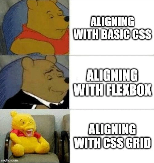
Imagine you’re trying to line up a picture in the center of a wall. At first, you just eyeball it and hammer a nail – the picture is kind of centered but not perfect (that’s like using basic CSS: it works, but it’s clumsy). Then someone gives you a special tool, like a laser level, that instantly shows where the exact center is – you hang the picture there effortlessly and feel very proud of how neat it looks (that’s like using Flexbox: the new tool makes centering super easy, and you feel fancy and accomplished). Finally, someone hands you an entire complicated toolkit with measuring gadgets and instructions to arrange a whole gallery of pictures at once. It’s very powerful, but there are so many pieces and steps that you get confused. You try to use it to hang just one picture, but end up putting extra holes in the wall and the picture is crooked. You feel totally puzzled and frustrated, sitting on the floor surrounded by tools (that’s like using CSS Grid without quite knowing how: it’s a strong tool, but it can overwhelm you for a simple task). The meme is funny because it shows that as our tools get fancier (from basic methods to Flexbox to Grid), we’d expect things to get easier or make us look even more skillful – but sometimes a super advanced tool can actually leave us more mixed-up at first. In simple terms, it’s a joke about how a web developer feels: from normal 🤨, to very confident 😏, to totally bewildered 😵 when trying to center stuff using different CSS tricks. The pictures of Pooh Bear in the meme perfectly match those feelings, making us laugh because we’ve all been there in one way or another.
Level 2: Layout Alignment 101
Let’s break down what’s happening in this meme by explaining each stage of CSS alignment in simpler terms. The meme is using Winnie-the-Pooh’s changing appearance to illustrate a front-end developer’s progression through three ways of aligning web page elements: Basic CSS, Flexbox, and CSS Grid. Each of these is a method or tool in CSS (Cascading Style Sheets) that we use to arrange things on a webpage. We’ll go through them one by one:
1. Basic CSS Alignment (Old School): This refers to aligning elements using the standard CSS properties available before Flexbox or Grid existed. In the top panel, Pooh looks plain and unenthusiastic, matching how developers feel when using these simplistic or hacky methods. Basic CSS alignment might include using things like text-align, margin, or position. For example, to center a block-level element (like a <div>) horizontally, one common trick is to give it margin: 0 auto; – this sets equal left and right margins, pushing it to the middle. But vertical centering was notoriously tricky with just basic CSS. Developers often had to get creative: for instance, making the parent container a table or using position: absolute with percentage offsets. Here’s an example of a classic “basic CSS” centering hack for an element inside a container:
/* Basic CSS centering hack using absolute positioning */
.parent {
position: relative; /* establish a containing block for absolutely positioned child */
}
.child {
position: absolute; /* remove from normal flow, position relative to parent */
top: 50%; left: 50%; /* move top-left corner to the center of parent */
transform: translate(-50%, -50%); /* adjust the element back by half its width and height */
}
In the code above, we’re literally nudging the element to the center using math (50% offsets and a translate). This works, but it feels like a workaround rather than a straightforward solution. No wonder Pooh isn’t looking excited in the first panel – aligning with basic CSS often required extra wrappers or weird CSS incantations. If you were a new developer around the 2000s or early 2010s, aligning things perfectly (especially vertically) felt like solving a puzzle every time. These are the layout_alignment_struggles many of us remember: lots of trial and error, and often consulting Stack Overflow for snippets that just center this dang element.
2. Aligning with Flexbox (Modern & One-dimensional): In the second panel, Pooh is dressed in a sharp tuxedo looking very pleased. That’s how a lot of us felt when we discovered Flexbox. Flexbox (short for the Flexible Box Layout Module) is a more modern CSS layout system designed to make aligning and distributing space among items much easier, especially in one direction (either a row or a column). If you have a navigation bar or a row of buttons you want centered, Flexbox is perfect. To use Flexbox, you set a container’s display to flex and then use properties on the container like justify-content (for horizontal alignment along the main axis) and align-items (for vertical alignment along the cross axis) to position the child elements. For example, to center a single item both horizontally and vertically, you can do this:
/* Centering content with Flexbox */
.container {
display: flex; /* turn the container into a flex container */
justify-content: center; /* center items horizontally (along the main axis) */
align-items: center; /* center items vertically (along the cross axis) */
}
That’s it – just three lines, and anything inside .container will be beautifully centered in both directions! Compared to the convoluted hacks of basic CSS, this felt almost magical. In the meme, “ALIGNING WITH FLEXBOX” corresponds to this scenario. The tuxedo Pooh image represents the developer feeling like a fancy gentleman or an expert, because Flexbox made what used to be hard (centering and aligning) extremely easy and clean. It was a huge quality-of-life improvement for web developers. Even if you’re a junior developer today, you’ve probably heard of Flexbox or used it in a tutorial – it’s everywhere in modern web design. Using Flexbox for layout might make you feel proud because suddenly you can accomplish in a couple of lines what used to take many lines of code or didn’t work consistently across browsers. It’s like upgrading from a clunky old tool to a shiny new one that “just works.” So Pooh’s smug, satisfied look in the second panel is a tongue-in-cheek way of saying “I’m fancy now, I use Flexbox for alignment.” In real life, once you learn Flexbox, you often don’t want to go back to the old methods unless you absolutely have to support an ancient browser. Flexbox is your new default for centering things in one dimension.
3. Aligning with CSS Grid (Advanced & Two-dimensional): Now, the meme takes an unexpected turn in the third panel. The text “ALIGNING WITH CSS GRID” appears next to an image of Pooh as a misshapen plush toy slumped in a chair, looking utterly confused or broken. CSS Grid is another modern layout system, introduced after Flexbox, which allows for two-dimensional layouts (both rows and columns). You might think that since Grid is newer and more powerful, it would make alignment even easier or make you feel even more accomplished. And indeed, CSS Grid can center items – it actually has a property that makes centering as simple as Flexbox’s, and it can do far more complex layouts that Flexbox can’t do as easily. But the learning curve for Grid is a bit steeper, and the meme jokes about that reality.
First, what is CSS Grid? It turns a container into a grid with defined rows and columns. You set display: grid on a parent container, define the number of columns and rows (for example, using grid-template-columns and grid-template-rows to set sizes or using shorthand like grid-template:), and then you can place child items into specific grid cells or have them span multiple cells. It’s extremely powerful for designing complete page layouts (like a gallery or a complex form) because you can position items in two directions. Aligning items in Grid involves a similar mindset to Flexbox but with more options: you have align-items and justify-items (and their -content variants) for the grid container to control alignment of items within their cells or the grid as a whole. There’s even a convenient shorthand: place-items: center; on a grid container will center each item in its grid cell (both horizontally and vertically) just like that. Here’s how you could center content with CSS Grid:
/* Centering content with CSS Grid */
.container {
display: grid; /* turn the container into a grid container */
place-items: center; /* shorthand to center items horizontally & vertically */
/* (Equivalent to align-items: center; justify-items: center;) */
}
Surprisingly simple, right? In theory, this is as easy as the flex example. So why does the meme show Pooh in total disarray for Grid? The humor comes from the fact that when developers first start using Grid, it can feel overwhelming. There are many new concepts to juggle (explicit vs. implicit grids, grid lines, spanning, etc.), and if you misuse a property, the outcome might not be what you expect. For instance, a newcomer might try to use align-content on a grid when they meant align-items, or forget that the grid container needs a height defined for align-content to have an effect. It’s easy to mix up these properties or wonder why nothing happens because the defaults differ (by default, grid items stretch to fill their cells, which might not be obvious at first). The result? A confused developer with a layout that’s almost right but a bit off — much like that poor plush Pooh who looks like he’s been through a war.
In summary, the meme is comparing three stages of mastering CSS layout:
- Basic CSS alignment – the early methods (like using margins, text-align, or weird hacks). It gets the job done but can be cumbersome. (Pooh is unimpressed/bored because this is old news and not fun.)
- Flexbox alignment – the modern, nifty way to align items easily in one direction. It’s powerful yet straightforward for things like centering, making developers feel empowered. (Tuxedo Pooh is proud and fancy, reflecting our satisfaction.)
- CSS Grid alignment – the next-gen way, capable of entire page layouts. It’s more complex, and diving into it for simple tasks can be overkill or confusing at first. (Plush Pooh is frazzled, representing how we feel when Grid’s complexity hits us unexpectedly.)
For a junior developer, the takeaway is: each of these tools has its place. Basic CSS techniques are fundamental and still useful for simple cases (e.g., margin: auto is still a quick way to center a fixed-width block horizontally). Flexbox is usually your go-to for most component-level layout needs, especially when you only need to arrange items in a row or column (like centering a button within a toolbar or spacing out menu items evenly). CSS Grid is awesome for building more complex, two-dimensional layouts – think of dividing a page into a header, sidebar, main content, and footer in a grid, or making a photo gallery with rows and columns that reflow. But if you use Grid just to center one thing, it’s like using a Swiss Army knife’s entire toolset when you only needed a single screwdriver. It can work, but it might feel confusing if you haven’t mastered the tool.
The Winnie-the-Pooh meme format adds a layer of FrontendHumor to this lesson. It’s visually showing the emotional states:
- “Okay, I’ll do it the old way” (basic CSS, not thrilled),
- “Ah, I have a clever solution!” (Flexbox, feeling classy),
- “Wait, why is this so complicated now?” (Grid, feeling defeated).
As a new developer, don’t be discouraged by the plush-Pooh stage – it’s normal! Everyone goes through a learning curve with new tech. The meme simply acknowledges with a wink that even experienced devs who feel like pros with Flexbox might find themselves humbled when they first tackle CSS Grid. Over time, you’ll likely become comfortable with Grid too (and Pooh will go back to looking classy again), but we all have that initial “grid breakdown” moment where things don’t line up and we feel a bit lost. This meme captures that shared experience in a funny, exaggerated way, using a beloved cartoon bear to remind us that learning new CSS tricks can knock you off your fancy chair – at least until you get the hang of them.
Level 3: The Alignment Paradox
On the surface, aligning elements with CSS sounds trivial, but front-end developers know it’s anything but. This meme nails a painful reality: the journey from old-school CSS techniques to Flexbox elegance to CSS Grid complexity can feel paradoxical. In the first panel, Winnie-the-Pooh sits plain and unamused with the caption “ALIGNING WITH BASIC CSS.” This represents the clunky, tedious methods we historically used for layout alignment. For years, something as simple as centering a div was infamously difficult – a running joke in WebDev circles (some say “centering a div” is right up there with cache invalidation as a hard problem). Early Frontend developers resorted to all sorts of hacks: setting mysterious margin: auto on blocks for horizontal centering, using the ancient text-align: center on container elements, or abusing line-height to vertically center text. Let’s not forget the time of table-based layouts and floats – aligning with basic CSS often meant wrestling with the cascade and weird box model quirks. Pooh’s bored expression captures how unimpressed we are by these primitive tricks (and how frustrating they were). It’s the “meh” of alignment solutions: they work, but inelegantly, and cross-browser issues (hello IE!) could still leave you hunched over your desk at 2 AM.
In the second panel, Pooh dons a tuxedo and a smug smile, captioned “ALIGNING WITH FLEXBOX.” This is the classy tuxedo Pooh persona – a step up in sophistication. The meme humorously portrays how developers feel like proper gentlemen (or gentlewomen) when using Flexbox for alignment. And honestly, CSS Flexbox was a game changer. Introduced as part of CSS3, Flexbox provided a clean, logical way to align items along one axis. No more random negative margins or JavaScript hacks – you could center a box both horizontally and vertically with just a couple of CSS rules. It felt like a superpower! Setting display: flex; justify-content: center; align-items: center; on a container would magically center its child elements. For those of us who suffered through the dark ages of <center> tags and float clearfixes, Flexbox was like putting on a tailored suit: suddenly everything lines up elegantly. The FrontendHumor here is that we feel far too pleased with ourselves when we finally master Flexbox’s properties – as if we’ve solved web design’s greatest mystery with a touch of class. The tuxedo Pooh image perfectly satirizes that overconfidence and relief. After all, using Flexbox for layout alignment is so straightforward that one can’t help but lean back smugly once all those pesky <div>s snap into place. It’s the gentleman’s choice of layout tools, leaving behind the crude bricolage of basic CSS. The meme’s second panel resonates with any dev who remembers the first time their CSS display: flex instantly did what dozens of frustrating rules failed to achieve. Flexbox turned alignment from arcane art into a refined skill – hence Pooh’s aristocratic satisfaction.
Then comes the twist: the third panel shows a disheveled plush Pooh slumped on a chair, mouth agape and eyes askew, captioned “ALIGNING WITH CSS GRID.” Here the meme throws us a curveball. Intuitively, you’d think moving to CSS Grid – a more advanced, two-dimensional layout system – would make us even more sophisticated (maybe Pooh would ascend to a higher level of class). But no: instead we get plush Pooh looking utterly defeated. This humorously illustrates a common FrontendPainPoints reality: CSS Grid, for all its power, can initially overwhelm and confuse. It’s the “ultimate boss” of layout systems — theoretically superior, yet capable of reducing a knowledgeable dev to a perplexed puddle. Why? Because CSS Grid introduces a whole new mental model. It’s not just one axis of alignment; it’s defining rows, columns, grid lines, and areas. You have to think in two dimensions, setting up a grid container with tracks (using grid-template-columns and grid-template-rows), then placing child elements onto this matrix. It’s immensely powerful for complex layouts (headers, sidebars, content areas all in one cohesive grid – no more nested flexbox hacks or weird percentage widths). But aligning items in Grid can trip you up if you expect it to behave exactly like Flexbox. For example, by default grid items stretch to fill their grid cells, and the grid container’s align-items/justify-items defaults might not center things the way align-items: center on flex does. Many of us eagerly tried Grid for the first time, only to stare in confusion when our content didn’t center or space out as expected. (Cue the plush Pooh face of “what did I do wrong?”). The meme captures that grid-induced bewilderment: we went in feeling like seasoned layout experts (after mastering Flexbox), and came out looking like we barely survived an encounter with a wild Heffalump. It’s a perfect comic exaggeration of how a Frontend pro’s confidence can crumble when grappling with new layout primitives.
The combination of these three panels creates a comedic progression that many developers find too real. It skewers the expectation that “newer = easier.” With Flexbox, alignment got easier — so we naturally assume CSS Grid, being newer and more powerful, should be easier still or at least make us feel even more accomplished. Instead, the meme suggests a regression in our emotional state: from bored (basic CSS) to smug (Flexbox) to completely wrecked (Grid). This absurd reversal is where the humor lies. It touches on the shared experience of learning curves and the humbling moments in a dev’s career. No matter how fancy our tools get, there’s always another layer of complexity waiting to knock us down a peg. The layout_alignment_struggles are real: you think you’ve mastered centering, then the paradigm shifts and you’re back to googling “how to center in CSS Grid?” at 1 AM. The punchline is that CSS Grid, which in theory lets you do everything Flexbox can do and more, somehow has us scratching our heads again. It’s not that Grid is bad – in fact, it’s brilliant – but the meme plays up the humorous disconnect between our expectations and first impressions. Think of it as the “I know Kung Fu... oh wait, no I don’t” moment for front-end devs.
Importantly, this Winnie-the-Pooh meme format accentuates each step with visual satire:
- Panel 1 (Basic CSS): Regular Pooh is unimpressed – aligning with floats, margins, or
inline-blocktricks was tedious and felt primitive. We get it done, but there’s no fanfare. - Panel 2 (Flexbox): Tuxedo Pooh exudes pride – using Flexbox makes us feel like refined wizards effortlessly solving alignment. We’re practically saying “Oh, you still use margin hacks? How quaint.”
- Panel 3 (CSS Grid): Deranged plush Pooh is falling over – attempting Grid for alignment leaves us in comic disarray. We’re overwhelmed by options (grid templates, spanning, justifying tracks) and possibly end up with elements placed in all the wrong spots. It’s the CSS Grid breakdown: we started with high hopes and ended up like a flopped teddy bear.
From a seasoned developer’s perspective, the meme also hints at choosing the right tool for the job. A senior engineer might chuckle because they know: Basic CSS alignment still has its uses for very simple things; Flexbox is ideal for one-dimensional layouts like navbars or centering a single element in a known container; and CSS Grid shines for complex two-dimensional layouts like entire page layouts or photo galleries. The plush Pooh could be seen as the dev who tried to use CSS Grid just to center a single element — effectively bringing a rocket launcher to a pillow fight, then wondering why it blew up. The irony is palpable: the most advanced tool can actually complicate a simple task if you haven’t mastered it yet. In reality, CSS Grid can center content as easily as flex (e.g. using place-items: center on the grid container), but when it first arrived, plenty of us overlooked those shortcuts and got tangled in grid lines and span rules. The meme’s comedic exaggeration taps into that collective memory of “I thought I was good at CSS until I tried Grid.” It’s a gentle poke at our Frontend ambitions — reminding us that there’s always something new to learn, and it’s okay to feel like a plush Pooh sometimes when confronting cutting-edge tech.
Description
This meme uses the three-panel 'Tuxedo Winnie the Pooh' format to comment on the evolution and perception of CSS alignment techniques. The first panel shows a standard, relaxed Winnie the Pooh next to the text 'ALIGNING WITH BASIC CSS', representing older, sometimes clunky methods like floats or absolute positioning. The second panel features a sophisticated Pooh in a tuxedo, looking pleased, paired with 'ALIGNING WITH FLEXBOX', celebrating it as a modern, elegant solution for layout. The final panel subverts the progression by showing a creepy, oddly realistic, and unsettling Pooh plushie sitting in a chair, with the caption 'ALIGNING WITH CSS GRID'. The joke lies in this unexpected final frame. While CSS Grid is an incredibly powerful tool for two-dimensional layouts, the meme humorously portrays it as something alien, overly complex, or even unnerving compared to the more readily understood elegance of Flexbox, reflecting the initial intimidation some developers feel when confronting its powerful but different mental model

Comments
9Comment deleted
Flexbox is like telling your items to stand in a neat line. CSS Grid is like handing them a blueprint for a multi-story city and expecting them to self-assemble without accidentally summoning a layout demon
After two decades in front-end: floats were duct tape, Flexbox felt tux-level, and Grid? That’s Paxos for pixels - consensus eventually forms, but only after your layout briefly looks like that last Pooh on every breakpoint
The real flex is when junior devs discover CSS Grid and suddenly their PRs look like they're solving distributed systems problems with grid-template-areas
The meme perfectly captures the existential journey every frontend developer experiences: starting with `float: left` and `clear: both` hacks, graduating to Flexbox's one-dimensional enlightenment, and finally achieving CSS Grid nirvana where you can actually center things both horizontally AND vertically without sacrificing a div to the layout gods. The third panel's smug satisfaction is what you feel when you realize you can define `grid-template-areas` with named regions and your layout just... works. No more 'why is there a 3px gap?' or 'which parent needs `display: flex` again?' It's the difference between fighting CSS and conducting it like an orchestra - though we all know that one day there'll be a fourth panel with an even fancier Pooh representing whatever replaces Grid, probably involving quantum entanglement of DOM nodes
Flexbox whispers sweet 1D nothings; Grid screams 'define every track or perish' - frontend's ultimate plot twist
Centering a div: margin:auto passes code review, Flexbox triggers the justify-vs-align bikeshedding, and Grid quietly adds implicit tracks, subgrid, and a design system RFC redefining what “center” means
Basic CSS, Flexbox, Grid: just escalating the number of ways “center” can be wrong - once auto min-size meets writing-mode, you remember tables were simpler
No one uses flexbox or grid separately, the best way is to combine them Comment deleted
Also grid is easy. Comment deleted