Peak Web Design: The Counter-Strike 1.6 CSS Framework
Why is this Frontend meme funny?
Level 1: Dressing Up Websites
Imagine you have a favorite old video game that had a really distinctive menu screen with a greenish look and chunky buttons. Now picture someone making a website that looks exactly like that game’s menu. It’s like the website is wearing a costume of that game! This is funny because it mixes something modern (a website you might use today) with something very nostalgic and old (the game style from years ago). People are joking that “we’ve hit the peak of design” – kind of like saying “This is it, folks, this goofy idea is the best thing ever, we can all go home now.” Of course, they’re not serious; they’re playfully exaggerating. The humor is a lot like seeing your friend dress up in a retro outfit from the 90s and everyone joking, “Fashion can’t get any better than this!” In simple terms, the meme is funny because someone gave a website a video game makeover, and that mash-up is so over-the-top that web designers are jokingly saying, “Welp, we’ve done it all. Nothing more to add to design – we’re finished here!” It’s a light-hearted laugh at how creative and crazy web ideas can get, combining our love for old games with our daily world of websites.
Level 2: Counter-Strike Meets CSS
For a newer developer or someone outside the joke, here’s what’s going on: Counter-Strike 1.6 is a classic first-person shooter video game from the early 2000s, and its menu screens have a very distinct look – think dark olive-green panels, simple gray buttons, and pixelated text. Now, a developer has created cs16.css, which is basically a CSS framework (a collection of styling rules) that makes your website elements look just like those Counter-Strike menus. In other words, it’s a themed stylesheet. If you attach this CSS file to your webpage, all your buttons, checkboxes, input fields, etc., will suddenly appear as if they are part of that game’s user interface.
Let’s break down some terms. CSS stands for Cascading Style Sheets, and it’s the language used to style the appearance of web pages (colors, layouts, fonts, all the visual stuff). A CSS framework or library is a pre-built set of CSS rules that you can use so you don’t have to start styling from scratch. Popular CSS frameworks you might’ve heard of include Bootstrap or Tailwind CSS, which help create clean, responsive designs easily. But unlike those serious, general-purpose tools, cs16.css is a novelty_css_framework – it’s more for fun and nostalgia than for building the next corporate website. It’s similar in spirit to other theme-based CSS libraries (for example, there’s an NES-themed one that makes your site look like an old Nintendo game, and a Windows 98 one that mimics retro OS windows). These are usually side projects or jokes by developers to show what CSS can do. They aren’t really meant to replace standard designs, just to amuse and perhaps spark some creativity.
The meme text says: “Someone made a counterstrike 1.6 CSS framework. Design is over, we have reached peak.” This is a tongue-in-cheek way of saying “Wow, they even made a CSS theme for Counter-Strike’s UI. That’s it, we’ve done it all – web design has peaked (and it’s kind of hilarious)!” The phrase “reached peak” is often used in jokes to mean the most extreme or ultimate example of something. In tech satire and meme culture, developers might say “peak JavaScript” or “peak frontend” when they see a ridiculously over-the-top library or use-case, implying the trend can’t go any further. Here, making a web framework from a nostalgic video game interface is seen as the ultimate, slightly absurd pinnacle of frontend theming. It combines the world of modern web development with a GamingReference from many people’s childhood or teen years.
Why is this funny to frontend developers specifically? A big reason is framework fatigue. In the frontend world, there’s a running joke that there’s a new JavaScript or CSS framework every day. It’s hard to keep up, and many devs feel a bit overwhelmed by how often they’re told to try the “next big thing.” Seeing something as outrageous as a Counter-Strike 1.6 CSS theme pokes fun at this – like, if we even have that, then maybe we’ve gone a bit overboard with making new frameworks. The meme exaggerates that feeling in a humorous way. It suggests that instead of focusing on new useful design ideas, people are just theming things after video games now, so maybe we’ve run out of ideas or taken it to a silly extreme.
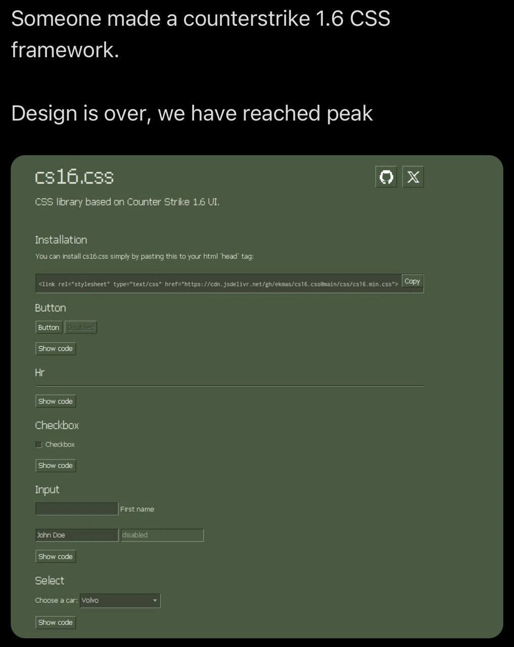
The image shown in the meme helps make it clear. It’s demonstrating the cs16.css library in action. The background is that signature dull green color (veteran Counter-Strike players will instantly recognize it). We see examples of UI components: a Button and a grayed-out Disabled button styled just like the game’s buttons, a horizontal line (<hr>) that looks like a separator you’d see in the game menu, a Checkbox with its label, some Input text fields including one with placeholder text “First name” and another filled with “John Doe” and disabled (grayed out), and a Select dropdown saying “Choose a car: Volvo” with a down-arrow. Even the little icons at the top of the demo panel (a minimize “_” and a close “X” button in small squares) mimic the old-school window controls from the game’s interface. All of these elements are standard HTML elements; they’re just wearing Counter-Strike’s UI skin thanks to the magic of that CSS file.
To paint a clearer picture: normally, if you write HTML like <button>Click me</button>, it will look like a generic button based on the browser’s default style (which is usually pretty plain). If you link the cs16.css stylesheet in your page’s <head>, that same <button> will suddenly get a dark green background, a blocky gray border, and light green text – just like a “Buy” button in Counter-Strike’s menu. The text font might even change to match the game’s vibe. The checkbox (<input type="checkbox">) will probably get a custom style too (perhaps a tiny green checkbox with a checkmark that fits the theme). So essentially, this CSS file is skinning your webpage elements to look like a particular game’s UI.
Now, the reason people joke “Design is over” is not because this design is the most beautiful ever (it’s actually very retro and clunky by today’s standards), but because it’s such an outlandish thing to do that it feels like there’s nowhere further to go. It humorously implies “we’ve designed everything imaginable, even our forms now look like a 2000-era shooter game, so let’s call it a day.” Of course, in reality design is always evolving, but the joke exaggerates that sentiment for comedic effect.
This meme falls into categories like Frontend humor and TechSatire because it’s specifically making fun of the trends in frontend development. It also has that GamingReference which is why it’s resonating with devs who grew up with games. If you haven’t played Counter-Strike 1.6, think of it like this: it’s as if someone made a theme to turn a modern app’s interface into the look of an old classic game or software. It’s funny in the same way dressing up a new smartphone in a giant retro phone case would be funny – it’s mixing eras and contexts in a playful way.
To a junior developer, the takeaway is: yes, developers really do these kinds of novelty projects! It shows how flexible CSS is (you can mimic almost any look with enough skill) and also how playful the developer community can be. We make serious frameworks, but we also make joke ones to entertain ourselves and each other. It’s a form of commentary on our own industry. The framework fatigue part is important: newbies should know it’s okay to feel overwhelmed by the sheer number of tools out there – even seasoned devs find it absurd sometimes, which is why they create or share memes like this.
In summary, Counter-Strike meets CSS is a perfect storm of nerd humor: it requires knowing a bit about front-end (so you understand what a CSS framework is) and knowing the game reference (so you get why that specific UI appearance is funny/nostalgic). It underscores how in web development, trends can sometimes produce delightful absurdities. And while no, this doesn’t mean actual web design has stopped, it’s a lighthearted joke that for one day, the community crowned a silly theme as the king of design just because it made everyone laugh and reminisce.
Level 3: Nostalgia as a Service
At this point, front-end development has officially gone full circle (and maybe a bit off the rails). Someone turned the Counter-Strike 1.6 UI into a CSS framework, and experienced devs are both amused and unsurprised. Why? Because we've seen an explosion of CSS frameworks over the years – from serious design systems like Bootstrap and Material UI to tongue-in-cheek throwbacks like 98.css (Windows 98 style) or NES.css (8-bit Nintendo style). A Counter-Strike 1.6 theme is the latest entry in this hall of fame, blending gaming nostalgia with web design. The meme’s punchline "Design is over, we have reached peak" satirically declares framework fatigue has hit its zenith: when even a 20-year-old video game menu becomes a reusable style library, what more could possibly be left to theme?
This humor resonates with senior developers because it exaggerates a real feeling in the industry. Every other week there's a shiny new front-end library, a new way to style buttons or layout pages. Eventually, it’s peak absurdity – like we’re saying, “Alright, we’ve themed everything, pack it up guys.” The image shows a demo page styled in drab green, pixelated fonts, and tiny HUD-like icons exactly like the Counter-Strike menu from around 2003. This hyper-specific detail is hilarious: the UI/UX of Counter-Strike 1.6 was functional for a game, not exactly a pinnacle of modern web design. It had a chunky, utilitarian look meant for quick settings changes between virtual gunfights. Recreating that look on a webpage is a quirky form of tech nostalgia. It’s the web equivalent of modding your modern car to look like a 90s arcade cabinet – utterly impractical but delightfully nerdy.
The senior-perspective joke here is also a wink at how developers idolize their programming youth. Many of today’s devs grew up playing Counter-Strike in school labs or at LAN parties late into the night. Seeing a CSS library that makes a form input look exactly like those old game menus triggers a double-take and a chuckle. It’s both a genuine “Oh wow, I remember that!” and a sarcastic “Of course someone did this… what won’t we turn into a framework?” After surviving trends like skeuomorphic design, flat design, Material Design, and countless JavaScript frameworks du jour, veteran devs have a bit of dark humor about the next “big thing.” Here the “big thing” is ironically a blast from two decades past. The phrase "Design is over" is them saying: we've hit the ultimate ironic milestone; web design innovation can officially rest in peace now that we’ve crowned a gaming reference as king.
Under the hood, cs16.css is likely just a stylesheet that overrides normal HTML elements with Counter-Strike’s color scheme and typography. It’s not solving any real problem except giving your webpage that tactical 1990s hacker vibe. And that’s the beautiful irony – after years of chasing pixel-perfect, mobile-responsive, ARIA-accessible, sleek modern UI, some dev said “forget all that, let’s party like it’s 1999 (literally)”. The community’s reaction isn’t to adopt this seriously, but to share a laugh. It satirizes our tendency to create a package or library for absolutely everything. When a novelty_css_framework like this hits front page of developer forums, seniors smirk and say “Peak frontend, folks!”. It’s the same energy as joking that we’ve seen Doom run on every device imaginable – once you run Doom on a pregnancy test or Minecraft inside Minecraft, you humorously claim computing can’t get any crazier. Likewise, once we have a CSS theme for Counter-Strike 1.6’s HUD, web design has reached its comedic apex.
Of course, behind the laughter is a tiny kernel of truth: developers really do get framework fatigue. Keeping up with every new tool or style trend is exhausting. The meme gives a cathartic outlet – we’re collectively laughing at how ridiculous it can be. It’s a subtle nod to how over-engineered front-end sometimes feels. In an era when new CSS-in-JS libraries or design systems drop weekly, a completely off-the-wall framework like cs16.css is both a parody and a palate cleanser. It reminds us that not every new thing is serious – some are just for fun, and that’s okay. In fact, the existence of this project is almost comforting to jaded devs: it says “Yes, the hype cycle is ridiculous, but we can still have fun with it.” The GamingReference serves as the sugar to make the TechSatire go down easy. After all, who wouldn’t crack a smile seeing a modern web form skinned like the menu where they once frantically clicked “Buy Kevlar” before a match? Developers share a collective memory of that olive-green interface, so using it in a new context is absurd in the best way.
In summary, the senior-level insight is that this meme isn’t just about one silly CSS file – it’s poking fun at the entire culture of endless front-end frameworks and our love of nostalgic mashups. It captures the “too much of a good thing” phenomenon: when you have so many tools and themes that you start doing things that are hilariously unnecessary. And it bonds the community through a shared history (gaming) and a shared pain (framework overload). As seasoned devs, we laugh because we recognize ourselves in both the fatigue and the folly. Peak reached? Probably not – give it a week and someone will make a Half-Life 1 Lambda-themed React component library. But for now, we raise a virtual toast (or flashbang?) to the absurd glory of cs16.css, the framework nobody asked for yet everyone chuckled about.
<!-- Including the Counter-Strike 1.6 themed CSS from a CDN -->
<link rel="stylesheet" href="https://cdn.jsdelivr.net/gh/ekmas/cs16.css@main/css/cs16.min.css">
<!-- Now all standard HTML elements on this page will don the classic CS 1.6 look -->
<h1>cs16.css Demo</h1>
<button>Button</button>
<button disabled>Disabled</button>
<!-- A horizontal rule, just like in the game menu -->
<hr>
<label>
<input type="checkbox"> Checkbox
</label>
<p>Input</p>
<input type="text" placeholder="First name">
<br>
<input type="text" value="John Doe" disabled>
<p>Select</p>
<select>
<option>Choose a car: Volvo</option>
</select>
<!-- Each element above gets styled in army green, low-res glory.
It's like your web page is wearing Counter-Strike's uniform. -->
Description
The image is a screenshot showing a humorous declaration about a niche CSS framework. At the top, white text on a black background proclaims, 'Someone made a counterstrike 1.6 CSS framework.' followed by 'Design is over, we have reached peak'. Below this, the main content is a view of a webpage with a muted, olive-green background, showcasing the 'cs16.css' library. The page demonstrates various HTML UI elements like buttons (active and disabled), checkboxes, input fields, and a select dropdown, all styled to perfectly mimic the classic, somewhat clunky graphical user interface of the video game Counter-Strike 1.6. The font is pixelated and simple, and the components have a distinct, retro feel. The technical humor stems from the nostalgic and absurd act of creating a modern web framework based on a 25-year-old game's UI, ironically presenting it as the pinnacle of design in an industry saturated with sleek, minimalist frameworks. It's a self-aware joke for developers who grew up with the game and understand the contrast between this retro aesthetic and current design trends

Comments
14Comment deleted
This is the perfect UI for a startup's MVP dashboard. It clearly communicates, 'We rush B with feature deployments and have no time to defuse the tech debt.'
Adopted cs16.css today - accessibility took a headshot, but the bundle is lighter than Tailwind plus three design-token layers, so the PR got merged faster than a de_dust2 B-rush
After 20 years of arguing about CSS-in-JS vs CSS Modules, someone finally solved it by making CSS-in-Counter-Strike. Now we can debug our stylesheets while defusing bombs and our bundle size is measured in AWP headshots per minute
When you've cycled through Bootstrap, Tailwind, Material UI, and Ant Design so many times that someone finally said 'screw it' and built a CSS framework themed after a 20-year-old FPS game's UI - and honestly, it's the most honest take on framework fatigue I've seen. The real genius is that Counter-Strike 1.6's utilitarian, no-nonsense interface is probably more accessible and performant than half the bloated component libraries we ship to production. 'Design is over, we have reached peak' indeed - sometimes the best architecture decision is embracing the absurd and shipping a 50KB stylesheet that looks like it was compiled in 2003
Adopting cs16.css ends framework churn - pin it as LTS and watch redesign requests vanish when the only design tokens are kevlar-200 and smoke-50
Peak CSS: When your grid system is just 'CT' and 'T' teams duking it out over layout
CS16.css: deploy is plant bomb, rollback is defuse, and specificity is just one global selector camping long with !important
There is some of unauthentic elements (ms edge) Comment deleted
link? Comment deleted
https://cs16.samke.me/ Comment deleted
We need to go further and update to Counter-Strike: Source, so that we can play CSS while playing with CSS. Comment deleted
> framework > a single css file Comment deleted
semantics change each time dumb developers dumb down the ecosystem even more with abstractions Comment deleted
don't forget to include emo textures Comment deleted