Skip to content
DevMeme
2650 of 7435
When a Backend Developer Tries Frontend Design
Frontend Post #2929, on Apr 10, 2021 in TG

When a Backend Developer Tries Frontend Design

Why is this Frontend meme funny?

Level 1: Fish Out of Water

Imagine asking someone who’s really good at one thing to suddenly do something completely different – the results can be pretty funny! Think of a car mechanic who fixes engines every day. Now, what if you asked that mechanic to bake and decorate a fancy birthday cake? The mechanic would know how to turn the oven on (just like a backend dev knows basic HTML), and the cake might come out of the oven fully baked (the website might technically work). But when it’s time to decorate, the mechanic might use tools he’s familiar with – maybe he’d plop a toy wrench on top of the cake or spread gray icing that looks like motor oil! The cake would taste okay, but it would look weird and not at all like a beautiful bakery cake. You’d probably laugh seeing it, because it’s clearly a cake made by someone who builds cars, not cakes.

This meme is just like that. The person who usually builds the invisible engine of a website (the backend) was asked to make the part everyone sees and interacts with (the frontend). He did get a webpage put together, but it ended up looking odd, like a mishmash of bright colors and funky text – kind of how a 90s website looked. It’s the wrong person for the job, like a fish out of water. We find it funny because the website works but looks really silly, and we can tell a design expert didn’t make it. It’s a lighthearted reminder that everyone has different skills: you wouldn’t ask an artist to write your math homework, and you wouldn’t ask a math whiz to design a poster. When they try, you get results that are earnest but a bit off – and that’s exactly why this awkward, colorful webpage makes us smile.

Level 2: Clipart Overload

Let’s break down what’s happening in simpler terms. In web development, frontend and backend are two very different roles. A front-end developer builds the part of a website that you actually see and interact with – things like layouts, buttons, text styles, and colors, using languages like HTML, CSS, and JavaScript. A back-end developer, by contrast, works on the behind-the-scenes logic – the server, database, and application code that make features work, usually using languages like Python, Java, or Node.js on the server. In this meme, the person who usually does server code (backend) was asked to design the web page (frontend). That’s like asking someone who usually cooks in the kitchen to suddenly decorate the dining room; the skill sets only partly overlap.

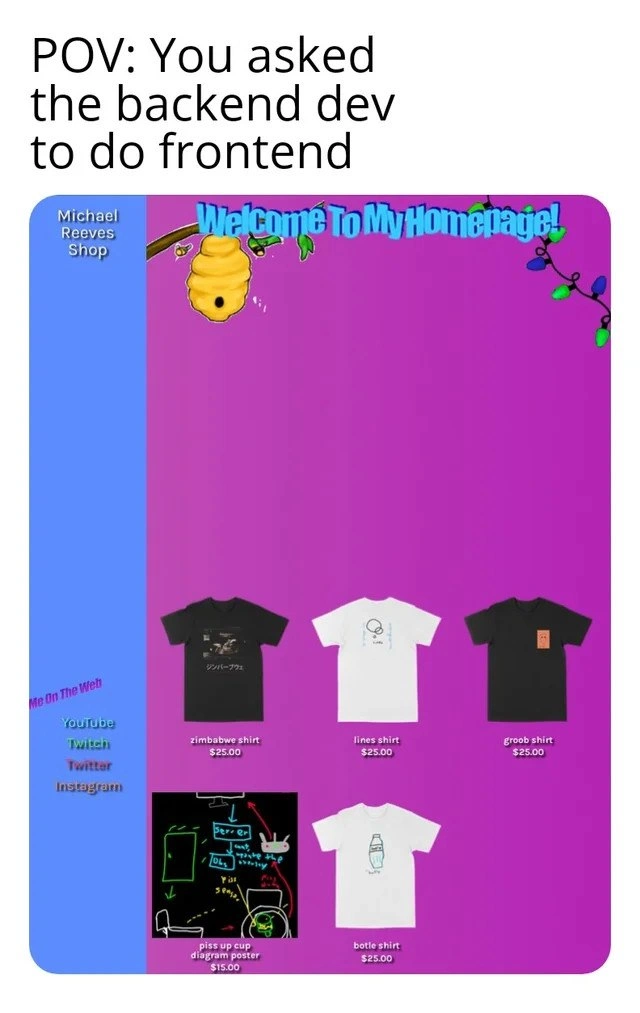
The result? A webpage that looks hilariously out-of-date and chaotic. The meme shows a fake “shop” page with an intentionally ugly design – something we might call “garish web design”. It has a big solid blue sidebar on the left and a loud purple-to-pink gradient background for the main area (a gradient means one color smoothly blending into another). At the top of the main area, there’s the phrase “Welcome To My Homepage!” in a goofy aqua-colored text with a 3D effect that wiggles – it looks like old-school WordArt or an early internet banner. There’s even a random cartoon clip art beehive and a branch graphic decorating the header for no reason. The whole style screams 90s_style_homepage – basically the way websites looked in the late 1990s or early 2000s when people were just excited to put anything flashy on a page without worrying if it was good design.

Now, on this page, they list some merchandise (t-shirts and a poster for sale). But the products are just thrown on there without any modern layout techniques. The spacing between them is uneven, and the fonts used for each product name don’t match each other. One item might have a different font or size than the next. This is something a frontend developer today would avoid by using a consistent style guide or CSS rules. The sidebar on the left says “Michael Reeves Shop” and has a list titled “Me On The Web” with links to YouTube, Twitch, Twitter, Instagram – that kind of sidebar is common, but here it’s styled in plain text with clashing colors (for example, bright aqua text on a blue background, which is low contrast and hard to read). A modern site usually ensures text and background colors have enough contrast to be easily readable (an important part of accessibility) and uses a clean, readable font across the whole site. Here, it looks like every element was styled independently with whatever felt fun at the moment, resulting in a rainbow of text styles.

To put it simply, the page looks like a beginner’s project or a joke website because it breaks a lot of basic UI rules. For instance, a quick glance shows several issues:

  • Clashing colors: The sidebar is bright blue, the main panel is neon purple-pink, and the header text is aqua. These colors don’t go well together and make the text hard to read. It kind of hurts your eyes – which is funny in the meme, but would be bad in a real site.
  • Inconsistent fonts and spacing: The product names (“zimbabwe shirt”, “lines shirt”, etc.) are all written in different styles or sizes, and the images aren’t aligned neatly. It looks messy, as if the items were just slapped on the page without tidying up. A professional front-end developer would normally use a grid or flexbox (CSS layout tools) to align products evenly, and they’d keep the typography (fonts and text size) consistent. Here, it’s a free-for-all.
  • Random graphics (clipart overload): The page has a beehive graphic and a vine or branch on it, which have nothing to do with the products being sold. They’re just there for decoration, but they make the site feel cluttered and confusing. Modern design favors using images purposefully (like product photos or icons that match the content). Throwing in unrelated clip-art just because it looks “cool” is an old-school rookie move.
  • No sense of modern style or responsiveness: If you opened this page on a phone, you’d probably have to zoom in and scroll around horizontally, because it likely isn’t using a responsive layout (a design that adapts to different screen sizes). Today, good web design is responsive – elements rearrange or resize for smaller screens. But a backend dev who doesn’t know CSS well might not implement that, resulting in a site that only looks okay on their own large monitor. Also, there’s no sign of attention to accessibility (like readable fonts, alt text for images, or color contrast). It’s the opposite of user-friendly; it’s more like a personal art project from an earlier era of the web.

So why is this funny to developers? Because it’s relatable humor highlighting an important point: front-end development is a specialized skill. Many of us have tried making a webpage when we were new and ended up with something like this. Maybe you remember using too many fonts on a school project website, or adding a crazy background image that made the text illegible. It’s a common newbie mistake. In this meme, the “newbie” in terms of design is actually a seasoned programmer who is just inexperienced at UI. The back-end engineer likely knows how to build robust systems, but when it comes to UI, they might only know the basics (or what they remember from the early 2000s). They might think, “Well, the site is up and running, the data displays, my job is done.” Meanwhile, any front-end or UX designer looking at it would gasp, because it ignores so many design principles.

This is also about Developer Experience (DX) from the coder’s side. A back-end dev forced to do front-end might feel out of their comfort zone. They might not enjoy tweaking CSS for hours to get margins right or picking color palettes – that’s not what they normally do. As a result, they’ll do the minimum to get it looking “okay-ish” and focus on the functionality. The user experience (what the customer sees and feels) suffers, but the developer’s goal was just to deliver a working feature. The meme exaggerates it for comedic effect: the page is intentionally made extra awful to make us laugh. But it echoes reality: when developers work on parts of the stack they aren’t trained in, the end product can look amateur.

In summary, at this level we understand that the meme is showing an exaggerated example of a back-end developer doing front-end work and making a very outdated-looking webpage. It’s packed with visual jokes referencing the old days of web design (like the wild colors, 3D text, and random clip art), which seasoned devs and even newer folks who’ve seen “ugly website” memes can recognize. The key terms to know are that front-end is about the visual/interface part of apps, back-end is about the behind-the-scenes logic, and that good UI/UX design follows certain principles which are clearly being ignored here. The humor comes from the obvious mismatch: the person building this page treats design like it’s still 1998, either because they don’t know better or as a tongue-in-cheek way to show “Look, I’m a backend dev; this is what you get when you make me do frontend!”

Level 3: Full-Stack Follies

This meme illustrates a classic Frontend vs Backend culture clash in web development. The caption “POV: You asked the backend dev to do frontend” sets the stage for a comically disastrous UX/UI outcome. We see a webpage that looks like a time capsule from 1999: a bright purple-pink gradient background, a rounded blue sidebar, and a wobbly aqua “Welcome To My Homepage!” banner rendered in cheesy 3D text. It’s practically screaming with a garish web design aesthetic. The page is cluttered with random clip-art (a cartoon beehive and branch for decoration) and an overload of mismatched fonts and colors. This backend_dev_frontend_attempt is both hilarious and cringe-inducing for anyone who’s been in a development team. It satirizes what happens when a server-side specialist, who lives in databases and APIs, is suddenly tasked with pixel-pushing and CSS.

On a deeper level, the humor comes from breaking unspoken industry rules. Modern frontend engineers obsess over spacing, consistency, and accessibility, but here the Developer Experience (DX) of the creator was clearly “just make it work.” The result flouts almost every best practice in user interface design. Consider some obvious contrasts between what a polished site should do and what we see here:

Good UI Practice What We Got Instead
Subtle, cohesive color scheme Neon aqua text on a loud purple-pink gradient
Consistent fonts and typography Each section and item uses a different font size or style
Aligned, grid-based layout Merchandise thumbnails are unevenly spaced and thrown about randomly
Purposeful graphics that match content Decorative clip-art (beehive, branch) unrelated to the shop items
Accessibility & responsive design Low-contrast colors, likely no alt-text on images, and a fixed layout that would break on mobile

Every row in that table is a UX failure that experienced developers can spot a mile away. Frontend devs will chuckle (or shudder) at the neon color combo and WordArt-esque banner because it’s exactly what not to do in modern design. Backend devs, on the other hand, might laugh in recognition: maybe they’ve written an internal tool or two with equally questionable UI when forced to dabble in design. This meme is relatable humor for anyone who’s seen a colleague proudly demo a feature that “works flawlessly” but looks like an early MySpace page.

Why does this situation arise? It highlights the specialization within software teams. Frontend development isn’t just “making things pretty”; it’s a skill set involving HTML/CSS mastery, a good eye for design, and knowledge of frameworks and accessibility guidelines. Backenders who focus on server logic often treat the UI as an afterthought — they might reach for the first vaguely-working solution, using outdated techniques from the 90s or whatever default styles the browser gives. In the early web, a layout like this was normal: developers used <table> grids, <font> tags, garish GeoCities-style backgrounds, and even the infamous <blink> or <marquee> tags to add excitement. (Yes, early HTML let you have blinking or scrolling text everywhere — and it was just as chaotic as it sounds.) Today, those old tricks are deprecated or considered bad practice, but a back-end coder under deadline might not bother with the nuances of modern CSS. They’ll slap together something that technically shows the data, even if the page looks like a unicorn threw up a color palette.

There’s also an undercurrent of workplace humor here. Often management or clients assume any “coder” can do any coding task — “Our backend guy can handle the UI, no need to hire a designer!”. Seasoned developers know this is a recipe for disaster (or comedy). The meme’s over-the-top 90s vibe exaggerates the outcome, but it’s rooted in truth: full-stack development is hard. The term “full-stack developer” gets thrown around, but truly excelling at both back and front-end is rare. Usually people have a strength in one and just passable knowledge in the other. When incentive structures or tight budgets force someone to work outside their expertise, you often end up with something that technically functions but ignores all quality standards of the other domain. The code might be solid under the hood here, but the user-facing part is a hot mess.

In short, the meme is poking fun at the folly of treating UI design as an afterthought. It’s a shared joke in developer humor circles precisely because it’s so relatable: we’ve either produced something like this ourselves when learning, or had a laugh reviewing a colleague’s “designer nightmare” web page. The image blends nostalgia (for the wild west days of 90s web design) with the modern awareness that just because you can code backend doesn’t mean you should code the UI. It’s humor born from experience: a senior engineer will grin at the bee clip-art and neon colors and think, “Yup, seen that happen when Dave from database tried to write some CSS.” After all, nothing unites devs more than mocking a UX trainwreck that could have been avoided by involving the right people for the job!

Description

A two-part meme. The top section features white text on a plain background that reads, 'POV: You asked the backend dev to do frontend'. The bottom section is a screenshot of a comically outdated and poorly designed e-commerce website. The website has a bright purple background and a solid blue sidebar. A large, stylized text at the top says 'Welcome To My Homepage!' with decorative elements like a beehive and Christmas lights. The sidebar contains 'Michael Reeves Shop' and links to 'YouTube', 'Twitch', 'Twitter', and 'Instagram'. The main content area displays several t-shirts and a poster for sale with inconsistent alignment and spacing. The overall aesthetic is reminiscent of early 2000s amateur web design (Geocities/MySpace era), characterized by clashing colors, basic layout, and cheesy graphics. The humor comes from the stereotype that backend developers, who focus on server-side logic, often lack the design sensibilities for creating a visually appealing and user-friendly frontend interface. This stereotype is relatable to any developer who has seen a 'full-stack' effort go wrong or witnessed the sharp divide in skills between frontend and backend specialists

Comments

10
Anonymous ★ Top Pick The backend dev said the new frontend is perfect: the API response times are under 50ms and every button returns a 200 OK. What more could a user possibly want?
  1. Anonymous ★ Top Pick

    The backend dev said the new frontend is perfect: the API response times are under 50ms and every button returns a 200 OK. What more could a user possibly want?

  2. Anonymous

    Asked the PostgreSQL wizard to “just build the UI” - now the page is a 3-k-line string returned by a PL/pgSQL function: TTFB 5 ms, aesthetics `SELECT 1998 FROM color_palette WHERE taste IS NULL;`

  3. Anonymous

    This is what happens when you tell the senior backend architect who's been optimizing database queries for 15 years that 'frontend is just HTML and CSS, how hard can it be?' - suddenly your perfectly normalized data models are rendered in Comic Sans with a color scheme that violates the Geneva Convention

  4. Anonymous

    When your backend architect with 20 years of distributed systems experience gets assigned a 'simple' landing page and delivers a pixel-perfect recreation of 1997 - complete with magenta gradients, Comic Sans headers, and a layout that makes CSS Grid weep. The real tragedy? It's probably more performant than half the React SPAs shipping today, and definitely loads faster than that 3MB hero image the design team wanted

  5. Anonymous

    Backend frontend: Inline styles as 'env vars', Comic Sans for 'semantic HTML', Goatse as the A/B test winner - because who needs design systems when tables nest forever?

  6. Anonymous

    Backend dev did the shop UI: layout via JOINs, “Welcome” is a stored procedure, and the only cascade he trusts is a cascading delete on the DOM

  7. Anonymous

    Backends treat CSS like deterministic config; when specificity breaks referential transparency, they add !important until the layout reaches eventual consistency with their monitor’s resolution

  8. @zherud 5y

    I'm pretty sure they'll just yoink the other site's design.

  9. @rest_in_pianissimo 5y

    Michael Reeves) He has recently made a Boston Dynamics' robot piss beer. What a legend

    1. @desrevereman 5y

      Agreed.

Use J and K for navigation