Backend Color Palette Selection
Why is this Frontend meme funny?
Level 1: Too Much Same Color
This is like decorating an entire room with the exact same bright crayon. The wall, chair, table, door, and lamp all match, but now it is hard to tell what is important. The funny part is that the person did choose a color shade: they just chose it for everything.
Level 2: Palette Is Not Paint
A backend developer usually works on the server side of an application: databases, APIs, authentication, business logic, jobs, and infrastructure. A frontend developer works on the part users interact with: pages, forms, buttons, layout, styling, and browser behavior.
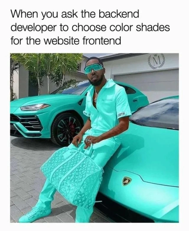
The image jokes that if a backend developer is asked to choose frontend color shades, they might pick one bright color and use it everywhere. The repeated cyan across the cars, clothes, shoes, glasses, and bag makes the joke visible immediately.
In CSS, colors can be written with hex codes like #00FFFF. That code represents a bright cyan. But a website usually needs more than one bright color. It needs readable text colors, background colors, borders, hover styles, error states, success states, and subtle differences between active and inactive elements.
For newer developers, the key lesson is that UI design is about communication. Color helps users understand what matters and what action they can take. If every part of a page uses the same strong color, nothing stands out. It may be consistent, but consistency alone is not the same as clarity.
Level 3: One Hex Fits All
The caption says:
When you ask the backend developer to choose color shades for the website frontend
Below it, nearly everything is the same bright turquoise-cyan family: the cars, the man's outfit, the shoes, the sunglasses, and the large bag. The post message sharpens the joke with #00FFFF, the classic full-intensity cyan hex value. In other words, the “palette” is not really a palette. It is one color wearing different outfits and hoping design review gets canceled.
The backend-versus-frontend stereotype works because backend developers are often rewarded for correctness, reliability, data modeling, APIs, queues, caching, security, and failure handling. Frontend work has those concerns too, but it also has an immediate visual layer: typography, spacing, hierarchy, contrast, responsive behavior, states, motion, and color. A backend developer asked to choose “shades” may reasonably think, “We have cyan. Ship it.” A frontend designer sees the same choice and starts checking whether buttons, links, disabled states, hover states, alerts, backgrounds, borders, and focus rings can actually be distinguished.
The image exaggerates color theory by collapsing every nuance into one dominant hue. Real UI palettes need roles, not just colors. A design system might define primary, secondary, accent, surface, border, text, muted, success, warning, and error tokens. Even if the brand color is cyan, the interface still needs darker and lighter variants, neutral support colors, accessible text contrast, and semantic colors that communicate state. Otherwise every component competes at the same volume, like a dashboard where every metric is marked urgent because someone discovered font-weight: bold.
This is why color selection is engineering, not decoration. A poor palette can create usability bugs. Users may not know what is clickable, disabled, selected, destructive, or important. Low contrast can make text hard to read. Similar shades can make charts misleading. Overusing a single saturated color can flatten hierarchy until the page becomes visually loud but informationally quiet. The meme is funny because the backend developer's imagined solution is consistent, deterministic, and wildly under-specified for actual humans.
There is a subtle sympathy here too. Frontend looks easy from the outside because everyone can see it. But seeing a color and building a usable color system are different tasks. The man in the image is committed to turquoise with admirable deployment confidence. The website, unfortunately, still needs more than one token.
Description
The top caption reads, "When you ask the backend developer to choose color shades for the website frontend." Below it, a man wearing turquoise clothing, turquoise shoes, turquoise sunglasses, and holding a turquoise bag sits between two turquoise luxury cars, creating an almost entirely single-color scene. The meme jokes that a backend developer asked to handle visual design might pick one favorite color and call it a palette. It plays on the familiar split between backend implementation comfort and frontend/UI attention to color nuance, contrast, and visual hierarchy.
Comments
9Comment deleted
The backend palette has excellent consistency: one hex code, zero contrast debt, and a designer silently opening Figma in another tab.
Just use #FF0000 Comment deleted
Me at 8 found diamonds in minecraft Comment deleted
idk but I always use this colour. That's surely a good one or I am just dumb? Comment deleted
same i use mostly this color #00ff6e Comment deleted
It's very bright for a shade of teal, but it's definitely not the worst colour. If you reduce the blue or green or both down a little bit, it won't be as bright Comment deleted
Use only RGB). Comment deleted
My favorite color indeed Comment deleted
#007fff Bond style ;) Comment deleted