Skip to content
DevMeme
3047 of 7435
Developer's Simple UI vs. User's Unexpected Approach
UX UI Post #3362, on Jul 2, 2021 in TG

Developer's Simple UI vs. User's Unexpected Approach

Why is this UX UI meme funny?

Level 1: Easier Said Than Done

Imagine you tell all your friends you’ve built a super easy-to-use lemonade stand for drive-through customers. You’re so proud, saying “Anyone can just drive up and grab a lemonade, no hassle!” But on opening day, you watch a driver pull in a little too far from your stand. To your surprise, they have to open their car door and stretch out awkwardly just to reach the cup you’re handing them. It looks a bit like a comedy show — the driver half-out of the car, balancing on one foot, trying not to spill the lemonade. You thought it was going to be so simple, but in reality people are struggling and doing funny maneuvers to use it.

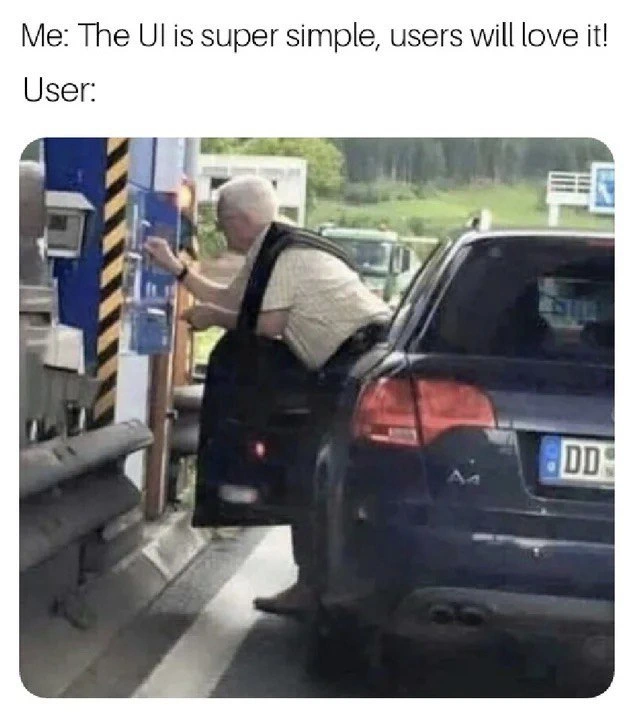
This meme is poking fun at that kind of situation. The developer said, “My design is intuitive (really easy)!” but a real user found it so unintuitive that they’re doing literal acrobatics (like stretching out of a car) just to use it. It’s like thinking a door is easy to open, but then everyone who comes along tries to pull it when it was meant to be pushed — they get confused and maybe stumble a bit. We laugh because we’ve all been there: something was supposed to be easy, but when we or others actually try it, it ends up being much harder than expected. In simple terms, the meme is telling us: just because the creator thinks it’s easy, doesn’t mean it’s actually easy for the person using it. And seeing that mismatch (especially when it leads to a goofy scenario like a man almost climbing out of his car at a toll booth) is both funny and a little eye-opening.

Level 2: Test with Real Users

Let’s break down what’s happening in this meme in simpler terms. We have a developer or designer proudly proclaiming that their UI (User Interface) is straightforward and easy to use. The UI here isn’t a software screen or website, but a physical kiosk at a toll booth (the machine with buttons where drivers take a ticket or pay). When we say “UI is super simple”, the developer probably thought everything was obvious: the button is right there, the process is clear.

UX, which stands for User Experience, is about how a real person feels when using that interface. A good UX means the user can achieve their goal easily and comfortably. A UXDesign success would be if any driver could roll up, press the button from their window, grab the ticket, and drive on happily. But here we have a UXFailure: the elderly man in the car has opened his door and is stretching out — practically doing a half-exit from the car — just to reach the machine. This is a prime example of an unexpected_edge_case in design. An edge case means a scenario that’s unusual or not the standard use case. Designers and devs try to plan for common cases (like a driver pulling up correctly), but they might forget about edge cases (like if the car stops a bit too far away, or the driver has limited mobility, etc.). Sometimes what we think is a rare edge case isn’t that rare after all! Here, a common slight misalignment of the car or a shorter arm span turns into a big usability problem.

So why did this happen? Likely usability testing was overlooked. Usability testing means trying out the design with real people (in this case, real drivers, in actual cars) before finalizing it. If the team had done a test drive, they might have seen someone struggle and realized “Oops, the machine is placed too far from where a car naturally stops.” It’s a usability_testing_fail if you don’t catch such things. Real users often do things developers don’t expect. The tag real_world_vs_design really nails it: in the design phase (or maybe in a CAD diagram or on paper), the setup looked fine. In the real world, tiny differences like where exactly a car tires stop or how far an average person’s arm can reach can turn a “simple” task into a circus act.

Another term: UserError. Sometimes when users struggle, inexperienced devs might say “Oh, that’s user error” – implying the person used it wrong. But good designers know that if lots of people make the same “error,” it’s really a design error. Here the user isn’t wrongly using the toll booth; he’s just dealing with a design that didn’t accommodate normal human variance. It’s not fair to blame him for parking a few inches off if the system gave no guidance or leeway.

For front-end developers (those who build the parts of software that users interact with directly – the buttons, forms, layouts, etc.), this meme is RelatableHumor. Why? Because as DevHumor goes, we’ve all seen users do things we didn’t predict. Maybe you built a website and put the “Submit” button on the right, thinking it’s obvious, but many users missed it entirely. Or you assumed everyone would follow a certain sequence on a form, but actual people tried to do it out of order and got confused. It’s RelatableDevExperience because you eventually learn that nothing is truly idiot-proof and you have to test with real people in real scenarios.

The physical_user_interface aspect is key: not all interfaces are on a screen. This kiosk is a user interface made of metal, plastic, and positioning in space. The distance_misalignment here is essentially the “bug.” It’s as if the developer wrote code that works only if the user clicks at exactly the right pixel, and any deviation causes a problem. In physical terms, the machine might have been installed a bit too far from the ideal line of where cars stop, or the car lane has no guide to align. It’s literally a design bug in spacing.

To a junior dev or someone new to UX, the lesson is: always test with real users (and if relevant, in the real environment). What seems simple to you might not be so for others. Pay attention to those UserExpectations – for example, a driver expects that if it’s a drive-up machine, they should be able to reach it without leaving their seat. When a design doesn’t meet that expectation, users get frustrated or do awkward things. Good front-end or UI design means thinking about those human factors: if it’s a website, can all users find the nav menu? If it’s an app, are the buttons sized for all fingers? If it’s a kiosk like here, can people actually reach and see it comfortably?

In short, the meme is a funny reminder: don’t just assume your design is great – watch someone use it. If a real user needs to become a gymnast to complete the task, back to the drawing board you go! This is how we turn a so-called “intuitive” design into an actually intuitive one.

Level 3: Intuition vs Reality

This meme resonates with every seasoned developer and designer because it captures the classic gap between how creators think users will behave and what users actually do. The top text – “Me: The UI is super simple, users will love it!” – are famous last words in development. It’s the intuition illusion: as creators, we convince ourselves that our design is obvious, maybe because it made perfect sense to us or in our perfectly controlled tests. But then comes Reality, often in the form of a user doing something completely unexpected (like performing roadside_acrobatics just to hit a button). The image of the gentleman literally climbing out of his Audi at a toll booth is a humorous exaggeration of this disconnect. It’s painfully relatable: many of us have proudly demoed a feature, saying “look how straightforward!”, only to watch a real user struggle or misuse it in ways we never imagined.

From a senior perspective, the humor here is a knowing laugh — we’ve all been the overconfident dev at some point. The RelatableDevExperience is that moment during a live usability session or a production deployment where a user’s actions leave us slack-jawed, thinking, “Why on earth are they doing that?!” But as funny as it is, it’s also humbling. In this case, the developer/designer assumed drivers would naturally pull up at the perfect distance or that the interface’s placement was fine. Cue reality: users come in all shapes, sizes, and situations. Maybe the UserExpectations were different — perhaps the driver expected the machine to extend closer, or simply misjudged the distance (an easy mistake if there were no clear markers). A senior UX engineer would instantly spot this as a lack of user-centered design: the design was centered on the system’s convenience (install machine here, done ✅) rather than the user’s convenience.

The meme underscores a broader point: “intuitive” is not a label you, as a dev, get to declare — it’s an earned title that users bestow when something truly works well for them. If users are resorting to stunts, that’s a clear sign the interface isn’t intuitive at all. It reminds experienced devs of the importance of usability_testing_fail scenarios: those cringe-worthy test recordings where a user utterly struggles with what was supposed to be a simple task. We laugh at this image because we recognize the pattern: design/implementation meets the real world and promptly faceplants. It’s the UI equivalent of “Works on my machine!” — sure, it functioned in theory or in ideal conditions, but in production (the wild world of actual users), it fails spectacularly.

In real projects, this is why we build prototypes and conduct usability tests with actual users (preferably in realistic environments): to catch these misalignments early. It’s why veteran front-end developers often pair with UX researchers or at least do hallway testing. Anyone with a few projects under their belt can tell you that users will always surprise you. No matter how sure you are that “users will love it!”, a bit of skepticism and a lot of testing can save you from ending up on the next UXFailures montage. This meme is funny because it’s true: the only truly “intuitive” interface is the one that’s been refined through observing real user behavior — anything else and you might end up watching someone do gymnastics to use your creation.

Level 4: Fitts’s Law at the Toll

At the deepest technical level, this meme highlights a violation of fundamental HCI (Human-Computer Interaction) principles — almost like a case study in ergonomics and user-centered design gone wrong. One key principle at play is Fitts’s Law, a classic predictive model of human movement which says the time (and difficulty) to hit a target increases with the distance to that target and decreases with the target’s size. In formula form, it’s often given as:

$$ MT = a + b \cdot \log_2!\Big(1 + \frac{D}{W}\Big), $$

where $MT$ is the movement time, $D$ the distance to the target, and $W$ the width (size) of the target. Here, the poor driver is grappling with an extreme $D$ — the kiosk is positioned too far from the car window. The design failed to account for real-world variance in car positioning and driver reach, making the simple task of pressing a button physically arduous. In user experience design terms, the “interface” extends into the physical space: the toll_booth_ui isn’t just the screen and button, but also how it’s situated relative to the user (driver). Ignoring physics and human factors is as much a UX failure as a misaligned button in a mobile app.

From an anthropometric perspective (using human body measurements in design), this setup probably didn’t consider the 5th percentile vs. 95th percentile user sizes or vehicle dimensions. Real-world UI design (including ATMs, drive-thrus, cockpit controls) relies on data about how far people can reach, how tall they sit in a car, etc. If the kiosk was installed at a fixed curb distance optimal for one vehicle type or one body type, anyone outside those assumptions hits an unexpected_edge_case. Essentially, the designers optimized for an ideal scenario and failed to include a margin of error or guidance for alignment. This is why usability testing in the actual context of use is crucial: in a lab, a UXDesign team might have declared the interface “intuitive” because a tester walked up on foot or a certain car fit fine. But in the field, small differences compound: the curb width, the car model’s door thickness, an elderly driver’s flexibility — all these factors turn a “simple” interaction into a contortion act.

This photo is a physical_user_interface lesson that even the most simple UI concept must respect real-world constraints. Renowned HCI researcher Don Norman often talks about affordances and signifiers — cues that indicate how to use something. In this case, perhaps there was a lack of clear signifiers (like pavement markings or a prominent “pull closer” sign) to ensure drivers stop at the right spot. The result? We get a roadside acrobat, vividly demonstrating the distance_misalignment between design and reality. The situation might look comical, but it’s a serious reminder that UserExperienceDesign isn’t just about pretty screens; it’s about engineering interfaces (digital or physical) that align with human abilities and expectations. The “intuitive” design utterly failed its usability_testing exam because it ignored the laws of UX (quite literally, Fitts’s Law!) and the messy, variable nature of the real world. The meme nails this irony: in software terms, it’s like shipping to production without testing in a production-like environment — the theoretical simplicity falls apart due to unaccounted-for real-world variables.

Description

The image is a two-part meme format. The top text reads, 'Me: The UI is super simple, users will love it!'. Below this, the text 'User:' introduces the visual punchline. The image shows an elderly man at a drive-up ticket machine, likely in a parking garage or at a toll booth. Instead of simply reaching out of his driver-side window, he has opened the car door completely and is leaning out awkwardly to interact with the machine. This meme humorously captures the profound disconnect between a developer's intention for a user interface and the actual, often unpredictable, ways users interact with it. For experienced developers, this is a relatable scenario that underscores the fallacy of assuming a design is 'intuitive' without real-world user testing. It highlights how users bring their own mental models and habits, leading them to find cumbersome workarounds for what was designed to be a simple process

Comments

7
Anonymous ★ Top Pick We can spend months architecting the perfect API, only to find the main client is a legacy system that just screen-scrapes the front-end with a cron job every five minutes
  1. Anonymous ★ Top Pick

    We can spend months architecting the perfect API, only to find the main client is a legacy system that just screen-scrapes the front-end with a cron job every five minutes

  2. Anonymous

    “Design review: ‘44 dp tap targets, AAA contrast - Fitts-law compliant.’ Production: user stretches half-way out of an Audi, revealing we forgot to responsive-design for wheelbase.”

  3. Anonymous

    After 20 years of arguing about tabs vs spaces, we finally achieved perfect code formatting standards, only to discover our users are still double-clicking hyperlinks and using sticks to reach our 'optimally positioned' interfaces

  4. Anonymous

    This is the physical manifestation of every 'mobile-first' designer who's never actually tested their interface on a device smaller than a 27-inch monitor. The gap between 'simple UI' and 'accessible UI' is literally measured in the distance this poor user has to stretch - reminds me of APIs designed by backend engineers who've never had to consume them from the frontend. We've all shipped that 'intuitive' feature that required users to be contortionists, haven't we?

  5. Anonymous

    “Simple UI” is the toll-booth button you can’t reach: gorgeous in Figma, requires a yoga pose in prod - design for the physics layer, not just the pixel layer

  6. Anonymous

    Pixel‑perfect in Figma, but in prod the primary button is 40 cm outside the user’s reach - classic happy‑path UX; congratulations, you’ve invented a new KPI: doors per transaction

  7. Anonymous

    Devs tout 'grandma-proof UI' like architects tout 'zero-downtime deploys' - until the first fat-finger incident hits prod

Use J and K for navigation