Skip to content
DevMeme
858 of 7435
The 'Common Sense' Feature That Wasn't
Documentation Post #971, on Jan 18, 2020 in TG

The 'Common Sense' Feature That Wasn't

Why is this Documentation meme funny?

Level 1: No Manual, No Clue

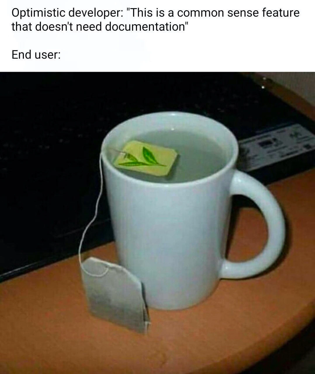
Imagine you give your friend a cup of hot water and a tea bag, but you don’t tell them how to make tea. You just assume they know. Your friend has never made tea before, so they do something silly: they dip the paper tag of the tea bag into the water and leave the actual tea bag out. 😝 Of course, this isn’t how you make tea! The water stays plain hot water, and the paper tag is all wet and ruined. Now, it’s a funny mistake – we might laugh because it seems so obvious that the tea bag (with the leaves) should go in the water, not the paper label. But to your friend, it wasn’t obvious at all because nobody showed them.

This is the same thing that can happen with people using new gadgets or apps. If the person who made the gadget doesn’t include an instruction manual or any hints, a new user might use it the wrong way. It’s like giving a toy to a kid with no instructions: the kid might use the toy in a completely unexpected (and wrong) way. The meme is joking about a software developer who thinks, “This feature is so simple, anyone can use it without help.” That’s like you thinking “anyone can make tea, it’s common sense.” Then the real-world user (or your friend with the tea) does something totally unexpected that makes a mess. It’s funny, but it also teaches a lesson: even if you think something is really easy or obvious, it’s always helpful to give a little guidance or instructions. Otherwise, people might get confused and do the opposite of what you expected, just like putting the wrong end of the tea bag in water!

Level 2: Instructions Not Included

Let’s break down what’s happening here. We have a software developer and an end user. The developer thinks they added a new feature that is so simple and intuitive that documentation isn’t necessary. Documentation, in this context, means any helpful instructions or manuals that tell users how to use a feature. The developer is basically saying, “Come on, this is common sense! Anyone can figure it out.”

Now enter the end user – the person actually using the software (or in the picture, the person making tea). The meme shows a funny real-world analogy: a cup of hot water with a tea bag string hanging over the side. But the tea bag’s paper tag is floating inside the water, and the actual tea bag (the part with tea leaves) is hanging outside the cup. It’s completely backwards! This visual gag represents the user misunderstanding an “obvious” task. In a normal situation, you would dunk the tea bag in the water to brew tea, and keep the paper tag (which usually has a logo and helps you pull the bag out) outside. But this user either never made tea before or got confused, so they misused the teabag: they put the wrong part in the water. The result is no tea in the water (since the leaves never steeped) and a soggy paper tag drifting around. Ridiculous, right? But that’s exactly the point. What seemed like common sense to the person who provided the tea (analogous to the developer) was not obvious at all to the person using it.

Translating this to software: imagine a developer adds a new button or feature in an app. It made perfect sense to them how it should be used, so they didn’t write any help text or tutorial. They assumed users would naturally know what to do. This is a documentation gap – because the explanation or guidance was left out. The communication from developer to user is incomplete. Now a first-time user comes along and has no idea what the button is for or uses it the wrong way. For example, say the feature is a text box where you type your email to get a report. The developer might think, “It’s obvious, just enter your email.” But an end user might try to type their name instead, or not realize they need to press Enter, and then nothing happens. Without a quick instruction like “Enter your email and press Submit to receive the report,” the user can get confused. The gap between what the developer expects and what the user knows is exactly what this meme is joking about. It’s highlighting a communication gap in a funny, memorable way.

This kind of mix-up is common in tech when there’s no documentation or poor UX design. “UX” stands for User Experience, which is basically how easy and clear it is for a person to use a product. A good UX means even a newbie can figure out what to do without much help. But achieving that isn’t magic – it requires thinking from the user’s perspective, sometimes adding labels or instructions, and definitely not assuming every user has the same knowledge as the developer. New developers (and honestly, even experienced ones) might skip writing a README file or user guide, thinking their feature is straightforward. The meme’s joke is that this overconfidence can lead to comical errors. It’s funny to see someone put a tea bag tag in water wrong, but in software it can be frustrating for both user and developer when a feature is used wrong. The user might blame themselves or think the software is broken, and the developer might shake their head wondering “Why on Earth would anyone do THAT?!”

The answer to “why would a user do that?” is usually: because no one told them not to, and it wasn’t as obvious to them as it was to the developer. What’s “common sense” to a techie isn’t necessarily common to everyone. People have diverse backgrounds and levels of experience. A feature that seems intuitive (super clear) to the developer might be totally alien to a non-technical user. That’s why documentation (like help pages, tooltips, instructions) and good design (with clear cues) are so important. They bridge the knowledge gap. This meme serves as a lighthearted documentation lesson: always assume some users will need guidance, because if it can be done differently or incorrectly, someone out there will do it that way. Writing even a short note or providing an example can prevent a lot of confusion. In summary, “obvious” features sometimes aren’t obvious at all – and skipping the manual or instructions can lead to exactly the kind of mix-up we see with the poor tea bag example.

Level 3: Foolproof Fallacy

Developers often talk about making a feature “foolproof”, but reality has a way of punching through our optimistic assumptions. In this meme’s scenario, an optimistic developer proudly declares a new function so intuitive that it “doesn't need documentation.” In theory, it’s a simple, common sense feature. In practice? Enter the end user entropy: a real user immediately uses the feature in a hilariously wrong way – just like someone dunking the tea bag’s paper tag into hot water while the actual tea pouch hangs dry outside the cup. It’s a perfect visual metaphor for UXFailures born from a DocumentationGap. The developer assumed the usage was obvious, but the end user’s approach turned out inside-out.

Every experienced engineer has witnessed this foolproof fallacy before. We build something and think, “Nobody could possibly misuse this!” – famous last words. The truth is, “common sense” is notoriously uncommon in software usage because what’s obvious to the creator is often opaque to the user. There’s even a term for this blind spot: the curse of knowledge. Once you know how a feature works, you can’t imagine not knowing. Developers steeped in their own app forget what it’s like coming in fresh. That’s why an interface we find self-explanatory might confuse new users completely. It’s not because users are dumb; it’s because humans approach things with a wild variety of perspectives – a source of end_user_confusion as natural (and chaotic) as entropy. Given enough users, if a feature can be misunderstood, someone will misunderstand it. It’s a CommunicationGap issue: the information in the dev’s head never made it to the user. Skipping documentation or clear instructions is basically leaving users to their own imaginative (mis)interpretations.

This image with the misused teabag is a comically exaggerated documentation lesson. It highlights that even a task as straightforward as making tea can go wrong without guidance. In software terms, it’s like a user holding a mouse upside down, or trying to login by typing their password into the “username” field – behaviors that make developers facepalm, yet happen all the time if the UI doesn’t guide people. When a feature lacks affordances (visual clues on how to use it) or any note in the manual, users fill in the blanks themselves. The result? DeveloperFrustration and support tickets galore, as the dev scrambles to explain something they thought would “just be obvious.” It’s an age-old irony: the “obvious” feature becomes the one generating the most confusion. Seasoned devs know that documentation and tooltips aren’t optional niceties – they’re essential safety nets for the unpredictable ways real users behave. After all, “foolproof” to an engineer just challenges the universe to produce a better fool. And as every battle-scarred senior knows, the universe usually delivers.

To drive the point home, consider some classic cases where developers assumed common sense would prevail, but users had other plans:

Dev’s “Obvious” Design User’s Misinterpretation
Program says “Press any key to continue.” User literally searches the keyboard for the “Any” key.
Floppy disk icon as the Save button New user doesn’t recognize the symbol and never clicks it, unsure how to save.
CD-ROM tray meant for disks Person uses it as a coffee cup holder, then complains it broke.

In each case, developers assumed the usage was self-evident. It wasn’t. These UX failures aren’t just “user errors” in a vacuum – they’re often the product of design and communication gaps. The meme’s humor hits so hard among developers because we’ve all been that optimistic dev at some point. We confidently shipped a feature with zero docs or hints, only to witness misuse on a level we didn’t think possible. It’s a humbling reminder that writing a few lines of documentation, adding an example, or even just a clear label can save everyone a lot of grief (and laughter). Code may compile without comments, but user-facing features released without guidance will eventually compile incidents in your bug tracker.

So the next time someone says “No need for a README, this feature is obvious,” just remember the image of a tea bag tag floating sadly in hot water. Common sense failure in action. Murphy’s Law of UI (User Interface) is real: if anything can be done the wrong way, some user will do it. A veteran developer doesn’t see that as user stupidity; they see it as proof that better communication was needed. The meme perfectly captures this hard-won truth with humor – a soggy tea tag as the punchline to a missing manual.

Description

A two-part meme. The top section contains text on a white background that reads: 'Optimistic developer: "This is a common sense feature that doesn't need documentation"' followed by 'End user:'. The bottom section is a photograph of a white ceramic mug filled with water, sitting on a wooden desk next to a black laptop. A teabag is being used incorrectly: the small, square paper tag with a green leaf logo is floating inside the mug, while the actual teabag containing tea leaves hangs uselessly outside the mug, connected by its string. This meme illustrates the classic disconnect between a developer's assumptions and an end user's actual behavior. It humorously demonstrates that what seems intuitive or 'common sense' to the creator of a feature is not always clear to the user, underscoring the critical need for thorough documentation and user testing. For senior engineers, it's a painful reminder that user empathy is not optional and that there's no such thing as a feature that's too simple to be misunderstood

Comments

7
Anonymous ★ Top Pick We once shipped a feature we called 'self-documenting.' The first support ticket was from a user who tried to print the source code and read it like a manual
  1. Anonymous ★ Top Pick

    We once shipped a feature we called 'self-documenting.' The first support ticket was from a user who tried to print the source code and read it like a manual

  2. Anonymous

    Writing zero docs and trusting "common sense" is the UX equivalent of dereferencing the pointer label while leaving the actual object dangling on the heap - undefined behavior is guaranteed

  3. Anonymous

    After 20 years of building "intuitive" interfaces, I've learned that the only thing users will consistently do with an unmarked button is find a way to use it that violates the laws of physics, common sense, and occasionally the Geneva Convention

  4. Anonymous

    This meme perfectly encapsulates the eternal optimism of developers who believe their API is 'self-documenting' because the method names are descriptive. Six months later, you're fielding support tickets from users who've been running `initializeDatabase()` in production loops because nowhere did you mention it drops all tables first. The tea bag wrapper is still on because you assumed everyone would just *know* to remove it - much like assuming everyone understands that your `process()` method is idempotent, requires OAuth2 bearer tokens, and silently fails on weekends due to that legacy cron job nobody documented

  5. Anonymous

    Call a feature “intuitive” and someone implements teabag architecture - metadata in the hot path, payload out-of-band - then opens tickets asking for the ‘obvious’ docs

  6. Anonymous

    Calling a feature 'self‑explanatory' is the frontend equivalent of 'the API is RESTful by convention' - you only learn the spec during the incident review after users invent new undefined behavior

  7. Anonymous

    Devs' 'common sense' features: the tea bag of software - obvious to brew, eternal mystery to extract without docs

Use J and K for navigation