Web Developers Doubt the 'Good Old Days' of the 2000s
Why is this WebDev meme funny?
Level 1: Not All Sunshine & Rainbows
Imagine someone says an old video game system from 20 years ago was the best ever, way better than today’s consoles. They talk about it with a big smile. But then their older sibling, who actually used that game system back then, remembers how often the games would freeze or how you had to blow on the cartridges to get them to work. The older sibling hears the rosy claim and just shakes their head, not buying it. In the same way, when people say the early 2000s web was perfect, the developers who built websites back then can’t help but quietly laugh and doubt it was really so wonderful. They remember all the little headaches that others forget—just like the sibling remembers the glitches behind those fun old games.
Level 2: Quirks Mode Crash Course
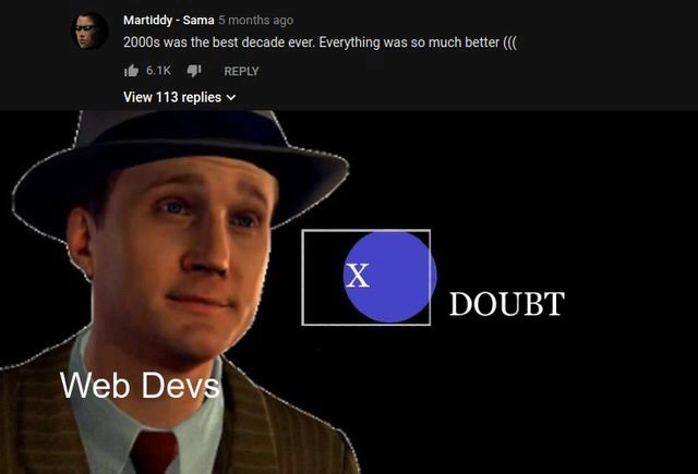
If you’re not a seasoned web developer, the bottom image might need explanation. It’s from the game L.A. Noire, where pressing the X button lets the detective character indicate he doubts a suspect’s story. “Press X to Doubt” became a meme for calling out things that sound fishy. In this meme, Web Devs are cast as the detective ready to press X because they don’t buy the claim that the 2000s were the best decade for the web.
Why are older developers so skeptical about the “good old days” of web development? Let’s break down some key terms and pain points from the early 2000s that the veterans remember all too well:
- Internet Explorer 6 (IE6): A web browser released by Microsoft in 2001, bundled with Windows XP. It was hugely popular (at one point over 90% of people used it) but became infamous among developers. IE6 had lots of browser-specific quirks and didn’t fully follow web standards. That meant a webpage could look fine in other browsers (like Firefox or Safari) but appear completely messed up in IE6. Developers spent enormous time writing special fixes just for IE6. It’s often cited as the number one reason web dev in the 2000s was painful.
- Table-based layout: This was a method of building webpage layouts using HTML
<table>elements for structure. Instead of today’s CSS-based layouts, developers in the late ’90s and early ’00s would use tables with rows and columns to position everything: headers, sidebars, content areas— all arranged via table cells. It was a hack because CSS support was limited and inconsistent back then. While it got the job done for basic designs, these tables-within-tables could become very complicated. Changing one thing often meant recalculating cell widths or adding extra rows, and a small HTML mistake could break the whole layout. - Spacer GIFs: A spacer GIF is a tiny transparent image (usually 1×1 pixel) used to create blank space on a page. For example, if you needed a 50px gap above some text, you’d put in an image set to 50px height as a placeholder. This was a common trick because browsers didn’t render CSS spacing uniformly, so images guaranteed the space. It was cumbersome: imagine littering your HTML with invisible images whose only job is to push stuff around. Today we’d just use CSS margin or padding, but back then those could be unreliable across browsers, so spacer GIFs were a workaround.
- CSS hacks: These are clever little CSS or HTML tricks to target (or hide from) specific browsers. For instance, developers found out that the rule
* html .foo { color: red; }would apply in IE6 but be ignored by other browsers (due to an IE6 parsing bug). They would use such hacks to feed IE6 alternate styles without affecting others. Another example: adding a\at the end of a CSS line might hide it from one browser but not another. It was like speaking in code dialects to accommodate different browsers. Hacks were fragile and often unofficial, but when you had no other choice, you used them to patch the gaps. - Conditional comments: A more formal way to target Internet Explorer specifically. Microsoft introduced special HTML comments that IE would parse. For example,
<!--[if IE 6]> ... <![endif]-->would make the enclosed HTML/CSS only load in IE6. Developers would use these to include an extra CSS file with fixes for IE, or show a warning to IE6 users. It was a lifesaver for managing IE-specific code in a somewhat cleaner way than pure hacks. Still, it meant maintaining separate code just for one browser. (These conditional comments were so tied to that era that modern IE/Edge dropped support for them as standards improved.) - Blink tag:
<blink>was an early HTML tag (in Netscape Navigator) that made text blink on and off, like a flashing sign. By the 2000s, it was largely obsolete — Internet Explorer didn’t support it — but it remains a legendary example of 90s web styling. People who call themselves “blink tag survivors” are joking that they lived through an age when it was okay to have blinking text on your webpage. There was also<marquee>in IE that made text scroll horizontally. These tags were fun to play with, but they’re the kind of “everything was better” feature that really hasn’t aged well. - FrontPage Express: A simple WYSIWYG web page editor that came free with Windows around that time (part of Internet Explorer 4 installations). It let you make web pages by dragging images, typing text, choosing colors, etc., without writing HTML manually. The catch: the HTML code it generated was often messy or proprietary. For example, it might use lots of
<font>tags or Microsoft-specific markup that only worked in IE. Professional developers often had to go into that code to fix things, and it was frustrating to untangle. It’d be like opening a school essay written by a student who didn’t know grammar – lots of cleanup needed.
In short, veteran web devs doubt the “everything was better back then” claim because they remember the reality: building websites was a laborious exercise in coping with browser limitations and inconsistent behavior. Sure, the early 2000s web had a certain charm (pages were simpler, and there was a lot of individual creativity on sites like GeoCities or MySpace). But from a WebDev standpoint, it was full of tedious workarounds and unglamorous troubleshooting. That nostalgia glosses over how much effort it took to make those “simple” sites actually function and look right. The meme is poking fun at how memories can be selective – users remember the good parts, while developers remember all the broken bits they had to fix.
Level 3: Browser War Scars
The top half of this meme shows a nostalgic YouTube comment claiming “2000s was the best decade ever. Everything was so much better (((”. The bottom half features the classic L.A. Noire game prompt “Press X to Doubt” with the label Web Devs. This perfectly captures how seasoned web development veterans react to overly rosy TechNostalgia about the early 2000s web. We old-timers have some serious browser war scars that make us instinctively hit the doubt button when someone says the 2000s web was “so much better.”
Why the skepticism? Anyone who actually built websites in the early 2000s remembers wrestling with Internet Explorer 6 (IE6) until 3 AM. This was the era of table-based layouts and quirky CSS hacks. Web standards were more like friendly suggestions back then, and each browser (IE6, Netscape, etc.) did whatever it pleased. If you think modern cross-browser testing is annoying, imagine a world where IE6 had its own interpretation of the CSS box model (spoiler: it was wrong). We had to implement hair-raising hackery just to get a simple two-column layout to look right in IE. The phrase “Works in IE6” was basically a prayer and a miracle combined.
Let's talk about some of those fun early-2000s “best practices”:
- Tables for layout: Forget CSS Flexbox or Grid – we built entire page layouts by nesting HTML
<table>tags like sets of Russian dolls. Want a sidebar? Put it in a<td>. Need spacing? Throw in an invisible spacer GIF. It was like constructing webpages out of LEGO bricks made of<tr>and<td>cells. This led to monstrous markup and incredibly fragile pages. One missing</td>could break the whole layout catastrophically. - Spacer GIFs: These were 1×1 pixel transparent images stretched to specific widths or heights to create blank space. Essentially, we used images to do the job of CSS margins/padding because early browsers and CSS often weren’t reliable. A typical page might have dozens of
<img src="spacer.gif" width="10" height="1" alt="">tags sprinkled around to push content into place. Maintaining those was, frankly, a nightmare – move one thing and you’d have to tweak a bunch of invisible images too. - Browser quirks & hacks: Each browser had its own bugs, especially IE6. We used CSS hacks – little tricks that only a certain browser would interpret – to feed different rules to IE6 versus others. For example, the
* html #element { ... }hack targeted IE6 due to its parsing bug, letting us hide styles from other browsers. We also had proprietary filters and<!--[if IE]>conditional comments to give IE its own CSS. Making one website often felt like maintaining two codebases: one standard, and one full of band-aids for IE’s quirks. It was like plugging leaks in a sinking ship — fix one IE issue, and another would spring up.<!-- An IE6-only conditional comment hack --> <!--[if IE 6]> <link rel="stylesheet" href="ie6-fixes.css" /> <![endif]--> - No dev tools: Frontend debugging in the early 2000s was done with
alert()pop-ups and guesswork. There was no Chrome DevTools (Chrome didn’t exist yet) and no Firefox Inspector in the very early days. The first real help, Firebug for Firefox, only appeared mid-decade. Before that, if your page looked wrong in IE6, you’d be digging through nested table tags in Notepad or Dreamweaver, trying random changes to see what fixed the gap. Inspecting elements or live-editing CSS wasn’t an option – it was web development with the lights off. - Cheesy tags & tricks: In the absence of modern JS libraries, “dynamic” flair often came from gimmicks like the
<blink>tag (making text blink like a neon sign) or<marquee>(scrolling ticker text). It was eye-catching in a “my eyes, make it stop!” kind of way. Auto-playing MIDI music, hit counters, and “Under Construction” GIFs were also part of that era’s charm. If someone truly thinks everything was better, ask if they miss blinking text and garish MySpace glitter—those were the cutting-edge features of the day. - WYSIWYG editors (FrontPage/Dreamweaver): A lot of “webmasters” back then used tools like Microsoft FrontPage Express or Macromedia Dreamweaver to design sites visually. Those editors would spit out heaps of HTML with inline styles and non-standard tags. It worked at first... until you (the developer) opened the code and saw a soup of nested tables,
<font face="Comic Sans">tags everywhere, and mysteriousmso-attributes (thanks, Microsoft Office). Maintaining WYSIWYG-generated pages was like defusing a bomb made of spaghetti code. So much for “easy” and “better”!
Now, compare that to today. Modern devs have powerful frameworks, debug consoles, and evergreen browsers that (mostly) adhere to standards. Sure, we gripe about JavaScript fatigue (all those new libraries and tools) and deal with our own bugs, but at least we’re not supporting a browser frozen in time that mangles basic CSS. Every era has its challenges, but early-2000s Frontend work had some uniquely tedious ones.
To illustrate the nostalgia vs. reality gap, here’s how a fan’s memory stacks up against a developer’s experience:
| Nostalgic Claim (“2000s web was the best”) | Developer’s Reality Check (early 2000s) |
|---|---|
| “Websites were so simple and clean back then.” | They looked simple, yes, but that’s partly because we couldn’t do anything too fancy. Making an interactive menu or a nice layout required tons of extra work and hacks. Many features we take for granted today just weren’t feasible or worth the risk of breaking the page. |
| “No big frameworks or libraries to worry about.” | True, there were no React or Angular bloating things – but that meant writing everything from scratch and dealing directly with raw browser bugs. It was not a stress-free paradise, just a different kind of hard mode. |
| “Everything just worked in those days.” | It seemed to work only because developers spent countless hours tweaking for each browser. Plenty of pages broke in one browser unless you dumbed them down. Things “just worked” after you poured in sweat to make them appear that way everywhere. |
So when someone online proclaims the 2000s web was the pinnacle, veteran devs react exactly like that detective in the meme. They have a knee-jerk reflex to doubt those claims, because they remember the headaches behind those GeoCities pages and IE6-only intranets. It’s a funny generational clash: people remember the past as users (fun, quirky websites with no pop-ups or Facebook logins), but developers remember what it took to make those sites work at all. That’s why when we hear “best decade ever” for the web, our response is a world-weary smirk and a pressed X – in other words, “Doubt.”
Description
A two-part meme contrasting nostalgia for the 2000s with the harsh reality of web development during that era. The top section displays a screenshot of a YouTube comment by user 'Martiddy - Sama', which reads, '2000s was the best decade ever. Everything was so much better ((('. Below this, the meme features a still from the video game 'L.A. Noire', where the protagonist, Cole Phelps, is shown with a skeptical expression. The character is labeled 'Web Devs'. To his right is the iconic game prompt: a white 'X' inside a blue circle, followed by the word 'DOUBT' in capital letters. This format is known as the 'Press X to Doubt' meme. The joke is that any web developer who worked through the 2000s would strongly dispute the notion that it was a better time, given the technological nightmares like Internet Explorer 6, browser wars, lack of standardized tools, and primitive CSS/JavaScript
Comments
7Comment deleted
Anyone who says web development was better in the 2000s has clearly repressed the memory of debugging the IE6 box model with `alert()` statements
Ah yes, the ‘better’ era - when you fixed layout shifts with a 1-pixel spacer GIF and prayed Quirks Mode wouldn’t reboot your career
"2000s was the best decade" says someone who never had to explain to a client why their pixel-perfect design looks completely different in IE6, IE7, Firefox 2, and Safari 3, then spend three days writing browser-specific CSS hacks that would make your future self question your career choices
Web devs pressing X to doubt because they remember the 2000s meant debugging CSS in IE6, waiting 3 seconds for jQuery to load over DSL, and explaining to clients why their Flash intro was killing mobile users - back when 'mobile-first' meant hoping your site didn't completely break on a Blackberry
2000s web dev: the era when 'responsive design' meant a <nobr> tag and praying IE6 didn't implode your box model
Sure, the 2000s were better - if better means shipping spacer.gif table layouts, a forest of IE6 conditional comments, and a prayer that AlphaImageLoader wouldn’t liquefy your PNGs
People who miss the 2000s never shipped a table layout through IE6’s box model, hasLayout, and PNG alpha fixes - press X to doubt and Y to FTP straight into prod