Skip to content
DevMeme
2020 of 7435
When your UI component accurately reflects your mental state
Frontend Post #2250, on Nov 6, 2020 in TG

When your UI component accurately reflects your mental state

Why is this Frontend meme funny?

Level 1: Sad Little Button

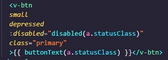
Imagine you have a toy button on your computer screen that can light up or stay grey. We want it to be a small button, use the main color, and sometimes we don’t want people to click it. To set it up, the programmer uses words to tell the button how to look and act. Funny enough, those words sound like we’re talking about feelings! The code says the button is “small”, “depressed”, and “disabled”, which in everyday language sounds like we have a tiny button that is sad and can’t do anything. 😢 But really, it’s not sad at all – it’s just a way to describe its style and state. “Depressed” just means the button looks pressed down flat (like a button that stays in when you press it), and “disabled” means it’s turned off so you can’t click it right now.

Think of it like a toy car: you can call it a “blue fast car with no batteries.” That doesn’t mean the car feels blue or is actually sad; it means it’s painted blue, it can go fast, but at the moment it can’t run because there are no batteries. In the same way, calling a button “depressed and disabled” sounds emotional, but it really means it’s styled flat and not working by design. The reason it’s funny is because the computer doesn’t understand emotions – it’s using those words in a technical way – yet to us humans, it reads like the button is having a bad day. We know buttons don’t have feelings, so seeing those words together makes us laugh. It’s a silly little mix-up between computer language and human language, making the button sound like a sad little thing even though it’s completely fine in button-land.

Level 2: Not Actually Sad

Let’s break down what’s really happening in this code snippet, in plain technical terms. This is a Vue.js component template using Vuetify’s button component, <v-btn>. Despite the words sounding like feelings, they each have a specific job in the interface. In frontend development, especially with frameworks like Vue and libraries like Vuetify, we use these props and attributes to control how things look and behave. Here's the code from the meme, simplified:

<v-btn small depressed :disabled="disabled(a.statusClass)" class="primary">
  {{ buttonText(a.statusClass) }}
</v-btn>

Now, what does each part mean?

  • Vue.js: A JavaScript framework used in web development to build reactive user interfaces. Templates in Vue let us write HTML-like code with special features.
  • Vuetify: A UI component library for Vue.js, following Material Design guidelines. It gives us ready-made components like forms, cards, and buttons so we don’t have to style everything from scratch. <v-btn> is Vuetify’s component for a button (it’s like a fancy <button> tag with extra powers).
  • small (boolean prop on <v-btn>): This makes the button smaller than the default size. In Vuetify, just writing the prop name (without : or a value) means you’re setting that prop to true. It’s a shortcut for “enable the small size variant”. So small = make the button compact.
  • depressed (boolean prop on <v-btn>): This is a stylistic option that removes the usual elevation or shadow from the button, so it looks flat, as if it’s pressed down into the page. (Think of a physical button that stays pressed in—developers call that look “depressed”.) It doesn’t mean the button is sad; it just means it doesn’t have a raised shadow. It’s similar to a “flat” style button.
  • :disabled="disabled(a.statusClass)": The : in front of disabled means we are using Vue’s v-bind directive to bind the HTML disabled attribute to a dynamic value. In plain HTML, disabled is an attribute that, when present, makes a button not clickable and greyed out. Here, instead of just writing disabled or :disabled="true", the code calls a method or computed property named disabled() with an argument (a.statusClass). Likely, disabled(a.statusClass) is a function in the Vue component’s script that returns true or false based on a.statusClass. In other words, the button will be disabled (unclickable) if whatever condition disabled(a.statusClass) checks comes out true. Perhaps a.statusClass describes some status of an item (like “completed” or “inactive”), and the button should be disabled for certain statuses. This is a common pattern: enabling/disabling UI elements based on application state. So effectively, :disabled="disabled(a.statusClass)" = sometimes turn off this button (dynamically, depending on data).
  • class="primary": This sets an HTML CSS class on the button element. In Vuetify, there is a concept of theme colors (primary, secondary, etc.). Often, Vuetify provides a prop like color="primary" to style a component, but you can also use classes. If a class named “primary” is defined (Vuetify might map it to the theme’s primary color, or the developer may have their own CSS), this will style the button with the primary color scheme (usually a prominent color like blue). So class="primary" = make the button follow the primary theme color.
  • {{ buttonText(a.statusClass) }}: These double curly braces are Vue’s text interpolation syntax. It means “insert the result of the buttonText(a.statusClass) expression here as text.” So there is likely a method or computed property buttonText() that returns a label (string) based on the a.statusClass value. For example, if a.statusClass were "error", maybe buttonText returns "Retry"; if it’s "success", maybe it returns "Done". This way the button’s text updates dynamically depending on context. It’s how Vue displays dynamic content. In short, {{ buttonText(a.statusClass) }} = show a label on the button that can change based on status.

When you see it all together in the editor with pretty colors, each piece is distinct. But reading those prop names together without context is inadvertently funny. The words “small”, “depressed”, “disabled”, “primary” are not actually describing emotions or people – they’re describing a UI element’s configuration:

  • “small” = size,
  • “depressed” = style (flat look),
  • “disabled” = state (inactive),
  • “primary” = importance/style theme (main color).

So, even though it reads like “the primary button is small, depressed, and disabled”, it’s really just a concise way to set a bunch of design options on a button. Frontend developers often use such shorthand. For example, in plain HTML a disabled button might be: <button disabled>Submit</button>. In Vue/Vuetify, we layer on more options as seen here.

This combination is a little FrontendHumor gem because our human brains momentarily ignore the technical meaning and imagine the literal meaning. It’s like if someone unfamiliar with coding looked at it, they might ask, “Why are you calling the button depressed and disabled? Is it okay?” 😅 As developers, we have to remember these terms are overloaded: in code, disabled just means “turned off”, and depressed is just “pressed down flat”. No actual sadness involved! The meme is pointing out this funny overlap between programming language and everyday language. It’s a common inside joke among developers (DeveloperInJokes): code can sound really strange or funny when read out of context.

So, don’t worry – our small primary button isn’t having an existential crisis. It’s just been styled to be small, given a flat appearance, and temporarily deactivated based on some condition. In the world of Frontend Development, that’s business as usual. The humor comes from the English phrasing, not from any problem in the code. In fact, this code is perfectly fine (likely part of a real feature). Once you know what each part means, the joke dissolves and you see the intended purpose. But until then, it’s a great example of how code can unintentionally read like a quirky sentence!

Level 3: Props with Feelings

At first glance, this code snippet looks like it's describing the button’s emotional state. An experienced front-end developer can’t help but chuckle: a Vuetify <v-btn> is configured with small, depressed, and :disabled props, plus a "primary" class. Read out loud, it literally says we have a small, depressed, disabled, primary button. It's a perfect storm of UI terminology colliding with plain English in a way that tells a sad little story. But behind the humor lies very real frontend mechanics:

In Vue.js (the progressive JavaScript framework) using Vuetify (a popular UI framework for Vue), you'll often stack multiple props on a component to tweak its appearance and behavior. Here the developer combined size, style, state, and theme:

<v-btn small depressed :disabled="disabled(a.statusClass)" class="primary">
  {{ buttonText(a.statusClass) }}
</v-btn>

Each attribute is intentional:

  • small makes the button more compact.
  • depressed is a Vuetify prop that flattens the button's elevation (no drop-shadows), so it looks literally pressed in or depressed (in UI terms, not mood).
  • :disabled="disabled(a.statusClass)" dynamically binds the button’s disabled state to a condition (calling a method disabled() with a.statusClass to decide if the button should be interactive). When true, the button is non-interactive/grayed out.
  • class="primary" applies the primary color/styling, marking it as the main action button (often styled in a bold color by the framework's theme).

For veteran developers, the comedy comes from the component_prop_wordplay: these independent props coincidentally form a melancholic phrase. It’s a classic DeveloperHumor moment in FrontendDevelopment – something only folks who wrangle UI code would see. The juxtaposition is entirely accidental: Vuetify’s API wasn’t trying to be poetic, it just chose descriptive names. In fact, Vuetify followed Material Design conventions (e.g., a “depressed” button style is one with no shadow, appearing as if it’s pressed into the interface). Similarly, disabled is a standard web term meaning “not active” (an HTML button can have a disabled attribute), and small is a common size modifier. These make perfect sense in code, but string them together and you get a sentence worthy of a therapy session for UI elements.

Seasoned frontend engineers might recall other frameworks with unintentionally funny combos – like Bootstrap’s classes creating phrases such as btn btn-primary disabled (a primary disabled button, how tragic!). We often name things in WebDev for clarity: “primary” indicates importance or a theme color, “disabled” stops user interaction, “depressed” conveys visual style. Each term is context-specific, but when context is dropped, the words revert to their everyday meanings. This meme exploits that dual meaning. It’s an insider chuckle at how our code can sound absurd out of context. We’ve all been there: after hours of coding, you read a line like this and suddenly empathize with a UI component as if it had feelings.

The reason this tickles the senior dev’s funny bone is because it underscores a truth about frameworks: they strive for readable, semantic APIs. Vuetify could have named the prop flat or noShadow, but naming it depressed gives a clear visual metaphor (a pushed-in button) – and a comedic double entendre. The Frontend world is filled with these little Easter eggs of language. We prize code that reads like English, but sometimes that English reads like a joke. In daily development, you normally parse these words in their technical context without a second thought. But when someone points it out – “hey, this literally says the button is small, depressed, and disabled” – you can’t unsee it. It’s a reminder that even our serious UI components can accidentally tell a sad story. And of course, the Vue interpolation {{ buttonText(a.statusClass) }} suggests the button’s text might change based on status – perhaps adding to the narrative (imagine it showing “Not Allowed” or “Unavailable” – poor little button!).

In summary, this meme resonates with engineers because it’s a light-hearted break from the usual grind: an example of FrontendHumor emerging from the very tools and frameworks we use. It pokes fun at how frameworks choose naming conventions, and how those can create emotional narratives when combined. No actual UI components were emotionally harmed here – but the developer reading it might anthropomorphize the button just for a giggle, then carry on coding. It’s a tiny shared joke about the literalism in code and the human tendency to find patterns (or feelings) even in our props. 🎉

Description

A close-up screenshot of a code snippet written in what appears to be a Vue.js template, displayed in a dark-themed editor. The code defines a '<v-btn>' component, which is likely from the Vuetify framework. Several properties are applied to the button, with 'small' and 'depressed' listed on separate lines in yellow text. This creates a humorous double entendre, as 'depressed' in Vuetify simply removes the button's box shadow for a flat design, but combined with 'small', it personifies the UI element as feeling insignificant and sad. The joke lands with experienced developers who are familiar with the often oddly-named properties in frameworks and can relate to the feelings of being small and depressed during challenging projects

Comments

20
Anonymous ★ Top Pick That button's state is 'depressed.' If it were 'disabled,' it would be a senior dev five minutes before vacation
  1. Anonymous ★ Top Pick

    That button's state is 'depressed.' If it were 'disabled,' it would be a senior dev five minutes before vacation

  2. Anonymous

    This <v-btn> is the front-end embodiment of our 2007 “core” service - still labeled primary, but after 30 sprints of scope creep it’s small, depressed, and feature-flagged into permanent disability

  3. Anonymous

    After 15 years in the industry, I've learned that 'statusClass' is just a fancy way of saying 'I'll figure out what this actually does when it breaks in production at 3 AM.'

  4. Anonymous

    When your UI framework's 'depressed' class for flat button styling perfectly captures the emotional state of the developer implementing yet another conditional button variant at 2 AM. Vuetify's design system is technically accurate, but the code reads like a cry for help wrapped in proper component composition

  5. Anonymous

    Small, depressed, disabled, yet class='primary' - the enterprise CTA behind three feature flags and a CAB review: beautifully styled no-op

  6. Anonymous

    Small, depressed, disabled, yet class="primary" - peak enterprise Vue: when statusClass is your state machine and the business logic lives inside class names

  7. Anonymous

    Small, depressed, primary yet disabled: the v-btn that perfectly models a feature flagged off in staging after statusClass meets stakeholder 'feedback'

  8. @RiedleroD 5y

    that looks like html, css and js in one place.

    1. @lowerkinded 5y

      jsx

  9. @RiedleroD 5y

    no idea what it actually is

    1. @dontmindmehere 5y

      Vue.js

  10. @lowerkinded 5y

    cool but where is the funny tho

    1. @bashiordache 5y

      the poor button is small, depressed and disabled because of it's status class

    2. dev_meme 5y

      Who said memes have to be funny only?

  11. @dmytro_sukhariev 5y

    мне кажется или это jsx на clojurescript?

    1. @justjonniejoy 5y

      обычный vue.js

  12. Deleted Account 5y

    its vue and vuetify ui library, bruh

  13. dev_meme 5y

    Pay some respect to depressive memes!

  14. @Sashman 5y

    to small depressed disabled buttons!

  15. @BotMike 5y

    This v-btn is literally me...

Use J and K for navigation