UI vs. UX: The Classic 'Beauty vs. Brains' Debate
Why is this UX UI meme funny?
Level 1: Shiny Gift, Empty Box
Imagine you get a birthday present that’s wrapped in the most beautiful shiny paper with a huge bow. It looks amazing on the outside – you’re super excited to open it! But when you do open it, the box is empty. 😟 That’s a bummer, right? It’s the same kind of funny disappointment this meme is talking about. The “shiny outside” of the gift is like a pretty UI (how an app or website looks), and the “empty inside” is like missing UX (how it actually works and feels). If something is all fancy looks but doesn’t actually do anything useful or is confusing to use, it’s just not satisfying. In other words, being pretty on the surface isn’t enough without some brains or substance behind it. The meme jokingly says a user interface without good user experience is like beauty without brains – it might catch your eye at first, but in the end, it’s not good enough!
Level 2: Pretty vs Practical
Let’s break down what UI and UX actually mean, especially for those new to Frontend development or design. UI (User Interface) is about how things look: the layout of a website or app, the colors, the typography, the buttons and icons – basically all the visual stuff the user sees and interacts with. UX (User Experience) is about how things work and feel: it’s the experience the user has while using the product – is it easy to use? intuitive? efficient? enjoyable? It deals with the practical side, like making sure a sign-up process is smooth, or that you can find the features you need without a hassle.
A helpful way to remember the difference is:
| UI (User Interface) | UX (User Experience) |
|---|---|
| The visual design of the product – its look and style. | The overall feel of the product – how it works for the user. |
| Focuses on aesthetics: colors, fonts, spacing, and shiny graphics. | Focuses on usability: ease of use, clarity, and usefulness of features. |
| For example, how a button is styled (shape, color, label). | For example, what happens when you click the button (does it do what you expect? is it satisfying?). |
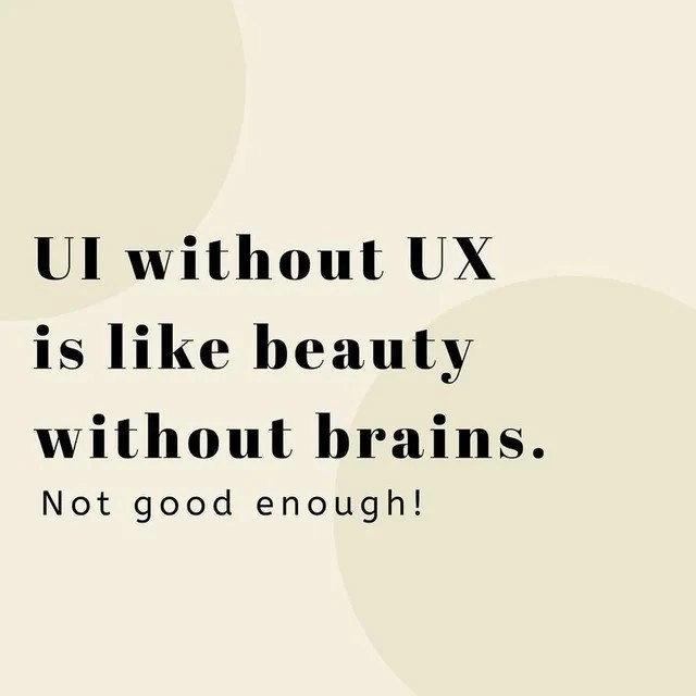
Now, the meme’s statement “UI without UX is like beauty without brains” basically means: if you have a pretty interface with no thoughtful experience design behind it, you’ve got a big problem. It’s akin to having a beautifully decorated car with no engine – it might look awesome, but it won’t take you anywhere. In tech terms, an application that’s all UI and no UX might have gorgeous screens and modern graphics, but users will struggle to actually use it. That’s why the meme adds the little line “Not good enough!” – just looking good isn’t enough for a product to be successful. You need the “brains” – the UX design principles and research – to back up the “beauty” of the UI design.
Consider a common scenario: let’s say you’re a junior front-end developer who just built your first web page for a school project or startup idea. You focus heavily on making it look beautiful – you pick a great color scheme, add cool images, maybe use fancy CSS animations. It really does look impressive, like something worthy of an Instagram post about modern design. But then you have your friends try to use it, and you discover they’re confused. Maybe they can’t find the navigation menu because it’s hidden behind an ambiguous icon. Or perhaps the text is hard to read because the font is stylish but too small. Maybe the sign-up form, while visually appealing, doesn’t clearly tell users if their password was accepted or if an error occurred. These are all UXDesignPrinciples issues. They’re not about how the site looks, but about how it works for the user.
A team that over-invests in pixel-perfect visuals might, for example, spend days tweaking the shadow on a button or the spacing of elements on the page (that’s the UI polish), yet they might skip doing a usability test with real users or neglect writing helpful error messages. Without UX input, they might not realize that their beautiful color palette has poor contrast (making text hard to read), or that their fancy menu is not obvious to users. This is what we mean by aesthetics_over_usability – choosing looks over practical function. It’s a classic rookie mistake (and sometimes a not-so-rookie mistake too!). In the world of UIDesign and UXDesign, there’s a mantra: “Don’t make me think.” A well-designed product should feel natural to use; the user shouldn’t have to stop and figure out how the interface works. If a design is so focused on looking cool that it makes users puzzled, then it’s failing the UX test.
Some key terms and concepts involved here:
Usability Research: This means testing and studying how real people use your product. For instance, you might conduct a user testing session where you watch someone try to complete a task on your app. If they get lost or confused, that’s a UX problem to fix. Many newbie developers skip this step, but it’s crucial. It’s like proofreading an essay – you need someone to try it out to catch issues you never thought of.
Information Architecture: This is a fancy term for how information is organized and structured in your app or site. Think of it like the layout of a supermarket: if items (features) are arranged logically, shoppers (users) find what they need quickly. If you only focus on pretty labels and signs (UI) but put items in strange aisles, customers wander around frustrated. Good UX means organizing content and features in a way that makes sense to users.
User Flows: This refers to the paths or steps a user takes to accomplish something (like placing an order, or updating their profile). It’s a big part of UX design. Even if each screen is beautifully designed, have you considered the flow from one screen to the next? For example, after a user clicks "Sign Up", do they know what to do next? Do they get a confirmation? If the flow is confusing or has dead-ends, it’s like having a gorgeous maze with no exit — not a fun experience.
To put it another way, UI is often what we show to stakeholders for a "wow" factor, but UX is what determines if people will continue using the product after that first minute. Early-career devs might initially be tasked with making a page pixel-perfect, but soon they learn that DesignTradeoffs are involved: sometimes you might sacrifice a bit of visual flair to make something clearer or faster for the user. And that’s usually the right call. A common piece of advice is to start with wireframes or prototypes focusing on UX first (layout, flow, “brains”), and only then skin it with a nice UI (“beauty”). Skipping those UX steps is tempting (because polishing UI is more immediately gratifying — who doesn’t love seeing a pretty design come to life?), but as the meme humorously warns: it’s not good enough to have beauty alone.
So, the next time you’re working on a project and someone says, “Hey, just make it look good and we’ll handle the rest later,” remember this meme. UI without UX is like a stunning car with no steering wheel – pretty pointless! The RelatableDevExperience captured here is that balance in design matters: Frontend folks chuckle because perhaps they’ve shipped something under pressure that looked amazing, only to watch users struggle and think, “Oops, we forgot the brains behind the beauty.” Lesson learned, hopefully with a bit of humor on the side!
Level 3: Pixel-Perfect Pitfalls
This meme nails a core truth in software design: a shiny UI (User Interface) isn’t worth much without a smart UX (User Experience) behind it. It’s poking fun at teams that obsess over pixel-perfect visuals and aesthetics_over_usability, while neglecting the actual usability and user flows of the product. In real projects, senior front-end engineers and UX designers often sigh at this scenario: an application that looks stunning in screenshots but frustrates users when they try to actually use it. It’s the classic ui_vs_ux showdown between style and substance.
In practice, this situation can be painfully relatable. Imagine a product manager who pressures the team to ship a gorgeous redesign ASAP, ignoring the UX researcher’s warnings:
Manager: "Our new interface looks amazing, let’s launch it now!"
UX Designer: "But in testing, users couldn’t even find the checkout button..."
Manager: "It’ll be fine. Look how modern it looks!"
The result? Users open the app, admire the modern look for a second, then immediately get confused. The interface might win a design award for beauty, but users are submitting angry support tickets because they can’t accomplish basic tasks. An experienced developer or designer reads this meme and chuckles (or maybe groans) because they’ve lived this. It’s a scene straight out of TechHumor and FrontendHumor folklore: the sleek mobile app that nobody knows how to navigate, or the website with an avant-garde menu hidden behind an obscure icon that nobody recognizes.
Why is this so funny (or tragic)? The meme highlights a common industry anti-pattern: design_without_research. Teams sometimes treat UX research, information architecture, and accessibility as “nice-to-have” extras, pouring all their time into visual polish. The interface may use the trendiest color gradients, stunning typography, and snappy micro-animations, but if users can’t figure out how to add an item to their cart or if the workflow doesn’t match any sane UXDesignPrinciples, you’ve basically painted a sports car that has no engine. Practically speaking, it’s not good enough! A real-world example senior devs like to cite is the prevalence of “Norman doors” in software — named after design expert Don Norman’s example of doors that look stylish but give no clue whether to push or pull. In apps, the equivalent might be a clean minimalist UI that lacks visual cues for interactivity (e.g., text that looks like a heading but is actually a button 🔓).
From a systems perspective, delivering UI without UX creates design tradeoffs that bite back later. It’s like shipping a feature-complete backend with no consideration for how humans will interact with it. The technical debt here isn’t in code; it’s in experience debt. You inevitably spend time later patching the interface with tooltips, FAQs, and hotfixes to handle all the user confusion — issues that proper UX design would have prevented from the start. Seasoned developers know that a beautiful login screen means nothing if users can’t figure out how to sign up, or if an error state isn’t handled gracefully. In fact, many bugs reported in production are not code errors at all, but UX flaws: unclear instructions, buttons too hard to find on the page, flows that don’t match user expectations. Each of these is a Pixel-Perfect Pitfall: focusing on a pretty detail while a fundamental usability problem goes unchecked.
Technically speaking, the humor has a tinge of painful truth: building a solid user experience requires a lot of behind-the-scenes work — prototyping, user testing, iterative improvement — which doesn’t show up in a flashy UI demo. Under the hood, a good user experience might involve boring things like form validation, logical navigation paths, performance tuning, and accessibility features (keyboard navigation, screen reader support, etc.). These don’t make for sexy screenshots, but they make or break the product’s success. We often see scenarios where developers implement a fancy UI component library with beautiful widgets, but skip writing the JavaScript to handle user interactions properly or omit state management that preserves what the user was doing. It’s akin to writing code that compiles but doesn’t actually do the right thing when run: an interface that renders but doesn’t deliver. Here’s a tongue-in-cheek mini snippet to illustrate:
<!-- A beautiful "Buy Now" button styled with fancy CSS -->
<button class="shiny-button">Buy Now</button>
<style>
.shiny-button {
padding: 12px 24px;
font-size: 1.1em;
color: #fff;
border: none;
border-radius: 5px;
background: linear-gradient(45deg, #ff4081, #ff80ab);
/* more gorgeous styling... */
}
</style>
<script>
// Oops, no onClick handler! The button looks great but does nothing - UI with no UX logic.
</script>
In the snippet above, we have the “beauty” (lovely styles) without the “brains” (no click functionality or follow-up action). This is obviously a simplified joke, but it captures the essence of a RelatableDevExperience: many of us have seen UIs that acted like this button — all form, no function.
The meme’s bold statement, “UI without UX is like beauty without brains”, uses a humorous metaphor to convey that Frontend developers and designers must balance UIDesign with UXDesign. The overlap of those two worlds is where truly great products are born. Senior folks know that behind every simple, intuitive app screen, there were probably dozens of test iterations and UX decisions guiding that simplicity. So when they see a product that’s all glitter with no substance, they can’t help but laugh (or cry) at how often this happens. Ultimately, the joke lands because it’s a truth seasoned devs and designers have learned the hard way: if you over-invest in the shiny UI and ignore the UX brains, your project may look great in the demo, but real users will give it a big thumbs down in practice. And that gap between how good something appears and how well it works is exactly where the humor (and pain) of this meme lives.
Description
This image presents a design maxim in a clean, minimalist graphic with a cream-colored background and black serif font. The text reads, 'UI without UX is like beauty without brains. Not good enough!' The quote forcefully argues for the importance of User Experience (UX) over just User Interface (UI). For developers and designers, this is a core principle. UI refers to the visual elements of an application - the buttons, colors, and layout (the 'beauty'). UX, on the other hand, refers to the overall feel and usability of the application - how intuitive the workflow is, how efficiently users can accomplish tasks, and whether the application actually solves their problem (the 'brains'). The image serves as a concise reminder that a visually stunning application is ultimately a failure if it's confusing, frustrating, or useless to the end-user
Comments
8Comment deleted
UI without UX is a Dribbble portfolio. UX without UI is a perfectly architected backend service that the business thinks is vaporware
Shipping pixel-perfect UI without UX is the front-end version of hitting 100% unit test coverage by stubbing everything to return true - dashboards look great, pager still goes off at 2 AM
After 20 years in tech, I've seen countless beautiful interfaces that users abandoned faster than a MongoDB instance without proper indexing - turns out, making buttons gradient and adding parallax scrolling doesn't fix a checkout flow that requires 17 steps and three password resets
This perfectly captures the eternal struggle: you can make your app look like it belongs in a design museum, but if users can't figure out how to delete their account without a PhD in archaeology, you've just built a very expensive monument to confusion. It's the software equivalent of a sports car with no steering wheel - gorgeous in the driveway, utterly useless on the road. Senior engineers know that the real art isn't in the gradient transitions or the micro-interactions; it's in anticipating that one edge case where a user tries to upload a 4GB CSV file on a mobile connection at 2 AM, and your app handles it gracefully instead of catching fire
Beauty without brains? That's just lipstick on a legacy monolith
UI without UX is Figma-driven development: pixel-perfect buttons for a workflow that should’ve been one API call
UI without UX is the design equivalent of 100% test coverage on mocks - comforting dashboards, same broken flow in production
Actually it's like brains without beauty Comment deleted