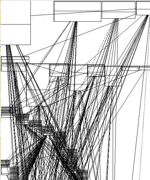
Auto-generated dependency graph of a legacy codebase: visualizing pure architectural chaos
Why is this Dependencies meme funny?
Level 1: Tangled Spaghetti
Imagine you have a big bowl of spaghetti noodles that got all mixed up. Now, someone asks you to pull out one noodle and follow it from one end to the other. But when you try, that noodle wraps around and dives under so many other noodles that you quickly get lost. In fact, if you tried to draw a picture showing which noodle touches which, you’d end up with a crazy scribble of lines crisscrossing everywhere. You wouldn’t be able to tell where one noodle ends and another begins. It would just look like a giant tangled mess.
This meme’s picture is just like that, but for a computer program. Each box is like a piece of the program (imagine each box is a story in a fairy tale book), and each line is like a character in one story who’s also popping into another story. If every character is in every story, all the stories get tangled together and it’s super confusing. The image is funny because someone thought they could understand the whole big program by drawing a neat picture of it – but the picture turned out as messy as the program itself! It’s like cleaning your room by dumping everything in the middle of the floor. Sure, now you see all your toys at once, but it’s even harder to walk around.
So the feeling this picture gives is a mix of surprise and frustration. It’s surprising (and a bit silly-looking) that the diagram meant to simplify things ended up looking like a child’s chaotic doodle. And it’s frustrating because you realize, “Oh no, this is impossible to untangle!” For a non-programmer, just think of any time you’ve seen a bunch of cables or yarn all knotted up. One big knot doesn’t really help you understand what’s connected – it just shows you that everything is. The humor here is in that irony: the tool that was supposed to make understanding easy instead just shouted, “Everything’s connected to everything! Good luck!” and left you with a scribbly picture. In simple terms, it’s funny the same way a absurdly tangled ball of string is funny (after you’re done being upset) – you can’t do much except laugh and grab a pair of scissors.
Level 2: Spaghetti Code 101
At first glance, this diagram is just a jumble of boxes and lines, so let’s break down exactly what we’re looking at. This is basically a dependency graph for a software project. Each box likely represents a class or module in the code, and each line represents a relationship or dependency (for example, Class A calls a function in Class B, or Module X relies on Module Y’s data). In a clean design, those lines would be organized in a nice flow – perhaps layered (e.g., user interface -> logic layer -> data layer), or grouped into clusters that talk to a few other clusters. Here, the lines are everywhere. That tells us that this project’s components are tightly coupled. Coupling is a term for how much pieces of code depend on one another. When coupling is loose, each piece does its job independently and only has a few points of contact with others (which is good, because you can understand or change one module without touching the rest). When coupling is tight, everything is interconnected; changing one thing means you have to worry about lots of other things – exactly the situation shown here.
This kind of all-to-all connectivity is often referred to as “spaghetti code.” That nickname comes from the image of a bowl of spaghetti noodles: a huge tangled snarl where it’s hard to follow one noodle from start to finish. In a spaghetti codebase, if you try to follow the logic of one module, you quickly get led through a dozen others, just like trying to trace one strand of spaghetti in a bowl – it loops around and intertwines with the rest. It’s a term every junior developer eventually hears, usually as a cautionary tale of how not to structure a program. Here, the UML diagram (Unified Modeling Language diagram) literally looks like someone dumped out a serving of spaghetti and drew lines between all the touchpoints. It’s illustrating the concept of dependency hell: a state where managing and understanding dependencies becomes a nightmare.
Let’s clarify a bit more: UML class diagrams are supposed to help visualize the structure of a program – classes, their attributes, methods, and how classes relate (e.g., inheritance, associations). Developers sometimes generate these diagrams to get an “overview” of how the code is organized. It can be useful in well-structured systems, showing neat hierarchies or modules. But if the system has no clear structure, the UML tool doesn’t magically organize it for you; it just faithfully draws what exists – and in this case, it’s drawing a mess. The phrase “Use UML generator… you will get an overview” is being mocked because the overview turned out to be overwhelming rather than enlightening. It’s like zooming out on a map and discovering the city is built with every road intersecting every other road – pure confusion.
There’s also a mention of circular dependencies. This means there are loops in the dependency graph. For example, Module A depends on Module B, and Module B depends on Module A (directly or through some chain: A -> C -> D -> B -> A). In code, that’s problematic because it can lead to situations where two pieces require each other to be present or initialized first – a classic “chicken-and-egg” scenario. If you have a lot of circular dependencies, it often implies you can’t use or understand one part of the system in isolation; you have to load pretty much everything together. Many build systems and programming languages discourage or outright forbid circular dependencies because they complicate compilation and runtime initialization. The fact that this graph likely has many cycles (the lines criss-crossing back onto each other) is a big red flag that the code wasn’t designed with clear separation in mind.
Now, legacy code typically refers to an older codebase that has been around for a long time, often developed by many people who have come and gone. Such codebases didn’t always follow modern best practices (or those best practices hadn’t even been developed when the code was written). Over years, features were added, bugs fixed under pressure, and quick patches applied – all of which can increase coupling and complexity if not carefully managed. The term technical debt is really useful here: it’s the idea that when you take shortcuts in code (like copy-pasting code instead of refactoring, or skipping writing tests, or tightly interweaving modules for speed), you incur a “debt” that eventually has to be paid back. The interest on that debt is the extra difficulty you face later when changing things. This diagram basically visualizes a huge amount of technical debt. Each messy line is like an IOU from the past saying, “We saved time then, but you’ll pay time now to understand this!”
For a junior developer, seeing something like this can be eye-opening (and maybe a little terrifying). If you’ve worked only on small projects or well-structured ones in school, you might not have encountered architecture decay before. Architecture decay means the original clean design of the system has degraded over time. Maybe at one point, the project had clear modules, but with many incremental changes, those boundaries got blurred. Imagine a house that started as a nice 2-bedroom and over the years people kept adding rooms, hallways, weird staircases connecting everything to everything (and no one followed the original blueprint). By the end, the house is a maze – that’s what happened to this software. Each line in the diagram is like a hallway someone knocked through between rooms because it was quicker than going around. Sure, it made things work in the moment, but do it 50 times and now the house is a labyrinth.
The humor in the meme comes from the huge gap between expectation and reality. The expectation: run a UML diagram tool and get a clear, high-level map of the code. The reality: the high-level map is just as confusing as the code itself! It’s funny in a facepalm way – like trying to organize your messy cables by dumping them all out on the floor first. You technically see everything, but it’s even more obviously a mess. For a newcomer, the takeaway is that not all diagrams bring clarity. Sometimes a chaotic diagram is an honest mirror of a chaotic system. And while it’s a bit frightening to realize such systems exist (and you might inherit one someday), it’s also a shared joke among developers: “Here’s what happens when we don’t clean up our messes.” The meme is a lighthearted warning wrapped in humor – and now you’ll definitely recognize “spaghetti code” when you see it (in code or in diagram form).
Level 3: The Gordian Graph
"Use UML generator," they said. "You will get an overview of the project," they said.
Staring at this auto-generated UML dependency graph feels like gazing into the abyss of a legacy codebase. What was meant to provide clarity has instead spewed out a Lovecraftian nightmare of boxes and lines. Each rectangle in this diagram represents a module or class, and each line is a dependency (one piece of code relying on another). In a sane system, you’d see some structure – layers or clusters of components with a few well-defined connections. Here, everything is talking to everything in a chaotic free-for-all. The result? A spaghetti architecture so tangled that even the UML tool basically threw up its hands and drew every possible line at every possible angle. The thin black lines weave an impenetrable web, overlapping so densely that it resembles a black-and-white Jackson Pollock painting. It’s pure architectural chaos distilled into a single image.
This isn’t just a funny visual – it’s a textbook example of uncontrolled coupling and architecture decay. Coupling refers to how much different parts of a system depend on each other. Ideally, you want loose coupling – components connected only by clear, minimal interfaces. But in this codebase, we have pathological tight coupling: each piece is directly or indirectly tied to dozens of others. Change one class, and you’re likely to awaken the kraken – dozens of unrelated parts could break without warning because of those hidden, criss-crossing dependencies. The graph essentially says “good luck isolating any part of this - it’s all one big knot.” It’s the software equivalent of a 1000-piece puzzle where every piece is glued to every other piece.
Seasoned engineers have a name for this pattern: Big Ball of Mud. It’s the ultimate anti-architecture, where expedience and quick fixes over years have created a system with no discernible structure. Initially, there might have been a plan (perhaps a layered design, or some design patterns in play), but technical debt piled up and eroded those boundaries. Each emergency patch and rushed feature added a new ad-hoc connection. Over time, the once-clear architecture diagram morphed into this dependency hell – a DependencyGraph from which no module can escape. We’re basically looking at a visual confession of CodebaseComplexity and SystemComplexity run amok.
Notice how some boxes are aligned at the top, some on the left, others center – likely the UML auto-layout tried multiple strategies (hierarchical layering, force-directed placement, etc.) and finally just shrugged. The result is architecture visual noise: an indecipherable box-and-line mess where lines cut through boxes, loop around, and intersect like a plate of spaghetti dropped on the floor. Any hope of tracing a single dependency path is lost; one line disappears behind another box and emerges 10 cm to the right connected to who-knows-what. It’s practically a dependency web visualization of despair. This is the kind of LegacyCode where even the diagram of the system induces a minor panic attack.
Why is this funny to those of us who’ve been there? Because it’s painfully relatable. Many of us have eagerly run an architectural analysis tool or UML class diagram generator on a gnarly project, hoping for enlightenment. Instead, we get confirmation of our worst fears. The joke is that the advice “use a UML generator for an overview” is hilariously naive when applied to a spaghetti codebase. The only “overview” we get is the realization that the system’s design is FUBAR. In practice, such a diagram is as useful as a map of tangled headphones – it tells you you have a problem, but not how to fix it.
In real-world scenarios, a graph like this has serious implications. It means there are likely circular dependencies lurking (components depending on each other in loops), which can make even compiling or loading the system a fragile dance. It means maintenance is a nightmare – you touch one part of the code and unexpected things break in far-off modules because of implicit couplings that no one remembered. Onboarding new developers becomes an exercise in cruelty: “Here’s the system diagram… good luck.” The shared dark humor here is that every senior dev knows this situation but wishes they didn’t. It’s the kind of codebase where you fix a bug and simultaneously introduce three new ones because the ripple effects are impossible to predict.
From an organizational perspective, such TechnicalDebt doesn’t happen overnight. It’s accumulated through years of move fast and break things, except the breaking things part never gets fully fixed. Short-term deadlines override long-term design, and by the time anyone realizes, you have a monolithic beast with all components fused together. Management might at some point suggest a grand refactor or splitting into microservices: “We’ll untangle this mess after the next release.” Seasoned devs just arch an eyebrow at this, knowing that untangling this requires a herculean effort – equivalent to rewriting a large chunk from scratch. The meme hits home because we’ve sat in those meetings, nodding grimly at the pretty UML chart that’s supposed to comfort us, while internally we’re thinking, “We are so doomed.”
And so the final punchline is that the UML diagram meant to save us has become an exhibit of our failure. It’s hanging there like modern art, almost mocking us. In fact, slap a fancy title on it and you could probably sell it to a contemporary art museum as “Overengineered System Visual #5”. The veteran in me can’t help but chuckle and cringe at the same time: been there, done that, burned the t-shirt. This DependencyHell illustration is funny because it’s true – and also terrifying because it’s true.
Description
The image is a black-and-white diagram filled with dozens of empty rectangular boxes scattered around the canvas, some aligned at the top, left, and center. Each box is connected to many others by thin, straight black lines drawn at every imaginable angle, forming an almost impenetrable web of intersecting edges. The result resembles an auto-generated UML or dependency graph where relationships overlap so densely that individual connections are hard to trace, evoking the look of classic "spaghetti architecture." No text labels are visible inside the boxes, reinforcing the idea that the structure itself - not the content - illustrates the complexity. For software engineers, this instantly signals uncontrolled coupling, hidden circular dependencies, and the inevitable pain of maintaining or refactoring such a system

Comments
14Comment deleted
Asked the UML generator for a “high-level overview”; it returned a Jackson Pollock of circular dependencies - apparently the only bounded context left is my patience
This is the architectural diagram that finally convinced management we needed a refactoring budget - right after they asked us to add "just one more integration."
This is what happens when you run 'npm install' on a project that hasn't been touched since 2015 - a beautiful visualization of why your node_modules folder is 2GB and contains three different versions of lodash, each required by a different transitive dependency that nobody remembers adding. The architect who designed this probably left the company five years ago, and the only documentation is a comment that says 'TODO: refactor this later.' Spoiler: later never came
The service mesh after your team discovers 'observability via every-to-every tracing' - now even the graph can't find itself
Architecture review: “Can someone highlight the critical path?” - “Tarjan says the whole diagram is one strongly connected component.”
This is our event‑driven microservices diagram; every arrow is an RPC with retries and a shared DB behind it - aka the distributed monolith’s self‑portrait
Organizing graphs for readability is NP-hard Comment deleted
I found a super hacky way to do it in networkx Comment deleted
Look at the OP, think again Comment deleted
Just don't organise for readability? Comment deleted
Nope, it's just pointless doing it algorithmically in general case Comment deleted
Cursed legacy project Comment deleted
me likes graphs. graphs good. Comment deleted
There is organic, tree, circle,... automatic reorganisation graph edges with custom minimum free space between them Comment deleted