User Reaction to UI Updates
Why is this UX UI meme funny?
Level 1: New Things Are Scary
Imagine you have a favorite playground where all the slides and swings are in certain spots that you know well. One day, the playground is updated: the swings and slides are moved around to make the playground better – safer and more fun. Now, you come to the playground expecting to run to your usual swing, but it’s not where it used to be. How do you feel? At first, you might be upset or angry simply because it’s different. You liked it the old way because that’s what you were used to. This meme is joking about that exact feeling. It’s saying that when something we use every day (like an app on your phone or computer) gets a new look, people often get mad just because it’s a change, even if the new look is actually nicer or more useful.
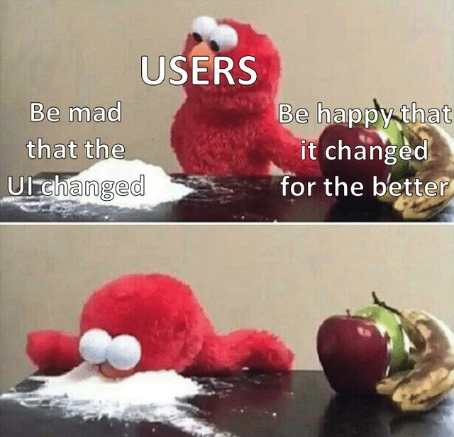
In the picture, a red puppet (Elmo) represents the users of an app. He has two choices in front of him: on one side, there’s a nice apple and banana, which stand for enjoying the new, improved design. On the other side, there’s a pile of white powder (flour) which stands for being angry just because the design changed. What does Elmo do? He completely ignores the healthy, good choice (the fruit) and silly dives face-first into the powder to show he’d rather be mad. It’s a funny way to show that people often reject new things simply because they’re new. It’s like if you offered a kid a yummy new vegetable that’s really good for them, but they throw a tantrum because it’s not their usual french fries. The core idea is very simple: people feel safe with what’s familiar, and when you change it, their first reaction might be to complain or resist. The meme makes us laugh because we recognize this behavior in ourselves or others. It’s poking fun at how we sometimes act like Elmo – ignoring the good improvements and choosing to be upset just because we’re a little scared or uncomfortable with change at first.
Level 2: Change Is Hard
This meme plays on a common experience in UX design and software development: people often don’t like it when the UI (User Interface) of an app or website changes. Let’s break down the scene. We have two panels with the red puppet Elmo (a character from Sesame Street). The word “USERS” is written above Elmo, meaning Elmo represents the typical end-user of your application. In the top image, Elmo is sitting between two options on a table. On Elmo’s left side, there’s a small pile of white flour labeled “Be mad that the UI changed.” On the right side, there’s a shiny red apple and a banana labeled “Be happy that it changed for the better.” These labels describe two possible reactions users could have to a new app interface: outrage or acceptance. The “mad at the UI change” side is portrayed as something oddly tempting (even though a pile of plain flour isn’t actually appealing in real life) while the “happy with improvement” side is depicted as the obvious healthy choice (fruit).
In the bottom panel, the joke comes to life: Elmo has completely ignored the fruit and instead face-planted straight into the white powder. In other words, the USERS character literally dives into being angry about the change. This image is exaggerating how users often choose to be upset about a new design even when that new design is objectively an improvement (healthier or better, like the fruit). The faceplant is a goofy, over-the-top way to show users emphatically picking the “be mad” option. It suggests a kind of emotional, almost childish reaction — picture a toddler throwing themselves onto the floor in a tantrum. Here, Elmo (the users) does it by dunking his face into the flour. This specific format is actually a known meme template (often called the elmo_faceplant_meme in meme communities) used to joke about someone dramatically choosing a silly or self-defeating option.
Now, why is this funny to developers and designers? Because it’s relatable: anyone who has worked on a frontend team or delivered a product update has likely seen users react this way. The meme labels make it clear: the development team offered something better (the improved UI, symbolized by the fresh apple and banana), but users often ignore the improvements and focus on the fact that “it’s different from what they’re used to.” This is a prime example of ui_change_resistance — people resisting an interface update just because it forces them out of their comfortable routine. Users get accustomed to where things are and how things look. When you move their “cheese” (to borrow a phrase about changing something familiar), they can get upset or disoriented. Even if the new design follows solid UX design principles and fixes a lot of old problems, users might not immediately see those benefits. All they notice at first is “My buttons aren’t where they used to be” or “The color scheme is new and strange.” In their mind, the product has suddenly become harder to use, not because the design is worse (often it’s objectively better), but because they haven’t learned the new layout yet. Change means a bit of friction and a learning curve.
Let’s define a few terms to make sure everything is clear: UX stands for User Experience, which is about the overall experience and satisfaction a user has when using a product. UI is User Interface, meaning the actual visual elements and layout the user interacts with (buttons, menus, icons, etc.). A UI redesign means the team changed the look and arrangement of those elements. They might do this to make the app look modern, to improve navigation, or to introduce new features. Ideally, a redesign is done “for the better” — perhaps the old interface was confusing or outdated, and the new one is more intuitive. In the meme, that ideal scenario (“for the better”) is represented by the appealing fruit.
However, an improved UI still disrupts user expectations. Users come to an app expecting things to be in the same place as yesterday. When they aren’t, even if the new setup is logical, the immediate reaction can be frustration. Imagine if your favorite grocery store rearranged all the aisles — you’d walk in and not know where anything is. Even if the new arrangement is meant to be more logical, your first reaction might be annoyance because you have to spend time relearning the layout. That’s exactly what happens with software UIs. This is why companies often conduct user feedback collection during design changes (through beta tests, surveys, or A/B testing) to see how real users feel about the new design before making it permanent. They know some people will react negatively just because the brain has to adjust.
The text on the meme captures this tension. “Be mad that the UI changed” is presented almost like an addictive but unhealthy choice — it’s easier for users to vent and complain than to calmly adapt. “Be happy that it changed for the better” is the rational, positive choice the developers hope for, but it’s sitting there like an ignored piece of fruit. This reflects a frequent stakeholder challenge: you might spend months on a redesign project, with clients or bosses (stakeholders) expecting a positive reception, only to have the actual end-users bombard you with negative feedback as soon as it launches. It’s a bit of a running joke in tech circles (TechHumor) that no matter how much improvement you deliver, the first feedback posts you see will be along the lines of:
Angry User: "What have you done to the app? Everything is ruined now!"
Meanwhile, the improvements you made (that likely solve past complaints or follow updated design standards) get overlooked initially. The meme is relatable humor because it dramatizes this exact scenario in a simple visual: the user base literally ignores the good stuff and dives into complaining. Frontend developers and UI/UX designers chuckle (or maybe sigh) when they see this, because they’ve lived this experience. It’s almost an inside joke about user feedback: often loud and initially negative, yet a predictable part of the cycle whenever you do a product update. Over time, many users do calm down and realize the new UI is actually nicer — but those first few days, as this meme implies, they’d rather be upset just because something changed.
Level 3: No Good Redesign Goes Unpunished
On a deep UX/UI level, this meme highlights the classic phenomenon of user change aversion in software development. The front-end team has rolled out a painstakingly improved UI redesign — better usability, cleaner look, perhaps even faster load times. By all objective UX design principles, this update is a win. Yet USERS, as depicted by the ever-dramatic Elmo, often react with immediate outrage purely because the UI changed at all. The top panel sets up two choices for the user base: on one side, a healthy acceptance of the new design ("Be happy that it changed for the better"), and on the other, an almost irrational rejection ("Be mad that the UI changed"). In true meme fashion, the users (Elmo) completely ignore the reasonable option (represented by a fresh apple and banana) and instead dive face-first into the absurd choice – the white powdery pile of discontent. This visual gag of Elmo face-planting into a mound of flour exaggerates the over-the-top backlash users unleash whenever a familiar interface is revamped. It’s a perfect snapshot of UX irony: even improvements born of user research and feedback can be met with initial animosity just because they disrupt familiarity.
The humor here is painfully relatable to anyone who’s shipped a UI update. It plays on the product_update_backlash that seems inevitable whenever beloved software gets a new paint job. No matter how much the redesign adheres to UX design principles or how many beta users said it was great, the wider audience often revolts on release day. We see this time and again: a social media app changes its layout and Twitter explodes with furious posts; a game updates its HUD and forums fill with “Bring back the old UI!” threads. In meetings, the stakeholders (product managers, client representatives, etc.) might frantically forward angry customer emails to the dev team: “Users hate it! Why did we change this?!” It’s a scenario where logical trade-offs and months of careful design are instantly overshadowed by emotional user feedback – a classic case of user expectations clashing with progress.
Why are users like this? It turns out humans are wired to favor the familiar. In cognitive terms, any change — even a positive one — introduces friction. Users have muscle memory for the old interface; they’ve learned exactly which menu item is where. A redesign, however intuitive in theory, forces a relearning. Initially, that feels like a sudden loss of efficiency and control, triggering frustration. Psychologically, it’s akin to a mini “loss aversion” effect: users perceive the removal of the old familiar layout as a loss, even if the new one offers gains. There’s also the expectation vs. reality gap: if users open an app expecting it to look a certain way and are surprised by a new look, that surprise can skew negative. This knee-jerk resistance is so common it’s practically a UX design pattern (or anti-pattern) in itself – designers must anticipate it. It’s why many apps include brief tutorials or highlight tours after a big update (“See what’s new!”) to help users adapt, and why change management is a big part of UX strategy. The meme humorously cuts through all that nuance to show the raw truth: given the choice to praise a good change or complain about any change, a sizable chunk of users will instinctively choose the latter.
From a seasoned developer’s perspective, this image also reflects a bit of weary humor. Frontend engineers often joke that “No one reads the release notes; they just go straight to complaining”. The Elmo meme format exaggerates this kind of user behavior to comic effect. Elmo’s dramatic dunk into the flour is like a user base collectively throwing a tantrum. The apple and banana – universally seen as wholesome choices – symbolize the genuinely better UX the team delivered. But users often ignore the actual improvements (better performance, more accessibility, cleaner design) and hone in on the one thing they care about: “It’s different now, and I don’t like different!” It’s a scenario that has led to many a sarcastic coffee-break remark among developers: “We gave them what they asked for, and they still weren’t happy.” The meme winks at this shared experience, acknowledging the disconnect between what users say they want (improvements) and how they actually react to those improvements when their routines are disrupted.
In practice, handling this UI change resistance is a delicate art. Smart teams do gradual rollouts or optional “Try the new design” toggles specifically to avoid the full-on faceplant moment shown in the meme. Stakeholders and client-facing team members brace themselves for the flood of confused support tickets after any major update. A bit of dark humor creeps in: it’s almost expected that a fraction of the user base will behave like Elmo here. Internally, devs might even half-jokingly write pseudo-code to anticipate the backlash:
try:
launch_redesign() # Deploy the improved UI
print("New UI live! Users will love it.")
except UserOutrageError:
print("Rolling back to old UI... Users are furious.")
restore_old_ui()
This tongue-in-cheek snippet captures the meme’s essence: even a successful deployment can feel like it “threw an exception” because of user outrage. Of course, in reality, rolling back a redesign isn’t so simple – doing so has its own costs and upsets another set of users who did like the changes. But the code joke resonates with developers: it’s a dramatization of that sinking feeling when you realize your user feedback collection is mostly angry comments post-update. Ultimately, “When users choose outrage over your improved UI” is a scenario that mixes technical challenges with human psychology. The meme gets a laugh (or a groan) from tech professionals because it’s relatable humor built on a truth we all learn sooner or later: even the best improvements can meet passionate resistance, and sometimes it feels like users would rather snort a line of outrage than take a bite of positive change.
Description
This is a two-panel meme known as 'Elmo's Choice' or 'Elmo with Cocaine'. In the top panel, a red Elmo stuffed animal, labeled 'USERS', is presented with two options. On the left is a pile of white powder representing an unhealthy choice, labeled 'Be mad that the UI changed'. On the right is a pile of healthy fruit (an apple and a banana), labeled 'Be happy that it changed for the better'. In the bottom panel, Elmo has decisively slammed his face into the pile of powder, completely ignoring the fruit. This meme humorously and cynically portrays the common user reaction to software updates. It satirizes the tendency of users to instinctively react with anger and frustration to any change in the user interface, even if the changes are objectively improvements to functionality or usability. For senior developers and product managers, this is a deeply relatable scenario reflecting the challenge of managing user expectations and the inherent resistance to change, regardless of the benefits

Comments
9Comment deleted
The main purpose of a gradual rollout isn't to test for bugs; it's to gaslight your users into thinking the UI was always this way
We shaved 300 ms off FCP, hit Lighthouse 100s, and even got WCAG AAA - yet every support ticket just says “revert, the button isn’t blue anymore.” Latency is negotiable; hue is sacred
After 20 years in tech, I've learned the only UI change users won't complain about is the one that never ships - which they'll also complain about. The real cocaine here is the dopamine hit from finally deprecating IE11 support
After 15 years in the industry, you learn that 'improved UX' is just a euphemism for 'prepare for a week of support tickets from users who can't find the button we moved 3 pixels to the left.' The real product roadmap isn't about features - it's about managing the emotional stages of grief users experience when you dare to update a shadow radius. Ship the A/B test, watch the metrics improve by 40%, read the feedback saying 'change it back,' and realize that Stockholm syndrome is the most powerful force in interface design
UI redesigns: users treat 'better UX' like a deprecated endpoint - immediate 410 Gone on their muscle memory
A/B says +3% task completion, but muscle-memory regressions turned the helpdesk into a write-ahead log - once the complaints append, nobody approves the rollback delete
Every redesign reminds me UI needs semantic versioning - move a button 8px and you’ve shipped a major release with an instant NPS regression
Better for the company maybe Comment deleted
For the better? Never happened to facebook Comment deleted