When Your Favorite App Update Ships Sparkle Over Actual Improvements
Why is this UX UI meme funny?
Level 1: Glitter on a Broken Toy
Imagine you have a favorite toy car that you play with every day. Over time, one of its wheels became loose and the car doesn’t drive straight anymore. You’re excited when your parent says they’re going to fix your toy. You wait eagerly, thinking the car will come back working better than ever. Now, picture this: when they return it to you, the wheel is still loose, but the entire car is covered in shiny gold glitter and stickers. It’s so sparkly you can hardly see the original car’s color! On the outside it looks new and flashy, but when you try to roll it on the floor... it still wobbles and veers off because that wheel wasn’t actually fixed. You give a little smile and say “Wow, it looks… fancy,” but inside you’re a bit disappointed because what you really wanted was a better working toy, not just a shinier one.
That’s exactly what’s happening in this meme. The man was happy to get an update for his app (like you were happy to get your toy back). But the only thing the update did was add a bunch of sparkles (like the glitter on the toy) without fixing any of the app’s real problems. It’s funny in a silly way: it’s as if someone tried to make something better by just making it shinier, even though the real issues are still there. The poor guy in the picture is smiling through the frustration, just like you might politely smile about your glittery car even though you’re thinking, “I wish it actually worked right.” The meme makes us laugh because we all know that feeling when something is all sparkly show and no real improvement. It’s a reminder that sometimes, underneath the glitter, the toy is still broken.
Level 2: Feature Bloat Blues
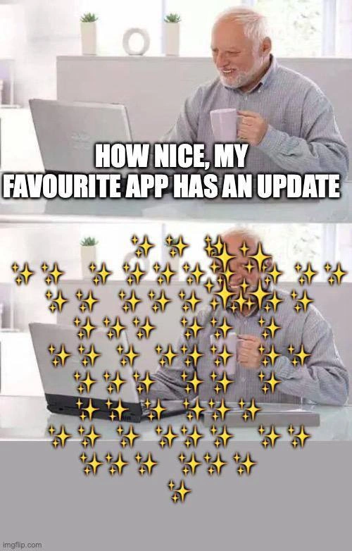
Let’s break down what’s going on here in simpler terms. The meme shows a two-panel image of an older man (known on the internet as “Hide the Pain Harold” for his meme-famous smile that hides discomfort) sitting at his laptop. In the first panel, he’s happy because his favorite app says there’s an update available. Think of when you see a notification that a new version of some app you love can be downloaded – you’re hopeful it might have cool new features or fix something that was bothering you. The text reflects this: “HOW NICE, MY FAVOURITE APP HAS AN UPDATE.”
Now, the second panel is the surprise: when he installs the update and opens the app, his entire screen (and even his face in the photo) is almost completely covered by dozens of sparkling star emojis. You can barely see him behind all the glitter. It’s as if the app’s new update literally dumped a layer of shiny confetti all over the interface. The joke here is that instead of the update delivering something actually useful, it just added a ridiculous glitter overlay – lots of sparkly animations – that doesn’t really help the user at all. Harold is still smiling, but we call him “Hide the Pain” for a reason: the smile is masking his inner disappointment. The poor guy was expecting something great from this update, and now he’s thinking, “What the heck is this?!” while trying to keep a polite face.
This scenario riffs on a common problem in software: feature bloat. That’s when over time an app keeps accumulating more and more features or decorative elements that it might not need. Instead of improving what’s important, each update adds another thing – like a new popup, another menu item, or in this extreme case, a bunch of sparkles – and eventually the app feels cluttered and heavy. You might also hear this called feature creep (because features creep in a bit at a time, quietly making the app a bloated beast before you know it). It’s like if every time you cleaned your room, you also bought a new toy and never threw anything away; pretty soon you can’t find your bed under all the stuff. Here the “stuff” added is flashy but shallow – glitter and animation – hence the blues (disappointment) of feature bloat: more stuff, but not more value.
Some key terms and concepts from this meme, explained in plain language:
- User Experience (UX): This is about how a user feels when using an app or website. Is it easy to use? Is it confusing? Pleasant or frustrating? In our scenario, the UX actually got worse because the sparkles make it harder to see or do things, which is ironic because updates are supposed to improve the experience.
- User Interface (UI): This refers to what you see on the screen – the buttons, text, images, layout, colors, all of that. Here, the UI got a cosmetic change (lots of sparkles!), but that change isn’t really helping the user do anything better. It’s just decoration.
- Front-end: This means the part of the app that runs on your device and that you directly interact with. For a web app that’s the HTML/CSS/JavaScript in your browser; for a mobile app, it’s what runs on your phone and shows you graphics and buttons. Front-end developers worry about things like how the app looks, making sure buttons respond when clicked, and that everything is smooth. One big front-end pain point is performance – ensuring the app doesn’t lag or stutter. Dumping a ton of animations (like these sparkles) is basically adding work for the front-end to do, which can cause those pain points like slowness or even crashes on weaker devices.
- Unnecessary animations: Animations can be fun and useful (like a subtle slide-down to make a menu feel smooth). But an unnecessary animation is one that doesn’t serve a real purpose, or is over-the-top. If every time you open a menu it explodes in glitter, that’s probably unnecessary. In coding terms, each animation takes processing power and time. Good design uses them sparingly so as not to distract or hinder the user. In our meme’s “update”, the animations are basically just there for show and actually get in the way – a textbook unnecessary animation.
- Accessibility: This is about making sure apps can be used by as many people as possible, including those with disabilities. For example, visually impaired users might use a screen reader that reads text out loud, and people with motion sensitivity may turn off animations because it makes them dizzy or uncomfortable. An update that covers the screen in sparkles could be bad for accessibility: it might confuse assistive tech and there’s a lot of motion that some users might find distracting or even harmful. Modern apps often have a “reduce motion” setting to disable fancy effects for this reason. If our favourite app ignored that and threw glitter everywhere, that’s an accessibility oversight.
- Developer Experience (DX): While UX is for users, DX is for developers. It’s about how enjoyable or easy it is for developers to build and maintain the app. Think of things like clean code, good documentation, or not having to fight mysterious bugs – that’s good DX. When an app suffers from feature bloat, DX usually goes down – code becomes messy with all the extra stuff, build times get longer, and developers spend more time fixing issues introduced by these unnecessary features. A sparkles feature might be fun to write at first, but when it causes five new bugs or makes the app slower, the developers maintaining the app get a headache.
Now, put yourself in the shoes of a relatively new developer or even just an avid app user. You might have encountered something like this: say a game you play releases an update and the only thing new is some fancy new animations or a redesigned home screen, but some bugs you hoped would be fixed are still there. It’s a bit frustrating, right? Or maybe early in your coding journey, you tried to add a lot of cool effects to your own project – like making elements bounce or adding a flashy background – and then you noticed it made your project lag or your friends found it annoying. This meme is basically joking about that phenomenon on a larger scale.
“Feature Bloat Blues” refers to the disappointment (the blues) one feels when an app becomes overloaded with flashy, unnecessary features. The top image (Harold excited for the update) is a feeling of optimism many of us know. The bottom image (Harold behind a glitter explosion) is the let-down when the update isn’t what we hoped. It’s funny because it exaggerates reality: most apps won’t literally plaster your screen with sparkle emojis, but sometimes it feels like they did – like the actual useful content is hidden under layers of pointless UI “improvements.” Developers find this humorous because we constantly balance adding new stuff with keeping apps efficient and user-friendly. When that balance tips toward "let's just add shiny things!", the result is comedic in memes (and a headache in real life).
In short, this meme’s scenario is easy to understand even without deep technical knowledge: it’s saying “They promised an update, but all we got was glitter.” Anyone who’s seen a gadget or app get an update that only changed the visuals or added silly extras will relate. And if you’re a junior dev, it’s a gentle reminder: cool effects are cool… until they’re overdone. The best apps are fun and functional. Glitter alone can’t carry an update – a lesson poor Harold learns with a sparkly smack to the face.
Level 3: Sparkles Over Substance
This meme absolutely nails a scenario all too familiar to experienced engineers: an app update that delivers jaw-dropping visual fluff instead of the functional improvements everyone actually needed. In the top panel, our beloved stock photo star Hide the Pain Harold sits innocently at his laptop, excited that his favorite application has an update (“HOW NICE, MY FAVOURITE APP HAS AN UPDATE”). By the bottom panel, poor Harold is practically drowning behind an avalanche of golden sparkles ✨ covering his screen. The joke is that the update “shipped” a bunch of glittery UI effects over any real fixes or features. It’s a case of all that glitters, no gold – the software equivalent of being blinded by science sparkles.
For senior developers, this image triggers knowing groans. It’s the classic tug-of-war between product marketing vs. engineering priorities. We’ve all been in that meeting where a manager says, “Let’s add something that wows the user!” and next thing you know, the team is implementing a UX glitterbomb instead of tackling the backlog of bug fixes. The humor here is razor-sharp: the app’s update essentially consists of flashy animations and feature bloat that overshadow the actual content – quite literally in the meme, where Harold and his laptop are obscured by emoji bling. The top caption sets us up for hope (“maybe this update has goodies!”), and the bottom delivers the punchline: the “improvement” is just cosmetic chaos. It’s funny because it’s true – many of us have updated an app only to find some new shiny UI skin or gimmick, while the real issues we cared about are untouched. Harold’s pained smile says it all: “Sure, it’s ‘updated’… if you call this mess an update.”
From an architecture perspective, an update like this is a nightmare dressed in gold. All those sparkles suggest the app likely added dozens of new DOM elements or canvas animations that tax the rendering engine. This often leads to animation jank – that cringe-worthy stuttering or frame-rate drop when the UI can’t keep up with excessive effects. Under the hood, modern UIs aim for a silky 60 frames per second (about 16ms per frame budget). Flood the screen with animated glitter, and you risk blowing past that budget, dropping frames, and causing visible lag. Senior devs know the term jank well; it’s the mortal enemy of a smooth user experience. Here, the “sparkle explosion” is basically inviting jank to the party. We can practically hear the front-end lead’s inner scream as the CPU/GPU struggle to paint all those twinkling pixels. If this is a web app, maybe they injected a heavy <canvas> or a stack of <div>s with CSS animations for each ✨. That could thrash the browser’s layout and paint cycles. If it’s a mobile app, perhaps a fancy Lottie animation or particle system is now hogging the GPU. Either way, performance goes shiny new down the drain.
And performance is just one aspect – there’s also bundle bloat. That term refers to how much code and asset weight an app carries. A glitter-filled update often means new image sprites, animation libraries, or extra JavaScript. So the app’s download size jumps, memory usage climbs, and load times slow, all for a feature nobody asked for. It’s the bane of FrontendPainPoints: adding a 500KB animation library to deliver floating sparkles while users on slow connections sigh, watching the loading spinner stay longer. Engineers cringe at this because they’ve spent effort optimizing performance and bundle size, only to have a “must-have” decorative feature balloon it right back up. It’s a textbook case of FeatureCreep – small innocuous additions piling up release after release until your once slender app is an overstuffed glittery monolith.
Let’s not forget the accessibility fiasco lurking here. Imagine a user with a visual impairment or motion sensitivity opening this updated app. Suddenly their screen reader is trying to announce “sparkle… sparkle… sparkle” 50 times, or the dazzling animation triggers a headache. Accessible design principles (like the WCAG guidelines) warn against excessive visual stimuli and ensure everything on screen has a purpose (and proper alt-text if it’s content). Those sparkles likely have no label (how do you even label pure eye-candy?), so they’d just confuse assistive technologies. Or if they’re animated without respecting user “reduced motion” settings, they could make some users physically uncomfortable. A senior UX designer seeing this would facepalm: the update probably regressed accessibility by prioritizing style over inclusive design. There’s deep irony in an update meant to “delight” users actually making the app harder to use for many – the very definition of UX irony. The meme captures that perfectly with Harold’s forced smile: the users are expected to be delighted, but in reality they’re straining to see content through the confetti.
The humor has a dark edge for developers who’ve lived this. It’s common in corporate software culture: every release must have something visibly “new” to show stakeholders. A slick animation is easy to showcase in a demo or App Store screenshots, whereas a refactored database call or a caching improvement (which truly makes the app better) is invisible to marketing. So guess what gets prioritized? Cue the glitter overlay. Sure, now when you open the app a cute sparkle effect plays – but that one bug that causes a crash on startup? Still there. The important new feature users requested? Pushed off to next sprint. It’s a bittersweet joke: we traded actual progress for superficial pizzazz. Developers laugh (and cry a little) because it rings so true.
We can almost imagine the commit history for this release: a flurry of CSS tweaks, sparkle.js includes, and maybe a desperate comment like // TODO: remove glitter if performance issues. The dev team probably had to scramble to integrate this at the last minute because someone upstairs said, “Our competitor has cool animations, we need some sparkle too!” In the meme, Harold’s entire workspace is blanketed in glitter; similarly, the app’s core functionality is now overshadowed by unnecessary animations. Nothing says professional productivity app like needing to wipe virtual fairy dust off your dashboard, right? 😜 (That’s the kind of tongue-in-cheek pain we’re dealing with.)
To put it succinctly, the meme is poking fun at feature bloat in UX/UI design. It exaggerates an update where glitz triumphs over substance. Every senior dev has a war story about this: the time a simple app became sluggish because someone added a particle effect background, or when a “simple UI refresh” introduced dozens of new style files and JavaScript bloat. It’s funny in the cartoonish way it’s shown, but it hits close to home. As a final tongue-in-cheek illustration, consider the changelog vs reality for such an update:
| Users Hoped For | What the Update Shipped |
|---|---|
| Faster load times | 5-second splash screen with logo reveal and sparkles |
| Fix that annoying crash bug | Confetti cannon animation on app launch (bug still lives) |
| Better readability in dark mode | Neon-glitter icons everywhere (blinding in dark mode) |
| New useful features | New fancy UI skins (no real features added) |
Harold’s bemused expression under the sparkles is basically every developer or power user reading those release notes thinking, “Seriously? All this ✨ and you didn’t even fix the basics.” The meme gets its punch because it’s an exaggeration with a lot of truth behind it. Tech folks share it and laugh, half to cope with the memory of similar past fiascos. In the end, “sparkles over actual improvements” is a cautionary tale: just because an update is shiny doesn’t mean it’s good. And Harold, smiling through the pain, is all of us politely enduring that reality.
Description
Two-panel meme using the well-known ‘Hide the Pain’ stock photo of a grey-haired man at a white kitchen table with a laptop and a pink mug. Top panel text in bold white capitals reads: “HOW NICE, MY FAVOURITE APP HAS AN UPDATE.” In the bottom panel the same scene is almost completely obscured by dozens of gold-sparkle emoji, leaving only faint outlines of the man and laptop visible. The visual gag conveys how an innocuous update can drown the real UI in gratuitous animation and glitter. For senior engineers it evokes the classic tension between product marketing wanting “wow” effects and architects cringing at animation jank, bundle bloat, and accessibility regressions
Comments
12Comment deleted
Sure, the 120 fps sparkles look pretty - right up until Lighthouse flags them as your new largest contentful pain
After 20 years in tech, I've learned that 'favourite app has an update' is just corporate speak for 'we've moved that button you use 500 times a day, deprecated the API you depend on, and our new React rewrite somehow uses 3GB of RAM to display text.'
Ah yes, the classic 'minor version bump' that somehow manages to deprecate half your codebase, introduce three new peer dependency conflicts, and require a complete refactor of your authentication layer. The sparkles perfectly capture that moment when you realize the 'update' just turned your stable production environment into a glitter bomb of runtime errors. Remember: `npm update` is just `rm -rf node_modules && npm install` with extra steps and existential dread
App updates: semver patch that atomizes your monorepo faster than a forced migrate
That 'minor UI improvements' patch replaced the search box with 3MB of sparkles, ignored prefers-reduced-motion, and made our Core Web Vitals dashboard look festive
Nothing says “patch release” like a 0.0.1 bump that ships a z-index:9999 sparkle layer with pointer-events:auto; p99 latency climbs, accessibility flatlines, and the only thing improved is the marketing deck
I dont get it. Comment deleted
Some random ai features Comment deleted
Oh Comment deleted
star symbol is often used to represent AI Comment deleted
Looks like "✡". 🤔 Comment deleted
иизда Comment deleted