Skip to content
DevMeme
2161 of 7435
The C++ Hospital Logo
Languages Post #2412, on Dec 3, 2020 in TG

The C++ Hospital Logo

Why is this Languages meme funny?

Level 1: The Wrong Sign

This is like seeing a hospital sign that accidentally looks like the logo for a difficult tool. Most people see a normal medical brand, but programmers see something that reminds them of tricky code bugs. The funny part is that the logo probably meant “care,” while developers read it as “this might crash.”

Level 2: C Plus Plus

C++ is a programming language descended from C. It is used for systems software, games, performance-sensitive applications, embedded software, finance systems, and many places where speed and control matter. It gives programmers a lot of power over how memory and objects behave.

That power is why developers joke about C++ being dangerous. If code handles memory incorrectly, it can create bugs that are hard to find. A pointer can point to the wrong place. A value can outlive what it depends on. A program can enter undefined behavior, meaning the language no longer promises what will happen. The program might crash, produce strange results, or appear fine until the worst possible moment.

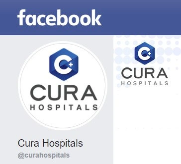
The image is not showing actual C++ code. It is showing a hospital logo that looks similar to C++ branding: a C, a plus sign, and a blue technical-looking shape. That resemblance is enough for developers to make the joke. The hospital is about healthcare, but the logo accidentally reminds programmers of a language famous for both performance and footguns.

For newer developers, the key idea is that symbols build associations. A plus sign can be a medical symbol. In a programming context, ++ means increment, and C++ names a language. Put those pieces close together, and the developer brain makes the connection even if the designer never intended it.

Level 3: Undefined Healthcare

The screenshot shows a Facebook page for:

CURA HOSPITALS

with a blue hexagonal logo containing a large C and a small plus sign. For developers, that mark instantly resembles the visual language around C++: a C-shaped emblem, plus signs, blue geometry, and just enough corporate polish to make the brain autocomplete “programming language” before it reads “hospital.”

That is the entire joke: ordinary healthcare branding accidentally walks into programming-language iconography. A non-programmer may see a clean medical logo implying care, positivity, and professionalism. A C++ developer sees C+ and immediately starts thinking about pointers, references, manual memory management, templates, segmentation faults, and undefined behavior. Not exactly the associations a hospital wants near the admissions desk.

The humor depends on mismatch. Hospitals are supposed to suggest safety, trust, precision, and controlled procedures. C++ is powerful and serious, but its reputation among developers includes sharp edges: dangling pointers, buffer overflows, lifetime bugs, accidental copies, template error messages, and the special suspense of code that compiles successfully before doing something unreasonable at runtime. Seeing those vibes leak into a hospital logo creates an instant mental collision.

The post message says Hmm, looks familliar. Wait a minute..., which is exactly how visual puns like this work. Nothing in the screenshot says the hospital is technical, and there is no evidence that the branding intentionally references C++. The joke is the viewer's pattern recognition. Developers are trained to notice icons, syntax, symbols, and naming conventions, so a C plus a + inside a geometric badge gets mentally reclassified as “C++ Hospital” before the sensible part of the brain files a complaint.

There is also a quiet branding lesson here. Icon design is never read in isolation. Symbols carry communities with them. A plus sign in medicine can mean care or health. A plus sign near a C can mean “oh no, who owns this memory?” Both readings are visually plausible. The meme lives in that overlap, where the hospital probably wanted reassuring minimalism and programmers received a warning about dangling references in triage.

Description

The image is a cropped Facebook page screenshot with a blue header reading "facebook." The profile and cover areas both show the "CURA HOSPITALS" logo, where the mark looks like a C++-style hexagonal icon with a large "C" and plus sign; below it the page name reads "Cura Hospitals" and the handle reads "@curahospitals." The developer humor comes from interpreting ordinary healthcare branding as a C++ hospital, immediately invoking pointers, memory safety, and undefined behavior in a place where none of those should be involved. It is primarily a visual pun based on programming-language iconography leaking into non-technical branding.

Comments

8
Anonymous ★ Top Pick A C++ hospital is the only place where the consent form includes a warning about dangling references.
  1. Anonymous ★ Top Pick

    A C++ hospital is the only place where the consent form includes a warning about dangling references.

  2. @RiedleroD 5y

    They changed their Logo to this disappointing thingy

  3. @RiedleroD 5y

    nvm i got the wrong one

  4. @alexolexo 5y

    Cure, Cura, Curaga

  5. @thenester 5y

    Finally... C+

    1. @imperishablemonk 5y

      Finally... C++-+

      1. @thenester 5y

        Smart brain. Almost as pointers. ( ͡° ͜ʖ ͡°)

  6. @dfgprg 5y

    С+/-

Use J and K for navigation