Skip to content
DevMeme
6501 of 7435
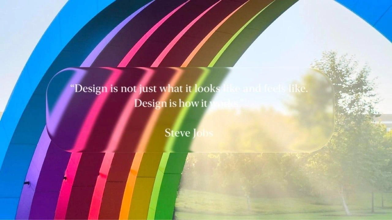
Steve Jobs Design Quote Over Apple Park Rainbow Arch
UX UI Post #7126, on Sep 14, 2025 in TG

Steve Jobs Design Quote Over Apple Park Rainbow Arch

Why is this UX UI meme funny?

Level 1: Too Fancy to Work

Imagine you made a sign with an important message, but then you decided to decorate it with a shiny, frosted glass sheet on top. It might look really pretty – kind of like a colorful window you’d see in a candy store – but suddenly it’s hard to actually see the words on the sign. That’s what’s happening here, and it’s kind of funny! The quote on the picture says basically, “What matters in design is how well something works, not just how nice it looks.” But the person who made this image put a fancy blurry glass effect over it, which makes the words themselves difficult to read. It’s like writing “Always be clear!” in faint pencil and covering it with wax paper. Pretty silly, right? The whole joke is that the designer got so carried away making it look cool that they actually made it less useful. It’s a bit like wearing super stylish sunglasses that are so tinted you can’t see where you’re going. In simple terms: it looks nice, but it doesn’t work well – and that kind of proves the point of the quote in a laughable way!

Level 2: Form vs Function

Let’s break down what’s happening here. The big idea revolves around form vs function. “Form” means how something looks – the visual design, the style. “Function” means how it works – how usable or effective it is. In design (especially UXDesign and UIDesign), there’s a constant balancing act between making things look appealing and making sure they’re easy to use.

Now, Steve Jobs (Apple’s co-founder) had a famous quote: “Design is not just what it looks like and feels like. Design is how it works.” He meant that true design isn’t just about pretty visuals, but about whether the product is functional and serves the user’s needs. Apple has long been known for paying attention to both – sleek aesthetics and intuitive usability – which is a big part of their DesignThinking approach. This meme plays on that quote in a clever way.

In the image, we see a design style called glassmorphism. That’s a trendy way to create UIs that look like frosted glass. Imagine a piece of tinted glass over a background: you can see the shapes and colors behind it, but they’re blurred out. Apple’s software uses this a lot – for example, on iPhones and Macs, panels like notification centers often have a blurry, see-through effect so background content shows through vaguely. It’s part of the modern AppleEcosystem look and feel. Designers love it because it adds depth and makes interfaces feel layered and dynamic. You might have seen it in app designs where a card or popup is semi-transparent.

Here’s roughly how one might do a glassmorphic style in code:

/* Example of a glassmorphism overlay style */
.glass-overlay {
  background: rgba(255, 255, 255, 0.25); /* translucent white background */
  backdrop-filter: blur(8px);           /* apply a medium blur to background content */
  color: white;                         /* white text on the overlay */
  border-radius: 20px;                  /* rounded corners for aesthetic */
}

The CSS above creates a see-through blurred panel (a white overlay at 25% opacity with an 8px blur). It looks cool! The Apple Park rainbow behind such an overlay would still show its vibrant colors, just softened. The overlay in the meme is exactly this: a rounded rectangle with a frosted glass look.

However, there’s a design gotcha here: contrast. Contrast is the difference in color and brightness between the text and its background. Good contrast means text is easy to read (for instance, black text on a white background is high contrast, very readable). Low contrast, like light gray text on a white background (or white text on a pastel, light background), can be hard to read. Accessibility guidelines (like web standards called WCAG) actually define minimum contrast ratios for text to be considered easily readable for most people. Designers and developers have to pay attention to this, so that everyone – including people with weaker eyesight or in bright sunlight – can read the interface comfortably.

In our meme, the text is white and the background behind it (the rainbow arch + sunlight) is also very light in places. The frosted glass overlay does blur and dim it a bit, but apparently not enough. So the white text isn’t popping out clearly; it’s kind of blending in. That’s low_contrast_text. If you’ve ever struggled to read light-colored words on a light background, you know it’s annoying – you might squint or give up reading. That’s exactly the issue here. The quote is talking about how design is about function, yet the way it’s displayed isn’t functioning well (since reading it is a challenge). Irony! 😅

To a junior developer or designer, this is a good lesson. Fancy visuals can backfire if they harm usability. You might be tempted to use a cool glass effect or a trendy style you saw on a showcase website, and it does impress people at first glance. But you always have to ask: can the user still easily do what they need to do? In this case, the “user’s task” is as simple as reading a quote. If the stylish overlay makes reading hard, that’s a usability failure. It’s like having a beautiful button that people don’t realize is a button – the design might look nice, but it’s not clear or practical.

This meme is relatable because many of us have been through a scenario like this early in our careers. For example, you design a webpage or an app screen with a cool background image and place text on top of it. On your high-end monitor it looked fine, but then on a phone screen in daylight, your friend says, “I can barely read this.” You quickly learn why things like UXDesignPrinciples emphasize simplicity, clarity, and testing your design in real conditions. Apple’s own guidelines (the Human Interface Guidelines) often mention things like legibility and not using too much transparency without sufficient contrast. So the meme is basically a fun “gotcha!” moment: it reminds us in a lighthearted way that good design finds the right balance between looking good and working well. After all, even a quote from the great Steve Jobs isn’t exempt from that rule – if you present it poorly, the message literally gets lost.

Level 3: Glass UI, Fragile UX

At first glance, this meme perfectly captures a classic form vs function showdown in modern design. We see Apple Park’s iconic rainbow arch bathed in sunlight, with a sleek glassmorphism overlay — that translucent, frosted-glass UI style Apple made trendy in its ecosystem. It’s gorgeous visually: the rainbow colors bleed through the blurred panel, giving off that high-polish Apple vibe. But there’s a catch that every seasoned UX/UI professional will spot: the white text of the Steve Jobs quote has literally faded into the background. The famous line “Design is not just what it looks like and feels like. Design is how it works” is almost illegible due to low contrast. The result? The design’s appearance is undermining its function, creating an ironic self-own.

Experienced designers and developers can’t help but chuckle at this form_vs_function_irony. It’s the kind of scenario that gets debated in countless design reviews: a visually cool effect that unintentionally breaks usability. Apple’s own founder, Steve Jobs, was a champion of product_design_philosophy that prioritized how a product works for the user above all. Here, his quote about functional design is being obscured by a stylistic flourish — basically the UI contradicting the UX message. It’s like the interface is not following its own advice, a textbook example of style over substance. Somewhere in the Apple design studio, you can almost hear an interface designer facepalming.

This resonates deeply with senior engineers who’ve witnessed Dribbble-inspired designs meet real-world users. Glassmorphism (using blurred transparent layers) became popular in interfaces starting around iOS 7 and macOS Big Sur. It creates depth and looks futuristic, but it’s easy to overdo. In fact, when Apple first rolled out heavy translucency in iOS, they got feedback that certain text was hard to read on busy backgrounds. (Remember the outcry when the fancy blurred Control Center made it tough to see labels if your wallpaper was bright? 🙃) Apple even added a “Reduce Transparency” accessibility setting as a direct response. In other words, even Apple — the king of gloss and polish — had to tweak its UXDesign when visual flair hampered functionality.

From a DeveloperExperience_DX perspective, this meme hits home too. Developers are often the ones implementing these pretty overlays and then discovering that the QA team or users report, “Hey, I can’t read this text.” A senior iOS/macOS dev might recall adjusting UIVisualEffectView blur parameters or a web dev tweaking CSS translucency to satisfy contrast requirements. There’s a real tension: the designer wants that slick Apple-esque look, the dev knows it might violate accessibility guidelines (like WCAG contrast ratios). The end result in this image is a low_contrast_text fail — something any UXDesignPrinciples checklist would flag. A well-seasoned developer might joke, “We’ve made Steve Jobs’ words literally disappear behind eye-candy!” It’s a bittersweet humor, because while everyone loves a beautiful UI, the core lesson of great UX is on full display: if you sacrifice clarity for style, you get a pretty product that doesn’t communicate. And as this meme deftly points out, that is the very antithesis of good design per Apple’s own philosophy.

Description

An inspirational quote image with a vibrant rainbow arch structure (likely at Apple Park campus) in the background with blurred greenery visible through the arch. The overlaid white text reads: '"Design is not just what it looks like and feels like. Design is how it works." Steve Jobs'. This is one of Jobs' most famous quotes about the intersection of form and function in product design, emphasizing that true design encompasses both aesthetics and functionality

Comments

12
Anonymous ★ Top Pick Steve Jobs said 'design is how it works' - which is why Apple designed the trash can Mac Pro to work exactly like a trash can for your productivity
  1. Anonymous ★ Top Pick

    Steve Jobs said 'design is how it works' - which is why Apple designed the trash can Mac Pro to work exactly like a trash can for your productivity

  2. Anonymous

    Proof that a single poorly-chosen alpha channel can undo an entire decade of HIG evangelism

  3. Anonymous

    Ah yes, the famous Jobs quote that every PM uses to justify why their 47-step onboarding flow with mandatory tutorial is actually 'how it works' - meanwhile, the senior engineers are over here trying to explain that sometimes the best design is just letting users import their config file and get on with their lives

  4. Anonymous

    Ah yes, the classic 'design is how it works' quote - which every PM uses to justify why the API returns a 200 status code with an error message in the body, the mobile app crashes on rotation, and the 'simple' feature requires rewriting the entire authentication layer. But hey, at least it looks good in the pitch deck with a rainbow gradient

  5. Anonymous

    Peak enterprise irony: a glassmorphism hero quoting “Design is how it works” while failing WCAG AA, because brand gradients are P0 and readability is “tracked for Q4.”

  6. Anonymous

    Every time someone opens with this Jobs quote, we budget gradients and blur - ARIA roles, focus management, and failure states become ‘phase two’ right after the pixel review

  7. Anonymous

    Jobs got it right - pretty rainbows won't save a system that violates CAP theorem under load

  8. @RaySollium99 10mo

    Unreadable ahh text moment

  9. @SheepGod 10mo

    ah yes accesibility

  10. @hur7m3 10mo

    I wouldn't trust me either

  11. @koltypka 10mo

    Woah

  12. @shaha1am 10mo

    Design by canva?

Use J and K for navigation