
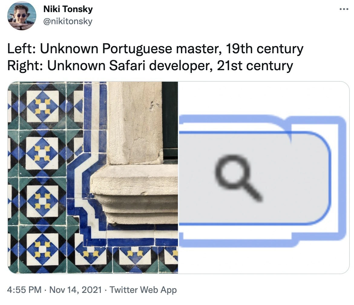
Safari's UI: inspired by 19th-century Portuguese tiles?
Description
This image is a screenshot of a tweet from user Niki Tonsky (@nikitonsky). The tweet presents a side-by-side comparison. The text reads: "Left: Unknown Portuguese master, 19th century. Right: Unknown Safari developer, 21st century". The left panel shows a photograph of traditional Portuguese azulejo tiles, with an intricate blue and white border next to a stone window frame. The right panel shows a close-up of the Apple Safari browser's user interface, specifically the tab and address bar. The humor lies in the striking and uncanny resemblance between the curved, stepped outline of the blue tilework and the distinct shape of the Safari browser's tab design. It's a clever visual gag that humorously suggests a modern software design was either inspired by or accidentally recreated a centuries-old artisan pattern, highlighting unexpected parallels between history, art, and technology

Comments
11Comment deleted
Turns out Safari's unique approach to web standards also applies to its UI design, sourcing its inspiration from pre-W3C-era artisans
19th-century masons perfected sub-millimetre border-radii in ceramic; two decades of WebKit later and I’m still shipping a 300-line CSS hack to keep Safari’s focus ring sober
After centuries of perfecting geometric patterns, Portuguese masters would be proud to know their legacy lives on in Safari's search bar - though they probably put more effort into a single tile than Apple did into the entire Finder redesign
After centuries of perfecting intricate tile patterns with mathematical precision and artistic mastery, we've finally achieved peak design efficiency: a blurry circle in a rounded rectangle. The Portuguese masters spent months hand-crafting each geometric tessellation; our Safari developer probably spent months in design review meetings debating the exact shade of blue and corner radius. Both unknown, but only one had to justify their choices in a Figma comment thread
Proof that craftsmanship peaked before outline: auto - Safari still renders focus rings like they’re exempt from border-radius, and my design reviews now include topology
The one time Safari's outlines align perfectly - on a 19th-century wall, not your flexbox layout
Apparently -webkit-focus-ring is implemented as a Minkowski sum with a square - great for Manhattan routing, disastrous for rounded corners and WCAG demos
I didn't get it Comment deleted
The blue outline is a strange shape for the text field. I blame the webpage's dev, not Safari's, but it's still weird Comment deleted
Border around the icon is bigger than border around textfield, and for some reason it has rounded upper corners Comment deleted
I do believe it's to catch and make your mind. Comment deleted