The Eternal Struggle of Project Timelines
Why is this ProjectManagement meme funny?
Level 1: When Plans Derail
Imagine you spent all afternoon building a tall, perfect tower out of Lego blocks. It’s your proudest creation, standing super sturdy (at least you think so). You’re feeling happy and confident about it. But then, out of nowhere, your big dog zooms through the room chasing a ball and smacks right into the tower. Crash! Your beautiful Lego creation explodes into pieces all over the floor. You’d probably throw your hands up and shout, “No! I worked so hard on that!”
That sudden disappointment you’d feel is exactly the point of this meme. The developer is the kid who built something carefully (a nice website design), and Safari is like the clumsy dog that unexpectedly wrecks it. It’s funny because anyone who’s built something (and had it unexpectedly ruined) knows that “Are you kidding me?!” feeling. In the tech world, that dog is Safari messing up the site, and the meme makes us laugh about it — because sometimes laughing is all you can do when your hard work falls apart in a split second.
Level 2: Cross-Browser Crash Course
Let’s break down the joke in simpler terms. CSS stands for Cascading Style Sheets – it’s the language that makes websites look a certain way (colors, layouts, fonts, spacing). When you write CSS code, you expect all web browsers to show your design the same way. Safari is Apple’s web browser (the default on iPhones, iPads, and Mac computers). Now, not all browsers are built the same; under the hood they have different rendering engines (the part of the browser that turns code into what's displayed on your screen). Safari’s engine is called WebKit, while Chrome’s is Blink and Firefox’s is Gecko. These engines are supposed to follow standard rules (the web standards for HTML/CSS set by groups like W3C), but in reality each may have slight differences or even bugs. Those little differences are what developers call browser quirks.
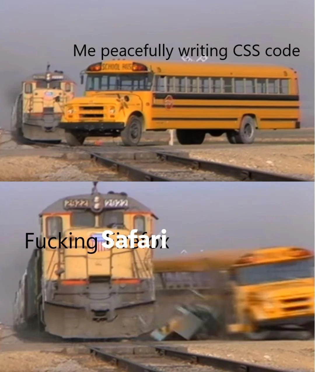
Now, the meme image itself is a popular format: a calm scene suddenly smashed by a disaster. In the top half, a school bus is going along with the caption “Me peacefully writing CSS code.” This represents the developer happily styling a webpage, thinking everything is fine. In the bottom half, a speeding train absolutely demolishes the bus, and it’s labeled “Fucking Safari.” This dramatic collision is a humorous way to say, “Safari the browser came out of nowhere and wrecked my work.” In everyday development, this refers to a scenario where your webpage looks great in one browser but breaks in Safari due to a browser compatibility issue. It’s a classic front-end pain point: you might finish a feature and be proud of how it looks, then someone opens the page on Safari and things are misaligned, or the layout is broken. Suddenly you’re scrambling to fix CSS that was “peaceful” moments ago.
For example, suppose you used a modern CSS layout technique like CSS Grid to build a photo gallery. It works perfectly in Chrome and Firefox. But when testing on Safari, you find some images overlap or the spacing is off. Why? Perhaps Safari’s version at that time hadn’t fully implemented the Grid spec or had a known bug. The developer’s reaction is basically the meme: shock and frustration, “Ugh, Safari!” Now they have to do cross-browser testing and debugging — figure out what Safari doesn’t like. This often means writing special case code or tweaks just for Safari. Developers might add vendor-prefixed CSS (rules with -webkit- for Safari’s engine) or use a slightly different approach that Safari supports. It’s extra work that you wouldn’t expect if you assumed every browser is the same.
The humor of the meme comes from how over-the-top the train crash is compared to the calm bus. It’s exaggeration. In reality, a Safari bug usually won’t literally blow up your entire project, but it feels that way when you discover it late in the game. If you’re new to web development, the lesson here is: always check your site in multiple browsers. Don’t just test in Chrome! Especially give Safari a look, because it might behave differently. Front-end developers have all learned this the hard way. The meme is basically seasoned devs telling a war story — with a wink — about that one time a Safari quirk turned a “peaceful” coding day into a chaotic bug hunt.
Level 3: Off the Rails with WebKit
The senior engineers are nodding (and maybe twitching) at this one. A calm yellow school bus labeled “Me peacefully writing CSS code” coasts along — that’s our innocent, well-behaved stylesheet humming on Chrome or Firefox. Enter the freight train in the next frame, emblazoned with “Fucking Safari”: an unstoppable locomotive of browser bugs that obliterates the bus (our layout) without mercy. This dramatic collision perfectly visualizes cross-browser CSS woes. It’s the kind of front-end catastrophe you encounter when Safari’s rendering engine (Apple’s WebKit) decides that your neatly coded CSS should derail in a way you didn’t see coming. Seasoned devs have learned to fear these Safari surprises. We’ve fought this war before — remember the Browser Wars of old? Back then, it was Internet Explorer gleefully ignoring web standards. Now, years later, Safari has picked up the mantle as the modern mischief-maker. There’s even a running joke that “Safari is the new IE”.
Why the drama? In theory, all browsers agree on the CSS specs, but in practice Safari has a habit of interpreting those rules with a twist. It often lags in adopting new features or has idiosyncratic bugs with things like Flexbox, Grid, or cutting-edge CSS. A layout that’s pixel-perfect in Chrome can morph into a hot mess in Safari, thanks to some WebKit-specific quirk. For example, Safari historically struggled with flex containers: a child element with overflow could magically expand and refuse to shrink, throwing your whole layout off. The train wreck metaphor isn’t far off—one odd bug in Safari’s CSS implementation can blow everything off the rails. You’ll hear battle-scarred devs mutter “Works on every browser… except Safari 😤” the same way a weary ops engineer sighs about DNS.
Let’s talk real examples. Say you have a flexbox layout with a scrollable sidebar. Looks great in Firefox/Chrome. But on Safari, that sidebar inexplicably overflows its container. The fix? A hack, naturally. You end up writing code like:
.container {
display: flex;
}
.sidebar {
overflow: auto;
min-height: 0; /* Safari hack: ensure flex child can shrink */
}
That min-height: 0 does nothing in other browsers — they don’t need it — but in Safari it’s a lifesaver to prevent a known flexbox bug. This is the life of BrowserCompatibility work: peppering your stylesheet with odd one-liners or -webkit- prefixes to cajole Safari into behaving. Another classic: Safari was late to support some cool features (looking at you, backdrop-filter blur effects), or required its own syntax. So developers either include Safari-specific CSS or find polyfills because Apple’s engine didn’t get the memo in time. These browser quirks pile up like debris from that wrecked bus, and you end up maintaining a list of “Safari gotchas” in your head.
What makes it worse is Safari’s unavoidable presence. On desktop Mac and all iPhones/iPads, Safari (WebKit) is the default and often the only choice (on iOS every browser is essentially Safari under the hood, thanks to Apple’s policies). You can’t tell users “just use Chrome” when Safari has a fit – many can’t. So devs must deal with it. That’s why this meme hits home: every front-end engineer has felt the slow dread of discovering a Safari-only bug hours before launch. It’s a rite of passage in WebDev. We laugh at the meme because if we didn’t, we might cry remembering the all-nighters spent fixing a layout that Safari decided to trash. In short, the meme exaggerates a very real dynamic: no matter how “peaceful” and standard-compliant your CSS is, Safari can come along like a freight train and turn your project into a trainwreck – and you’ll be left picking up the pieces (while muttering some choice words about WebKit).
Description
This meme uses the 'Drake Hotline Bling' meme format. In the top panel, Drake is shown looking displeased and holding up a hand to reject the text: 'Giving a realistic project timeline based on complexity and team velocity.' In the bottom panel, he is smiling and pointing in approval at the text: 'Just saying 'two weeks' to make the stakeholders happy.' This meme perfectly captures the pressure developers face to provide overly optimistic estimates to please clients or management, a practice that senior engineers know leads to inevitable crunch time, technical debt, and broken promises. It's a cynical nod to the art of managing expectations versus the reality of software development

Comments
7Comment deleted
My project estimates have three levels of accuracy: optimistic, pessimistic, and what the product manager put on the PowerPoint slide. Only one of them ever sees the light of day
Safari isn’t just another browser; it’s the surprise regression suite that arrives uninvited and on rails
Safari: the only browser where "works on my machine" means "works on everything except the CEO's iPhone, which is the only device that matters in the post-mortem."
After 15 years of web development, I've learned that 'works in Chrome' and 'production ready' are separated by approximately 40 hours of Safari debugging, three existential crises, and a Stack Overflow thread from 2014 that's somehow still relevant. Safari is the new IE6, except Apple has the market cap to ignore our complaints while we frantically add -webkit- prefixes like it's 2010
Cross-browser CSS is the front-end CAP theorem: you can have standards-compliance, modern layout features, or Safari support - pick two
Definition of done for CSS: Chrome and Firefox green, then survive iOS WebKit’s 100vh and flex‑gap gauntlet with autoprefixer and a sacrificial safari.css
Safari CSS: Where 'display: flex' flexes its right to interpret specs creatively, every damn time