Translating subjective design feedback into CSS
Why is this UX UI meme funny?
Level 1: Arguing Over Sprinkles
Imagine two kids arguing over who got more candy sprinkles on their cookie. One kid (the “designer”) counts 50 sprinkles on his cookie and sees the other cookie has 49 sprinkles. He insists, “Mine should be a teeny bit bigger because it has one more sprinkle!” The other kid (the “developer”) rolls her eyes and says, “They’re basically the same size cookie! One tiny sprinkle doesn’t matter.” They point fingers and bicker over that one sprinkle. To everyone else watching, the cookies look identical – you wouldn’t ever notice that small difference. The joke here is just like that: one side is fussing over tiny details that the other side thinks are too small to care about. It’s funny because they’re fighting over something so small that, in the end, it doesn’t really change how things look or work to anyone else.
Level 2: Points vs. Pixels Showdown
Let’s unpack the jargon for newer developers and designers. The conflict here is about units and consistency in UX_UI design. Pixels (px) are the basic unit of measure for screen display in web CSS. One pixel is essentially one tiny dot on a screen (on standard displays, anyway). When we say font-size: 16px, it means the browser draws the text roughly 16 pixels tall. Points (pt), on the other hand, come from print design – 1 point is 1/72 of an inch. Many design tools (like Adobe tools or Figma) use points or allow fractional values for precision. If a designer specifies a font as “12 pt”, when that translates to screen, it becomes 16px (because by web standards, 1pt ≈ 1.333px; so 12 * 1.333 = 16). But if they choose something odd like “11.5 pt”, that equals ~15.3px in CSS – a weird, fractional pixel value! A “half-point” basically means 0.5pt differences (half of 1/72 inch), which don’t line up neatly with whole screen pixels.
Now imagine a UIDesign style guide that’s not strict: a designer might tweak font sizes by tiny amounts (14.9px here, 15.3px there) maybe to make some text fit or look “just right” on their high-resolution monitor. To a newcomer, those numbers look almost the same. And that’s the crux: 14.9px versus 15px – nobody can tell apart on a webpage without a magnifying glass. FrontendDevelopment best practice (and good UXDesignPrinciples) say you should use a limited set of font sizes – for example, a common set might be 14px for small text, 16px for body text (that’s actually the default in many browsers), 24px for headings, 32px for big headings, etc. This creates a clear hierarchy and keeps things consistent. If every text element had its own unique size like 15.3px or 16.2px, the site would feel inconsistent and be harder to maintain. Developers also prefer rounding off those odd values. It’s easier to write and remember – and it avoids situations where one paragraph is 15px and the next is 15.3px for no real reason.
In code, if we truly followed a chaotic spec, we’d have to write multiple nearly duplicate CSS rules:
.hero-title { font-size: 32px; }
.subhead { font-size: 31px; } /* 31px? really? */
.footer-tagline { font-size: 33px; } /* 33px, so close to 32! */
This is obviously not ideal. It’s much cleaner to standardize, for example:
.hero-title, .subhead, .footer-tagline { font-size: 32px; }
By doing that, we use one common value (32px) instead of three separate ones that are 1px or 2px apart. That’s why the developer in the meme is grouping values: they want one CSS value to cover that whole range of designer values.
Let’s touch on MediaQueries and AdaptiveDesign: In responsive web design, we do often change font sizes at different screen widths (using @media rules in CSS) — say, 16px on mobile and 18px on desktop for body text. But those are deliberate, noticeable jumps to improve readability on larger screens, not tiny 0.3px tweaks. AdaptiveDesign might provide a separate layout and style guide for mobile, tablet, desktop, etc. It’s possible a designer gave slightly different font sizes in each mockup, and when compiled, you see lots of near-duplicates. A junior dev might initially try to match every value exactly. But soon they learn it’s better to ask, “Can we simplify these? Which ones are essentially meant to be the same?” Often, the answer is yes: consolidate to a consistent set, for both developer sanity and a uniform user experience.
Key takeaway for newbies: DesignSystem and consistency are your friends. A Design System is basically an agreement on what values to use — colors, spacing, font sizes, etc. — so everyone (designers and devs) works from the same playbook. When a spec ignores that and hands off a gazillion font sizes, it’s a headache. The developer isn’t being lazy; they know users won’t notice 0.4px difference, but they will notice if the site feels incohesive or if one line strangely wraps because of an odd size. So, in simpler terms, the developer is rounding off those CSS values to make the design consistent, maintainable, and true to good UX practice.
Level 3: Pixel Perfect Purgatory
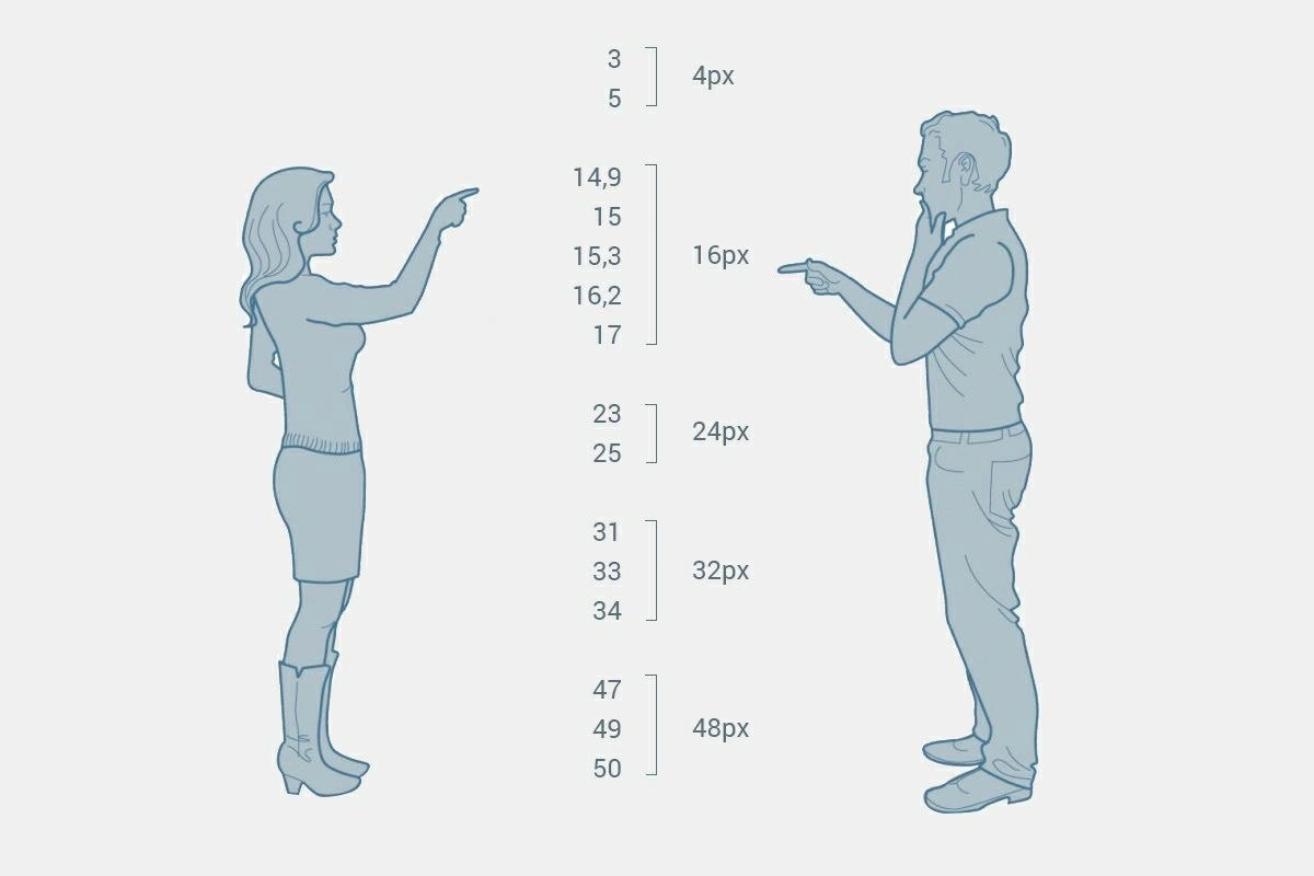
The standoff here is a classic designer_vs_developer duel over typography precision. On the left, the UX designer holds up a spec that seemingly includes every conceivable half-point font size; on the right, the front-end developer is effectively saying, “Nope, we’re standardizing these.” The curly braces in the image group multiple arbitrary values into a single CSS pixel size. For example, the spec might list a bunch of near-identical sizes:
| Designer’s Spec Values | Developer’s Chosen Size |
|---|---|
| 3, 5 (tiny labels perhaps) | 4px (miniscule!) |
| 14.9, 15, 15.3, 16.2, 17 (body text variations) | 16px (base text) |
| 23, 25 (maybe small headers) | 24px |
| 31, 33, 34 (mid headers) | 32px |
| 47, 49, 50 (big headers) | 48px |
Each cluster of decimal values gets snapped to a “sane” whole-pixel number. Why is this funny to seasoned devs? Because it captures a painful reality: designers often use ultra-fine point sizes (like 15.3pt) in tools like Sketch or Figma, resulting in weird px values (15.3px, 16.2px, etc.), while developers need consistent CSSProperties. This meme exaggerates that tension — even showing an absurd {3, 5} → 4px case (3px or 5px text is basically unreadable, so 4px is a tongue-in-cheek “compromise”).
For experienced FrontendEngineering folks, this triggers memories of the “pixel-perfect” era and modern DesignSystem fights. A senior dev knows that having half a dozen tiny variants of what should be the same font size is a nightmare. It means extra CSS classes, inconsistent margins, and a UI that feels subtly off-kilter. In practice, a UIDesign guideline would define a limited set of font sizes (a font_scale_consistency strategy): e.g., a base body text at 16px, then maybe 24px for titles, 32px for big headings, 48px for display text, etc. Anything in between is usually unnecessary or could be achieved with relative sizing if truly needed. When a spec ignores this and tosses in 15.3px, 16.2px, 17px all for body text, the dev is left scratching their head — do we really need three nearly identical sizes? The answer in sane projects: No, pick one (16px here) and stick to it.
This scene also hints at the pain of maintaining a DesignSystem. Imagine you’re coding a style guide and you discover designers used 5 slightly different font sizes for what should be the same type of text. It’s a pixel-perfect purgatory: you either push back and unify them (risking a meeting debating why 15.3px vs 16px doesn’t matter), or you give in and implement all, ending up with messy CSS and future UXDesignPrinciples violations. Seasoned devs will chuckle because they’ve been in those meetings where you zoom in 400% on the screen to see the difference between 15px and 15.3px. (Spoiler: it’s nearly imperceptible, but someone will insist “See, it aligns better with the icon when it’s 0.2px bigger!” 🙄).
Under the hood, browsers can handle fractional pixel values (e.g. you can specify font-size: 15.3px; in CSS). But on actual screens, especially standard DPI ones, such tiny differences often get lost due to device pixel rounding or font anti-aliasing. In other words, 15.3px might render virtually the same as 15px or 16px — except you’ve now introduced a weird one-off value in your codebase. That’s why experienced front-end devs treat overly precise design specs as pixel_perfect_debate fodder: it’s an invitation to endless tweaking for negligible gain. The meme exaggerates the absurdity: listing “every half-point font size ever invented” is like a designer saying, “I used every possible size from 3pt to 50pt in 0.1 increments, good luck!” Meanwhile, the battle-scarred developer consolidates it all into a few CSS values like a peace treaty for the sanity of the project. It’s funny because it’s true — at scale, inconsistency is chaos, and FrontendDevelopment veterans have the scars from wrangling those rogue decimals into clean, maintainable code. In summary, this level highlights the “half-point havoc” and why Frontend seniors preach: Define a typography scale and stick to it, or prepare for a showdown.
Description
An illustrative diagram humorously depicting the communication gap between designers and developers. On the left, a woman, representing a designer or stakeholder, points and gives a range of vague, non-standard numbers for spacing (e.g., '14,9, 15, 15,3, 16,2, 17'). On the right, a man, representing a developer, looks thoughtful as he tries to translate these imprecise requests into the concrete, standardized pixel values required for implementation ('16px', '24px', '32px', etc.). The image cleverly visualizes the classic problem of turning subjective feedback into precise code, a common challenge in frontend development where design systems with fixed spacing (like an 8-point grid) clash with ambiguous human perception
Comments
7Comment deleted
The designer wants 15.3px of padding. The developer implements `var(--spacing-medium)`. The user sees a button. Everyone is happy
Figma handed me five decimal font sizes for the same heading - now I’m basically running Paxos in the CSS just to agree on 16 px
The real tragedy isn't the font sizes - it's that we spent three sprints building a design token system, only to hardcode these values anyway because "the designer said it looks better at 15.3px on their MacBook."
When the designer's Figma spec says 15.3px but your design system only speaks in multiples of 4, you realize the real technical debt isn't in the codebase - it's in the Slack thread explaining why 16px is 'close enough.' Bonus points if you've ever had to defend your spacing tokens against a designer armed with a pixel ruler and righteous indignation
Typography is a distributed system: every 15.x ‘point’ eventually achieves eventual consistency at 16px under default DPR - until someone throws in an em and we get split-brain
If your spacing scale includes 15.3px, you don’t have a design system - you have a floating‑point bug with a marketing team
16px in Figma, 16.2px in Chrome - frontend's CAP theorem: pick two from Crisp, Accurate, Production