Paddington 2: A CSS Padding Story
Why is this Frontend meme funny?
Level 1: A Bear Named After Spacing
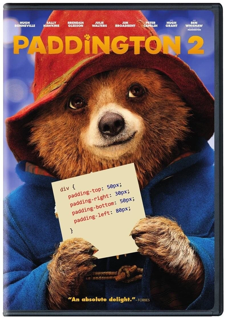
There's a famous storybook bear called Paddington who always carries a little note around his neck. In web design, "padding" is the word for the empty cushion of space around words and pictures — like the foam inside a shipping box that keeps the mug from touching the cardboard. So someone took the bear's note and wrote spacing instructions on it instead, turning Padding-ton into the official mascot of cushion-space. It's funny the way a dog named "Sit" is funny: his name was already the punchline, and someone finally finished the joke.
Level 2: The Box Model, as Modeled by a Bear
What the note actually does: in CSS, every element is a rectangular box, and padding is the space inside the box, between the content and its border. The four longhand properties set each side independently:
padding-top: 50px— 50 pixels of breathing room above the contentpadding-right: 30px— 30 to the rightpadding-bottom: 50px— 50 belowpadding-left: 80px— 80 to the left
Padding is one corner of the CSS box model — content, padding, border, margin, from inside out. The classic beginner confusion is padding vs margin: padding is space inside your jacket (between you and the fabric), margin is the personal space you keep between yourself and the next person on the bus. Both push things apart; only one is part of you.
The shorthand equivalent, padding: 50px 30px 50px 80px;, lists the sides clockwise from the top — Top, Right, Bottom, Left, memorized by generations as "TRouBLe." Forgetting that order and padding the wrong side is a rite of passage, which is a point in favor of the bear's verbose-but-foolproof longhand. And a div, for completeness, is the generic container element of HTML — the cardboard box of the web, used for everything precisely because it means nothing.
Level 3: Longhand Bear, Shorthand Crimes
The craft of this image is in its restraint: it's a faithful Paddington 2 DVD cover — full cast billing from Hugh Bonneville through Ben Whishaw intact, Forbes' "An absolute delight." still on the case — with exactly one element altered. The luggage tag Paddington famously wears ("Please look after this bear") has been replaced with a syntactically perfect CSS rule:
div {
padding-top: 50px;
padding-right: 30px;
padding-bottom: 50px;
padding-left: 80px;
}
Padding-ton. The pun is the headline, but the details of the rule are where frontend developers find the second laugh. Whoever wrote this tag chose the four longhand properties instead of the shorthand padding: 50px 30px 50px 80px; — same computed style, one line, and any style linter or code reviewer would flag the longhand version on sight. There are two readings of that choice, and both are funny. The charitable one: Paddington is the politest character in cinema, and longhand is the politest CSS — explicit, unambiguous, kind to whoever reads it next, immune to the eternal "wait, which order does shorthand go in?" confusion. The cynical one: this is exactly the CSS a real codebase contains, because four different developers each added one side's padding in four different sprints and nobody ever consolidated.
There's also a quiet joke in the selector. div { ... } is a bare element selector applying asymmetric padding to every div on the page — no class, no scoping, just raw global ambition. That's the kind of rule you find at line 14 of a legacy styles.css, load-bearing and unexplained, which every subsequent stylesheet spends hundreds of lines overriding. The asymmetric values (80px left vs 30px right) even look like real production CSS: numbers clearly tuned by hand until a specific layout stopped looking wrong on one specific screen, then committed forever.
The meme belongs to a beloved frontend genre — sanctifying the mundane parts of CSS — because padding, margins, and the box model are simultaneously the first things you learn and the things that still produce mysterious layout bugs a decade in. Making Paddington the patron bear of padding is just giving the property the mascot it earned.
Description
This image is a parody of the movie poster for 'Paddington 2'. It features the main character, Paddington Bear, wearing his classic red hat and blue duffle coat, holding up a small, light-yellow piece of paper. Instead of a personal note, the paper displays a snippet of CSS code: 'div { padding-top: 50px; padding-right: 30px; padding-bottom: 50px; padding-left: 80px; }'. The movie title and cast are visible at the top, and a review quote, '"An absolute delight." -FORBES', is at the bottom. The humor is a direct pun on the character's name, 'Paddington', and the CSS 'padding' property, which is fundamental for controlling layout and spacing in web design. It's a classic example of a developer 'dad joke', appreciated for its simplicity and the clever merging of pop culture with a core web development concept

Comments
8Comment deleted
I showed this to a designer and they said the padding values were all wrong. They'd prefer something more consistent, like 'padding: marmalade;'
Paddington 2: the gritty sequel where the design system is “8-point everywhere” - yet that rogue 30 px right padding keeps shipping to prod and haunting every retro
Finally, a sequel where the protagonist spends 90 minutes trying to center himself vertically while everyone insists flexbox would've been easier
Four longhand declarations instead of 'padding: 50px 30px 50px 80px' - Paddington is polite, but his CSS would never survive the linter
When your PM asks why the layout looks off and you realize you've been setting padding values as inconsistently as Paddington's marmalade sandwich distribution - 80px on the left because that's where you started debugging at 2 AM, and somehow it shipped to production. At least the box model is more forgiving than your CSS linter
Paddington 2: when the movie poster practically begs you to replace padding-left/right with padding-inline and design tokens - before the Arabic launch turns the bear into a localization bug
Paddington: the only dev achieving perfect symmetry without flexbox hacks or viewport tantrums
Great sequel, but my PR comment would be: refactor to padding: 50px 30px 50px 80px; and put it behind a spacing token - maintaining Padding‑tons doesn’t scale