Skip to content
DevMeme
5909 of 7435
The Five Lines of Code Holding Back the Apocalypse
LegacySystems Post #6470, on Dec 20, 2024 in TG

The Five Lines of Code Holding Back the Apocalypse

Why is this LegacySystems meme funny?

Level 1: There’s Always a Bigger Fish

Imagine you spent a whole week building the tallest sandcastle at the beach. It’s big, you’re proud, and everyone can see it from far away. But then, just as you’re celebrating, a kid comes along with a brand-new super bucket and in one afternoon builds a sandcastle twice as tall right next to yours. Suddenly, your once-amazing castle looks small and ordinary. In the world of AI models, something similar happens: you work really hard to make a smart computer program a little bit smarter, but then a new version comes out that is a LOT smarter without even trying. It’s like being proud of how fast you ran, but then an Olympic sprinter shows up and runs much faster. The meme is a funny way of saying “no matter how great you think you are, someone (or something) new can come along and make your great work look average.” It reminds us to stay humble, because there’s always a bigger fish in the pond.

Level 2: Benchmark Basics

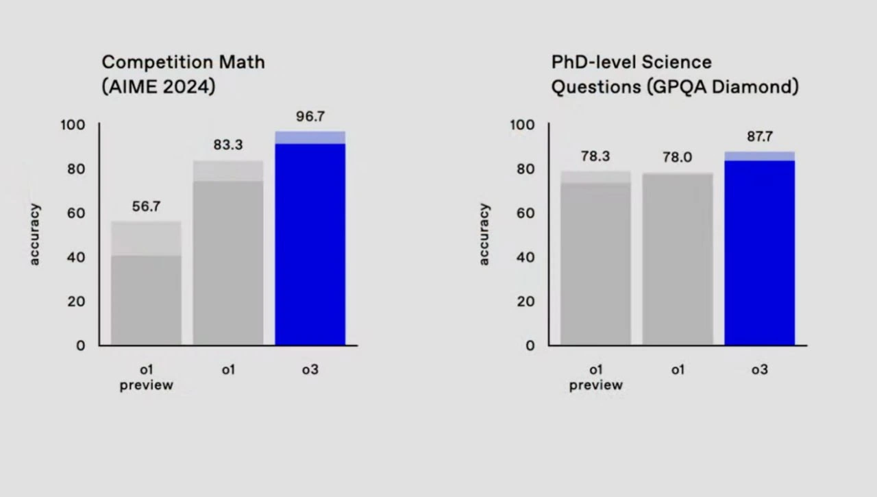
Let’s break down what’s going on in this meme in plain terms. In machine learning, a benchmark is like a standardized test for models. Here we have two tests: one is Competition Math (AIME 2024), which likely contains really hard high-school or early-college level math problems (AIME is an actual math competition known for challenging problems). The other is PhD-level Science Questions (GPQA Diamond), which sounds like a tough science quiz, possibly for graduate-level knowledge and reasoning. The bars on the charts show the model’s accuracy on these tests – basically, the percentage of questions the model answered correctly. An accuracy of 96.7 means the model got 96.7% of the answers right, which is extremely high (almost acing the test!). The y-axis labeled “accuracy” running from 0 to 100 tells us these are percentages out of 100.

Each colored bar corresponds to a version of the AI model. The labels “o1 preview”, “o1”, and “o3” suggest sequential versions (like Version 0.1 preview, then Version 0.1 official, then Version 0.3 – or perhaps OpenAI’s internal naming convention for model checkpoints). The exact naming isn’t as important as the pattern: o3 is a later, improved version of the model, and it’s represented by the blue bar (to highlight it’s the newest and best). The earlier versions (o1 preview and o1) are gray bars, and their heights show how they performed. On the left chart, the first bar (o1 preview) is at 56.7%, meaning just over half the math questions were answered correctly. The second bar (o1) jumps to 83.3%, which is much better – maybe the model got training upgrades or more data and suddenly solved a lot more problems. But the star of the show is the blue “o3” bar towering at 96.7%. Visually, that blue bar dwarfs the gray ones, showing the new model got almost all answers correct. It’s as if the model went from a B- grade to an A to an A+.

On the right chart (the science questions), the story is similar but with a twist. The first gray bar (o1 preview) is 78.3%, and interestingly the second bar (o1) is 78.0%, basically the same. That tells us that between the preview and the official o1 version, there was no significant improvement on that science quiz – the score stayed around 78% (maybe the update improved math skills but not science, or it was just a tiny change overall). But again, the blue bar for o3 shoots up to 87.7%, meaning the new model got about 10% more questions right than the older one. That’s a sizeable bump! In machine learning, a few percentage points can be a big deal, so a jump of nearly 10 points is like going from scoring a C+ to a solid B+/A- on a very hard test.

Now, why is this funny or noteworthy to developers? It’s highlighting a common scenario in the AI industry: you might pour a lot of effort into tweaking and tuning a model to perform well on these benchmarks (like adjusting prompts, which is a way of phrasing the model’s input questions to guide it to better answers, or fine-tuning the model with extra training data). Say you manage to get your model from 78% to 83% on the math test by doing all that work – you’d feel pretty proud, right? But then a new version of the base model (o3) is released by the AI model developers, and right out-of-the-box it scores 96.7% without any of your special tweaks. 🚀 Essentially, all those micro-optimizations you did got instantly outclassed by a general improvement in the model. This feels both amazing (wow, the new model is so good!) and frustrating (did I just waste my time squeezing water from a stone when a fire-hose was coming?).

Think of the bar charts as a leaderboard for models. Researchers and companies often maintain public leaderboards for how well different models do on tasks like these. Being at the top of a leaderboard (Rank #1 model) is a point of pride. The meme is saying: you might have been at the top with o1, but as soon as o3 comes out, it owns the leaderboard, and your model’s score now looks ordinary or “pedestrian” by comparison. In simpler terms, there’s a new champion in town. And because AI is evolving so fast, this happens a lot. One month you have the best results; the next month a new model comes and beats all those results by a wide margin. Developers joke about this because it keeps them humble and on their toes. It’s a mix of Performance bragging and humility – you can flaunt your tall gray bar today, but don’t be surprised if a taller blue bar shows up tomorrow!

Level 3: SOTA Today, Obsolete Tomorrow

Seasoned developers and data scientists will immediately recognize the mix of pride and despair behind those bar charts. It’s a scene straight out of an AI lab’s release notes: Version o1 of the model was the reigning champ, your state-of-the-art (SOTA) solution that had everyone clapping. Maybe you even gave a tech talk bragging how your finely-tuned system hit 83.3% on a notoriously hard math benchmark. But then “o3” drops – a new model update rolls in like an express train – and suddenly that achievement is old news. The meme’s caption nails it: “3 drops and your once-proud benchmark bars suddenly feel pedestrian.” It’s a bittersweet industry joke. We’ve all been there: you spend weeks (and many late-night pizzas) micro-optimizing your model or prompts to gain that last 2% accuracy, only to have a new model version leap 10+% in one go. AIHumor often comes with a side of pain.

Those gray bars (the earlier versions) represent our ego and effort – solid, respectable, tall in their own right. But the bright blue bar of the latest model towers over them, almost mockingly. It’s like the AI saying, “Oh, you were proud of that? Watch this.” In the left chart, going from a mediocre 56.7% (o1 preview) to 83.3% (o1) probably involved countless hours of prompt engineering, fine-tuning, and hyperparameter hunts. Maybe the team cheered when breaking the 80% barrier on AIME 2024, a competition-level math test where even many humans struggle. But the right chart’s initial plateau (78.3 → 78.0) shows reality too: sometimes even big efforts yield negligible improvements – a familiar frustration in ModelEvaluation. Perhaps o1 preview to o1 was mostly an infrastructure or alignment update with little effect on that science QA task, so you’d rationalize that 78% is still great. Yet with o3, the science QA accuracy shoots up to 87.7%. This feels like the new model just casually solved a bunch of tricky problems that stumped the old one. It’s as if your diligent PhD researcher was upstaged by a genius prodigy who didn’t even break a sweat.

The humor here is also an indictment of AIIndustryTrends and our perpetual benchmarking treadmill. In machine learning, yesterday’s breakthrough is today’s baseline. Leaderboards on sites like Papers With Code or OpenAI’s evals get new entries so fast that a result once hailed as “super-human performance!” can become the second-place line on a bar chart just weeks later. To a senior engineer, this meme recalls all those internal demos where you proudly present a bar chart of your model’s performance... right before someone announces a new model that renders your chart obsolete. Cue the awkward chuckle. Your painstakingly optimized solution gets relegated to a footnote by a generic model update labeled simply o3. It’s both exciting and brutal: exciting because who doesn’t want better models, and brutal because it invalidates tons of work (and perhaps your bragging rights). The phrase “iteration_velocity” from the context tags sums it up: AI is moving so fast that code, models, and one’s technical ego have a very short half-life.

This dynamic also nudges at a deeper point: the performance gap between successive model generations often dwarfs the gains from classic software optimizations. In traditional software engineering, you might get a 2x speed boost by painstakingly optimizing C++ code or hand-crafting assembly. In the AI world, you might get a similar or bigger leap in capability just by waiting for the next model release that has more parameters or better training. It’s like the difference between micro-tuning and macro-innovation. One meme-worthy way to imagine it: you’re adding one GPU at a time to your training job hoping for incremental gains, while the model developers just introduced a new algorithm that effectively adds 100 GPUs worth of brainpower overnight. Small wonder your benchmarking tools suddenly show your once impressive bar as just a mid-tier result. That mix of admiration (for the new model) and exasperation (for one’s own now-diminished achievement) is exactly why this meme resonates. It’s poking fun at the AI researcher’s emotional rollercoaster: pride in one moment, humble pie in the next. As a senior dev might wryly note, “Well, at least I had the highest score for a month. That’s like a decade in AI years.”

Level 4: Emergent Abilities Unleashed

At the cutting edge of AI_ML, we often witness sudden jumps in capability that feel almost phase-transition-like. The meme’s bar charts hint at an emergent ability phenomenon: with a new LLM version (the mysterious o3), performance on certain benchmarks rockets from merely strong (83.3% accuracy) to near-perfect (96.7%). How is such a leap even possible? It comes down to the scaling laws and architectural breakthroughs in modern models. As model parameters and training data grow (think billions more neurons lighting up in the transformer network), models can develop qualitatively new skills rather than just incremental improvements. Researchers have documented these "emergent abilities" – for example, a model might suddenly learn to solve complex multi-step math problems once it crosses a certain size or is given a novel training regimen. In this case, the left chart’s Competition Math (AIME 2024) results suggest the new model has basically learned to “show its work” internally. Where earlier versions floundered on tricky algebra or combinatorics, the o3 model likely employs advanced reasoning strategies (perhaps an implicit form of chain-of-thought reasoning) to ace 96.7% of those test questions. This is like a phase shift in capability: a modest upgrade in the model’s design or training (from o1 to o3) yields disproportionate gains on a hard task, much like how water suddenly turns to ice at a precise temperature threshold.

Behind the scenes, this could involve heavier compute (more GPUs crunching numbers), refined model architecture, or fine-tuned training objectives that specifically target weaknesses of the previous version. The term “capability overhang” comes to mind: it’s possible the model was already capable of more, but needed either the right prompt technique or a slight version tweak to fully unleash that potential. The left panel’s dramatic jump from 56.7 → 83.3 → 96.7 in accuracy hints that the initial model (o1 preview) lacked something substantial — perhaps context length or training in problem decomposition — which the later versions added. By o3, the model might be integrating advanced reasoning or external knowledge seamlessly, hence the almost human-expert level performance on AIME math problems.

Interestingly, the right panel (PhD-level Science Questions, GPQA Diamond) shows a smaller improvement: 78.0% to 87.7%. This narrower gain could reflect the diminishing returns as models approach the upper bounds of certain knowledge tasks. Answering PhD-level science questions might demand not just memorized facts (which even earlier versions had plenty of), but nuanced understanding and on-the-fly reasoning across disciplines. The 9.7-point jump from o1 to o3, while smaller than the math leap, is still huge by academic standards – it’s as if a doctoral candidate suddenly had an eureka moment that clears up a bunch of previously missed questions. From a theoretical perspective, this highlights how different benchmark domains have different improvement curves: tasks like math can exhibit steep sigmoid-like gains once the model “figures out” the trick, whereas broad knowledge Q&A grows more linearly as the model absorbs more data and better reasoning heuristics. In sum, the meme encapsulates an AIIndustryTrends truth: progress in AI isn’t always steady – sometimes it’s a series of step functions. One new release can render the previous state-of-the-art quaint, thanks to those unleashed emergent abilities that make yesterday’s impressive results look pedestrian today.

Description

This meme uses the 'Man Holding Up Pillar' or 'Atlas' format. It shows a muscular, shirtless man straining with immense effort to hold up a single, cracking stone pillar. This pillar is labeled 'My 5 lines of code'. The pillar is the sole support preventing a massive, crumbling, and ornate temple-like structure, labeled 'The entire application,' from collapsing entirely. The man himself is labeled 'Me'. The scene is dramatic and chaotic, emphasizing the critical importance of this seemingly small piece of code. The meme humorously and accurately portrays the concept of 'load-bearing code' in a complex or legacy system. It's a relatable scenario for senior developers where a small, often poorly understood, block of code is discovered to be the critical linchpin preventing total system failure. The joke lies in the disproportionate impact of a tiny contribution, highlighting fragile architecture, hidden dependencies, and the terror of refactoring code that 'just works' without anyone knowing why. It’s the digital equivalent of Jenga, where removing one wrong block brings everything down
Comments

7
Anonymous ★ Top Pick We call that 'Jenga-driven architecture.' Everyone knows that one critical block of code exists, but nobody has the courage to pull the ticket for its refactoring
  1. Anonymous ★ Top Pick

    We call that 'Jenga-driven architecture.' Everyone knows that one critical block of code exists, but nobody has the courage to pull the ticket for its refactoring

  2. Anonymous

    o3’s accuracy bump is great - until the KPI review slides reveal the real blocker: your y-axis only has two more pixels of headroom

  3. Anonymous

    o3 solving math problems at 96.7% accuracy while our production code still breaks when someone enters their name with an apostrophe

  4. Anonymous

    When your model goes from o1 to o3 but the PhD-level science scores barely budge - turns out even AI experiences the classic 'works on my benchmark' problem. The o1→o1-preview regression on GPQA is giving strong 'we fixed the bug that was actually a feature' vibes. At this rate of improvement, o5 will achieve 100% on competition math while still confidently hallucinating that P=NP has been proven

  5. Anonymous

    Great, o3 hits 96.7 on AIME - too bad accuracy doesn’t include P95 latency, token burn, or the new API contract it hallucinated during “reasoning”

  6. Anonymous

    o1 laps PhDs in math; too bad it can't optimize our monolith-to-microservices migration ROI

  7. Anonymous

    The bars say o3 is smarter; the pager says we’ll find out when the benchmark changes from AIME/GPQA to ambiguous tickets, misconfigured YAML, and 3am SLO math

Use J and K for navigation