Irony Overflow: Article Warns Against Emails, Instantly Demands Yours Anyway
Why is this DataPrivacy meme funny?
Level 1: Mixed Messages
Imagine your mom tells you, “Never share your secret candy stash with anyone. You need to keep it safe.” You nod, because that makes sense – your candy is special and you shouldn’t just give it away. But then, literally one minute later, your mom holds out her hand and says, “Now, give me a piece of your candy if you want to hear the rest of the story.” 😮 You’d probably blink in confusion and think, “Wait, didn’t you just say not to share it?”
That’s what’s happening here. The website is basically an adult in the room saying “Don’t give away your personal info (like your email address) to everyone,” and then immediately that same website asks, “Can I have your email address, please?” It’s a big, silly mixed message. On one hand they’re warning you, but on the other hand they’re doing the exact thing they warned about. It’s like a friend telling you not to trust strangers, then dressing up as a stranger and asking you for a favor. It feels contradictory and a bit funny.
Even a kid can see why this is goofy: the advice and the action totally conflict. It’s the classic “do as I say, not as I do” scenario. We find it funny (and a little exasperating) because the website isn’t practicing what it preaches. It’s saying one thing and doing another. Just as you’d laugh or roll your eyes if a teacher said “Don’t cheat” and then immediately handed you the cheat sheet, people are laughing at this screenshot. The site basically proved the article’s point in the most direct way – by wanting the reader’s email for itself. It’s a simple lesson: when words and actions don’t match, it stands out – and here it stands out in a hilarious, head-shaking way.
Level 2: Everyone Wants Your Email
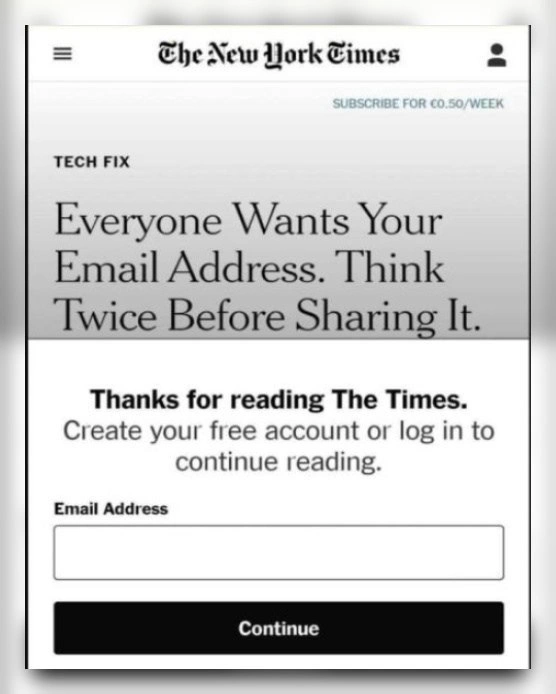
Let’s break down what’s happening in this meme in simpler terms. You have a screenshot of a New York Times tech article. The headline of the article says, “Everyone Wants Your Email Address. Think Twice Before Sharing It.” That sounds like advice encouraging you to be cautious with your Email (your email address is personal information, kind of like your digital home address or phone number online). But right beneath that headline, the website immediately pops up a window that basically says: “Thanks for reading! To keep reading, please enter your email address (or log in, if you already have an account).” In other words, the site itself is asking for the very thing the article just told you to guard. The humor (and frustration) here comes from this blatant mixed message: the content says “protect your data,” while the design says “give us your data.”
Some key concepts and terms here:
Email Address: This is your identifier on the internet for communication. Companies love collecting emails because it lets them contact you directly (newsletters, promotions) and even track your activity tied to that email. It’s common these days that every website and app wants you to sign up with an email – hence the line “everyone wants your email address.” It’s not an exaggeration; from shopping sites to news sites, email = engagement.
Data Privacy: This refers to keeping your personal information (like your email, name, location, etc.) safe and only sharing it with people or companies you trust. The headline is literally a data privacy tip: be careful who you share your email with, because once you do, you might receive spam or unwanted tracking. PrivacyHumor memes like this poke fun at situations where privacy advice and real-life practices don’t line up.
UX/UI Design: UX stands for User Experience and UI stands for User Interface. These are about how a site/app is designed for people to use. A good UserExperienceDesign means the site is easy and fair for the user. Here, the UX is ironically bad (or intentionally pushy): as a reader, your experience is interrupted by a demand for information. The interface literally blocks you from reading until you comply. From a design perspective, this is considered a UXFailure or at least a very user-unfriendly choice. It’s also unintentionally funny because the design contradicts the content.
Paywall: Traditionally, a paywall means you have to pay money to access content (like a newspaper saying “you’ve read 5 free articles, subscribe for more”). In this case, it’s not asking for money but it’s still a kind of paywall – you “pay” with your personal data (your email) instead of money. That’s why many people call this a soft paywall or registration wall. It’s a common strategy: “Create your free account” is code for “give us your info so we can keep engaging with you or eventually get you to pay.”
Modal: The white box popping up is a modal window. In web design, a modal is a dialog or popup that appears on top of the page and prevents you from interacting with the rest of the content until you deal with it (either by submitting something or closing it). Here, the modal wants you to enter your email and click Continue. It covers the screen, so you can’t just keep reading the article behind it – you must address the modal. This design is meant to funnel you into a single action.
Dark Pattern: This is an important term in UX. A dark pattern is a UI design trick that manipulates or compels a user to do something they might not really want to do. It’s like when a website makes the “Decline cookies” button hard to find but the “Accept all” button big and shiny. In this meme’s scenario, the dark pattern is that the site is not giving you a real choice: it’s forcing you to share data if you want to proceed. There’s an implied pressure: “If you care about this content, you have to give us your email.” That feels a bit sneaky or coercive, right? It’s not lying to you, but it is leveraging the content to get what it (the site) wants. Many users find these constant sign-up requests frustrating – that frustration is often called consent_fatigue. That means people are tired of consenting to cookies, signing up, and giving out emails on every site they visit. It’s like being asked “pretty please, just one little detail about you” by every service out there. Eventually, you either give in everywhere (and feel annoyed), or you stop browsing as much. Neither is great.
Marketing vs Privacy: What’s at play here is a tug-of-war between marketing goals and privacy/user comfort. The marketing side (or MarketingTech team) of a company wants to capture leads – an email is a lead, a potential subscriber, a way to bring you back with reminders. They measure success with KPIs – for example, “how many emails did we collect today.” On the flip side, privacy-oriented folks or user-focused designers want to respect the user’s boundaries: if the article is about not giving away info, ideally the user shouldn’t have to give info to read it. This conflict often surfaces in product design. As a junior developer, you might encounter this when a product manager asks you to implement a feature like a newsletter signup popup or a mandatory account creation for a feature. You might think, “But won’t that annoy users?” – and you’d be right, it can. Yet the business might insist because they see value in those emails and accounts. This meme is basically shining a light on that conflict in one of the most ironic ways possible.
GDPR and user anxiety: You might have heard of GDPR (General Data Protection Regulation in the EU) or seen lots of cookie consent notices, especially if you’re browsing from Europe (note the “€0.50/week” subscribe banner – that indicates the EU edition). Regulations like GDPR are meant to protect users by requiring clear consent for data collection. However, one side effect is now users are very aware that their data has value and that they should be cautious. So reading a headline advising caution and immediately seeing a request for data can trigger gdpr_anxiety – a feeling of “Uh oh, is this okay? Why do they need this from me?”. It’s not that the Times is breaking any rule here (asking for an email to create an account is legitimate), but it feels funny and a bit suspicious given the context. It’s like being served a salad that warns “eating too many sweets is bad for you” and underneath the bowl there’s a piece of candy you must unwrap to get to the lettuce. Weird, right?
In everyday terms, the site is basically doing: “Don’t share personal info... by the way, share personal info now.” For someone new to web development or product design, it’s a prime example of how different teams’ goals can collide on the user’s screen. The UserExpectations here were to get some helpful advice about protecting privacy. The reality turned into a quick lesson in how websites often operate: they give some value (the article) but usually ask for something in return (your data, an account, a subscription). As a junior dev, one day you might have to code an interstitial page or modal like this, and you’ll remember how it felt as a user. It might even make you pause and think, “Is there a more user-friendly way to do this?” The big takeaway is understanding why companies do it (data is valuable) and how it affects the user experience (it can be jarring or seen as UXIrony when done at the wrong moment). This meme perfectly captures that awkward gap between what users are told and what they’re asked to do, all in one screen. And once you see it, you can’t unsee it – you’ll start noticing this kind of pattern all over the web.
Level 3: Privacy Paywall Paradox
At first glance, this is a masterclass in UXIrony. The New York Times tech column headline bluntly warns, “Everyone Wants Your Email Address. Think Twice Before Sharing It.” Immediately below, the site deploys a classic email_capture_modal paywall demanding – you guessed it – your email address to continue reading. It’s a paywall_irony so rich you could sprinkle it on your morning cereal. We have a cautionary tale about DataPrivacy instantly undermined by the page’s own design. The headline and the call-to-action are at war – a textbook headline_vs_cta contradiction that senior developers recognize with a groan (and maybe a chuckle). This situation practically raises a big red dark_pattern_alert sign for anyone who’s seen how growth hacking can clash with user trust.
Why is this so hilarious (or horrifying) to experienced devs? Because we’ve sat through those meetings. You know, the ones where the Marketing “growth team” insists on aggressive user data collection as a KPI (Key Performance Indicator), while the UX/UI team facepalms in the corner. Here, the Tech Fix editorial team is preaching privacy discipline, but the business side couldn’t care less – they’re salivating for sign-ups. An email address is valuable digital currency: a unique identifier to track a user across sessions and devices, a way to target you with newsletters or promotional offers, and a gateway to MarketingTech analytics. In modern media, if you’re not paying with cash, you’re paying with data. The Times isn’t asking for €0.50 here, but it is asking for personal info that can be monetized later. It’s a Privacy Paradox: the site itself exemplifies the very problem the article claims to fix. Experienced engineers recognize this as the classic trade-off between privacy-by-design principles and growth-at-all-costs strategies. The result? A “do as I say, not as I do” moment immortalized in screenshot form.
Let’s talk dark patterns. A dark pattern is a design that manipulates or heavily pressures the user into a choice – often one that benefits the site while potentially eroding user DataPrivacy or agency. This “free account” modal is a form of forced action: you either comply (give up your email) or you can’t read the content. There’s likely no obvious escape hatch (no big “X” to close it without complying). The irony is almost comical: the article likely advises caution with sharing personal data online, yet the interface gives you no choice but to share data. It’s as if the site is saying, “Be careful who you trust... now trust us completely and hand over that info.” This can induce a sort of gdpr_anxiety in savvy users – especially in the EU where GDPR has made people extra aware of data grabs. The page is literally triggering the reader’s fear of exploitation and then exploiting it. Talk about an ouroboros of consent.
From an insider perspective, this scenario reflects siloed priorities. The editorial content was probably written in good faith to help users guard their privacy. But the web platform’s design (likely dictated by a separate product team) cares more about converting readers into registered users. It’s a consent_fatigue double whammy too: users are already tired of constant pop-ups (cookie banners, “subscribe to our newsletter” pleas, etc.), and here even an article about that fatigue can’t be read without agreeing to yet another request. The UserExperienceDesign here effectively says, “We value your privacy… just kidding, give us your data.” The contradiction is so stark that it’s darkly humorous to those of us who have been on the implementation side of such features. We’ve built sign-up flows under protest, muttering things like “this is going to annoy users”, but the UserExpectations often come second to quarterly targets. As a result, the site ends up undermining its own credibility: a privacy tip article turned into a trap.
In code, it might look something like this:
// Ironically enforce the very thing the article warns against
const articleTitle = "Everyone Wants Your Email Address. Think Twice Before Sharing It.";
render(articleTitle);
if (articleTitle.includes("Think Twice Before Sharing")) {
showModal({
message: "Thanks for reading The Times. Create your free account or log in to continue.",
fields: ["Email Address"], // user must provide this
actionButton: "Continue"
});
}
// The irony: The content warns "don't share email", then the modal immediately asks for email.
Even a few lines of pseudocode expose the absurdity: the logic of the page essentially says “If user seeks privacy advice, then require personal data.” It’s the kind of implementation detail that makes seasoned engineers smirk and sigh. We’ve seen similar scenarios: a UXDesign guide about not overusing pop-ups… published on a site that throws a newsletter pop-up in your face. Or a security blog preaching strong passwords, hosting it on http://insecure-website. The humor here is in the blatant UXFailures. The left hand (content) says stop sharing data, while the right hand (site framework) grabs data with both fists.
Ultimately, this meme is a sardonic nod to a Marketing-driven world: even a privacy lesson can become a lead generation funnel. It resonates with senior devs because it encapsulates a daily truth of tech work – sometimes our products practice the opposite of what we preach. The next time you’re asked to implement a modal like this, you’ll remember this image and think, “We’re literally becoming the joke.” And you wouldn’t be wrong. In the end, everyone wants your email – even the very page that warns you not to give it away. It’s an Email-hungry ouroboros, and we’re all just trying not to get bit.
Description
The screenshot shows a mobile-sized New York Times page. At the top are the masthead logo "The New York Times" and a small link reading "SUBSCRIBE FOR €0.50/WEEK." Below the section label "TECH FIX" appears the headline: "Everyone Wants Your Email Address. Think Twice Before Sharing It." Directly underneath, a modal-style paywall states "Thanks for reading The Times. Create your free account or log in to continue reading." It then asks for "Email Address" with an empty input field and a solid black "Continue" button. The visual punchline is the immediate juxtaposition between the cautionary headline and the page’s demand for the very data it tells readers to guard, highlighting the dark patterns and consent fatigue senior engineers battle while debating growth-team KPIs versus privacy-by-design
Comments
6Comment deleted
Growth team: “We need a smarter opt-in funnel.” Privacy team: “Warn them not to share emails.” Product manager: “Perfect - do both on the same pixel and call it ‘balanced architecture.’”
Ah yes, the classic architectural pattern: implement a privacy-focused content delivery system by first requiring users to surrender the very data your content warns them about protecting. It's like building a secure vault with a sign that says 'Please leave your valuables outside for safekeeping.'
When your privacy article becomes a honeypot for the exact data it warns against sharing - a perfect example of the 'do as I say, not as I do' pattern in modern content monetization. It's like writing a piece on SQL injection vulnerabilities while your signup form concatenates user input directly into queries. The real tech fix here isn't in the article; it's recognizing that in the attention economy, even privacy advocacy is just another funnel optimization strategy
Privacy article preaching consent? Backend endpoint: 'Nah, just pipe it to marketing.'
Privacy‑by‑design meets growth‑by‑default: the only way to read “think twice before sharing your email” is to share your email - data minimization losing a race condition to the Growth OKR behind a dark‑pattern feature flag
Headline says "think twice before sharing your email"; the DOM renders a mandatory email field - Privacy by Design just lost sprint poker to the Growth OKR