Skip to content
DevMeme
5898 of 7435
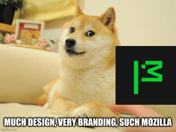
Doge Reviews MDN Neon Green Logo: Much Design, Very Branding, Wow
UX UI Post #6458, on Dec 16, 2024 in TG

Doge Reviews MDN Neon Green Logo: Much Design, Very Branding, Wow

Why is this UX UI meme funny?

Level 1: Fancy New Outfit

Imagine your very serious teacher – the one who always wears a plain brown suit – walking into class one day wearing a bright neon-green jacket. All the students would sit up and stare in surprise. It’s still the same teacher you trust, but now they look super flashy and different. A couple of kids might start giggling. One jokester in the back might even shout in a silly voice, “Wow, so stylish, very cool, much trendy!” Everyone laughs because they know that classmate is just teasing in a friendly way.

This meme is just like that. MDN is like the serious teacher – usually very calm and traditional. The new neon green logo is its crazy new outfit. And the Doge (that Shiba Inu dog) is like the funny student making a light-hearted comment about it. When Doge says, “much design, very branding, such Mozilla,” he’s basically joking, “Whoa, look who got all fancy – so cool, wow!” It’s funny because something that’s normally plain and serious (a documentation website) suddenly dressed up in neon colors. Instead of reacting with anger or confusion, the developer community reacted with humor. They used the friendly Doge meme to both appreciate and playfully poke fun at MDN’s bright new look. In the end, it’s a joke that says: we notice the big change, it’s kind of amusing, but we’re smiling along with it.

Level 2: Branding Meme-ified

This meme combines a famous internet dog with a big change in a tech website’s look. Let’s break down the pieces:

  • MDN Web Docs (Mozilla Developer Network): This is a popular site where web developers find official documentation and tutorials for HTML, CSS, JavaScript, and other web technologies. Think of it as the reference book for how to build websites correctly. It’s known for being reliable, comprehensive, and usually pretty straightforward in design.

  • MDN’s rebrand: In 2023, MDN gave itself a makeover – a new logo, new colors, the works. The new logo is a black square with a bright neon green symbol on it. The symbol is very minimalistic: it looks like two green vertical lines next to a shape that resembles a backward “3”. Those shapes together subtly form the letters “MDN” in an abstract way. The color choice – a fluorescent green – really stands out. A rebrand like this means the site changed its visual identity (logo, color scheme, maybe the site style) to appear fresh and modern. Such big changes in appearance can surprise users who were used to the old look, especially on a beloved site that hasn’t changed its vibe in a long time.

  • Branding and design system: Companies like Mozilla have a design system – basically a set of guidelines for how all their products and websites should look and feel. This keeps everything consistent. MDN’s new neon green look wasn’t random; it likely follows Mozilla’s latest branding rules. Brand consistency means that MDN’s new style should make it feel like it’s in the same family as other Mozilla products (like Firefox). For example, they might use the same fonts or a complementary color palette across their sites. The idea is that if you see that neon green and the minimalist style, you’ll connect it to Mozilla’s brand identity. Of course, design consistency has to be balanced with usability, which is where some of the critique came in.

  • Accessibility and contrast: Accessibility is about making sure a website can be used by as many people as possible, including those with visual impairments or other difficulties. Contrast is a big part of web accessibility – you want text to stand out from the background so it’s easy to read. High contrast (like bright green on a black background) is usually good for readability in principle because the letters pop out clearly. In fact, there are accessibility guidelines (called WCAG) that recommend certain contrast ratios between text and background colors. The new MDN style with neon green and black likely meets those guidelines (since neon green on black is very high contrast). However, some people find extreme neon colors tiring to look at over long periods. If you’ve ever stared at something bright and your eyes felt weird after a while, you know the feeling. Some developers were concerned or at least curious: Will MDN’s new color scheme be comfortable for long documentation reading sessions? This was part of the discussion — not just “does it look cool?” but “is it still easy on the eyes and practical?”

  • Doge meme format: Doge is the name of the Shiba Inu dog in the picture. Doge became one of the internet’s most famous memes around 2013. In Doge memes, people overlay short phrases in multicolored Comic Sans font around the dog’s face. The phrases deliberately use broken English and the dog’s inner thoughts, like: “so scare,” “much wow,” “very talent,” etc. This style is called Doge-speak. It’s playful and intentionally tacky-cute. In this meme, the text “MUCH DESIGN, VERY BRANDING, SUCH MOZILLA” is written in that Doge style. Let’s translate that: it means the dog (Doge) is noticing the MDN redesign and is saying it has a lot of design effort, very strong branding, and it’s so... Mozilla. Doge-speak drops words like “of” and “the” and just throws adjectives around in a funny way (“much design” instead of “so much design”). It’s basically a way to sound excited and silly about something.

  • Why it’s funny to developers: The humor here comes from contrast and exaggeration. MDN is a serious site for learning web development – people think of it kind of like a formal encyclopedia or a teacher. Suddenly it has this flashy neon look, which is unexpected. The meme responds by using a goofy dog character who speaks in childlike, enthusiastic praise. It’s like meeting a very formal librarian who’s now wearing a party costume – and then a cartoon dog compliments it in baby talk. For developers, mixing the Doge meme with the MDN logo is delightful because it’s so out-of-place. TechSatire and memes allow the community to comment on changes humorously. Instead of writing a long blog post about whether the neon design is good or bad, someone made this meme to convey: “Whoa, MDN’s new look is really something, huh?” – but in a light-hearted, joking way. It’s a form of DeveloperHumor: expressing an opinion about a tech topic (here, a design overhaul) using an absurd, shareable joke.

In simpler terms, MDN changed its look in a big, bright way, and the developer community reacted by doing what internet communities love to do – turning it into a meme. The dog in the picture is basically saying, “Wow, look at Mozilla being all modern and stylish with MDN!” But using the silly Doge language (“much design, very branding, wow”) tells us this is said with a wink and a smile. Even if you didn’t know MDN or Doge, you can sense the playful tone. For those who do know, it’s even better: it mixes a classic meme with a real discussion about web design trends. It goes to show that in tech, even a logo change on a documentation site can end up creating a moment of fun across the community.

Level 3: Contrasts of Opinion

The Mozilla Developer Network (MDN) underwent a bold rebrand in 2023, trading its familiar, no-nonsense look for a striking neon green logo and minimalist glyph design. For a site revered as the canonical reference in WebDevelopment circles, this sudden brand makeover was like seeing your reliable old textbook printed with highlighter ink. Developers, especially long-time users, immediately took notice – and of course, took to humor. This meme takes the iconic Doge (that Shiba Inu of early MemeCulture) and has it enthusiastically praise the new MDN design in classic Doge-speak: “MUCH DESIGN, VERY BRANDING, SUCH MOZILLA.” It’s a perfect example of tech inside-jokes and DeveloperHumor: mixing a beloved meme format with a real-life tech trend to poke fun at it.

But why is it so funny (and so relatable) to those in the know? MDN is not just any documentation site – it’s the go-to learning hub for web standards, an authoritative source that web devs trust daily. It has traditionally been all about substance over style. So when MDN’s design suddenly goes “high-vis” with a fluorescent palette and an abstract logo, it feels almost like your famously serious professor showing up to lecture in a neon tracksuit. Devs who grew up with MDN’s clean, utilitarian interface couldn’t help but react. Some actually liked the fresh look, but many jokingly wondered if the MDN design team had simply found a leftover can of 1980s neon green paint and thought, “Why not?” The meme captures that split reaction perfectly: Doge’s over-the-top praise is so exaggerated that it reads as tongue-in-cheek. It’s as if the community is saying, “Yes, much design, very fancy… we see you, Mozilla,” with an affectionate eye-roll.

Underneath the jokes lies a layer of genuine UX_UI discussion. The meme text hints at “design” and “branding” because those were hot topics when the rebrand launched. MDN’s new look was part of a broader design system overhaul – Mozilla’s effort to unify the style of its sites and projects. A design system is like a rulebook of fonts, colors, and UI components to keep everything consistent. By adopting a neon green/black theme and a minimalist emblem (the new logo looks like two vertical bars next to a mirrored “3”, abstractly forming “MDN”), MDN aligned with Mozilla’s edgy new visual identity. This kind of BrandingInTech update is meant to signal that the site is modern and evolving. However, experienced developers immediately thought about practical implications, like accessibility contrast. MDN is a resource people read for hours, so the color scheme isn’t just a branding choice – it affects readability. Is that electric green (#00FF00) text on a black background comfortable to read? In terms of pure contrast ratio (a key metric from WCAG guidelines), neon green on black is extremely high-contrast – the text practically glows against the dark. High contrast can be great for visibility, but saturated neon can also cause eye strain. Some devs half-jokingly commented that they might need sunglasses at night when reading MDN in dark mode. In other words, beyond the “such wow” jokes, there was a real design critique happening about whether the new style was as functional as the old one.

Another nuance is brand consistency and community attachment. MDN is part of Mozilla, a company with its own history of bold branding moves (remember when Mozilla’s logo became “moz://a”? That was a quirky nod to its URL heritage). Still, MDN had always been a pretty conservative-looking documentation site. Changing its image so dramatically felt almost personal to veteran web devs – like someone redecorated a favorite library overnight in neon lights. This contrast between industry trends and a community’s comfort zone is fertile ground for memes. In tech circles, whenever a familiar tool or site changes its logo or UI, you’ll often see playful outrage and satire. It’s a form of TechSatire: everyone becomes a part-time design critic, not out of hate but because we’re passionate (and yes, a bit protective) about the tools we use. It’s classic bikeshedding too – it’s easier (and more fun) to debate logo colors than, say, the complexities of JavaScript semantics. So, when MDN’s rebirth in neon green hit, forums lit up with spicy takes. “My eyes, what have they done?” and “I kind of love it, is that bad?” existed side by side. The Doge meme distills all that chatter into one image that both teases and celebrates Mozilla’s bold move.

In the meme, Doge’s goofy, grammatically twisted praise – “much design, very branding, such Mozilla” – says a lot with very few words. It humorously magnifies what everyone noticed: this rebrand is loud and unapologetically branded. The phrasing is exaggerated praise, which hints at slight sarcasm. It’s as if the community, via Doge, is tipping their hat to Mozilla’s design team with a smirk: “You really went all in on this look, huh? Bold choice, Mozilla – wow.” Yet, the tone isn’t mean-spirited. Developers love MDN; they rely on it. The meme is a way of bonding over the shock of the new look without actually trashing the site itself. In fact, by meme-ifying the situation, the community turned potential negativity into shared laughter. It’s a coping mechanism and a comedic release valve. The meme highlights how dev communities handle IndustryTrends_Hype and changes — we meet it with memes, blending genuine critique with humor. In the end, everyone still uses MDN for the great content (neon glow and all), but now we have this funny image to remember “that time MDN went full Cyberpunk green.” The combination of an old-school meme format with a cutting-edge rebrand turned a serious discussion about design into an inside joke. And for seasoned devs, that mix of nostalgia (Doge is a meme from their internet youth) and current events (the MDN revamp) is pure gold. They’re nodding and chuckling because they’ve seen this pattern before: serious tech thing gets trendy redesign, community reacts with wit and memes. Much design. Very branding. Wow, indeed.

Description

Meme image of the famous Doge Shiba Inu lounging on a beige couch; the dog’s face is pixel-blurred. In the lower-right quadrant, a black square with Mozilla MDN’s new neon-green, highly abstract logo (two vertical strokes and a mirrored “3” forming a stylised “MDN”) is overlaid on the dog’s chest. Along the bottom, bold white Impact-font text reads: “MUCH DESIGN, VERY BRANDING, SUCH MOZILLA”. The visual gag riffs on classic Doge-speak to poke fun at Mozilla’s 2023 MDN rebrand, whose fluorescent palette and minimalist glyphs sparked lively debate among senior web devs about design systems, accessibility contrast, and brand consistency for a site long regarded as the canonical web-standards reference

Comments

11
Anonymous ★ Top Pick Somewhere an over-eager brand guide just elevated --brand-green from accent color to incident severity
  1. Anonymous ★ Top Pick

    Somewhere an over-eager brand guide just elevated --brand-green from accent color to incident severity

  2. Anonymous

    After 20 years in tech, you realize the most breaking changes aren't in your API versioning - they're when MDN moves that one CSS property example you've been copy-pasting since 2012, and suddenly your muscle memory grep patterns return nothing but existential dread

  3. Anonymous

    When Mozilla spent months workshopping their rebrand with design agencies and focus groups, only to have the entire developer community summarize their reaction in a single Doge meme. The real kicker? The geometric 'M' logo cost more than most startups' entire Series A, yet somehow has less personality than a Comic Sans wordmark. At least when they deprecated XUL extensions, we got WebExtensions in return - this rebrand gave us a logo that looks like it escaped from a 'Learn CSS Grid' tutorial

  4. Anonymous

    Thunderbird's logo: where Mozilla perfected Rust's syntax but forgot to refactor pixel art from the Netscape era

  5. Anonymous

    Marketing spent a quarter turning “Mozilla” into “moz://a”; my 12‑line i3 config actually improved throughput - yet only the logo got a launch party

  6. Anonymous

    While marketing agonizes over moz://a kerning, i3 users tweak a 40-line config and shave context-switch latency - branding with benchmarks

  7. @Algoinde 1y

    All I have to say is "Why not white flag"

    1. dev_meme 1y

      Only for 🇫🇷 locales

  8. @Finchleigh 1y

    I see a little barky face

  9. @sandor73 1y

    But who cares about the corporation? The browser logo doesn't change right?

  10. @sandor73 1y

    Like, the corporation could literally pick as its symbol the intolerant tolerance black power indigenous furry LGBTQIAA+ flag, and I still would not care.

Use J and K for navigation