Skip to content
DevMeme
5600 of 7435
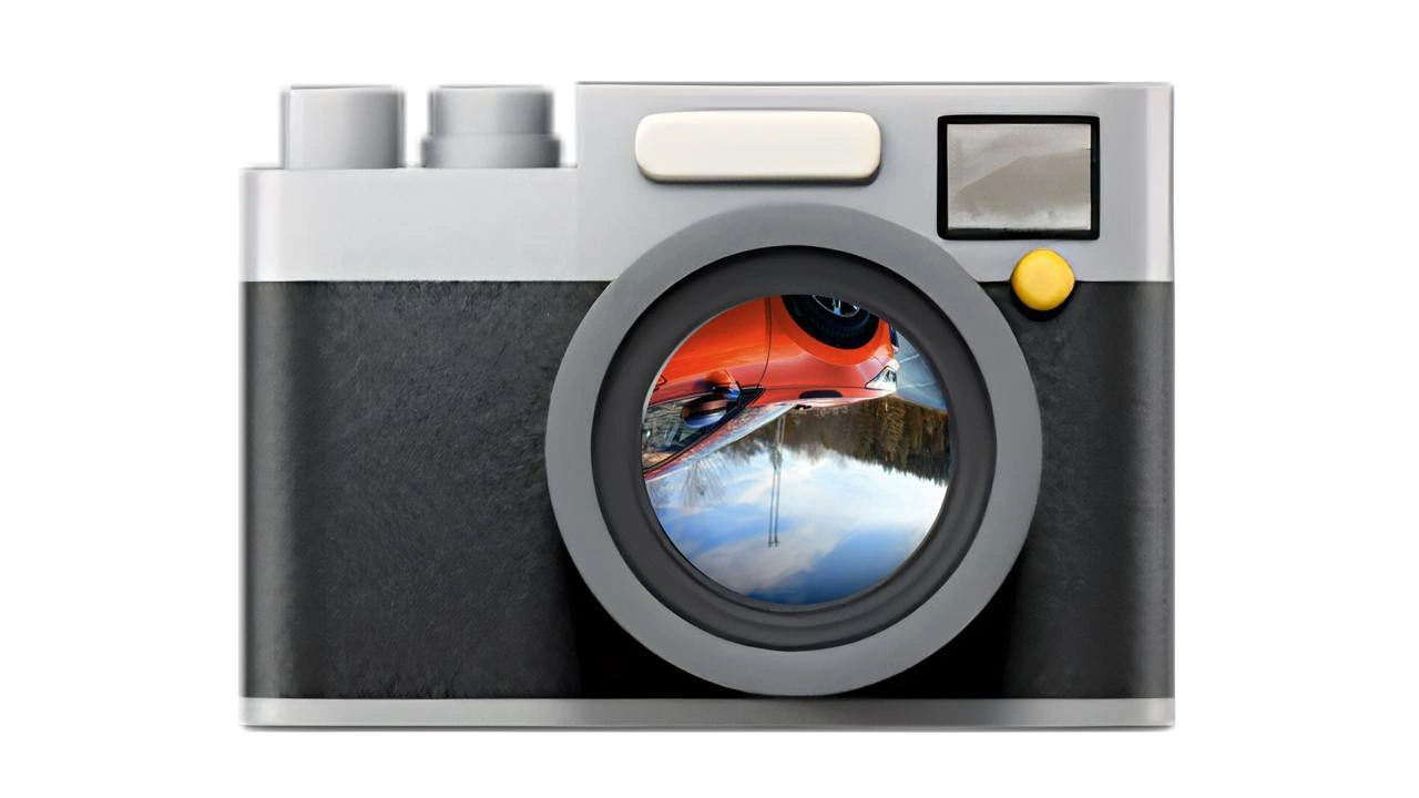
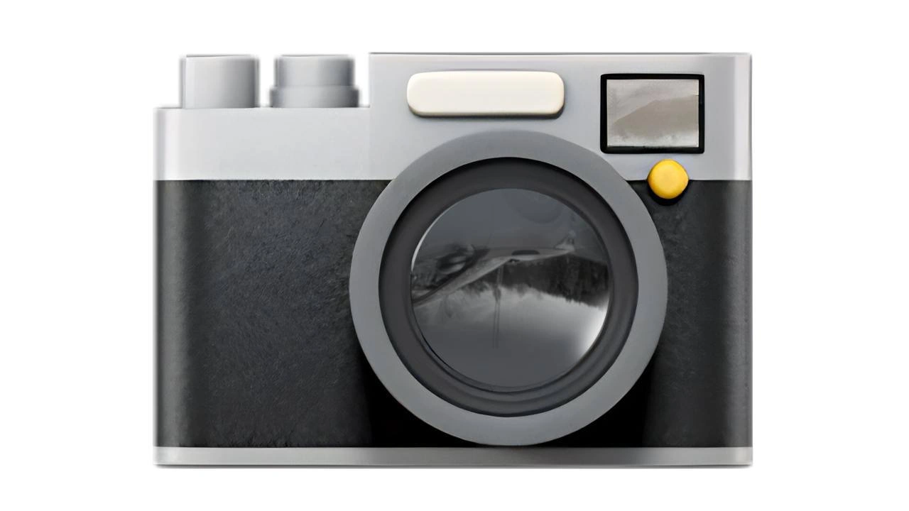
When your entire UI mockup ships as a single camera icon
UX UI Post #6142, on Aug 7, 2024 in TG

When your entire UI mockup ships as a single camera icon

Why is this UX UI meme funny?

Level 1: Oops, Only an Icon

Imagine you open a brand new coloring book that’s supposed to have lots of drawings to color… but every page is blank except for one little camera picture in the middle. That’s what happened here, but in a software app! The people making the app had a full picture in mind of how it should look (with buttons, text, and images), kind of like expecting a storybook with many pages. But when they gave it out, users saw just one single camera icon on the screen and nothing else – like getting a storybook that only has the cover image and no story. It’s funny in a silly way: it’s as if they forgot to put the whole UI in and only left the “picture goes here” sticker. The camera icon was meant to be a placeholder, like a sign saying “image will come here,” but someone accidentally treated that sign as the real thing. So the app ended up empty, showing only that one camera image. For the user, it’s confusing (“Where’s everything else?”), and for the creators, it’s an “oops!” moment. The humor comes from how absurd it is – it’s like setting up an entire photo album but inside it there’s just a single picture of a camera on every page. Everyone can laugh because it’s a big obvious goof: the app was supposed to have a whole bunch of stuff, and instead it only had an icon, standing all by itself.

Level 2: One Icon to Rule Them All

Stepping down to a more straightforward view, let’s clarify what’s happening. The phrase “UI mockup” refers to a UIDesign draft or model of what an app or website should look like – usually made by a designer to show layout, colors, and icons in a static image form. Here, instead of implementing that design properly (turning the mockup into real code with buttons and text), the team somehow delivered just a single camera icon from the mockup. It’s as if the devs took an example image from the design and used only that in the final app. In practical terms, a placeholder_asset like a camera icon is often used during development to mark where an image or component will go. It’s supposed to be temporary. For example, a profile page might show a camera icon as a placeholder if the user hasn’t uploaded a photo yet. But shipping the entire interface as just that icon means the temporary filler never got replaced with actual UI elements.

Why would this happen? Possibly a missing resource bug or a build issue. In front-end terms, a missing resource bug is when an image or file path is wrong or the asset didn’t load, and the app doesn’t handle it gracefully. A common result is either a broken image icon or some default content shows up. If the default content was a camera graphic meant to indicate “image missing,” and if every UI component failed to load, you could literally see just that one icon everywhere. Another scenario is misusing an SVG sprite. Developers often pack many icons into one SVG file (a sprite) and reference them by ID. If by mistake every reference points to #camera-icon (or if the sprite fallback is the first icon, which is a camera), then every icon on the page becomes the same camera. So instead of a rich interface with home icons, menu icons, etc., you get one camera repeated – or in the worst case, one giant camera icon because only one element loaded. In any case, FrontendDevelopment best practices say you should test your app thoroughly. Clearly, something slipped through the cracks: maybe an incomplete merge, maybe a last-minute change that went untested. And code reviews, which are supposed to catch obvious issues (like "hey, why is our homepage just one <img> tag?"), didn’t catch it – that’s the code-review blind spot the description mentions. It’s funny in hindsight because it’s such an absurd outcome, but it likely wasn’t funny to the team at the time!

From a UXDesign perspective, this is a failure of UXDesignPrinciples 101: provide the user with a meaningful interface. A single icon with no context gives the user nothing to do and no information – it’s essentially a blank page with a decoration. It’s also a cautionary tale for IconDesign usage. Icons are meant to support labels and content, not replace your entire application. This one icon might be beautifully designed (shiny lens reflection and all) but it can’t stand in for an actual user interface. The user probably reacted with confusion (“Is something supposed to happen when I click this camera?”) or frustration. For a junior developer or someone new to UI work, the lesson is clear: placeholders must be replaced. Always double-check that your real content or interactive elements made it into the final build. If you see a camera emoji or any default graphic in your final product where it shouldn’t be, that’s a red flag! In summary, this meme highlights a simple but important aspect of frontend work: don’t accidentally ship your app in placeholder mode.

Level 3: Monolithic Mockup Mishap

At the highest technical level, this meme exposes a front-end development folly where an entire UI design gets collapsed into a single image asset. Imagine a carefully crafted UI mockup in Figma or Sketch – complete with buttons, menus, and content – but due to a pipeline snafu or oversight, the product ships with just one placeholder asset (the camera icon) visible. This is a monolithic UI mistake: instead of modular components working together, we end up with one giant SVG icon monolith on the screen. The humor lands because experienced devs recognize this as a deployment facepalm: some part of the build or deployment script likely defaulted to a stub image, or a developer accidentally hard-coded the mockup as an image. It’s the front-end equivalent of deploying a single brick instead of a house.

From a senior perspective, a lot of things had to go wrong in unison for this UX/UI nightmare to reach users. The design-to-code handoff clearly broke down – maybe the dev treated the entire mock as an exportable picture, or left a <div> with a background of a camera_emoji 📷 as a stand-in. In a healthy pipeline, you’d catch a missing_resource_bug: if real assets weren’t ready, there would be errors or at least obvious red flags in testing. But here, a blind spot in code review meant nobody noticed that the UI was essentially empty except for that default icon. This speaks to a breakdown in UX design principles and quality control: one of the cardinal rules is that placeholders should never be user-facing in production. The meme is tagging that shared industry trauma – the kind of production fail where you cringe and say, “I can’t believe we actually shipped that.”

Digging deeper, there’s an interesting hint in the image choice: a detailed camera illustration, reminiscent of a camera emoji or a stock placeholder icon. In design prototypes, empty image frames often show a camera or image icon as a hint (“image goes here”). If a developer mistakenly leaves those in place, the user sees the literal placeholder. It’s a bit like the infamous “svg_sprite gotcha” where all icons default to one because the <use> references weren’t updated – suddenly every icon in your app is the camera symbol because that was the first in the sprite sheet. The IconDesign that was meant to be one small part of the UI has usurped the entire interface! This one-icon takeover humorously underscores why we have processes like component previews and QA: to prevent exactly this kind of FrontendDevelopment blunder. (On the bright side, at least the camera icon is pixel-perfect – too bad it’s the only thing on screen.)

Description

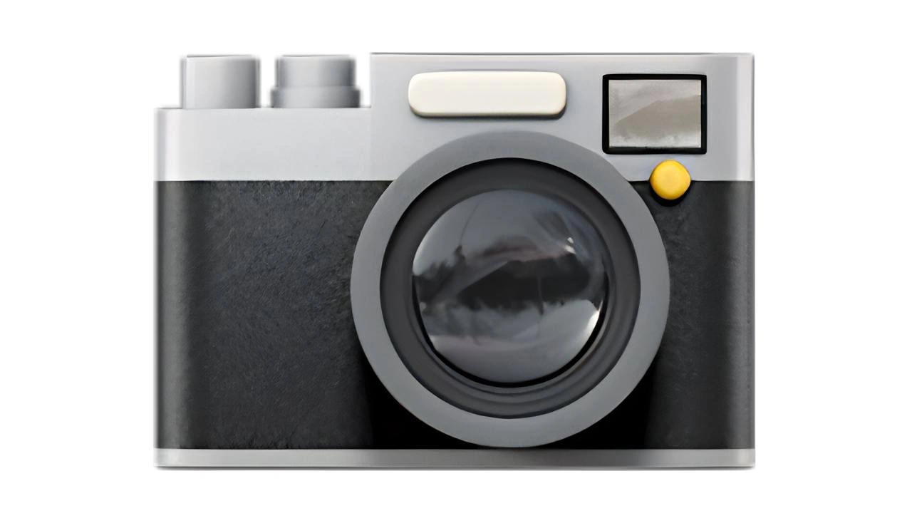
A flat, vector-style camera illustration fills the frame, echoing the default "camera" emoji. The body is silver on top and textured black on the bottom, with two light-grey dials, a cream rectangular shutter bar, a small yellow button beside a square viewfinder, and a large circular lens whose glossy glass reflects an inverted grayscale landscape. No written text appears anywhere; it is purely graphical. To a developer, it recalls the scenario where a placeholder asset is accidentally promoted to production, underlining issues in front-end asset pipelines, design - dev hand-offs, and code-review blind spots that let a single icon stand in for an entire UI
Comments

6
Anonymous ★ Top Pick CI promised a single deployable artifact - now the entire React app is literally one camera SVG. Product calls it a “hyper-focused experience”; ops is just enjoying the 100 % CDN cache hit rate
  1. Anonymous ★ Top Pick

    CI promised a single deployable artifact - now the entire React app is literally one camera SVG. Product calls it a “hyper-focused experience”; ops is just enjoying the 100 % CDN cache hit rate

  2. Anonymous

    The designer spent three sprints perfecting the skeuomorphic shadows on this camera icon while the actual camera API still returns photos rotated 90 degrees on half of Android devices

  3. Anonymous

    This camera icon perfectly captures the essence of modern software development: a beautifully rendered 3D asset that probably took three sprints to design, two rounds of stakeholder feedback, and a complete design system overhaul - all to represent a feature that 80% of users will access via a keyboard shortcut anyway. At least it's not another hamburger menu

  4. Anonymous

    Shutter speed? Irrelevant when your bug's repro cycle rivals blockchain finality

  5. Anonymous

    Our “image pipeline” at scale: Docker tagged :latest, CDN caching old builds, EXIF rotation gaslighting QA - the camera is the only component that isn’t eventually consistent

  6. Anonymous

    Product: “Just add a camera button.” Senior dev: “Sure - right after the HEIC→JPEG transcoder, EXIF-orientation normalizer, presigned S3 multipart upload, srcset generator, CSP/CORS wrangling, metadata scrub for GDPR, and the Safari-only fix; then it’s a button.”

Use J and K for navigation