Camera emoji reminds devs that even tiny icons need pixel-perfect care
Why is this UX UI meme funny?
Level 1: Tiny Picture, Big Care
Imagine you drew a little picture of a camera on a sticky note. Now your friend wants to use that drawing on a big poster. If you just stretch the sticky note drawing to be bigger, it might look all blurry and yucky on the poster, right? So instead, you’d probably redraw the camera nicer and clearer in a bigger size for the poster. That’s exactly what developers do with a tiny icon in an app – they make sure to have a small version, a medium version, and a big version of the same picture so it always looks clear, not fuzzy, whether it’s on a little phone screen or a big high-resolution monitor.
Now think about where you put that camera drawing: if you stick your camera drawing on a white fridge, using a black pen for the camera is great – it shows up nicely. But if you put the same drawing on a black notebook, suddenly a black pen on black background disappears! You might trace over it with a light pen or add a white outline so you can see it. In apps, “dark mode” is like that black notebook – the background goes dark. So developers sometimes use a lighter colored icon or add a light outline for dark mode, so the camera picture doesn’t vanish. They’re basically making sure the little camera icon is visible no matter what color the background is.
So even though it’s just a tiny picture of a camera, developers treat it with a lot of care – kind of like making sure a small sticker looks perfect on both a birthday card and a huge poster, and that you can see it in daylight or at night. It’s funny, because it’s such a small thing, but those little details can make an app feel really polished and friendly to use. After all, nobody likes a blurry or hidden picture, even a tiny one!
Level 2: Pixel Perfect 101
Let’s break down what’s going on in simpler terms. We have a small camera emoji asset – basically a tiny picture of a camera – that a developer wants to put in an app or website. Even though it’s small, making it look good everywhere is a bit of an art and science. Pixel-perfect icons means the icon is designed so carefully that every dot (pixel) on the screen is just the right color and in the right place, with no blurring or jagged edges. Why is this a challenge? Because not all screens are the same! Some screens (like older monitors or standard displays) have fewer pixels per inch, while others (like modern phone screens or “Retina” displays) pack many more pixels into the same space. For example, a normal display might use one hardware pixel to draw one image pixel, but a retina_display_scaling display might use four hardware pixels (2×2 grid) to show what’s meant to be one “point” of imagery. If you try to show a low-resolution icon on a high-resolution screen, the device has to stretch it – and that’s when things get fuzzy. It’s like taking a small photo and zooming in; it can look blurry or blocky unless you have a higher quality photo to start with. That’s why developers export the camera emoji in multiple resolutions. You might have camera_1x.png for regular screens, camera_2x.png for retina screens (double the pixels in width/height), and maybe camera_3x.png for super dense screens. Each one is a sharper version made for that density, so the app will automatically pick the best one and the icon stays nice and crisp.
Now, what about dark_mode_contrast? Dark mode is when an app uses a dark background (gray/black) instead of a light background. It’s easier on the eyes at night. But if your icon is dark (our camera icon has a black body), putting it on a black background is like drawing with a black pen on dark paper – you won’t see it well. So designers and devs ensure the icon either has some lighter elements or they provide an alternate version for dark mode. For instance, they might make the silver top of the camera a bit lighter, or add a faint outline around the camera shape, or simply use a differently colored icon that stands out on dark backgrounds. Good UIDesign is about making sure things are visible and understandable in all conditions, so contrast (the difference in brightness between the icon and the background) is super important. If an icon has poor contrast, users with even slight vision differences or in glare conditions will literally not see it. That’s a UX no-no, hence the extra care.
Let’s talk formats: PNG vs SVG – the classic GraphicsAndMultimediaProcessing choice. A PNG is like a fixed painting. It’s made of pixels. If you need it bigger or smaller, you essentially scale the painting, which can blur it if you enlarge or make details disappear if you shrink. The upside: what you see is exactly what you get – every pixel is decided by the designer, so at the size it was intended for, it looks perfect. A SVG, on the other hand, is like an instruction recipe for the image: “draw a circle here, a rectangle there, color it this way.” It’s vector graphics. The big advantage is you can ask the recipe to draw the image at any size – tiny or huge – and it will redraw it fresh, so it’s always sharp in theory. In practice, for something simple like a flat icon (e.g., a plain camera outline), SVGs are amazing: one small text file can produce icons of any size with no loss of quality. But for something detailed, like a camera emoji that might have reflections and multiple colors and subtle shading, the SVG file can get complicated or even larger than a comparable PNG. Also, when an SVG is drawn very small, the lines and gradients might be so fine that they kind of blur anyway (because the computer has to approximate those shapes on the tiny pixel grid, a process similar to smoothing).
Here’s a quick comparison to make it clearer:
| Format | Pros (Good) | Cons (Challenges) |
|---|---|---|
| PNG (bitmap image) | Exact pixels at a given size, rich detail (good for complex artwork) | Blurry if scaled larger than intended, needs multiple sizes for different screens, can increase app size with many files |
| SVG (vector image) | Scales to any size without pixelation, often a small file for simple icons (one file covers all densities) | Can get heavy or slow if the artwork is very detailed (lots of math to draw it), might look slightly less crisp at tiny sizes due to anti-aliasing, not supported everywhere (older platforms) |
Developers decide between these based on the icon’s complexity and usage. Many modern apps actually use a hybrid approach: they might use SVG (or icon fonts) for their flat simple icons (like arrows, basic shapes in a UI), but use PNGs for emojis or highly detailed icons where they want a very specific look.
Another term tossed around is “bundle bloat” – basically, the more files (like images) you pack into your app or webpage, the larger it is for users to download or install. If you include five versions of the camera icon (different sizes, different themes), that’s five files’ worth of data instead of one. So developers try to find a sweet spot: enough versions to look good on all devices, but not so many that the app becomes unnecessarily large. Techniques like image compression help reduce file sizes (for example, PNG files can often be crushed down without losing quality by removing unused metadata or optimizing the color palette). There are even specialized tools that optimize PNGs (like PNGQuant or ZopfliPNG) which engineers run before shipping the app, just to save a few kilobytes here and there. It might seem overkill for an emoji, but when you have hundreds of icons in an app, it adds up!
In summary, even this humble camera emoji touches various aspects of development and design: IconDesign principles (so it’s recognizable and beautiful at 16px or 128px), UXDesign considerations (visible in all themes and screen sizes), and a bit of ImageProcessingAlgorithms know-how (scaling and optimizing). A junior dev learning about these things might be surprised: “All that for one icon?” Yes! Making software look polished means sweating the small stuff, and the small stuff often isn’t as simple as it looks.
Level 3: Small Icon, Huge Effort
Why do developers chuckle at the phrase “even tiny icons need pixel-perfect care”? Because it’s oh-so-true. This meme captures a scenario every experienced front-end or mobile dev knows too well: that one small icon (say, a camera emoji in your chat app’s UI) can unexpectedly consume hours of work and an almost obsessive level of detail. The humor comes from the contrast – we imagine coding as grand architecture (algorithms, databases, ImageProcessingAlgorithms for fancy features), yet here we are fussing over a 48px graphic, zooming in until we see individual pixels like we’re defusing a bomb. The senior perspective knows that UIDesign and IconDesign aren’t afterthoughts; a blurry icon can make a polished app look amateur. It’s the kind of bug a QA tester or a keen-eyed manager will spot immediately in a demo: “Why does that camera icon look fuzzy on the new phone?” Cue the developer’s facepalm.
There’s a bundle of well-known real world issues being referenced:
- Multi-resolution asset hell: Modern apps need multiple versions of each icon for different screen densities. Seasoned iOS devs recall adding
@2xand@3xvariants of every PNG asset. Android folks deal withdrawable-mdpi,hdpi,xhdpi, etc. Forget one size, and that gorgeous icon turns into a blurry mess on some devices. The phrase retina_display_scaling is basically shorthand for “don’t forget to include a super high-res version or it’ll be scaled up and look bad.” Many of us have had that last-minute scramble searching “why is my icon blurry on iPhone X” only to realize we missed the 3x asset. - Pixel-perfect OCD: Experienced UX/UI designers often insist on pixel_perfect_icons. To a developer fresh on the job, this might sound like nitpicking – “it’s a 1px change, who will notice?” – but veterans know that 1px can be the difference between a crisp edge and a fuzzy line due to anti-aliasing. There’s a shared war story trope: a PR (pull request) where the only changes are coordinates nudged by a pixel or a slightly adjusted SVG path to align with the pixel grid. At the time it feels ridiculous, but when you toggle before/after, everyone nods in relief: much better.
- Dark mode surprises: The meme description explicitly mentions dark mode contrast, which opens another can of worms a senior dev has wrestled with. Perhaps you added a nice black camera icon on a transparent background. Looks great on a light theme. Then a user switches to dark mode and… where’d the icon go?! It’s nearly invisible against a dark background. Whoops. Now you need either a light-themed version of the icon or to add an outline or adjust the color – something to provide dark_mode_contrast. There’s humor in imagining a tiny yellow or white outline being added to the icon just so it doesn’t become a stealth ninja on night mode. Seasoned devs have learned to think ahead: “How will this asset look in both light and dark UIs?”
- SVG vs PNG trade-offs in practice: Ah, the svg_vs_png_tradeoff – a classic senior discussion. In theory, using an SVG for an icon is great: one file that scales to any size (no more multiple PNGs) and often a smaller footprint if it’s simple shapes. In practice, we’ve seen pros and cons. Senior devs joke about how an SVG that’s basically a mini painting (with many points, gradients, filters) can actually bloat your bundle or even render slower than a bitmap. We recall times where using a complex SVG made the app chug on low-end devices, so we caved and used PNGs for performance. Conversely, we’ve also been burned by sticking to PNGs and later having to re-export a dozen sizes when the design changed. It’s a “choose your poison” scenario: either do extra image processing upfront (export multiple PNGs, optimize each) or rely on runtime rendering and risk subtle quality issues. There’s a cheeky understanding here that neither is perfect. So devs adopt hybrid strategies: simple icons as SVG (think flat symbols in a toolbar), detailed ones as PNG (like this camera emoji with reflections), and pray the design team doesn’t change the icon for the tenth time (or else redo all the assets again!).
What makes this all memeworthy is how UX_UI polish tasks often balloon in complexity. An experienced engineer reading the meme can practically hear the designer saying, “Make sure that emoji icon is pixel-perfect!” It triggers memories of late-stage app reviews where someone zooms the interface on a simulator and points at a tiny blur: “This icon isn’t as sharp as the others.” And indeed, sometimes the smallest visual glitch gets disproportionate attention – a mixture of pride and perfectionism in our craft. We laugh because we’ve been the developer painstakingly comparing a 16px and 32px icon export, or debating if #000000 black or #1A1A1A is better for dark mode visibility. It’s absurd, it’s detail-oriented, and it’s essential for a quality product.
This culture of caring down to the pixel also speaks to developer mindset: we know users might not consciously say “the icon is off,” but a crisp interface just feels better. It’s part of good UXDesign – reducing any little friction or inconsistency. Senior devs joke about it, but they also take pride when even an emoji icon looks immaculate on every device. As the saying goes in graphics programming, "God is in the details." Here, the “God” is that one pixel you had to fix to get the icon just right. 😅
Level 4: Under the Pixel Microscope
At the most granular level, this meme hints at the invisible complexities behind rendering a tiny camera emoji on modern screens. To a seasoned graphics engineer, a 24×24 pixel icon is a playground for sampling theory and ImageProcessingAlgorithms. Why? Because when you scale images up or down for different displays, you’re essentially resampling a signal (the image) at a new resolution. If done naively, you get dreaded aliasing – those jagged edges or blurry details that make any UI designer shudder. High-density screens (think retina_display_scaling where a “point” on screen maps to 2×2 or 3×3 physical pixels) demand extra care. You can’t just enlarge a 1× image and hope for the best; each additional device pixel needs the right color information.
In practice, frameworks use clever interpolation algorithms to stretch or shrink images. Bilinear filtering takes a weighted average of neighboring pixels to smoothly interpolate them, while nearest-neighbor just duplicates the nearest pixel (crisp but blocky). For a pixel-art style emoji, nearest-neighbor preserves hard edges; for a photo-like icon with gradients (like the glossy camera lens here), bilinear or bicubic filtering avoids chunky artifacts. However, even these algorithms have to be gamma-corrected to prevent colors from darkening when averaging – yes, even blending pixel colors involves perceptual math! The goal is to avoid any unintended blur so the icon stays pixel perfect at any scale.
Then there’s the vector vs raster dilemma, a mini case of theoretical elegance vs practical reality (a classic svg_vs_png_tradeoff). Vector graphics (SVG) use shapes and lines defined by math, which means they can scale infinitely without losing detail – essentially bypassing sampling issues by recalculating the image for each resolution. But if our camera emoji is richly detailed (notice the subtle reflection in the lens and the yellow accent), an SVG would need complex gradients and possibly filters, which themselves get downsampled for display and could introduce softness at small sizes. Vectors also rely on the renderer’s algorithms to turn math into pixels, which can produce slight anti-aliasing (blurriness on fine details). By contrast, a hand-tuned raster PNG at exactly 48×48 for a 2× retina display can be pixel aligned to perfection, with every dot deliberately placed. This is akin to the old-school font hinting in TrueType fonts – aligning strokes to the pixel grid for maximum sharpness. Emoji design often combines both worlds: artists create the master image as a high-res vector in a design tool, then export carefully optimized rasters at multiple sizes, effectively doing a controlled downsampling to avoid algorithmic surprises.
Even color and contrast enter the realm of deeper science. An icon intended for “dark mode” might use different gamma or hues to appear equally vibrant on a dark background versus a light one. Human visual perception isn’t linear – a color that pops on white could look muted on black due to simultaneous contrast effects. Some platforms use compositing tricks (like adding a faint outline or adjusting brightness) when rendering UI icons on varying backgrounds to maintain visibility. There’s a touch of imaging science in ensuring the small yellow dot (the camera’s shutter button in the icon) doesn’t blend into a bright background or that the black camera body doesn’t vanish on dark mode. Ensuring a consistent look might involve calculating luminance and contrast ratios (per accessibility guidelines, e.g., ensuring sufficient difference in brightness, as defined in standards like WCAG). This is where GraphicsAndMultimediaProcessing meets UX: you might even preprocess assets to have slight color tweaks for dark mode, or include metadata for the system to swap to an alternate version.
Under the hood, modern UI frameworks treat images as multi-scale assets. For example, iOS asset catalogs or Android’s drawable buckets are essentially implementing a MIP-map strategy (a concept from 3D graphics): multiple precomputed sizes of an image to use the one closest to the device’s needed size, minimizing on-the-fly scaling. This reduces both runtime work and ensures the artwork was resized with the designer’s intended algorithm (or manual touch-ups). It’s a subtle dance of hardware and software: GPUs love power-of-two textures and interpolation, CPUs handle SVG parsing, and memory constraints push us to compress images tightly (PNG compression, vector path simplification, etc.). Every one of those silver dials and the lens reflection in the emoji had to survive compression without weird artifacts. The final laugh for the enthusiast engineer is that a camera_emoji_asset this small can engage principles from Fourier transforms (for filtering) to human color perception. It’s a reminder that even the tiniest UI element sits on layers of sophisticated technology – a little 2D artwork invoking a lot of computer science.
Description
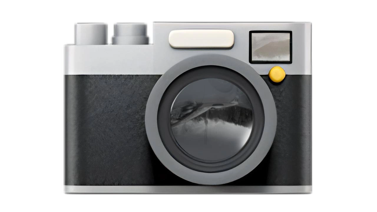
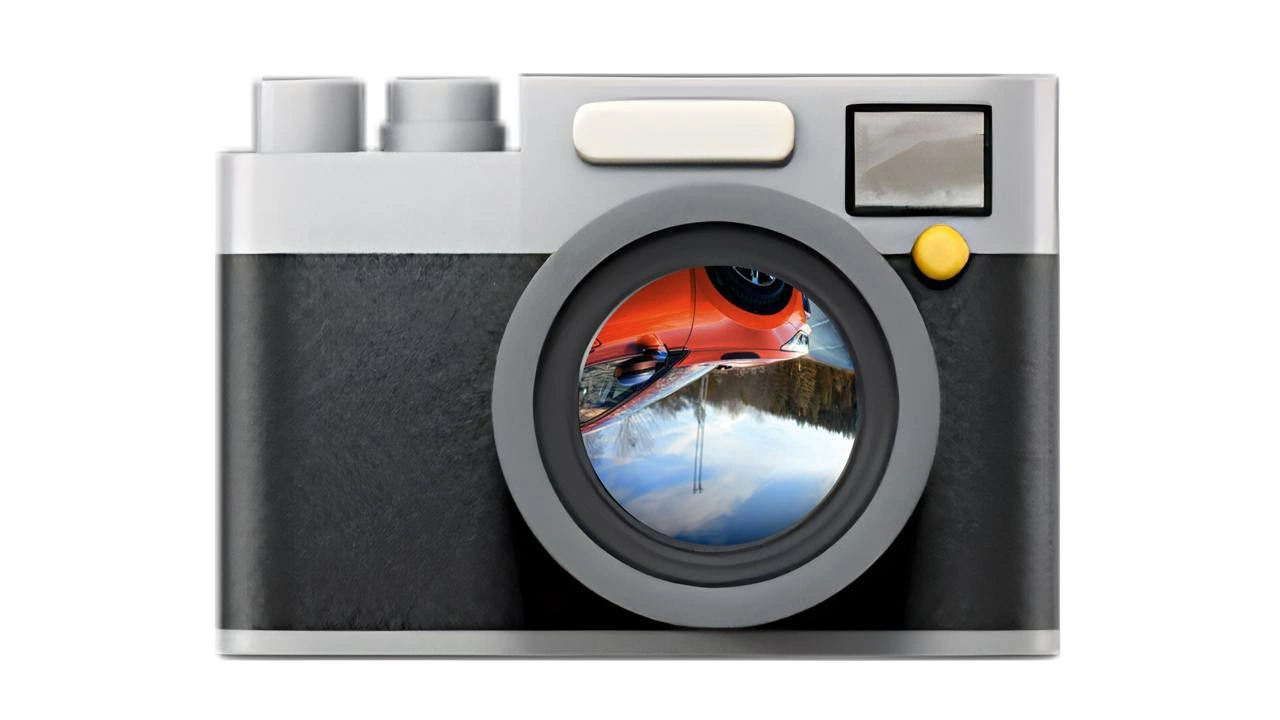
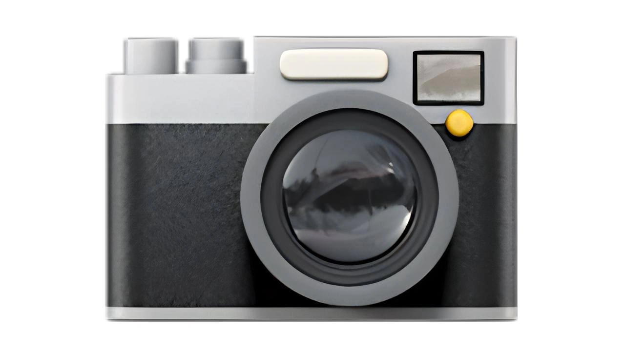
The image shows a flat, front-facing illustration of a vintage-style camera: matte black body with a silver top and bottom, a large glossy circular lens dominating the center, two rectangular silver dials on the top left, a cream-colored rectangular shutter button above the lens, and a small yellow circular accent beside a square viewfinder in the top right. No other text or elements appear; the background is plain white. In a software-engineering context this is the sort of raster/emoji asset that must be exported in multiple resolutions, considered for dark-mode contrast, and optimized to avoid bloating a mobile or web bundle while still looking crisp in high-DPI displays
Comments
6Comment deleted
Funny how we debate gRPC vs REST to save 10 ms, then a single camera emoji lands with 4-resolution, dark-mode, RTL variants and quietly adds 400 kB to the bundle - observability now tags it “📷 bottleneck.”
When the designer insists on shipping 47 different camera icon states for dark mode, light mode, and "maybe we'll add a sepia mode later," but the actual camera API still returns a base64 JPEG from 2009
This camera icon has better design consistency than most microservices architectures. At least when you click it, you know exactly what you're going to get - unlike that 'temporary' API endpoint from 2019 that's now load-bearing infrastructure serving 47 different clients, each expecting subtly different response formats
The original 'developer' workflow: load film, expose, then wait in the dark - no hotfixes, just chemical technical debt
Show a senior engineer a camera icon and watch them flinch - EXIF orientation, HEIC to JPEG, P3 color profiles, and cache invalidation turning “up” into a distributed consensus problem
Snapshot tests: because nothing says production readiness like a failed deploy over a 1px diff introduced by a different GPU driver