Modern Browser Wars: Bing's Desperate Plea to Remain the Default Search
Why is this UX UI meme funny?
Level 1: Caught in the Middle
Imagine you’re a kid at the playground and two friends each want you on their team. One friend grabs your left arm and says, “Hey, come back to my game, it’s the one you know and like!” But the other friend grabs your right arm at the same time, saying, “Wait, don’t go! Stay on my team — I have cool new toys we can play with if you stick with me!” You’re literally stuck in between while they both pull, each telling you something different. It’s confusing and a little funny too, because they’re so eager that they kind of forget how you feel.
That’s exactly what’s happening in this meme, but with web browsers instead of friends. Google and Microsoft are like two big kids fighting over who gets to be your search engine. One pop-up is Google saying, “Do you want to go back to using Google for search?” and the other pop-up is Microsoft (Bing) shouting, “Don’t switch back, we have goodies if you stay with Bing!” The poor user just wanted to search for something, and suddenly they’re caught in a tug-of-war. It’s amusing to see on the screen because it’s so literal — two boxes arguing one on top of the other. Just like with two friends pulling you in different directions, you have to decide who to go with, and the whole situation is kind of silly. The humor comes from that feeling of being in the middle of a squabble that really isn’t yours: even on a computer, apparently, you can get two voices yelling “Pick me!” at the same time. It’s a funny reminder that even tech giants can act a bit childish when they really want your attention.
Level 2: Default Search Duel
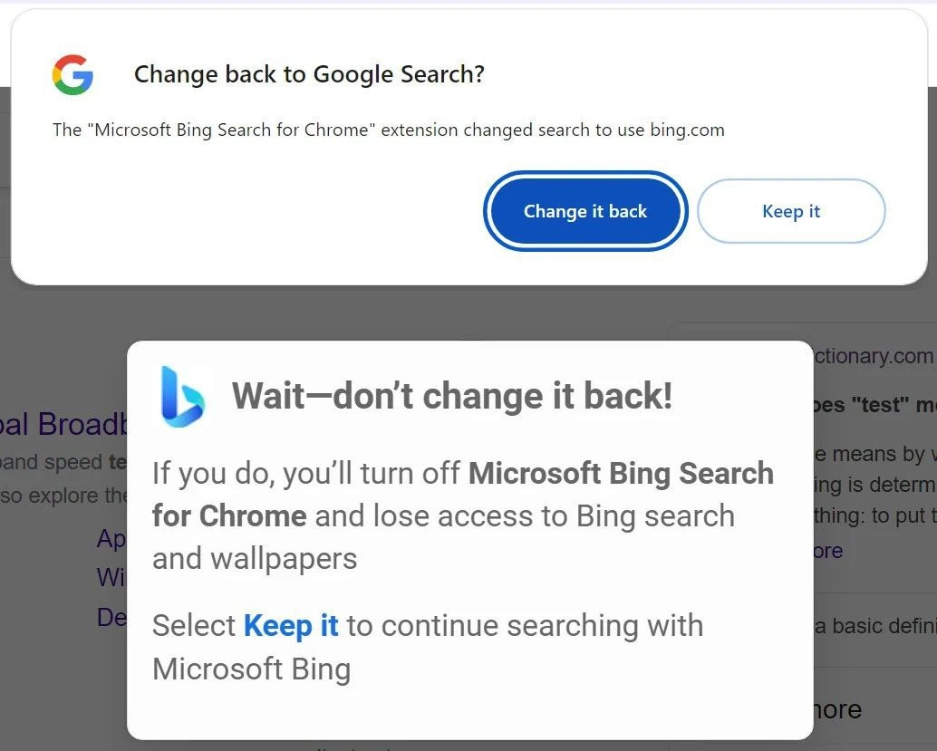
For those not as familiar with what’s happening, let’s break down the scene. You have two big companies — Google and Microsoft — essentially fighting over which search engine you use in Chrome. Chrome is Google’s web browser, and by default it uses Google’s own search engine (Google Search) whenever you type a query in the address bar. Microsoft owns Bing, which is a competing search engine. In the image, Google’s Chrome is showing a prompt that says “Change back to Google Search?” because something (in this case, an extension) changed Chrome’s settings to use Bing instead of Google. Right beneath that, partially covering it, there’s another pop-up from the Microsoft Bing side, basically saying “Wait — don’t switch back to Google! Keep using Bing!” The result is an almost comical two-layer dialog, each urging the user to pick a different default search engine. This is the “tug-of-war” mentioned: two pop-ups competing for your click.
Let’s clarify some terms here. A browser extension is like a small add-on or plugin you install in your browser to add new features or modify behavior. In this case, the extension named “Microsoft Bing Search for Chrome” was installed in Chrome (perhaps by the user intentionally, or bundled with some other Microsoft product). What this extension does is change Chrome’s search engine default to Bing. The “default search engine” means whichever search service the browser uses automatically when you type something generic (like “cute cat photos”) in the URL bar and hit enter. Chrome normally would take you to Google search results for that, but after installing this extension, it started sending those queries to Bing.
Now, Google Chrome has a security/UX feature where it monitors if an extension changes certain settings, especially search or the homepage, because in the past malicious extensions or software would secretly switch your search engine to something shady. So Chrome popped up a modal dialog — that white box at the top — to inform the user: “Hey, an extension (specifically, the Bing extension) changed your search settings to use Bing.com. Do you want to change it back to Google?” It gives you two buttons: “Change it back” (blue, highlighted, meaning Google would be restored) and “Keep it” (meaning keep Bing as is). This is Chrome essentially acting like the referee saying, “Your settings changed, is that what you really want?”
However, Microsoft really wants you to keep using Bing. So the extension immediately responded with its own dialog (the gray box with the Bing logo) that says, “Wait—don’t change it back!” and then explains “If you do, you’ll turn off Microsoft Bing Search for Chrome and lose access to Bing search and wallpapers.” Here, Microsoft is warning that if you click that “Change it back” button (thus restoring Google and effectively disabling the Bing extension), you won’t be able to use the Bing extension’s features anymore. They mention wallpapers specifically because one feature of that extension is likely to also change your new tab page or background to Microsoft’s daily Bing image, which some users enjoy. So they’re dangling a little carrot: “keep our extension, and you get nice daily wallpaper images and Bing search results.” The Keep it option in this second dialog is what Microsoft wants you to press, to continue “searching with Microsoft Bing.” Essentially, each dialog is biased towards its own company’s interest: Chrome’s dialog makes it one-click easy to revert to Google; the Bing dialog tries to entice you to stick with Bing.
This double pop-up scenario is quite unusual. Normally, you don’t see two overlapping modal dialogs — a modal is a window that freezes the background until you deal with it. Here, Chrome’s modal came up, then Bing’s modal came up on top of it. For a user, this is pretty confusing: “Which one do I even click first?” It’s a bit like dueling alerts. The reason it’s happening is because you have two separate pieces of software each doing their own thing: Chrome itself, and a Chrome extension. They weren’t exactly designed to coordinate with each other’s pop-ups. So it’s an accidental UX clash. From a user experience design perspective, it’s awkward — definitely not a smooth interaction — but it perfectly illustrates how competition can manifest directly in the user interface.
Now, why do we call this a “fight” or “tug-of-war”? Because Google and Microsoft are effectively competing for who gets to be your browser’s search engine. Vendor lock-in is a term that applies here: it’s when a company does everything it can to keep you using its products and services, making it harder or less appealing to switch to a competitor. In this case, Google wants you locked into Google Search (since that’s where they make ad revenue), and Microsoft wants you locked into Bing (for the same reason — they make money when you use Bing and click ads or see their content). So each is using the tools at their disposal: Google has Chrome, so Chrome will actively nudge you back to Google if something switches you to Bing. Microsoft has this extension (and also their own browser, Edge, which isn’t part of this meme but has its own tactics), and so the extension will nudge you to stay with Bing if something tries to pull you away. It’s a mini browser war inside one browser! We often use the phrase BrowserWars to talk about big picture battles like Chrome vs. Edge or Chrome vs. Firefox, but here it’s specifically about the search engine setting within Chrome — still a part of the browser war arena.
For a junior developer or someone new to these concepts, it’s interesting to see how design patterns can be influenced by corporate strategy. Chrome’s prompt is actually there for user protection (many users have been annoyed or harmed by unwanted search engine changes, so Chrome tries to offer a one-click fix). But Microsoft turning around to say “don’t change it back” is an example of a somewhat aggressive UX pattern often called a nag screen or nagware. Nagware refers to UI elements that repeatedly urge you to do something (often something that benefits the software maker). Here it’s not repetitive in time, but it’s very overt: basically a plea not to switch. The wording in the Bing dialog is carefully chosen: it doesn’t say “please keep us because we’re better” — it kind of indirectly suggests you’d lose important functionality (search itself and pretty backgrounds) if you disable it. That’s meant to make the user second-guess hitting the “change back” button. It’s a soft form of scare tactic in UX writing, and it’s definitely intentional. These kinds of prompts are similar in tone to, say, when you try to uninstall an app and it says “Are you sure? You will lose access to X, Y, and Z features!” It’s technically true, but phrased to make you feel like you’d be missing out on a lot. This is the choice paradox in UX: giving the user a decision with a framing that makes it hard to choose, possibly leaving them feeling a bit annoyed or uncertain. If you present too many choices or conflicting choices, users can get overwhelmed or frustrated. In this case, two choices (Google or Bing) are presented, but each choice is championed by a different pop-up, making the whole thing feel like a mini crisis for the user.
From a developer’s standpoint, especially if you’ve worked on anything involving default settings or user onboarding, this scenario is oddly relatable. It’s common to have to handle “what if another service is trying to do the opposite of what we’re doing?” For example, if you were a Chrome developer, you have to consider malicious extensions and offer users an out. If you were the extension developer at Microsoft, you have to consider Chrome’s counter-prompt and try to mitigate the user abandoning your extension immediately. It’s almost like a chess game of UX: “If they do this, we’ll do that.” The end user experience can become messy, as seen here. There’s also a bit of corporate humor in seeing these mega-companies essentially reduced to popping messages on a screen like kids saying “pick me, pick me!” Developers who have been in tech for a while have seen similar tussles — for instance, how Windows will give you multiple confirmation steps and a bit of guilt-tripping if you attempt to switch your default browser away from Edge. Or how Google search on some devices will constantly prompt “Do you want to set Chrome as your default browser?” if it’s not. These are all variations of the same theme: each side implementing features that favor themselves, and sometimes the user is caught in the middle clicking through dialogs.
In summary, what this meme shows in a humorous way is the Modern Browser War at the user experience level. Google’s Chrome and Microsoft’s Bing extension are having a little showdown via UI panels. Google vs. Bing in a pop-up duel. The technical mechanism (extension changes a setting, Chrome flags it) and the design strategies (one-click restore vs. persuasive warning) are both interesting to dissect. And it’s funny to us because it exposes the usually hidden battle for user preference in a very visible, somewhat absurd manner. Even if you didn’t know all the background, just seeing two dialogs — one saying “switch to A?” and the other saying “don’t switch to A!” — popping up together is a clear sign that these two are at odds. It resonates with any user or dev who’s felt stuck between conflicting software messages. In the end, you either side with Chrome (go back to Google) or side with the extension (stick with Bing), but for a moment you kind of got to watch Google and Microsoft argue right there on your screen. And that’s equal parts relatable and ridiculous.
Level 3: Alert Box Arms Race
The specter of the browser wars has returned, but instead of battles over entire browsers (like the Netscape vs. Internet Explorer showdown of the late 90s), it’s now fought one pop-up at a time between Google and Microsoft. In this screenshot, we witness a literal UI standoff: Google Chrome (naturally wanting Google as the default) presents a modal dialog asking “Change back to Google Search?” while, partially covering it, a Bing-branded dialog implores “Wait—don’t change it back!”. Two dueling messages, each with their own Keep it or Change it buttons, are stacked on the page like conflicting speech bubbles. It’s a comedic visual of two tech giants practically wrestling on your screen for control of your default search engine. This overlap of modals is something you should never see in well-behaved software — a modal is supposed to seize focus exclusively — yet here we have an alert box arms race for user loyalty, with both dialogs vying for the last word.
Under the hood, there’s a tug-of-war in code. The “Microsoft Bing Search for Chrome” extension has likely used Chrome’s extension APIs to override the browser’s default search settings (so that any address-bar query goes to Bing). In fact, Chrome extensions can declare a search engine takeover in their manifest. For example, an extension might include something like:
{
"name": "Microsoft Bing Search for Chrome",
"chrome_settings_overrides": {
"search_provider": {
"name": "Bing",
"keyword": "bing.com",
"search_url": "https://www.bing.com/search?q={searchTerms}"
// ... other settings like favicon, suggest_url, etc.
}
}
}
By inserting such a config, the extension hijacks Chrome’s search bar, seamlessly redirecting searches to Bing. Google Chrome, however, is built to guard against unexpected changes to user settings – a lesson from the era of sneaky toolbar hijackers. So the moment an extension flips the search engine, Chrome raises a white flag (or in this case, a white dialog) saying, “Hey, something altered your search provider. Do you want to switch back to Google?” That’s the first pop-up. Now enter Microsoft’s counter-move: the Bing extension immediately responds with its own plea, the gray dialog, effectively shouting, “Please don’t undo that! If you revert, you’ll disable this extension and lose those nifty Bing wallpapers and search features.” It’s a classic nagware gambit – instill a bit of FOMO and hope the user clicks “Keep it.” The end result is what we see: two overlapped dialogs, each coded by opposing teams, each trying to one-up the other. It almost feels like a skit in code form, something like:
// Chrome's built-in defense mechanism:
chrome.settings.onChanged.addListener(changes => {
if (changes.searchProvider) {
showModal("Change back to Google Search?", ["Change it back", "Keep it"]);
}
});
// Bing extension's counter:
browser.runtime.onMessage.addListener(msg => {
if (msg === "USER_WANTS_GOOGLE_BACK") {
showModal("Wait—don't change it back!", ["Keep it", "Change anyway"]);
}
});
(Not actual code from Google or Microsoft, but you get the idea: each side has a script ready to fire.)
From a UX perspective, this is both ironic and painful. Normally, a modal dialog is a serious thing — it’s meant to pause everything and focus the user’s attention on a single decision. Here we have a modal pile-up, which breaks fundamental UX design guidelines. It’s the equivalent of two customer service reps talking over each other, each insisting their solution is the best. The user is left in a state of choice paralysis: two big colorful buttons, two conflicting pieces of advice. This highlights a misalignment of expectations. The user probably just wants to continue browsing or searching normally, but instead they’ve stepped into the crossfire of a corporate feud. Each dialog represents a vendor lock-in tactic at work. Google, the incumbent in Chrome, frames the issue as an unauthorized change to be corrected (playing the role of the vigilant guardian of your browser). Microsoft, the challenger via extension, frames the reversal as a loss of features to be feared (playing the friendly benefactor you’d be sad to turn off). Both are tugging at the user with persuasive design: Google’s button to revert is bright blue and bold (“Change it back” is front and center), whereas Microsoft’s dialog uses an alarmed tone (“Wait—don’t!”) and emphasizes the benefits you’d lose by leaving Bing (even something as trivial as daily wallpaper images gets a mention). These are not accidental wordings; they’re carefully crafted UX copywriting intended to sway you. We’re basically witnessing a UI tug-of-war driven by the high stakes of search engine market share.
Why such desperation over a search box? Simply put, search queries = money. Google and Microsoft make enormous revenue from the ads shown alongside search results. Being the default search engine in a popular browser is a golden goose — consider that Google pays Apple billions of dollars every year to remain the default on iPhones’ Safari. In Chrome, Google obviously wants to keep that spot for itself, and Microsoft has been eager to increase Bing’s slice of the pie. This context explains the otherwise absurd lengths we see here. It’s corporate competition distilled into interface form. In earlier eras, Microsoft fought to make Internet Explorer the default browser everywhere, and Google fought back by launching Chrome. Now, with Chrome dominating usage, the battlefield has shifted to what the browser defaults inside Chrome are. Microsoft’s weapon of choice is a Chrome extension acting as a Trojan horse to inject Bing, and Google’s defense is an auto-triggered search engine default prompt. It’s history repeating as farce: instead of secret contracts or OS-level lock-ins, we get pop-up nagware UI patterns duking it out in real time on a user’s screen.
For seasoned developers, especially those who have dealt with product managers pushing growth metrics, this scenario is both hilarious and exasperating. It’s a live demonstration of how user experience design can be twisted by business objectives. You can almost hear the internal meetings behind each of these dialogs. One can imagine Google’s Chrome team saying: “We need to protect our users (and let’s be honest, our search share) by warning them if an extension changes their search settings.” Meanwhile, on Microsoft’s side: “We need a last-second intercept to persuade users to keep Bing, otherwise many will just click back to Google out of habit.” Both teams of developers implemented their spec, and individually each dialog makes a certain sense. But when combined in the wild, the UX irony is gold: two earnest attempts to “help” the user end up creating a mini pop-up war right in the middle of your supposed search session. As a result, the user’s simple act of opening a browser turns into refereeing a bout of Google vs. Bing. It’s the kind of absurd real-world edge case that QA testers both dread and laugh about. In fact, if you’ve ever worked in QA or tech support, you know users sometimes face these exact bizarre collisions of features (“Why does my Chrome keep asking me to change my search and another box says not to?”). This meme nails that experience. The relatable developer experience here is the unintended consequences of well-meaning features: two features that were never meant to meet are now stepping on each other’s toes.
All told, this image is a snapshot of the modern browser wars on a micro level. It’s corporate VendorLockIn strategy made visible in the most caricatured way. And it leaves everyone chuckling because it’s both ridiculous and unsurprising. After all, when giants fight, sometimes the battlefield ends up right on the user’s desktop — and apparently, they’ll even throw UI design principles out the window if it might win your default search setting back. The meme is funny in a “can you believe we’ve come to this?” way. Even as tech evolves, some battles (like who gets to be your default search) never die, they just open new fronts. Here, that front is a pair of dueling modals, and the hapless user is stuck clicking one or the other, effectively choosing sides in a war they probably didn’t even know was raging.
Description
The image captures a screenshot of two overlapping browser pop-up dialogs, illustrating the intense competition between search engines. The top dialog, initiated by Google Chrome, features the Google 'G' logo and asks the user, 'Change back to Google Search?', explaining that a 'Microsoft Bing Search for Chrome' extension has altered the default setting. The options are a prominent blue 'Change it back' button and a less emphasized 'Keep it' button. Layered just below, a second pop-up from Microsoft Bing desperately pleads, 'Wait - don't change it back!'. This dialog warns the user that reverting will cause them to 'lose access to Bing search and wallpapers,' urging them to 'Select Keep it'. This interaction is a perfect snapshot of the 'browser wars,' where tech giants compete for default status on user devices. The humor arises from Bing's almost pathetic, clingy attempt to retain the user, using a weak value proposition (wallpapers) and employing a manipulative UX pattern to create friction in the user's journey to restore their preferred setting. It's a scenario instantly recognizable to developers and tech-savvy users who frequently navigate these corporate battles for user control
Comments
39Comment deleted
This is Microsoft's version of a clingy ex. It's not a bug, it's a feature request: 'Please don't leave, I can change! I have wallpapers!'
Somewhere in a product retro: ‘Great news team - our retention KPI hit 100%! It only cost us two competing modals and every shred of user goodwill.’
The only thing more persistent than a memory leak in production is Microsoft trying to make Bing happen. At least the memory leak doesn't guilt-trip you about losing wallpapers when you try to fix it
When your browser extension implements a 'confirmation dialog recursion pattern' that would make any senior architect weep - because nothing says 'user-centric design' quite like a modal spawning another modal to guilt-trip users into keeping your search engine hijack. It's the software equivalent of a breakup where your ex sends increasingly desperate texts, except this one threatens to take the wallpapers with them. Classic example of why 'growth at all costs' product metrics eventually require a postmortem titled 'How We Accidentally Became Malware.'
Apparently my browser runs Raft for defaults - leaders alternate between Chrome and a Bing extension; the user is a read‑only follower
My browser just implemented Byzantine fault tolerance: Google proposes a rollback, Bing sends a conflicting write, and the human operator is the unreliable consensus module
Bing's retention hook: FOMO on wallpapers, because no self-respecting architect decomposes a service without fearing lost pixel dashboards
I sure hope this is not real Comment deleted
Its definitely real… Google does this since over a decade. Microsoft just showed a banner on top or bottom of the screen but since they have edge chromium they are very annoying. I have my own system service that deal with shit like these Comment deleted
Firefox be like: "I hate ni..." Comment deleted
"I nate hi..." Comment deleted
Hi there, would you like to sign my petition? Comment deleted
I don't want whiney congressmen to play violent video games. Comment deleted
Would be big if true but they stand for the exact same values as the big corp Comment deleted
and wallpapers… Comment deleted
Bing became self aware Comment deleted
and Chrome isn't? Comment deleted
Oh, you didn't finish your sentence, but don't worry, I have your back: "it's just trash taste to not use it" Comment deleted
Firefox doesn't have a lot of new cool CSS features WebKit gets every month. As for a silly frontend goober that's really unfortunate Comment deleted
As a silly frontend goober you shouldn't use the cool CSS features webkit gets every month anyway, if you're building a public website that is Comment deleted
That's why I'm silly. I do blog sites for my own enjoyment (autism) Comment deleted
I still remember when the timeline between the feature being shipped in all major browsers meant that you still had to wait 2 years to be able to use it safely, because nobody updates Comment deleted
I still hold grudges they cancelled border-corner-shape Comment deleted
Wait, it isn't these days? Comment deleted
https://motherfuckingwebsite.com/ Comment deleted
here, fixed it for you Comment deleted
i fucking love it Comment deleted
Postmodem my beloved Comment deleted
I fucking love building a whole ahh react application with CDN just for a two-page static website Comment deleted
Ok but the first message from chrome isn't browser wars. it is a warning that an extension changed the search engine. This is more of confirming that the user intended to change the search engine Comment deleted
We don't appreciate racism here, guys Comment deleted
There's no racism, it's just about a dog with nightmares. Comment deleted
we both know that's a lie Comment deleted
..htmares because I'm being scared Comment deleted
I love my browser policies Comment deleted
Это так отвратительно, он ещё на каждом обновлении винды плюётся "мы сделали вам браузер по умолчанию вот это, потому что он лучше" Comment deleted
Please use English in this chat Comment deleted
Skill issue. Ff has solid developer edition. Comment deleted
Muh wallpapers. I remember as a kid I downloaded that bing bar out of interest. Now I know... Comment deleted