A Data-Driven Look at UI-Induced Mortality
Why is this UX UI meme funny?
Level 1: Missing Labels
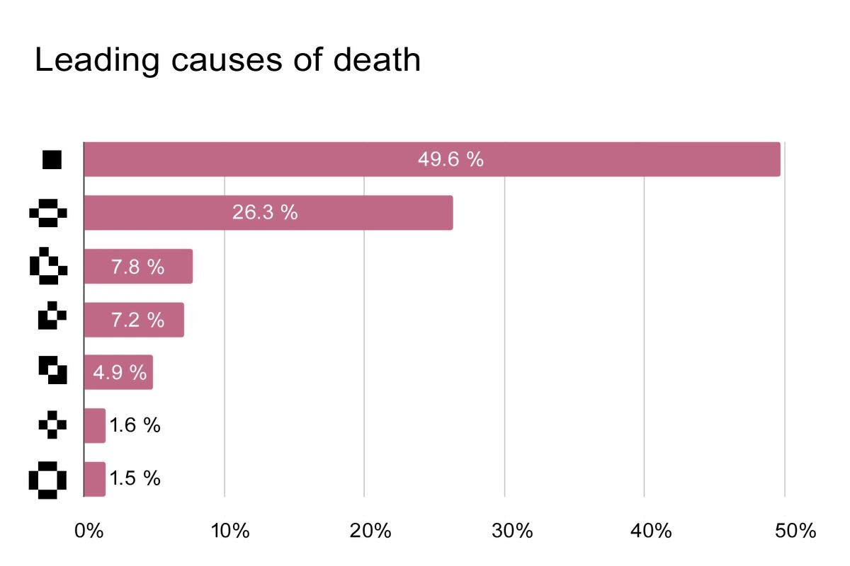
Imagine you drew a big poster for school with a bunch of bars showing different information – like the tallest bar is “how many cookies you ate,” the next bar is “how many vegetables you ate,” and so on. To make it fun, you decided to use little stickers as labels next to each bar (maybe a cookie sticker, a broccoli sticker, etc., instead of writing the words). Now, right before you show it to the class, something terrible happens: the sticker sheet you used fell off or got lost, and all that’s left on your poster are blank squares where the stickers should be! 😱
So you stand there with this nice colorful chart, and you can tell which bar is bigger, but nobody else knows what the bars mean because the labels are missing. The tallest bar says “50%” but 50% of what? Without the cookie picture, your classmates are guessing and confused. Your chart basically became a mystery. It’s pretty funny in a way, because everything else is perfect – you did the research, drew the bars neatly – but because one tiny thing (the labels) is missing, the whole presentation falls flat. The teacher gives you a puzzled look, and you just feel like facepalming. It’s like baking a beautiful cake and then realizing you left the labels off the flavors – now every slice is a surprise flavor. This meme is joking about that kind of situation in the coding world: a small missing piece (those icon labels) turned an important demo into a confusing mess, right at the worst possible moment. It’s funny and frustrating – even a kid can understand how a missing label can ruin the whole show!
Level 2: Where Did My Icons Go?
Okay, let’s break down what’s happening in simpler terms. We have a bar chart titled “Leading causes of death,” and normally, on the left side, each bar should have a little icon representing the cause (for example, a heart icon for heart disease, maybe a cigarette for smoking, etc.). But in the image, those icons didn’t show up. Instead, we see weird square symbols. Why? Because the website was using an icon font to draw those icons, and that font failed to load.
Icon font? 🤔 Think of an icon font as a special font file that, instead of letters (A, B, C), contains symbols and icons (hearts, arrows, etc.). Developers often use icon fonts (like Font Awesome or custom icon sets) to easily display icons by just typing or referencing a character. For example, the character A in a regular font is just “A”, but in an icon font, maybe that character spot is a picture of a heart. The web page uses CSS to say “use the icon font for this text, so it will display the heart picture”. This works only if the browser actually has that font file. If the font file is missing, the browser tries to show the character using normal fonts, which don’t have a “heart” in place of A – so you get a default placeholder (often a square or a question mark) because it literally doesn’t know how to display that code. That’s what those black squares are: the browser saying “I have no idea what symbol this is supposed to be.”
Now, why would the font file be missing? In the caption it says “icon font CDN dies”. A CDN (Content Delivery Network) is like a cloud service that hosts files (in this case, our icon font file) on servers around the world to deliver them quickly. Many websites link to popular libraries and fonts on CDNs. “CDN dies” means that at the critical moment, the browser couldn’t download the font from the CDN. Maybe the CDN service was down, or the internet connection was bad, or something blocked it. One common blocker in corporate or secure setups is something called a Content Security Policy (CSP) – basically a security setting that says “don’t load files from unknown sources.” If the icon font’s server wasn’t pre-approved, the browser itself might refuse to download it (for safety), leaving you with no icons. It’s like the site’s rules said “no, you can’t use that external sticker sheet for icons.”
So with no icon font available, every place where an icon should be turns into those funky squares. The chart bars still have their percentages (49.6%, 26.3%, etc.) because those are just normal text (the browser always knows how to draw numbers with built-in fonts). But the labels or legend items for what each percentage means are gone. It’s as if you drew a chart but erased the captions. The data is there, but context is missing – which makes the chart pretty useless, right?
For a junior dev or someone new to front-end, this highlights a big lesson: always include your assets properly and have a fallback. If you use external resources like fonts or scripts, test what happens if they don’t load. In development, maybe you never noticed the issue because the font was cached (saved) in your browser from earlier, or your dev machine had access to the internet. But in a secure demo environment (imagine a meeting room with spotty Wi-Fi or a strict firewall), those external links can fail. It’s like how sometimes, if you link an image in your HTML from somewhere else on the internet, and then you go offline or that site goes down, the image just shows a broken icon 🚫. Same idea here, but with icon fonts. The proper way is usually to bundle these assets with your app (i.e., have the font file locally or include it in your project) or ensure the environment allows them.
Another term mentioned is SVG sprite. That’s an alternative method: instead of a font, some charts use SVG images (vector images) for icons. If those are hosted externally and not loaded, you similarly get missing images (sometimes a little "X" or empty space). So whether it’s an SVG sprite or an icon font, if you don’t deliver those icons to the user’s browser, the user will see either broken image symbols or these square glyphs. The result is a data_viz_fail: the visualization loses crucial information.
This situation is painfully familiar to many front-end developers. It’s a prime example of BugsInSoftware that stem not from code logic, but from resource loading and environment issues. It’s also FrontendHumor in that horribly funny way: the kind of bug that makes you facepalm because it’s so obvious in hindsight (“oh no, we forgot to include the icon font!”). If you’ve ever done a school project website or an early career project and had something like a Google Font or a script hosted elsewhere, you might have encountered this – everything works on your laptop, but when you try it somewhere without internet, suddenly your beautiful font or crucial script is missing and things look broken. It’s the classic “It worked on my machine!” problem. The meme just takes that and shows it happening at the worst time – right before or during a big demo – which is super relatable to anyone who’s been in that hot seat. Lesson learned: always have a plan for when external stuff isn’t available, and test your app as if it had no external access (or under the same policies as production). That way, you won’t end up with a chart of mysterious bars that even you can’t decipher!
Level 3: Font-404 Fiasco
For experienced devs, this meme hits a nerve: a seemingly minor oversight blowing up at the worst possible moment. The scene: a big stakeholder demo, all the fancy DataVisualization is ready to wow the audience, and suddenly your bar chart’s category labels are just incoherent black squares. 🤦♂️ It’s the Font 404 fiasco — your icon font didn’t load, so all the icons that were supposed to label the bars (perhaps little symbols for each “cause of death”) are now just empty placeholders. The humor lands because of course it happens “right before the stakeholder demo.” In tech, if something can fail spectacularly, it tends to do so when the CEO or client is in the room. This is a RelatableDeveloperExperience: everyone remembers a time a last-minute bug or environment quirk turned a polished feature into an embarrassing slide of gibberish.
So why is this combination so potent? First, frontend bugs like this are visual. You can have the most robust backend crunching numbers correctly (and here the data layer is fine — the bar lengths and percentages are correct), but one missing asset in the presentation layer and the whole feature looks broken. It’s a classic FrontendPainPoints scenario: all the logic is correct, but the user sees nonsense. The chart in the meme literally has no readable labels; it’s essentially a legendless_chart. The bars show 49.6%, 26.3%, etc., but 49.6% of what? Heart disease? Shark attacks? Nobody can tell, not even the screen reader. To a stakeholder, this isn’t a small glitch — it’s a confusing failure of the product’s polish and maybe even its credibility.
From an industry perspective, this is a satire of how we sometimes trust external resources a bit too much. We include an icon font via a CDN link for convenience, assuming it’ll always be there. It’s a common practice: use Font Awesome or some icon library hosted elsewhere. It works great… until that CDN is unreachable (network outage, the service down, corporate firewall, you name it). This is the “single point of failure” problem: one missing resource can cascade into a visible bug. Experienced developers have learned (often the hard way) to mitigate this: you might self-host the font files, implement fallbacks, or at least test the app offline or behind a strict firewall. But maybe someone on the team thought “What could go wrong? It’s just an icon CDN.” — famous last words in web development.
Another element is BrowserCompatibility and security policies. In some environments, even if the CDN is up, a strict Content Security Policy might block those icons, as mentioned above. Seasoned devs hear “It works on my machine” and immediately suspect something like this. Maybe the developer had the icons cached from previous work, so they never noticed the font wasn’t actually bundled. Then they deploy or open the app on a fresh browser for the demo, and SURPRISE! the icons are missing_icon_fonts replaced by those placeholder_square_glyphs. It’s that stomach-dropping moment: “Uhh, those squares aren’t supposed to be there…” Too late – stakeholders are already squinting at the screen.
This meme also pokes at the BugsInSoftware that feel almost trivial yet cause big embarrassment. No algorithm is wrong here, no data lost – it’s literally a cosmetic asset issue. But try explaining that nuance to a non-technical stakeholder in the moment. 😅 They just see a broken chart. In terms of shared pain: every developer has shipped a bug that wasn’t in the code logic, but in the packaging or environment (missing file, wrong path, misconfigured setting). It’s a rite of passage. The joke’s subtext is, “We’ve all been there: everything’s ready to go, and the tiniest thing derails it.” The FrontendHumor is strong because front-end devs constantly wrestle with these “didn’t you see that coming?” issues – forgetting to import a CSS, an icon sprite not loading, a broken_svg_sprite reference, etc. After a few years, you get almost cynical: if a demo is coming, double-check the dumb stuff. (In fact, veteran teams will have a last-minute checklist: “Do the icons load? Did we bundle the fonts? What if the Wi-Fi dies?”)
In short, the meme is funny to devs because it’s true. It combines the irony of a DataVisualization failure (the chart is useless without labels) with the drama of a live demo fail. It’s an inside joke about planning for everything except the obvious. And the title captions it perfectly: “When your icon font CDN dies right before the stakeholder demo” — that phrase alone could give an experienced frontender flashbacks. It’s the perfect storm of a minor bug becoming a major facepalm, encapsulating the fragile nature of web UIs where one missing resource turns an impressive chart into a confusing data_viz_fail. We laugh because if we didn’t, we might cry. 😜
Level 4: Glyphs of Last Resort
At the heart of this meme is a font loading failure unmasked at the worst time. When an icon font fails to load, browsers don’t magically intuit the intended symbols — instead, they reach for the glyph of last resort. Those little black-and-white blocks in the chart are not random; they’re the placeholder square glyphs the OS/browser uses when it has no character to display (often dubbed "tofu" in typography circles, because they look like little squares of bland tofu). Here, each missing icon appears as a generic square because the font that contains the actual icon shapes never arrived.
Under the hood, this happens because icon fonts typically map custom symbols to either Private Use Area (PUA) Unicode code points or weird characters that normal fonts don’t cover. For example, an icon font might use U+E001 to represent a heart icon. If the font doesn’t load, the browser falls back to standard fonts. But no standard font has a glyph for U+E001 (since it’s a private use code point), so the browser’s font renderer draws a default missing-character box. The result? A stack of ⬜⬜⬜ where meaningful icons (like a heart, a skull, etc. for causes of death) should be.
This gets even more interesting (or tragicomic) with web security in play. Modern sites often use a Content Security Policy (CSP) to control what resources can load. If the CSP isn’t configured to allow the icon font’s CDN, the browser will deliberately refuse to fetch it, treating it as a violation. Imagine the app’s HTTP response headers include something like:
Content-Security-Policy: default-src 'self'; font-src 'self';
This strict CSP says fonts can only come from the same origin ('self'). So if the code tries to pull an icon font from https://cdn.fonts-r-us.com/icons.woff2, the browser will block it outright. You might see an error in the console like:
Refused to load the font
https://cdn.fonts-r-us.com/icons.woff2because it violates the following Content Security Policy directive: "font-src 'self'".
In our meme scenario, whether it’s the CDN being down (a font_404 situation) or a CSP misconfiguration, the result is the same: missing_icon_fonts leading to a data_viz_fail. The chart’s design likely relied on an external SVG sprite or webfont for those category icons, but when that resource vanishes, we get a legendless_chart — all data, no labels. This is a subtle failure of distributed content: the data (percentages, bar lengths) is fine (maybe coming from your database or API), but the presentation layer is distributed across servers and domains. Relying on a third-party CDN introduced a single point of failure (the CDN became the chart’s weakest link). Distributed systems theory tells us any external dependency can and will eventually fail. Here it’s almost darkly poetic: a chart of “Leading causes of death” was itself killed by a missing icon asset. It’s a front-end twist on Murphy’s Law, and a reminder that **the smallest missing piece in a complex system can break the whole. Seasoned engineers have seen this time and again: the grand machinery of your app can be humming along, but leave out a tiny file or permission and the user sees garbage characters. We laugh (after the fact) because it’s a technologically inevitable irony — an entire polished data visualization toppled by one file not loading, manifested as those goofy tofu squares.
Description
A minimalist bar chart humorously presents 'Leading causes of death'. The chart is set against a plain white background with a horizontal x-axis labeled from 0% to 50%. The y-axis, instead of text, features a series of seven highly pixelated, retro-style computer cursor icons. Each icon corresponds to a dusty rose-colored horizontal bar representing a percentage. The top bar, at 49.6%, is next to a simple black square pointer. Subsequent bars, with decreasing percentages (26.3%, 7.8%, 7.2%, 4.9%, 1.6%, 1.5%), are aligned with icons representing a four-way move arrow, a hand pointer, an hourglass, an I-beam for text selection, a precision crosshair, and a spinning 'wait' circle. The technical joke is a satirical take on user interface frustrations. It equates the annoyance and time lost dealing with common, often infuriating, UI states (like a frozen application signified by an hourglass) with literal causes of death. This hyperbole resonates deeply with developers and power users who have spent countless hours battling unresponsive GUIs and buggy software, making it a clever piece of data visualization parody
Comments
17Comment deleted
The most dangerous pointer in programming isn't null, it's the one that's stuck as an hourglass over your IDE right before you hit 'save'
Turns out nearly half of all fatalities are caused by forgetting to include the <link rel="preload" as="font"> tag - at least according to our now-silent typography layer
After 20 years in tech, I can confirm the leading cause of death is indeed a null pointer exception that somehow made it past three code reviews, comprehensive unit tests, and staging - only to manifest at 3 AM in production when the on-call engineer is already debugging a completely unrelated Kubernetes networking issue
Ah yes, the classic bar chart of architectural regret. That 49.6% monolith isn't just a leading cause of death - it's the entire legacy system that's been 'temporarily' holding the company together since 2008. The 26.3% microservices? That's what happens when you try to cure the monolith by creating 47 services that all need to talk to each other, each with its own database, deployment pipeline, and on-call rotation. The remaining percentages represent various stages of 'we'll refactor this later' that somehow became permanent fixtures. The real tragedy? Every senior architect has contributed to at least three of these categories, and we'll do it again because 'this time it's different.'
Top cause at 49.6%? The inevitable CAP tradeoff: you get consistency and availability, but partition tolerance kills the on-call engineer
This is Tufte’s coroner report: 49.6% of insights die when the legend component fails to mount and categories are encoded as decorative glyphs
We hit the OKR to “simplify dashboards” by replacing labels with Unicode tofu - 50% fewer bytes, 100% less information throughput
No Galaxy Comment deleted
how can you explain this to a normal human being without sounding like a total psychopath toying with its pet humans Comment deleted
Try it :3 Comment deleted
Aren't all these structures stable actually ? I'd have expected blinkers or flyers to be much more important causes of death Comment deleted
Movement is life☝️☝️ Comment deleted
Bruh thats deep. 🥀 Comment deleted
that's what she said Comment deleted
She said nothing. Proton mail died. 😭 Comment deleted
Whats this? Comment deleted
conway's game of life Comment deleted