Skip to content
DevMeme
894 of 7435
Know Your Menu: A Guide for Hungry Developers
UX UI Post #1011, on Jan 31, 2020 in TG

Know Your Menu: A Guide for Hungry Developers

Why is this UX UI meme funny?

Level 1: Looks Like Food

This picture is funny because it shows little buttons and symbols that are named after foods. People who make apps and websites often need to talk about those tiny menu pictures, so they gave them cute nicknames. For example, one icon looks like a hamburger – it’s just three lines stacked up, but if you use your imagination, it’s a bun, patty, and another bun. So everyone just calls it the “hamburger” button! Another icon is three dots in a line, kind of like three meatballs on a plate, so that’s called the “meatballs” menu. There’s a grid of squares that looks like a lunch box with compartments (a Japanese bento box), so they say “bento menu.” Basically, each tiny picture looks like food, so the designers and developers refer to it by a food name. It’s silly and makes the work feel more fun. It’s like looking at clouds and saying “that one looks like a bunny” – here they look at a button and say “that one looks like a hamburger!” Using these funny names helps everyone remember which icon is which, and it makes people smile during work. So, the joke is that a menu of app buttons has become a menu of food names – and that’s pretty deliciously funny to anyone making apps.

Level 2: Tasty Icon Names

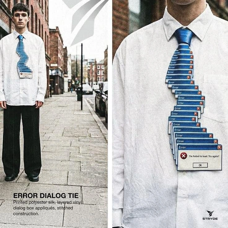
For newer developers or those just getting into Frontend and design, let’s break down these food-themed icon names. Modern apps and websites often use small graphic symbols (icons) to represent menus or actions, especially on mobile or minimalist UIs. Over time, the tech community gave playful nicknames to some of the most common menu icons, based on how they look. It’s a friendly kind of shorthand. Here are the icons shown in the meme and what they mean in real apps:

  • Hamburger Menu – This is the nickname for the icon with three stacked horizontal bars. It’s a super common symbol for a main menu (usually a collapsible navigation menu). Why hamburger? Because those three bold lines can remind you of the two buns and patty of a hamburger. In many mobile apps and responsive websites, tapping the hamburger_menu_icon in the corner slides out a list of options or pages (just like opening a real menu, but with a satisfying code-savvy twist). If you’re new to UXDesign, know that this icon has become a standard for “menu” – so much so that even if users don’t know the nickname, they recognize what the symbol does.

  • Döner Menu – This one might be less familiar by name. It shows three bars that get shorter from top to bottom, forming a funnel-like shape. In actual interfaces, this icon typically represents a filter function (like sorting or filtering a list of items). The meme calls it “Döner” (a kind of Turkish/German kebab) to stay in the food theme – possibly because the icon’s shape is vaguely similar to a cone of döner kebab meat stacked on a vertical rotisserie (wide at top, tapered at bottom). It’s a bit of a pun: not as universally used a term as “hamburger menu,” but in this context they’re having fun naming every icon after a tasty treat. So if someone says “Döner menu icon,” they mean the filter/funnel icon – not that they want takeout!

  • Bento Menu – This icon is a 3x3 grid of small squares. Think of it like the square arrangement of apps or categories. You often see this on dashboards or app launchers (for example, the grid icon that opens up a panel of apps on Google’s products is sometimes called the “bento” or even “waffle” menu). Bento is a Japanese lunch box with compartments for different foods, and the icon’s grid looks just like a neatly portioned bento box. In practice, clicking a bento_menu_icon might display a bunch of app icons or a mosaic of content options. The nickname makes it easy to remember: a grid of goodies = bento box. It’s a fun way to refer to an otherwise plain “grid menu” icon.

  • Kebab Menu – This refers to the icon of three vertical dots in a line. In many mobile design guidelines, this is the standard symbol for an overflow menu or a set of additional options. Picture the dots as pieces of meat on a skewer and you’ll see why it’s nicknamed a kebab. In code or design discussion, someone might say “put a kebab menu at the top-right of the card for extra actions.” Users tap the three-dot kebab_menu_icon to reveal a dropdown or pop-up with more choices (like editing or deleting an item). It’s widely used especially on Android and web apps. If you’re doing FrontendDevelopment, you’ll encounter this icon often – and now you know the fun name to call it!

  • Meatballs Menu – This one is the sibling of the kebab menu: it’s three dots in a row horizontally. Functionally, a meatballs_menu_icon often means the same “more options” menu, just oriented differently. Some design systems (or certain platforms) prefer the horizontal version in certain contexts, like at the end of a list item or on iOS interfaces. The nickname meatballs comes from the idea that the three round dots look like a line of three little meatballs (imagine them sitting side by side). So if a designer says “use a meatballs menu on the toolbar,” they want the horizontal three-dot icon for overflow actions. Just like the others, it’s an informal term – a bit of FrontendHumor – but it’s common enough that many developers will instantly know what you mean.

All these terms are examples of informal jargon in IconDesign and UX/UI work. They’re not official names you’d necessarily find in a textbook, but you'll hear them in the wild – in conversations, blog posts, and even some documentation. They make discussions more vivid: saying “hamburger icon” is quicker (and more fun) than saying “the menu toggle with three horizontal lines.” It’s also a quirky way to bond with fellow devs and designers. If you’re early in your career, don’t be surprised when a pull request comment reads something like, “Replace that text link with the hamburger menu icon.” Thanks to cheat-sheets like this meme, you’ll know they’re not asking you to place an actual burger on the site – just the universally understood symbol for navigation. In short, these food nicknames are a creative mnemonic device. They inject a bit of personality into UXDesign language, helping everyone remember and communicate interface ideas without confusion. Plus, they keep things light. (Pro tip: however, maybe don’t tell your project manager that the app “needs more meatballs” without context – you might get some raised eyebrows before you explain it’s about icons!).

Level 3: All You Can Eat UI

At the seasoned developer level, this meme is a playful taxonomy of UI icon nomenclature that every experienced front-end dev has internalized. It humorously lays out a buffet of common menu icons and their unofficial food-based UI terms. Why food? Because naming things in tech is hard, so we often reach for funny, memorable analogies – and it turns out a lot of tiny UI symbols coincidentally look like snacks! This image, titled “KNOW YOUR MENU,” is essentially an insider cheat-sheet: a menu of menus, if you will. It catalogs five navigation or option icons by their tongue-in-cheek nicknames: Hamburger, Döner, Bento, Kebab, and Meatballs. Each one is a minimalist glyph used in user interfaces (especially in FrontendDevelopment and mobile app design) to indicate some kind of menu or list, and each has a delicious code name that’s far more fun than a dry technical label.

Front-end veterans immediately chuckle at this because it’s TechHumor rooted in everyday dev life. We’ve sat in UIDesign meetings debating whether to use a hamburger_menu_icon or a kebab_menu_icon for navigation. The irony (UXIrony, indeed) is that we’re discussing serious design choices using lunch vocabulary – “Should this action list be behind a meatballs menu or a kebab menu?” is a real question that might be posed in a design review, sounding like restaurant talk instead of app development. This juxtaposition of the mundane (food) with the technical (UI icons) creates a shared comedic relief among developers and designers. Seasoned devs know that these cheeky terms are semi-official in practice: for instance, the Hamburger Menu (the three horizontal bars) became ubiquitous with the rise of responsive mobile designs needing a compact nav button. It’s so recognizable that even many non-techies now identify “the three-lines button” with hidden menus. Similarly, the vertical Kebab Menu (three vertical dots) is commonly seen as the “more options” button in Android apps and modern web interfaces – a quick way to indicate a dropdown of extra actions. There’s even nuance between a kebab and Meatballs Menu (three horizontal dots): they serve a similar purpose (an overflow menu), but the orientation and platform convention differ, and naturally, the community gave each its own tasty nickname. Because why not have both kebabs and meatballs on the UI platter?

The humor also lies in the hyper-specific IconDesign slang on display. If you’re an old hand in FrontendDevelopment, you’ve probably used or at least heard all these terms, but seeing them lined up like an authoritative diagram is hilariously relatable. It’s like a mini style-guide for new devs who might be confused when a senior says “Add a hamburger icon in the top-left.” (No, we’re not integrating a food delivery API – they mean the navigation toggle!). By calling it a “cheat-sheet,” the meme acknowledges that keeping these colloquial names straight is almost like memorizing menu items at a diner – you have to know your menu. And indeed, nothing bonds UI/UX folks like collectively referring to interface elements with foodie jargon during a code review, then clarifying to a puzzled product manager that no actual hamburgers or meatballs were harmed in the making of this app.

On a deeper level, this reflects how UX/UI culture thrives on metaphor and visual shorthand. We give icons friendly nicknames based on what they resemble, which makes them easier to talk about. It’s a lighthearted form of ui_icon_nomenclature that also helps with memory: “hamburger” is just more evocative than “three-line menu button”. In practice, these terms have even slipped into design documents and libraries (though often the official docs use more sober terms like “menu icon” or “overflow icon”). The shared understanding acts like a wink among developers – a bit of FrontendHumor that doubles as a jargon shortcut. And it’s not the only culinary reference in UX: we also speak of breadcrumbs (trail links showing where you are in a site, named after the fairy tale, also literally bread crumbs) and toasts (those little pop-up notifications, as ephemeral as toast from a toaster). Clearly, the design world has a long tradition of making tech terms more digestible by referencing food or everyday items. This meme captures that tradition in one image, letting senior devs nod in recognition (“Yep, I’ve used all of these!”) while maybe making us a bit hungry too. It’s the kind of clever UXDesign in-joke that reminds us that even in serious interface planning, there’s room for quirky, humanizing language. After all, when you’ve spent hours hashing out the perfect navigation flow, indulging in a bit of TechHumor by ordering the “UI buffet” of icons by name is the perfect side dish.

Description

A minimalist graphic on a light grey background with the title 'KNOW YOUR MENU' in black, sans-serif font. Below the title, five common UI menu icons are displayed in a row, each with a humorous, food-related name. From left to right, they are: the 'Hamburger Menu' (three parallel horizontal lines), the 'Döner Menu' (three stacked horizontal lines of decreasing width), the 'Bento Menu' (a 3x3 grid of squares), the 'Kebab Menu' (three vertical dots), and the 'Meatballs Menu' (three horizontal dots). The joke lies in the anthropomorphism of abstract UI elements into familiar food items, satirizing the sometimes arbitrary jargon that becomes standard in the tech industry. For senior developers, it's a nod to the shared vocabulary and visual language that has evolved in UI/UX design, where these names are now commonplace
Comments

7
Anonymous ★ Top Pick Design systems have a whole pantry of these menu icons, yet somehow the product manager always orders the one thing not on the menu: a 'custom solution'
  1. Anonymous ★ Top Pick

    Design systems have a whole pantry of these menu icons, yet somehow the product manager always orders the one thing not on the menu: a 'custom solution'

  2. Anonymous

    In our legacy SPA, the hamburger opens a React drawer, the kebab launches an Angular popup, and the bento still summons a jQuery modal - proof that even the UI is a full-stack buffet of regret

  3. Anonymous

    After 15 years in the industry, I've finally accepted that naming UI patterns after food is our way of admitting we're always hungry during design reviews - though I'm still waiting for someone to propose the 'Spaghetti Menu' for our legacy navigation code

  4. Anonymous

    After 20 years in the industry, I've learned that naming UI patterns after food is the only way to ensure designers and developers can agree on something - though we still argue whether the hamburger menu should have been called the 'stack overflow' icon

  5. Anonymous

    Hamburger for horizontal nav sprawl, kebab for vertical depth - UI's unspoken CAP theorem

  6. Anonymous

    We standardized menus: hamburger on web, kebab on Android, meatballs on iOS, bento in the dashboard - ARIA still says “button,” and nobody can find Settings

  7. Anonymous

    PRD said ‘hamburger’; Android shipped ‘kebab’; iOS labeled ‘meatballs’; design system calls it ‘overflow’ - the only consistent API is onClick=toggleMenu() and an analytics event named menu.more.clicked

Use J and K for navigation