Ilya Sutskever's Cryptic Doodle on the Future of AI
Why is this AI ML meme funny?
Level 1: Ant vs. Elephant
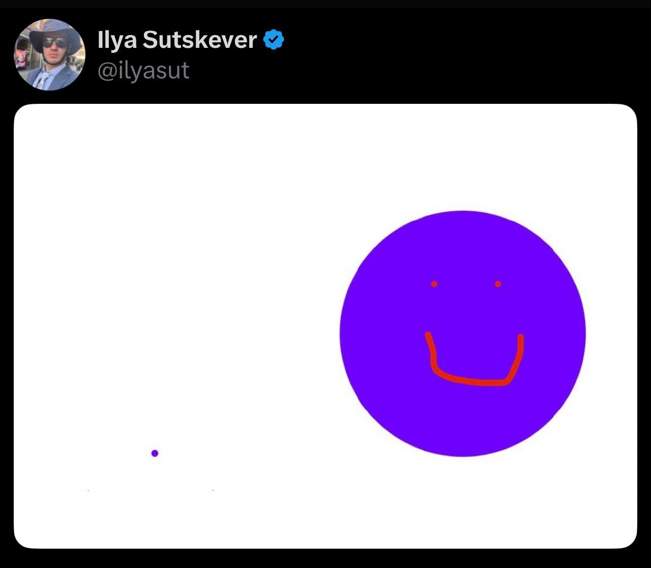
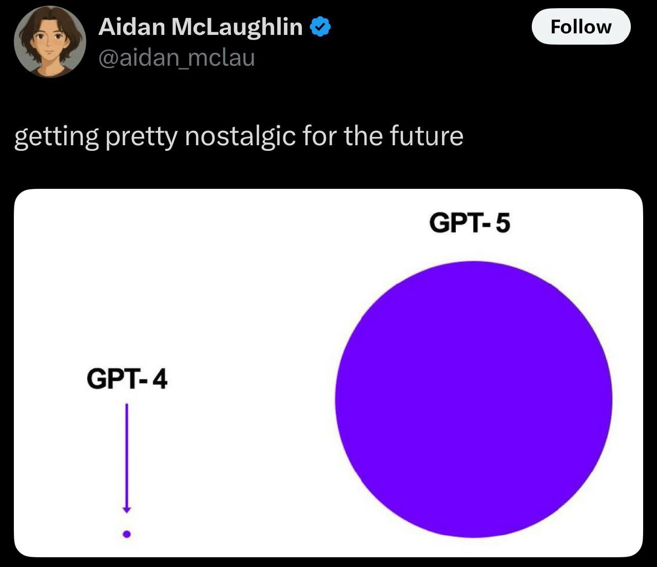
Imagine an ant standing next to an elephant – the ant was once the biggest bug in its little hill, but next to the elephant it’s just tiny. This meme is funny in the same way. The little purple dot is like the ant: it was impressive until something huge came along. The big purple smiley face is like the friendly elephant: enormous and kind of overshadowing everything, but with a goofy grin. It’s showing how in the world of AI, something that seemed big yesterday can suddenly look really small when something new and giant appears. The picture makes us laugh because the size difference is so ridiculous – it’s like saying, “Remember that little model we were so proud of? Well, look at the gigantic one we have now!” It’s a playful way to show how fast things change: today’s big deal can be left looking like a tiny dot tomorrow. Even if you don’t know anything about AI, you can feel the contrast and the silly idea that the big smiling circle completely steals the spotlight from the teeny dot. It’s basically a cartoon saying “whoa, that new thing is huge!” – a simple joke about one-upmanship that anyone who’s seen a bigger kid show up on the playground can understand.
Level 2: Bigger Is Better?
Let’s break down the meme in more straightforward terms. At its core, this image is about big AI models versus small AI models. In machine learning, a model is essentially a program that has been trained to recognize patterns or generate text/images; it has a bunch of internal numbers called parameters. Think of parameters as knobs or dials inside the model that get tuned during training on data – the more knobs, the more complex patterns the model can potentially learn. A Large Language Model (LLM) like OpenAI’s GPT-3 or GPT-4 is basically a neural network with an enormous number of these parameters (billions or trillions of them).
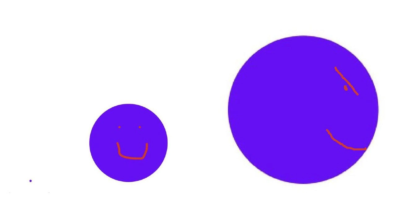
Now, model size comparison can be visualized by how many parameters one model has relative to another. The meme shows exactly that: a tiny dot on the left and a colossal purple circle on the right. This is a simplified parameter count visualization – the tiny dot might represent a model with, say, a few million parameters, and the huge circle represents a model with hundreds or thousands of times more parameters. The difference is so extreme that the small model is literally just a speck next to the gigantic one. It’s an exaggerated visual, but it’s not far off from reality: AI models have grown at an exponential rate. For example, in 2018 an important language model had ~100 million parameters, and by 2020 another had 175 billion. That’s like going from a toy car to a jumbo jet in two years – a shocking jump in scale.
The purple circle on the right has a simple smiley face drawn on it (two little orange dots for eyes and a red curved line as a mouth). This smiley face abstraction adds a playful human-like touch to the huge model. In a way, it personifies the model – saying “this big model is kind of happy and definitely the center of attention.” The small dot doesn’t even have a face; it’s just there, easy to miss. That implies the small model is not notable anymore, kind of how an outdated gadget just sits quietly while a flashy new gadget steals the show.
The top of the image is formatted like a Twitter post by Ilya Sutskever (who is a real and renowned AI researcher, one of the co-founders of OpenAI, and a key mind behind large models like GPT-3). Seeing his name there gives context: if he’s supposedly sharing this image, it suggests the topic is about AI research trends. (It’s possible the meme originated from a tweet or is parodying the style of AI researchers on Twitter). The verified handle and profile picture lend authenticity, making it feel like an insider joke within the AI community. Essentially, it looks like Ilya is pointing out, perhaps humorously or proudly, “Look how tiny our older model (dot) looks compared to our new one (big smiley)!”
So why is this funny or interesting? It’s poking fun at the AI community’s craze for bigger models. There’s even a term, scaling laws, which is about how performance improves as models get scaled up in size. According to those “laws,” if you want better results, one reliable way is to use a model with more parameters and train it on more data – basically make everything bigger. This has led to an AI industry trend (some would say a hype) where each new breakthrough often involves saying “we trained a model with X times more parameters and it achieved new records.” It’s almost competitive, which is why people call it an AI arms race. Companies and research labs are racing to see who can build the next biggest AI model because those often grab headlines for their impressive abilities (like writing essays, coding, passing exams, etc.).
For someone new to this, imagine parameters as brain cells of the AI model. A small model (few brain cells) can do basic tasks, but a huge model (many brain cells) can hold a lot more “knowledge” and handle more complex tasks. However, just like a bigger brain needs more energy, a bigger model needs a lot more computational power and data to train. Training a tiny model might take a single computer a few hours. Training a giant model might require a warehouse full of computers running for weeks! That’s why only big organizations did models like GPT-3 – they had the resources. The meme implicitly highlights this disparity too: that little dot could be a model you train on your own machine, the big circle is one that only a huge company could afford to create.
In summary, the meme humorously visualizes “bigger is better” in the AI world, but in such an extreme way that it’s clearly poking fun at it. It resonates with machine learning humor because anyone who follows AI news has seen the pattern: each new milestone often comes with an eye-popping number of parameters. It’s both amazing and a bit absurd, and this image captures that feeling without any words – just a dot, a giant smiley, and a knowing nod to the trend we’re all watching.
Level 3: The Great Model Arms Race
For seasoned engineers and researchers, this image lands as a wry commentary on the AI industry trends of the past few years. It caricatures the arms race of model scaling. In practice, we've witnessed a sequence of ever-larger models: one year you have GPT-2 with 1.5 billion parameters (the tiny dot that blew minds in 2019), and the next year GPT-3 storms in with 175 billion parameters (the massive smiling blob overshadowing all prior benchmarks). That leap felt as jarring as the meme’s visual: the cutting-edge went from a dot to a planet overnight. This trend didn’t stop – soon after, research rumors hinted at trillion-parameter models. The meme captures that almost absurd escalation: a model size comparison so lopsided it’s laughable.
Why is this humorous (and a bit painful) for insiders? Because it rings true. In the AI hype vs reality rollercoaster, it often seems the field is playing one game: "Go big or go obsolete." A model that was state-of-the-art last week suddenly looks quaint when a competitor unveils a new giant. We all nod knowingly (maybe with a touch of cynicism) because we've seen this pattern: each new LLM or generative model announcement touts a bigger parameter-count number like it’s an Olympic score. It’s essentially the “my model is bigger than yours” brag in corporate research. This leads to a collective one-upmanship – hence the arms race analogy – where organizations feel pressure to train something even larger just to stay relevant. The meme’s extreme visual disparity exaggerates this to great comic effect: it’s as if the tiny dot on the left is last year’s proud achievement, and the jumbo smiley face is this year’s new monster that makes the old one almost invisible.
The smiley face abstraction is a nice touch too. That big purple circle isn't just huge; it's smiling. It’s as if the giant model is smugly self-satisfied – “😁 I’m the new state-of-the-art, hello!” – while the tiny dot has no face at all, almost like it’s speechless or insignificant now. Seasoned folks recognize this feeling: the code or model you worked on intensely can feel instantly outdated when something dramatically better comes out. The emptiness of the white background around the dot emphasizes isolation – no fanfare anymore for the little guy. Meanwhile, the big purple model dominates the conversation (and probably the GPU clusters!). This alludes to the real-world dynamic where large models (massive in parameter count and requiring enormous compute) grab all the attention, resources, and GPU hours, often leaving smaller projects in the dust.
There’s also an undercurrent of AI humor pointed at the hype: bigger models are incredibly impressive (the breakthroughs in fluent text, coding assistance, image generation, etc., have come from scaling up), but the meme implicitly asks, “how far will this go?” It’s poking fun at the sometimes single-minded obsession with parameter count as a metric of progress. Insiders know that endlessly scaling isn’t a panacea – issues like data quality, model efficiency (you can almost hear an old-school engineer muttering “couldn’t we do better with 1/10th the size if we were cleverer?”). Yet, the reality is that throwing magnitude at the problem has yielded startling results, so the cycle continues.
In day-to-day terms, this meme hits home for anyone who’s been in those heated meetings or Twitter debates where someone says, “We achieved X with 10 billion parameters,” and someone else retorts, “We’ll do X+delta with 100 billion!” It’s both exciting and exhausting. The industry hype machine tends to celebrate these giant leaps (often with press releases boasting parameter count visualization graphs). Meanwhile, the people actually training the models experience the gritty side: memory bottlenecks, multi-node failures at 3 AM, astronomical cloud compute bills – the not-so-glamorous reality behind that smiling purple behemoth. So there’s a subtle dark humor for veterans: we chuckle, because we know that for that big purple circle to exist, somewhere an engineer was tearing their hair out dealing with distributed training bugs or a dying GPU in a pod of 256.
Historically, it also reminds the old-timers of previous tech arms races – like CPU clock speeds in the 90s or the core-count wars – where the numbers kept leapfrogging until hitting physical limits. There’s an implicit question: are we nearing a similar limit for model size, or is this just the beginning of even crazier jumps? In any case, the meme encapsulates the current era in AI: Massive Model Mania. It’s funny because it’s true – the only thing that ages faster than a tech device is an AI model’s glory days. Today’s giant laughing purple circle will be tomorrow’s tiny dot, and the cycle goes on.
Level 4: Power Law Prophecies
Deep in the AI/ML research trenches, the meme touches on scaling laws – empirical rules that govern how model performance improves as we amplify data and parameters. In cutting-edge literature, it's observed that as you increase a model’s parameter count N, certain performance metrics (like loss or accuracy) follow predictable curves (often power-law declines in error). The theoretical gist is that bigger models systematically get better: for example, doubling parameter count might cut error by some constant factor. Formally, one might say something like:
$$ \text{Error}(N) \approx C \times N^{-\alpha}, $$
with α being a positive exponent (a small one, reflecting diminishing returns). These prophecies of improvement drive the industry to push N from millions to billions to trillions. It’s a bit like a Moore’s Law for neural networks (though not a hardware law, but a trend in model scaling). The tiny dot on the left of the meme could represent a model with, say, 10^7 parameters, which once was state-of-the-art. The colossal purple smiley on the right might correspond to a model with 10^11 or more parameters (a jump by four orders of magnitude!). According to scaling theory, this jump isn’t just showy – it meaningfully reduces perplexity and broadens capabilities, albeit with steeply rising computational cost. This theoretical underpinning explains why researchers like Ilya Sutskever (the OpenAI co-founder whose Twitter profile tops the meme) bet on training ever-larger LLMs. They’re effectively exploiting those scaling curves, chasing that next few-percent gain in accuracy or coherence that the math promises from a massive model size increase.
However, scaling laws also carry a caution: each new colossal model yields smaller incremental gains relative to its size (hence the exponent α < 1). We enter a realm of diminishing returns – doubling parameters might only improve performance, say, 5%, not 100%. This leads to almost absurd contrasts like the meme’s tiny dot vs big circle – an almost comical visualization of how yesterday’s breakthrough can be dwarfed by today’s mega-model. There’s also a deeper implication in theory: these curves can hint at an eventual saturation point or new regime. If a model becomes astronomically large, will performance plateau? Are there fundamental limits (data availability, thermodynamics of computation, $$e=mc^2$$ style constraints) that will curb this trend? Researchers discuss concepts like the Chinchilla strategy (which balances model size and training data for optimal performance per compute) to find efficient points on these scaling curves. But in practice, until such limits bite, the community seems compelled by the almost fated trajectory that “more parameters = better results.” This meme humorously illustrates that prophecy: it’s practically a law of nature in ML right now that if you can afford to train a model 100× bigger, you do it, and boom – your new gigantic generative model makes the last one look like a speck. The power-law improvements have spoken, and the one with the biggest N wins – at least for now.
Description
A screenshot of a tweet from Ilya Sutskever (@ilyasut), a prominent AI researcher and co-founder of OpenAI. The tweet itself contains no text, only a simple, crudely drawn image. On a plain white background, there is a tiny purple dot on the left side. To its right is a massive, solid purple circle, which has a simple, happy face drawn on it in red - two small dots for eyes and a wide, U-shaped smile. This minimalist drawing is widely interpreted within the tech community as a visual metaphor for the exponential leap in scale and capability expected from future AI models (like GPT-5 or AGI) compared to current ones. The small dot represents the present, while the giant, smiling circle represents a powerful and potentially benevolent AGI. Coming from a key figure like Sutskever, this cryptic and child-like drawing became a significant and humorous piece of tech speculation
Comments
7Comment deleted
The small dot represents our current model's ability to follow instructions. The giant smiling circle represents its future ability to happily and confidently misunderstand us at a planetary scale
That speck on the left is your 30-million-parameter proof-of-concept; the smug violet planet is prod after finance approved 30 B more - turns out even the loss function is grinning
When you've seen enough transformer architectures to know that sometimes the simplest output - a smiley face - requires the most complex attention mechanisms behind the scenes. Classic Ilya: maximum impact, minimum tokens
When you deploy a 'quick fix' on Friday afternoon and watch your monitoring dashboard over the weekend - that tiny dot is your confidence, and that massive smiling circle is the cascading failure about to consume your entire distributed system. The smile? That's the bug knowing it's about to teach you why we have staging environments and why 'it works on my machine' is the most dangerous phrase in software engineering
The roadmap in one slide: left is “tune the 7B,” right is “buy 10k H100s, draw a smile, call it alignment.”
Overparameterized purple grin with a single-token dot: the ultimate sparse ASI architecture for safe, smiling alignment
Finally, a reproducible alignment algorithm: if parameter_count >> oversight_budget then return ":)"