Skip to content
DevMeme
4637 of 7435
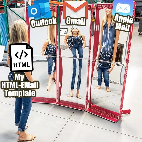
When email clients warp your perfect HTML email like funhouse mirrors
WebDev Post #5085, on Dec 14, 2022 in TG

When email clients warp your perfect HTML email like funhouse mirrors

Why is this WebDev meme funny?

Level 1: One Email, Three Versions

Imagine you spent a lot of time making a beautiful drawing for your friends. You use all your favorite colors and it looks just right to you. Now you go to a carnival funhouse and show that same drawing in front of three different funny mirrors. In the first mirror, your drawing looks short and squished. In the second mirror, it suddenly looks tall and stretched out. In the third mirror, it looks skinny and elongated. It’s the exact same drawing, but each mirror makes it look completely different and kind of silly. You feel frustrated because you know how it’s supposed to look (the way you drew it), but each friend who looks at it in their mirror sees a weird version instead. That’s what happens with a fancy HTML email that a developer designed: they made one email with a pretty layout, but when people open it in different email apps (which are like those funny mirrors), each app shows the email in its own distorted way. It’s both funny and a bit annoying – you just want everyone to see the drawing (email) the way you intended, but every mirror (email client) has other ideas!

Level 2: Coding Like It’s 1999

If you’re newer to web development, the idea of an “HTML Email Template” might sound simple – it’s just an email that’s formatted with HTML (the same language used for web pages) to include images, colors, and nice layouts, right? But unlike a normal webpage, which you can expect to look the same in most modern browsers, an HTML email can look very different depending on the email app or service where you open it. Each email app (we call them email clients) is kind of like a unique web browser. Examples of email clients are Microsoft Outlook, Gmail (the web Gmail or the Gmail app), and Apple Mail on Mac or iPhone. The meme shows these three as mirrors, which is a fun way to say: Outlook, Gmail, and Apple Mail each show the email in their own funky way.

The reason this happens is that email clients don’t all support HTML and CSS (the styling rules) in the same way. In fact, many email clients are based on very old web rendering engines or have strict security rules that strip away certain code. Let’s break down the three cases:

  • Outlook: Microsoft Outlook is basically the odd one out because it doesn’t use a web browser engine at all – it uses Microsoft Word’s engine to display emails. Word’s engine was never meant to be a full web browser, so it misses a lot of features. This means some things you might do in a webpage (like a fancy CSS layout with <div>s, margins, or background images using CSS) might not work in Outlook. Outlook might ignore your CSS, causing a nicely centered section to suddenly align wrong or a button with rounded corners to appear as a plain rectangle. Developers often have to use very basic HTML for Outlook, almost like coding a webpage in the late 1990s: lots of <table> tags to structure everything in rows and columns, and using old attributes like cellpadding and bgcolor to space things out or color sections, because those will work in Outlook. It’s a real throwback!

  • Gmail: Gmail is usually accessed through a web browser or the Gmail mobile app, and it uses a browser engine to render emails. You’d think that means it works like a normal modern browser, but Gmail has a history of being picky too. For a long time, Gmail automatically removed any <style> sections in your email (where you’d normally put CSS rules) for security reasons, and it wouldn’t let you link to external CSS files at all. So the only reliable way to style an email for Gmail was to use inline CSS. Inline CSS means writing your CSS directly inside each HTML tag. For example, instead of having a separate style that says p { color: blue; }, you’d write the paragraph like <p style="color: blue;">This text is blue.</p> so that Gmail definitely keeps and applies that style. Even today, it’s safest to style every element inline because of Gmail and some other clients. Gmail has gotten better – nowadays it does support more modern CSS like media queries (for responsiveness) – but it still might not support everything. If you use something fancy that Gmail doesn’t understand, it just leaves it out, and your design could look odd or stretched in places. Think of a two-column layout: if your CSS for making two columns isn’t supported, Gmail might display the content in one long column or jumble the columns, kind of like a mirror making you look taller or shorter than you should be.

  • Apple Mail: Apple’s Mail app is often the most forgiving. It uses a technology called WebKit (the same engine behind the Safari browser) to display emails, so it acts a lot like a modern web browser. Most of your HTML and CSS rules will work in Apple Mail, so usually your design appears as intended. If you carefully crafted an email, Apple Mail might reflect it almost perfectly, with just minor differences. But Apple Mail can have quirks too – for example, it might automatically load custom fonts or CSS that others don’t, and it has a feature where if your device is in dark mode, it may try to display emails in dark mode as well. This could invert colors (light backgrounds become dark, dark text becomes light) unless your email coding accounts for it. So occasionally, developers are surprised by Apple Mail doing something helpful like dark mode switching, which can inadvertently change how the email looks. Still, compared to Outlook and Gmail, Apple Mail usually causes the least trouble.

Because of all these differences, making an HTML email that looks consistent everywhere is tough! Developers essentially have to test their email in many clients and use the most basic, widely-supported code. A very common strategy is to build the entire email layout with HTML tables. This is something that was common in web design back in 1999 (hence “coding like it’s 1999”). Tables let you create a grid to place your content, and since tables are very old-school HTML, every email client knows how to display them properly. So instead of relying on modern CSS for multi-column layouts or precise positioning (which might fail in Outlook or Gmail), you nest tables within tables to get the right structure. It’s like building a scaffolding that you’re pretty sure each email client will not mess up. Likewise, all the styling (fonts, colors, spacing) is written inline on the elements. It makes the HTML code really long and repetitive (every <td> cell might have a style="padding: 10px; font-family: Arial;" and so on), but it’s done so that no matter what, the style sticks. Here’s a tiny example of what an inline-styled email snippet might look like:

<table width="100%" bgcolor="#ffffff" cellpadding="0" cellspacing="0">
  <tr>
    <td style="padding: 20px; font-family: Arial, sans-serif; font-size: 16px; color: #333333;">
      Hello, welcome to our newsletter!
    </td>
  </tr>
</table>

In the snippet above, we use a table to create a full-width section (width="100%" and some padding in the <td> cell). The text inside the cell has styles applied directly with the style attribute (setting the font family, size, and color). This approach might look overly simplistic or antiquated to a web developer, but for emails it’s the go-to method to ensure the content looks nice in all those different clients. If we left the same styling in a <style> tag at the top of the email, Gmail might strip it out. If we relied on a fancy CSS grid layout instead of a table, Outlook would almost certainly break it. So, we sacrifice elegance in code for reliability in presentation.

Testing and tweaking is the final (and crucial) part. A front-end developer will often send test emails to themselves on multiple services: open it in Outlook on their PC, check it in Gmail via a browser or on an Android phone, and open it in Apple Mail on a Mac or iPhone. Each might reveal a different quirk – maybe the button is a weird color in one, or an image doesn’t resize in another. Then the developer goes back to the code and adds a fix (often just for that client). This might involve adding an Outlook conditional comment (to target Outlook with some fix), or changing the code to use an approach all clients handle, even if it’s more cumbersome. It can feel like a whack-a-mole game: fix one client’s issue, and inadvertently something shifts in another client. Eventually, through careful adjustments, they reach a compromise where the email looks acceptable everywhere – not 100% identical in every pixel, but as close as possible. When the meme says email clients warp your perfect HTML email like funhouse mirrors, it’s highlighting this exact struggle. Developers aim for pixel-perfection, but each email client is a distortion mirror, and achieving perfection across all of them is an uphill battle. It’s a real trial by fire for new front-end devs: you don’t truly appreciate browser consistency until you’ve wrestled with an email that looks great in Gmail but breaks in Outlook. After that, you learn to always anticipate the “funhouse” effect and code accordingly!

Level 3: Cross-Client Chaos

In the wild frontier of HTML email development, a single meticulously crafted email design can transform into several bizarre versions of itself once it lands in different inboxes. The meme captures this perfectly: our proud email template (the woman with the HTML document on her back) stands before three carnival mirrors labeled Outlook, Gmail, and Apple Mail. Instead of a consistent reflection, each mirror warps her appearance in a unique way. This is a spot-on metaphor for how one email’s HTML/CSS can be rendered wildly differently by various email clients. Experienced developers immediately chuckle (or groan) at this image, because they’ve lived through the nightmare of email cross-client compatibility. It’s a shared industry joke that coding an email is like entering a house of mirrors – your code is the same, but every client shows a distorted result. The humor here is equal parts exasperation and commiseration: “Yep, been there, fought that.”

Why does this happen? Under the hood, each email client is effectively using its own mini web-rendering engine – and they’re not all modern or consistent. Microsoft Outlook, for instance, famously uses the Microsoft Word engine to render HTML emails (yes, you read that right: Word, the word processor!). This engine is stuck with HTML/CSS capabilities circa mid-2000s, which means many modern web standards are missing. You might code a nice CSS border-radius on a button or a flexbox layout, but Outlook will stare at that code blankly like “I have no idea what this is,” resulting in square corners or completely broken layouts. Margins might collapse or disappear, PNG images might not display correctly – it’s like your neatly arranged design gets squashed in Outlook’s funhouse mirror, with pieces oddly jammed together. There’s a well-worn saying among developers: “Outlook is the new IE6.” In other words, Outlook is to email what Internet Explorer 6 was to web pages: the biggest pain point for standards support. Seasoned email developers have scars from battling Outlook-specific issues. They resort to crazy hacks like conditional comments (special HTML comments that only Outlook will read) to feed it alternate code. For example, one might write something like:

<!--[if mso]>    <!-- This code only runs in Outlook's (Microsoft Office) engine -->
<table><tr><td>
<![endif]-->  

<!-- Regular email content here that other clients handle well -->

<!--[if mso]>  
</td></tr></table>  
<![endif]-->

In this snippet, the <!--[if mso]> condition is an Outlook-only trick (because “mso” stands for Microsoft Office). It essentially says, “Hey Outlook, use this old-school table layout or fallback content, since I know you can’t handle my fancy CSS.” It’s a bit like giving one mirror a special, simpler copy of the design so it doesn’t mess up as badly.

Now consider Gmail, the client behind the middle mirror in the meme. Gmail has its own quirks because it’s primarily a webmail client (often viewed in browsers or in Gmail’s mobile app). Historically, Gmail was notorious for stripping out <style> tags and external CSS. If your beautiful email relied on a <style> block in the header (like a normal webpage might), Gmail would throw that out for security reasons, leaving your email looking unstyled or stretched in odd ways. That’s why every serious HTML email is built with inline CSS – all your styles (colors, fonts, widths) have to be written in each element’s style="" attribute so that Gmail and friends apply them. Even as Gmail’s support has improved over time (by late 2022, Gmail does support embedded styles and media queries more than it used to), it still has limitations. It might ignore certain CSS properties, especially more advanced or obscure ones. Have a nice custom font? Gmail might not fetch it. Using CSS grid or sophisticated selectors? Gmail could flatten those into something simpler or just drop them. The result: your email that looked perfect in a browser test could appear with weird spacing or alignment in Gmail, like looking into a mirror that makes you tall and skinny – certain parts of the layout get elongated or shifted because the styling wasn’t fully applied. A common headache is responsive design: you might include CSS media queries to make your email adapt to mobile screens, but Gmail’s Android app only fairly recently began honoring those. Before that, a two-column layout might stubbornly remain two columns (shrunk and hard to read) on a phone, leaving developers tearing their hair out.

Lastly, Apple Mail (the third mirror) tends to be the friendliest of the bunch. Apple Mail uses the WebKit engine (similar to Safari) to render emails, so it has pretty good support for modern HTML and CSS. Often, if you get an email design to look right in a web browser, it’ll look nearly identical in Apple Mail – no extreme distortions. However, Apple Mail isn’t completely off the hook. It has its own quirks: for example, it might default to using your system’s fonts or add unexpected spacing around elements. Apple Mail is also aggressive about new trends – it was one of the first to support dark mode for emails. If your email isn’t prepared for dark mode, Apple Mail might automatically invert colors, turning your black text to white and light backgrounds to dark. Sometimes that yields strange results (imagine your meticulously chosen color scheme getting inverted without your consent!). In the funhouse analogy, the Apple Mail mirror might be the least distorted reflection – maybe just a slight funny stretch – but it can still surprise you with a wavy effect or two. The key point is, each client has a unique “interpretation” of your code. None of these reflections are wrong per se; they’re just following different rulebooks. The humor (and pain) arises from the fact that an email developer has to satisfy all these rulebooks simultaneously.

This is why HTML email development often feels like a trip back in time. Developers use techniques from the early web (circa late 90s and early 2000s) because those are the common denominators all email clients understand. Complex CSS layouts get replaced by <table> grids, CSS classes get inlined style-by-style, and interactive features (like JavaScript or even simple form inputs) are usually avoided entirely – they either won’t work or could even trigger spam filters. The meme’s exaggerated mirror distortions brilliantly illustrate the frustration: you pour your heart into a pixel-perfect design, only to see each email client twist it into something unintended. It’s funny because it’s true – any developer who’s spent days debugging why an email looks fine in Gmail but completely broken in Outlook will both laugh and cringe at this image. It’s a communal acknowledgement: we’ve all been in this carnival, and it’s as ridiculous as it looks.

Description

A woman stands in a warehouse-style space facing three red-framed funhouse mirrors. On her back is a white document icon with “</> HTML” and a caption reading “My HTML-EMail Template.” Each mirror has a different email-client logo and label at the top: a blue Outlook icon with text “Outlook,” a red Gmail envelope with text “Gmail,” and a light-blue Apple Mail envelope with text “Apple Mail.” Her reflection in each mirror is distorted in a unique way - squashed, stretched, or elongated - visually symbolizing how the same handcrafted HTML email renders wildly differently in Outlook, Gmail, and Apple Mail. The meme highlights the perennial cross-client compatibility nightmare front-end engineers face when building table-based, inline-CSS email templates
Comments

6
Anonymous ★ Top Pick HTML email: the only distributed system where each node - Word-powered Outlook, CSS-stripping Gmail, and wish-fulfilling Apple Mail - runs its own 1998 browser fork, yet marketing still demands pixel-perfect consensus by EOD
  1. Anonymous ★ Top Pick

    HTML email: the only distributed system where each node - Word-powered Outlook, CSS-stripping Gmail, and wish-fulfilling Apple Mail - runs its own 1998 browser fork, yet marketing still demands pixel-perfect consensus by EOD

  2. Anonymous

    The only codebase where "works on my machine" is less believable than "renders correctly in Outlook" - and we still ship it knowing full well we're maintaining three separate table-based layouts from 2003

  3. Anonymous

    Ah yes, the three stages of HTML email grief: Outlook using Word's rendering engine from 2007, Gmail stripping half your CSS like it's personal, and Apple Mail deciding that 'standards' are merely suggestions. Senior devs know the real skill isn't writing elegant semantic HTML - it's mastering the dark art of nested tables, inline styles, and the ancient incantation 'mso-conditional-comments' just to make a button look consistent. We've sent humans to space with less compatibility testing than it takes to render a centered div in Outlook

  4. Anonymous

    HTML email: one template, three browsers - Outlook’s Word-as-a-browser, Gmail’s selective CSS amnesia, and Apple Mail’s interpretive WebKit - yet marketing still insists on “pixel-perfect.”

  5. Anonymous

    HTML emails: where modern CSS meets Outlook's Word engine, birthing table-layout zombies that even Gmail can't fully resurrect

  6. Anonymous

    HTML email is the microservices of layout engines: your template is the contract, Outlook implements it in Word, Gmail drops half the spec, and Apple Mail achieves eventual consistency after dark mode rewrites everything

Use J and K for navigation