GPT-5's Debut Performance Crushes GPT-4o
Why is this AI ML meme funny?
Level 1: Trophy Before the Race
Imagine you and your friends are about to run a race, but before the race even starts, someone pulls out a big chart they drew. On this chart, they made a huge pink bar for their own speed and little tiny bars for everyone else’s. The pink bar says something like “I’ll be 75% faster!” and the tiny bars have smaller numbers. They’re basically claiming they’ve already won and are way better than everyone, before anyone has even run! It’s like they’re holding up a trophy before the race is run. You’d probably giggle or roll your eyes, right? Because how can they know without actually doing it? It feels a bit like bragging about an imaginary result. That’s exactly the feeling this meme gives. It’s showing a pretend victory chart for a new AI model that isn’t even out yet. It’s funny in the same way it’s funny when someone counts their chickens before they hatch – making a big boast with fancy numbers but no real proof. Even if you’re not an engineer, you can sense something’s off: you’d want to see the race (or the real test) before believing such an over-the-top chart. The meme is basically a playful nod, saying, “Look, they’re celebrating a win that hasn’t happened – isn’t that silly?”
Level 2: Bar Chart Boasting
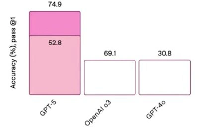
Let’s break down what’s going on in this meme in simpler terms. We have a bar chart comparing three AI models: one called GPT-5, one labeled OpenAI 03, and one called GPT-4o. The y-axis says “Accuracy (%) pass @ 1”, which is a way to measure how often the model gets the right answer on the first try (think of it like a test score where you only get one chance to answer each question). Higher means better – 100% would be a perfect score. Now, GPT-5 (which isn’t even released for real, it’s just speculated) is shown with a huge pink bar that goes up to 74.9%. Inside that bar there’s also a lighter pink section up to 52.8%, but there’s no explanation of what those two parts mean. The other two models, “OpenAI 03” and “GPT-4o,” have just empty outlined bars. Above them, you can see their numbers: 69.1% above OpenAI 03, and 30.8% above GPT-4o, indicating their accuracy. They don’t even get a fill color – they’re just blank, which visually makes them look less important or impressive compared to the flashy GPT-5 bar.
So why is this funny or significant? Because it’s poking fun at AI hype and how companies sometimes show off results. GPT-5 isn’t available yet, so any number for it is basically a guess or an internal result that no one can verify. It’s like bragging about a test score on a test you haven’t officially taken. The chart is telling us “Look, GPT-5 will be way better than everything else!” but it doesn’t tell us how it got those numbers or what test was used. This is what the description means by “missing methodology” – there’s no info on how they measured these accuracies. In proper research or reports, you’d expect them to say something like, “GPT-5 was evaluated on XYZ dataset with these conditions.” Here, it’s just numbers on a slide, which is a bit suspicious.
For a junior developer or someone new to AI, here are some key concepts: GPT-4 is a real model (a very advanced Large Language Model by OpenAI that came out in 2023). GPT-5 would be the next version, but as of the date in this meme (2025), it hasn’t been released yet. So any performance claims about GPT-5 are speculative. The term “pass @ 1” is commonly used in AI, especially for coding or question-answering tasks. It means the model had one chance to give the answer, and we check if it got it correct (“pass”) on that first try. So if we say 74.9% pass@1, that implies if we gave the model 100 problems, it solved ~75 of them correctly on the first response. OpenAI 03 is a bit unclear – it could be referring to an OpenAI model from March ’03 (OpenAI often names model versions by dates) or some code name for a previous model. GPT-4o might stand for an open-source version of GPT-4 or some other model (the “o” could mean “open” or a variant). The exact identity isn’t super important; what matters is GPT-5 is claiming to beat this OpenAI 03 model (69.1%) by a few points and absolutely trounce the GPT-4o model (30.8%).
This setup is a tongue-in-cheek reference to benchmarking culture in AI. A benchmark is a test or set of tests used to compare models. There are famous benchmarks for language models, like answering reading comprehension questions, solving math problems, writing code (e.g., the HumanEval benchmark for coding). Each time a new model comes out, folks rush to see its scores on these leaderboards. Companies love to show graphs of their new model being better than the previous ones. But often, these presentations cherry-pick the most favorable metrics. In other words, they’ll pick a test where their model shines and maybe ignore tests where it doesn’t. They might also omit details like how the test was done. For example, did they give each model the exact same prompts? Did they try multiple times and take the best attempt? None of that is explained here. That’s why the meme mentions “speculative metrics” and “suspiciously convenient scale.” The scale or context might be set up in a way that flatters GPT-5. The others are drawn as small, empty bars, which is a visual trick: it makes them look unimpressive next to the big colorful GPT-5 bar. It’s boasting with a bar chart.
Another clue something’s fishy: those very exact numbers (74.9 and 69.1). Such precision implies a real evaluation, but if it were real, why wouldn’t they share how it was done? It gives the impression of scientific accuracy (two decimal places!), but without any source, it’s more like decoration. It reminds experienced tech people of those conference slides where someone says “Our product is 15% faster than the competitor’s” with a big bar chart – but then in tiny fine print (or sometimes not at all) they fail to mention the test conditions (maybe they benchmarked under unrealistically perfect conditions). In fact, the phrase “PowerPoint benchmark” is an inside joke meaning a performance claim that exists only in slides but hasn’t been proven in reality yet.
The title’s analogy to a failing unit test is also telling. A unit test is a small test developers write to check that one part of the code works correctly. In a suite of many tests, if most pass and one fails, that failing one usually stands out in reports (often highlighted in red or bold). It’s the one bar or line that looks different – much like here, GPT-5’s bar looks very different from the other two. The idea is that GPT-5’s bar is so disproportionately tall (and colored) that it’s as noticeable as a failing test result among passing ones. It’s kind of ironic: usually a tall bar is a good thing (high accuracy), whereas a failing test is a bad thing, but what they share is being an outlier that grabs your attention immediately. The meme leverages that imagery to hint that something about this chart feels wrong or at least too good to be true, the way a red failing test in a sea of green passes feels wrong in a test suite.
For a junior developer or someone newer to this field, the takeaway is: be skeptical of bold performance graphs without detail. The meme is funny because it exaggerates a real phenomenon – the AI hype cycle. Every time a new Neural Network model is rumored, the internet fills with dramatic claims and leaked charts about how it’ll blow away the current generation. Seasoned engineers have learned to smile and think, “Alright, show me the actual evidence,” because we’ve seen many “breakthrough” slides quietly fizzle out later. It’s a lighthearted reminder not to accept every graph at face value, especially when it’s about unreleased tech. Always check for the methodology: what’s being measured, under what conditions, and who measured it. If those pieces are missing, the impressive bar chart might just be hot air in graphic form.
Level 3: Slideware Sorcery
At first glance, this bar chart screams “marketing magic” to any seasoned engineer. We’ve got a towering GPT-5 bar painted in rosy pink, absolutely dwarfing its neighbors OpenAI 03 and GPT-4o. The humor here is how suspiciously perfect everything looks — it’s a PowerPoint benchmark slide in its purest form. The y-axis declares Accuracy (%), pass@1, implying some evaluation metric (likely for code or Q&A tasks where the model gets one chance to answer correctly). And yet, crucial details are conspicuously absent: what dataset? which tasks? how many trials? The chart just hands us precise numbers (74.9%, 69.1%, 30.8%) as if they descended from the heavens of AI superiority. Any senior developer’s BS alarm is ringing at this point, because we’ve all critiqued premature benchmarks that tout speculative metrics without methodology. It’s the classic hype cycle move – slap big numbers on a slide to proclaim a new state-of-the-art, but don’t show the messy experiment details that might spoil the narrative.
Notice how GPT-5’s bar is actually two-toned: a lighter pink up to 52.8 and a darker cap reaching 74.9. Yet there’s no legend or explanation. This smells like they’re stacking two results – perhaps base model vs. some fine-tuned or chain-of-thought variant – but conveniently rolled into one bar. It’s as if they’re saying, “GPT-5 started here at 52.8%, then with our secret sauce it hits 74.9%.” But with zero context given, it’s a mystery gradient. Senior folks know this trick well: present an incremental improvement inside the same bar to hint at a dramatic gain, without disclosing what that improvement actually was. It’s slideware sleight-of-hand, implying breakthroughs without having to prove them separately. We’re essentially being asked to take GPT-5’s superiority on faith, bolstered by a chic color gradient. (The pink gradient itself feels symbolic – as one colleague quipped, they’re literally seeing their results through rose-colored glasses.)
Now look at the other two bars. They’re just empty outlines with numbers floating above: 69.1 for “OpenAI 03” and 30.8 for “GPT-4o”. No fill, no fanfare. They almost look like afterthoughts, or control samples in an experiment where the star of the show is pre-decided. This contrast is intentional and hilarious: the GPT-5 bar is shouting “memorable highlight,” while the others whisper “ignore me.” It’s reminiscent of those performance charts in product keynotes where Our Product is in bright color towering over dull gray competitor bars. Here, OpenAI 03 (whatever that exactly refers to – presumably an earlier model or baseline) is given a single number, 69.1%, slightly below GPT-5’s top score. How convenient! GPT-5 just barely edges out that rival, making it look like a tight but definitive victory. Meanwhile, GPT-4o is way down at 30.8%, serving as the “poor old baseline” to really exaggerate how far we’ve come. The naming “GPT-4o” likely hints this is an open-source GPT-4-like model or variant that’s lagging behind. By including a much weaker model, the chart inflates the perceived leap in performance – a classic hype tactic: always include something you can beat by a mile to make your gains look enormous. It’s akin to a boxer bringing a toddler into the ring just to guarantee a knockout comparison.
What’s especially funny to veterans is the speculative nature of the whole graph. GPT-5 isn’t even out yet – it’s an as-yet nonexistent model, just rumored. So presenting exact accuracy numbers (to one decimal place, no less!) is inherently ridiculous. It reminds us of all those times we saw internal roadmaps or leaked slides claiming “Project X will achieve 2x performance of current system” before anyone has built it. Those of us who survived enough product launches treat such slides as science fiction, not science. The meme nails this: it’s parodying how AI companies partake in leaderboard culture, announcing every new model as a massive jump on some benchmark, often without peer-reviewed evidence at first. The “pass @ 1” metric is a nod to the AI research habit of measuring success rates (for example, in coding challenges or quiz-style questions). By showing GPT-5’s pass@1 so high, they’re implying it will dominate coding problems or one-shot answers. But without telling us which benchmark, the claim is vacuous. Is this HumanEval for code? Is it trivia questions? The chart doesn’t say – a red flag. No mention of sample size, no error bars or confidence intervals. In any serious ML evaluation, you’d expect at least a ± margin or some shading for variance. Here, 74.9% stands alone as if it’s Gospel truth. As seniors, we’ve learned to ask: 74.9% of what, exactly? Because an accuracy with no context could be anything from solving 3 out of 4 very easy tasks to barely passing a tricky exam – context is king, and it’s missing.
The title text of the meme itself compares the situation to a failing unit test. In a suite of mostly passing tests, a failing test lights up in red and demands attention — it’s the one thing that stands out and breaks the build. Similarly, this GPT-5 bar stands out awkwardly from the others. It’s huge and hot-pink, almost like an error bar (pun intended) among empty placeholders. In real CI/CD output, you might see a big red “FAIL” line among greens: that one divergent result that you can’t ignore. Here GPT-5’s bar is that anomaly – so far above “normal” that it almost feels like a mistake or a glitch. The meme is winking at us: “Doesn’t this chart look as off-kilter as a lone failing test?” For seasoned devs, there’s additional irony: failing tests indicate something’s wrong, and indeed something is wrong here — the lack of credibility of this graph. We’ve been burned by enough overhyped claims (and late-night debugging of reality vs. slides) to be healthily cynical. We know that behind every beautiful slide might lurk a dozen caveats or an outright “it’s just theoretical, folks” disclaimer that somehow never made it on screen.
In summary, this meme’s humor lives in that too-familiar gap between hype and reality. It skewers the way AI progress is often presented: with glossy charts, cherry-picked metrics, and an implied “trust us, this is revolutionary” grin – all before anyone outside the company can verify a thing. It’s a gentle roast of AI industry’s tendency to inflate expectations. Those of us in the trenches can’t help but smirk, because we’ve learned that flashy bars on a slide are about as reliable as an npm install on Friday. In other words: proceed with extreme skepticism. This graph is basically the embodiment of AI hype – and we’re laughing because we’ve seen how these “groundbreaking” numbers often crumble under real-world scrutiny.
Description
A simple bar chart comparing the performance of three AI models: GPT-5, OpenAI o3, and GPT-4o. The y-axis is labeled "Accuracy (%), pass @1". The GPT-5 bar is a stacked pink bar, reaching a total accuracy of 74.9% (composed of a 52.8% base and a 22.1% addition). In contrast, the 'OpenAI o3' model scores 69.1% and 'GPT-4o' scores a significantly lower 30.8%, both represented by simple white bars. The caption indicates this was the opening slide of a presentation, designed for maximum impact. This chart is a classic example of a benchmark reveal during a major tech announcement, in this case for OpenAI's GPT-5. It's engineered to immediately establish the new model's dominance over its predecessors, particularly the massive leap in performance over GPT-4o. For senior engineers and tech leaders, this isn't just a data point; it's a strategic signal about the new state-of-the-art, prompting immediate re-evaluation of existing AI integrations and future roadmaps

Comments
8Comment deleted
The performance gap between GPT-4o and GPT-5 is so wide, they must have finally figured out how to properly center a div in the model's architecture
Sure, the chart shows GPT-5 at 75 % pass@1, but until I see the repo, the dataset, and the prompt length budget, it’s just another executive KPI target dressed up in #FF69B4
Ah yes, the classic 'my model is 2.4x better than yours' chart - the enterprise sales deck's favorite child. Meanwhile, we're all still prompt engineering our way around GPT-4's refusal to center a div properly
GPT-5 achieving 74.9% accuracy while GPT-4o sits at 30.8% is the AI equivalent of discovering your 'optimized' microservice architecture is actually just a well-documented monolith with extra steps - sometimes the next iteration really does justify the hype, but that segmented bar makes you wonder if they're measuring 'accuracy' the same way we measure 'story points' in sprint planning
OpenAI o3 at 69.1%: the benchmark score that auto-triggers every dev's inner 4chan meme
We upgraded RLHF to PPU - PowerPoint Parameter Updates: add a second pink rectangle, delete the error bars, and your pass@1 jumps 22.1%
Pass@1 is the new lines‑of‑code: it doubles on slides, halves in production, and explains exactly 52.8% of the executive excitement
I love that 52.8% is more than 69.1% but 69.1% is the same as 30.8% Comment deleted