Skip to content
DevMeme
6387 of 7435
GPT-5's Tool Use: Not a Universal Upgrade
AI ML Post #7002, on Aug 7, 2025 in TG

GPT-5's Tool Use: Not a Universal Upgrade

Why is this AI ML meme funny?

Level 1: Only the Good Parts

Imagine you have three students who took tests in three different subjects. One student (let’s call them G) is the newest, “smartest” kid on the block. The second student (O) is pretty smart too, and the third student (older G) was last year’s star. Now, in math class, the new kid G gets a nearly perfect score while the others do okay and poorly – G studied exactly those math problems beforehand. In history class, G and O both score about a B, and the older G gets a C. In science class, O actually gets the highest score, just a tad above the new kid G.

Now G goes around telling everyone, “I’m the top student across all subjects!” and even shows a chart with tall pink bars to prove it. It’s kind of true at first glance – G did awesome in math and did well in the others. But G conveniently doesn’t mention that in science class (Airline tasks) they actually got beat, or that for math (Telecom tasks) they had a special tutor helping them prepare. This is like bragging using only the good parts of your report card and hoping no one looks too closely at the rest.

The meme’s joke is basically that: companies will show off a fancy chart of their new AI getting great scores (the good parts), but they won’t talk about the extra help or tricks they used to get those scores, or the places where it didn’t do so well. It’s funny in the way a friend exaggerating a story is funny – you smile because you know they’re leaving out the messy bits.

Level 2: Bar Chart Breakdown

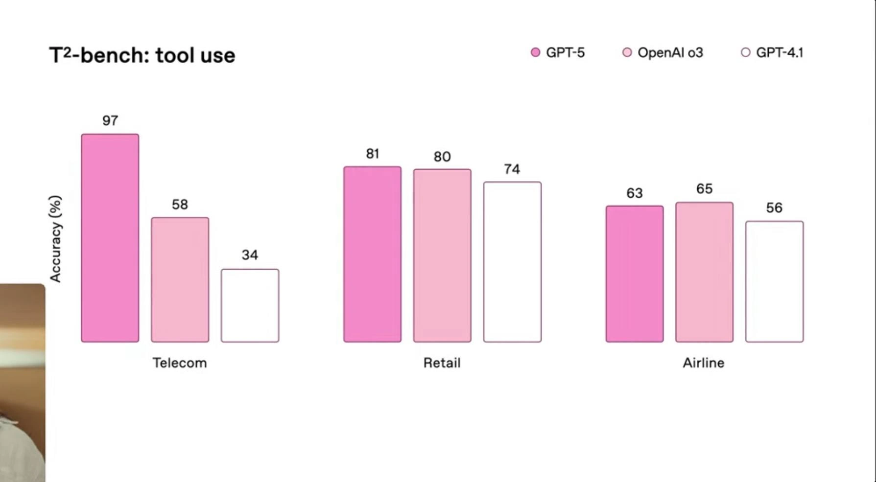
Let’s break down what this chart is actually showing. We have three groups of bars – one group for each industry: Telecom, Retail, and Airline. In each group, there are three bars representing three different AI models: GPT-5 (the newest model), OpenAI o3 (another model, possibly a rival or an older version), and GPT-4.1 (an improved version of GPT-4). The height of each bar corresponds to an accuracy (%), which is labeled right above the bar. “Accuracy” here likely means the percentage of tasks or questions the model answered correctly when it was allowed to use tools relevant to that industry. For example, in the Telecom domain, GPT-5’s bar is labeled 97, meaning it got 97% of the telecom test questions right, which is extremely high. Meanwhile, in Telecom, the OpenAI o3 model scored 58%, and GPT-4.1 scored only 34%. So, GPT-5 did much better than the other two in Telecom.

In Retail, the picture is different: GPT-5 got 81%, OpenAI o3 got 80%, and GPT-4.1 got 74%. Those are all somewhat close – GPT-5 is just barely ahead (81 vs 80), and GPT-4.1 isn’t too far behind either. This tells us that for retail-related tasks (maybe things like answering questions about store inventory or product details), all the models performed similarly, with GPT-5 only slightly the best. Then we look at the Airline industry: GPT-5 got 63%, OpenAI o3 got 65%, and GPT-4.1 got 56%. Here OpenAI o3 is actually a tiny bit ahead of GPT-5 (65 vs 63). That’s interesting – it implies that for airline-related tasks (like booking flights, checking statuses, etc.), some model other than the latest GPT-5 might do a bit better, perhaps because it’s specialized or trained more on airline data.

The chart uses shades of pink for the bars. According to the legend in the top-right, the darkest pink is GPT-5, the medium pink is OpenAI o3, and the light pink (with just an outline) is GPT-4.1. This color scheme makes GPT-5 stand out clearly, since it’s the darkest and most filled-in color. Visually, your eye is drawn to GPT-5’s performance first – especially that huge 97% bar in Telecom. This is a common data visualization technique: use color emphasis to highlight the star of the show (GPT-5 here). The title “T²-bench: tool use” implies that this was a benchmark test focusing on how well each model can use tools. “Tools” in the context of an LLM means things like using external data sources, APIs, calculators, or databases as part of answering a question. For instance, a question in the Airline domain might require the model to call a flight status API – the model needs to decide to use that tool and then use it correctly to get the answer, which is a more complex task than just replying from memory. Accuracy (%) would reflect how often the model got the right answer when it had the option to use those tools.

Now, why is this meme-worthy or funny to developers? Because it’s very marketing-ish. The title claims “GPT-5 benchmark outpaces GPT-4.1 and o3 across industries,” suggesting GPT-5 is the winner everywhere, but the data actually shows GPT-5 barely ties or even loses in one case. It’s the kind of slide you might see at a tech conference or in a company’s product launch, where they hype up a new AI model. Junior developers or newcomers might take this slide at face value: “Wow, GPT-5 is just crushing it, look at that 97%!” And indeed, 97% vs 34% for telecom is a big leap. But notice, someone with a bit more experience might question: How did GPT-5 get that 97%? That’s where those terms like prompt engineering, retrieval plugin, and fine-tuning come in:

  • Prompt engineering: This is the process of wording the input question or instructions to an AI in a very careful way to get the best result. If you just ask a blunt question, you might get a mediocre answer, but if you find the just right way to ask (or give the model an example or a specific format), you can boost accuracy. It’s called a “tax” humorously because it’s extra work required to unlock the model’s performance – an overhead not shown in the chart. The chart doesn’t tell you how much tweaking went into each model’s queries.
  • Retrieval-plugin: This refers to an add-on that lets the model fetch information it wasn’t originally trained on. Think of it like giving the model a tool, such as a wiki browser or a database lookup. “Cold start” means the first use of that tool might be slow because it has to start up. For example, the first time GPT-5 tries to use an airline database, that database might need a moment to wake up, causing a delay or maybe even a timeout. These issues don’t reflect in an accuracy percentage, but they do matter in real usage. A cold start can make a system feel unresponsive initially – something you wouldn’t brag about on a slide.
  • Fine-tuning bills: Fine-tuning is when you take a pre-trained model (like GPT-4.1) and train it further on specific data (say a lot of telecom transcripts) so it performs better in that area. GPT-5 might have undergone extra fine-tuning for telecom tasks to hit that 97%. However, training these huge models on new data is very expensive – it can literally cost millions in cloud compute for the largest models. So the joke is that somewhere off-screen, there’s possibly a massive bill from running all that extra training. Again, something a flashy chart isn’t going to disclose, but engineers know someone had to pay for those gains.

In simpler terms, the meme is showing how a company might boast about their new AI model being super good in all these industries with a nice chart, but in reality, those numbers come with footnotes. The experienced folks in MachineLearning and model evaluation see the footnotes mentally: they know a performance number can be pumped up with enough tweaking, and they also know that being the best on a benchmark isn’t the same as being the best in the real world across the board. It’s a light-hearted call-out of the AI hype cycle – where every new model is “revolutionary” on slides, while the practical challenges (like actually implementing it in a live Retail or Airline system) are glossed over.

For someone newer to this field, the takeaway is: charts are great summaries, but ask what’s beneath the summary. Why did GPT-5 do so much better in one case and not in another? Often it’s about data and optimization specifics. And the meme is funny because it’s basically saying, “Sure, those are the numbers, but let’s not pretend it’s as easy as plug-and-play supremacy in every domain.”

Level 3: Rose-Tinted Results

From a senior engineer’s perspective, this chart is a classic case of “slide deck optimism” in the AI/ML industry. All three bars for each sector are colored shades of rosy pink, almost like the presenter wants us to view GPT-5’s performance through rose-colored glasses. GPT-5 (dark pink bar) dominates in Telecom with a whopping 97% accuracy, absolutely dwarfing OpenAI o3 (58%) and the older GPT-4.1 (34%). That’s the kind of jaw-dropping metric a product manager loves to circle in bright colors. But by the time we scan right to the Airline industry, our wunderkind GPT-5 slips to 63%, actually getting beaten by o3’s 65%. So much for "outpaces across industries", huh? The meme is highlighting how these benchmarking slides often come with an unspoken asterisk. Experienced devs know that whenever you see one model bar massively taller than others, you should ask: What did they tweak behind the scenes for that demo?

This resonates with anyone who’s sat through vendor presentations or industry keynotes boasting about machine learning superiority. The fine print (absent here, of course) might read: “GPT-5 was fine-tuned on a huge telecom dataset and had access to a custom tool plugin during inference.” Meanwhile, maybe GPT-4.1 was evaluated out-of-the-box with zero prompt optimization, and o3 could be a competitor model specifically trained on airline data (hence its surprise lead in that domain). In other words, the chart’s telling a selective story. IndustryTrends_Hype is all about picking metrics that flatter your product: here GPT-5 looks like a general superstar, but only if you gloss over the context. A senior dev sees those 97–58–34 Telecom bars and immediately suspects “We must have spent a fortune fine-tuning GPT-5 for telecom customer support use-cases.” Likewise, the near-tie in Retail (81 vs 80) hints that without special prep, GPT-5 is only marginally better than its predecessor or competitor on everyday tasks – not exactly the sensational leap one might hope for from a next-gen LLM.

The humor also comes from what’s not on the slide but is painfully familiar to veterans: the prompt-engineering tax, retrieval-plugin cold starts, and fine-tuning bills that the description mentions. Each of these is a thorn that doesn’t show up in glossy charts:

  • Prompt-engineering tax: That 97% accuracy might have involved a team of engineers iterating on the perfect prompt or chain-of-prompts so GPT-5 outputs the right telecom troubleshooting steps. In the real world, that means extra development time and brittle queries. You won’t see that effort acknowledged in a marketing slide – it’s the hidden “tax” to make the model perform. Senior folks chuckle because they’ve burnt hours crafting prompts or few-shot examples to get those last few percentage points.
  • Retrieval-plugin cold starts: The title “tool use” implies models could use external tools or plugins (like a database lookup for airline flight info). Great, they can fetch data! But the first time a plugin is invoked, it might be asleep, causing a slow response (cold start). So maybe GPT-5 can call a telecom knowledge base with high accuracy – but if in production the user waits 30 seconds for an answer because the container was spinning up, that’s a problem. These slides conveniently ignore those operational hiccups. A grizzled engineer sees “tool use” and immediately thinks, “Alright, but what about latency and failure rates, eh?”
  • Fine-tuning bills: If GPT-5 needed domain-specific fine-tuning to hit 97%, imagine the compute bills for training on all that telecom data. Fine-tuning a giant model is expensive – both financially and in time. That cost (and subsequent model maintenance burden) is hiding off-screen. A seasoned dev either winces or laughs, recalling the CFO’s face when the cloud bill came after last quarter’s model tuning sprint.

In essence, this meme’s bar chart is the embodiment of the AI hype cycle in enterprise settings: a flashy data visualization with pretty colors and big numbers that make executives excited, while the engineers exchange knowing glances. They’ve learned that “GPT-5 outperforms GPT-4.1” often really means “GPT-5 outperforms when we measure exactly the things it was trained to do under ideal conditions, and we won’t talk about the edge cases.” The joke hits home because it’s data visualization and analytics used as a smoke-and-mirrors trick – something any experienced dev has seen in one form or another, from unrealistic performance charts in slide decks to cherry-picked benchmark stats in press releases. The truth is, as always, more complicated, and the senior folks find grim humor in how predictably this pattern repeats with each new generation of tech.

Level 4: No Free Launch

At the deepest technical level, this pink-themed bar chart pokes at the no-free-lunch theorem of machine learning: a single Large Language Model (LLM) like GPT-5 can’t magically dominate every domain without trade-offs. The chart is titled “T²-bench: tool use”, suggesting an evaluation of how well these models use tools (perhaps calling APIs or retrieving data) across industries. Academically, this hints at the challenges of domain adaptation and out-of-distribution generalization. Each industry (Telecom, Retail, Airline) represents a distinct problem distribution, and GPT-5’s towering 97% accuracy in Telecom vs. a mere 63% in Airline exemplifies the classic domain shift problem: the model likely excels where its training data or fine-tuning was rich (Telecom), but falters where it wasn’t (Airline).

Under the hood, GPT-5’s architecture might boast trillions of parameters and advanced tool-use capabilities, but fundamental constraints bite hard. It’s the AI equivalent of the CAP theorem but for language tasks – you can optimize for certain domains or tasks, but not all simultaneously. If GPT-5 was heavily fine-tuned on telecom support logs and troubleshooting steps, it’s effectively a specialist there, hence the sky-high accuracy. But that specialization can degrade performance on queries about, say, flight reservation systems (Airline domain) where an OpenAI o3 model – possibly a rival fine-tuned specifically for airline operations – edges it out at 65% accuracy. In ML theory, this is like the bias-variance tradeoff playing out in a multi-domain context: tune your bias to one domain and variance creeps up in another. No free lunch in AI means every gain (97% in one niche) comes with a cost (some lag in another).

It’s also worth noting the tool use aspect: advanced models like GPT-5 are judged not just by raw text generation, but by how well they use external tools or plugins to get answers. This introduces real-world engineering overhead into academic benchmarks. For instance, a retrieval plugin might allow the model to query a knowledge base for Telecom troubleshooting, bumping accuracy impressively. However, theoretical limits akin to Amdahl’s law appear: the overall system can’t exceed the speed/accuracy of the slowest component. If the Airline tasks require a tool (like a flight database) that GPT-5 wasn’t optimized for, the entire pipeline’s accuracy suffers. In research terms, it’s grappling with composability of AI services – even if the language model is powerful, the composite system (LLM + tools) must be tuned as a whole.

Behind this seemingly straightforward bar chart lies a landscape of academic debates about benchmark reliability. We’ve seen this pattern since the early days of GPT models and their benchmarks (recall the GPT-3 versus fine-tuned BERT leaderboard tussles): each new model iteration aces some benchmarking tool in certain categories, but skeptics know to ask “what data and prompt tricks were used?”. In fact, there’s ongoing research on how much prompt engineering and system tweaking inflate these numbers. The absence of error bars or confidence intervals on this slide would make any ML scientist raise an eyebrow – if a result looks too good to be true (97% accuracy where the nearest competitor is at 58%), it often is, achieved with additional fine-tuning or narrow evaluation criteria. This meme gets its sting from that underlying truth: even GPT-5, for all its hype, can’t escape the physics of model performance metrics and the mathematics of learning theory that guarantee diminishing returns and specialization costs.

Description

A bar chart from a presentation, titled 'T²-bench: tool use', comparing the accuracy of three AI models - GPT-5, OpenAI o3, and GPT-4.1 - across three different industry domains: Telecom, Retail, and Airline. The y-axis represents accuracy in percent. In the Telecom category, GPT-5 shows a massive performance lead with 97% accuracy, far ahead of o3 (58%) and GPT-4.1 (34%). In Retail, the models are much closer, with GPT-5 at 81%, o3 at 80%, and GPT-4.1 at 74%. In a surprising twist, for the Airline category, OpenAI o3 slightly outperforms GPT-5 with 65% accuracy compared to GPT-5's 63%. This chart provides a nuanced view of AI model performance, specifically on their ability to use tools. It demonstrates that while GPT-5 offers a monumental improvement in some areas (Telecom), its superiority is not absolute across all domains. For a senior technical audience, this highlights the critical importance of domain-specific testing and validation, as a newer model might not be the best choice for every single task, especially when specialized tool integration is involved
Comments

7
Anonymous ★ Top Pick The Airline benchmark proves what we've known for years: no amount of intelligence can make sense of a legacy GDS API from the 1980s
  1. Anonymous ★ Top Pick

    The Airline benchmark proves what we've known for years: no amount of intelligence can make sense of a legacy GDS API from the 1980s

  2. Anonymous

    Funny how the slide brags about 97 % accuracy in Telecom but stays silent on the 300 % increase in your GPU bill - classic ‘we’ll fix it in ops’ benchmarking

  3. Anonymous

    GPT-5 scoring 97% on telecom benchmarks while we're still struggling to get 97% test coverage on a CRUD app - turns out the real AGI was the technical debt we accumulated along the way

  4. Anonymous

    GPT-5 crushing it at 97% in Telecom while GPT-4.1 limps in at 34% - looks like someone finally figured out how to parse those legacy SOAP APIs from 2003. Meanwhile, in Retail and Airline, all three models are basically arguing over who gets to be 'pretty good but not great,' proving that even with billions of parameters, nobody truly understands airline booking systems

  5. Anonymous

    If your LLM benchmark fits on one slide with three pink bars, the p‑values are probably just the hex codes

  6. Anonymous

    GPT-5 refactors tool calling from prototype spaghetti to carrier-grade at 97% - GPT-4o's still entangled in schema drift

  7. Anonymous

    Cool chart - but as usual, “Accuracy (%) by vertical” is RFP-as-code: pick the dataset where your model hits 97, call it “general tool use,” and let the 3am on-call compute the real confidence interval

Use J and K for navigation