Skip to content
DevMeme
1900 of 7435
When the UI Suggests Gender is a Sliding Scale
UX UI Post #2110, on Sep 30, 2020 in TG

When the UI Suggests Gender is a Sliding Scale

Why is this UX UI meme funny?

Level 1: Not a Volume Knob

Imagine your friend asks, “Do you want the music on or off?” That’s basically a yes-or-no question. But instead of saying “on” or “off,” you walk over to the speaker and turn the volume knob to a medium level. Confusing, right? Your friend would probably stare and ask, “So… is that a yes or a no?” Using a slider to select something like gender is just as silly. It’s funny because the form is asking a simple question, but giving you a weird way to answer. It’s like using the wrong tool for an easy job, and anyone who sees it can tell it’s goofy.

Level 2: Wrong Widget for the Job

Let’s break down what’s going on in simpler terms. In a user interface (UI), we have different types of input controls (also called widgets or components) to match different kinds of data. For example, if you need the user to choose one option out of a small set (say, "Male" or "Female"), the usual approach in front-end development is to use radio buttons or a drop-down menu. Those UI elements clearly show all the discrete choices available. A slider, on the other hand, is meant for choosing a value along a continuous range, like a volume control from 0 to 100 or a timeline scrubber. Sliders are great when the input is a number within a range or a percentage. They are absolutely not meant for picking from two or three distinct categories.

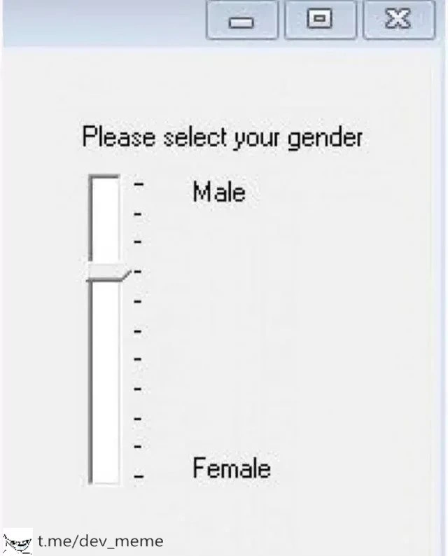
In the meme’s image, the form asks “Please select your gender” and presents a vertical slider. That’s the wrong tool for the job. Gender in a form is usually handled as a set of distinct options (this is a design convention and also aligns with how data is stored, typically as something like a category or an enumeration). By using a slider, the form implies you could be somewhere between male and female in a numerical sense, which isn’t a standard or clear way to ask that question. It’s a bit like having a light switch that usually just flips ON or OFF, but someone replaced it with a dimmer dial for the same question. You’d wonder, “Should I set it to halfway on? What does that mean?”

For a junior developer or someone new to UX design, it might not be immediately obvious why this is so wrong, so let’s clarify some terms:

  • User Experience (UX): This refers to the overall experience and satisfaction a person has when using a product or software. Good UX means the interface is clear, intuitive, and pleasant. A UX failure (like this one) is when the design confuses or frustrates the user.
  • User Interface (UI): This is the visual part of the software that you interact with – buttons, sliders, text fields, etc. UI design is about choosing and arranging these elements effectively.
  • Form: A form is a collection of input fields where users provide information (like a sign-up form that asks for your name, email, gender, etc.). Good form design follows common patterns so users know how to fill it out without getting confused.
  • Component misuse: Using a UI component for something it wasn’t meant for. Here, using a slider for gender selection is a prime example of component misuse. The component (slider) doesn’t suit the type of input (gender choice).
  • Inconsistent UI: A design that isn’t consistent with user expectations or with other interfaces. If every other form uses radio buttons for a question and one form uses a slider, that one is inconsistent and will likely puzzle people.
  • Accessibility: Designing and coding the interface so that people with disabilities can use it. For example, screen readers (for blind users) should be able to read the form properly, and all functions should be available via keyboard for those who can’t use a mouse. An accessibility violation is something that makes the interface hard or impossible for certain users to use. In this case, a slider for gender might not announce the options properly to a screen reader, whereas properly labeled radio buttons would.

To cement why the slider is wrong, look at a simple comparison using HTML (the language for creating web page forms):

<!-- ❌ Incorrect: using a slider (range input) for gender selection -->
<label for="genderRange">Please select your gender:</label>
<input type="range" id="genderRange" name="gender" min="0" max="100" value="50" />
<!-- This creates a slider from 0 to 100. But what do values in between mean? -->

<!-- ✅ Correct: using radio buttons for discrete options -->
<p>Please select your gender:</p>
<label><input type="radio" name="gender" value="Male"> Male</label>
<label><input type="radio" name="gender" value="Female"> Female</label>

In the first (incorrect) snippet, <input type="range"> is how you make a slider. It lets the user pick any number between a minimum and maximum. If someone dragged that slider to “42”, there’s no clear meaning for 42 in terms of gender — the form would capture a number, but that number doesn’t translate neatly to a category. In the second (correct) snippet, we use radio buttons for “Male” and “Female”. The user can click one of them, and it’s immediately clear which option they chose. This is how it’s usually done because it directly presents the choices.

For a new developer, the takeaway is: always use the right form input for the task. If the user needs to pick from defined choices, use the control that lists those choices (like radio buttons, checkboxes, or a select menu). If the user needs to input a free-form number or adjust a level, then something like a slider or numeric field might be appropriate. Sticking to these conventions helps with usability. Users have certain expectations — they’ve filled out lots of forms, so they expect a familiar interface. When you suddenly throw a curveball (like a gender slider), it’s both confusing and a little funny. It’s funny in the meme because it’s such an obvious mistake to a trained eye. But it’s also a gentle lesson: don’t reinvent the wheel in a weird way. The standard UI components exist for a reason. They make life easier for both the developer (less custom logic) and the user (less head-scratching). In short, match the input method to the kind of data you need. Do that, and you’ll avoid creating unintended comedy in your user experience!

Level 3: Slippery UI Slope

Now we break down the humor from a seasoned front-end developer’s perspective. This UI is a prime example of a UX failure that makes anyone with UX or front-end experience chuckle and cringe at the same time. The meme combines a straightforward task — selecting gender on a form — with a completely inappropriate UI control: a vertical slider. Just the sight of “Please select your gender” next to a slider immediately triggers that “oh no, what were they thinking?” reaction. It’s funny because it’s such an absurdly wrong choice of widget for the job, and yet it’s a scenario that feels almost plausible if a clueless developer or overzealous designer went rogue.

Think about typical front-end development practices: for a question like gender, standard UI design would use radio buttons (two small circles labeled Male and Female, so you pick one) or maybe a drop-down menu with those options. These controls make it clear you have discrete choices. A slider, on the other hand, usually implies a continuous range of values — like a volume knob or a brightness control. By using a slider here, the form is essentially treating gender as a continuum from 0% male to 100% female (or vice versa). That’s inherently inconsistent with how forms usually represent that data, hence we can call this an inconsistent UI. The humor is that someone actually went ahead and used a fancy sliding gadget where a simple checkbox or two radio buttons would do. It’s like using a NASA control panel to turn on a light bulb in your closet: complete overkill and missing the point.

We’ve all seen bad form design in one form or another, but this one takes the cake. You can almost imagine the internal monologue that led to this: “Hmm, need to let the user pick male or female… I’ve got this neat slider component available. Why not?” Perhaps the developer thought a slider would be a cool, modern touch, or maybe they mistakenly believed this was a clever way to allow nuance. Spoiler: it’s not. Instead, it creates confusion. What happens if a user slides to the middle?

User: “So... if I pick 50%, does that mean I’m half-male, half-female?”
Dev: “Umm… we didn’t really think that far. Maybe just slide it all the way up or down?”

This imaginary exchange captures why the meme is hilarious to those of us in UI/UX. The UX design folly here is obvious: the control doesn’t match the content. It’s a textbook case of component misuse. The tick marks on the slider and the labels “Male” at the top and “Female” at the bottom suggest the creator only intended the ends to be used — so why even have a continuous slider? With those end labels, it’s almost like they tried to make a fancy-looking substitute for a pair of radio buttons, but ended up with a contraption that implies a whole spectrum of possibilities with no explanation. It’s as if someone took the idea of a gender spectrum way too literally, implementing it in the clumsiest way possible. The result is comedic gold: an interface that manages to perplex users and break all the UI design rules in one fell swoop.

From a practical development standpoint, this is also an accessibility violation nightmare. Imagine a screen reader encountering this slider. It might announce something like “Gender, slider, 50, use up or down arrow to adjust.” A visually impaired user would have zero clue that 0 means Male and 100 means Female just from that. There are no discrete options announced, just a number. It’s both funny and painful because it’s such a blatant oversight. Even a sighted user is left scratching their head — a slider gives no clear indication of what values between the extremes represent. It’s a UI that manages to be unintentionally mysterious. Good UX is all about clarity, and here we have the opposite.

The old-school Windows dialog look adds an extra layer of irony. The UI in the image looks like it came straight out of the 90s or early 2000s (that pale gray window with classic minimize/maximize/close buttons). This retro aesthetic suggests an earlier era of software, which is perfect for the joke. It hints that maybe this was some naive Visual Basic or Windows Forms application thrown together without much thought. For those who have been around, it evokes nostalgia — we remember clunky interfaces from back in the day. Coupling a 2020-level awareness issue (gender as more than a binary) with a 1990s-style UI is a funny contrast in itself. It’s like the meme is saying, “Here’s an outdated interface making an even more outdated assumption (or just a baffling design choice)!” The visual throwback makes the HCI humor even more punchy, because it places this blunder in a context where we kind of expect design mistakes, albeit not this absurd.

In the real world, most experienced teams have design guidelines to prevent this kind of mix-up. But the fact this meme exists means at least someone, somewhere either did this or imagined it vividly enough to parody it. It serves as a light-hearted warning: just because a UI framework offers a shiny slider doesn’t mean it’s the right choice for every input. When developing the front end of a form, you have to consider the data type and the user’s expectation. Here, the expectation for a gender field is a simple selection, not fine-tuning a dial. Failing to meet that expectation leads straight into irony territory: it’s ironic because a control meant for precise adjustments ends up introducing massive ambiguity.

All in all, this meme resonates with developers and designers because it lampoons a scenario that’s so wrong it’s funny. It highlights the importance of choosing the correct UI elements for the task. Seasoned front-end folks have likely encountered similar (if not quite so extreme) cases of picking the wrong kind of input — like a drop-down with only two items for Yes/No (when a checkbox would be simpler), or using a text field when you really should use predefined options. Those everyday UI missteps aren’t usually as visually ridiculous as a gender slider, but they stem from the same root problem: not thinking about the user experience. This meme just makes the lesson unforgettable by exaggerating it. Selecting gender with a slider is a silly idea on the surface, and that silliness is exactly why it’s memorable and laughable. It’s a perfect comedic reminder to always match the UI control to the data and the user’s expectations.

Level 4: Nominal Sin

In the realm of User Experience Design, there's a fundamental mismatch here between data types and interface affordances. Gender, in the context of a form like this, is a nominal category — essentially a labeled classification without any numeric or ordered value. You’re either one category or another (or perhaps “other,” but still a distinct class, not halfway in between in a mathematical sense). Yet the interface presents a continuous slider, which by design implies an ordinal or interval scale. This is a classic example of what HCI (Human-Computer Interaction) experts might call a semantic mismatch: the UI control’s meaning doesn’t align with the data’s meaning. The slider's very form suggests that gender can be measured in degrees or along a spectrum of numeric values, which isn’t how categorical data works (and even in a social sense, identity isn’t a linear spectrum like this slider implies).

This misuse violates fundamental design principles taught in HCI courses and usability heuristics. Take Donald Norman’s concept of affordances: the slider affords dragging through a range, hinting to the user that any intermediate value is a valid choice. But here, intermediate values are meaningless (the form has no defined purpose for 37% “male,” for example). It’s as if the developer treated gender as a continuum that can be quantified — a design decision that creates cognitive dissonance. Users bring mental models to a UI: they expect to click a checkbox or choose from a small set of named options for something like gender. By presenting a slider, the interface communicates a completely different mental model, one where gender is like volume or temperature that you can turn up or down. This hidden metaphor is not just confusing; it’s fundamentally a wrong data modeling choice. In data terms, gender is categorical (no inherent numeric scale), whereas a slider typically manipulates a scalar value. This is the UI equivalent of storing "Male" as 0 and "Female" as 100 and then allowing any integer in between — essentially a misuse of the data type.

From a formal perspective, consider Nielsen’s Usability Heuristics, especially consistency and standards. On almost every platform and product, the standard for choosing categories (like gender) is to use something like radio buttons, a drop-down menu, or checkboxes — controls that reflect discrete choices. A slider is consistent with tasks like choosing a percentage or setting a level (brightness, volume). Breaking this convention means users have no familiar reference: they end up guessing what the slider positions mean. This inconsistency can lead to user errors. If someone slides to the middle thinking it might represent “Prefer not to say” or some kind of neutral option, the system likely doesn’t interpret it correctly (and indeed, the UI gives no clues what the midpoint represents). The humor here is underpinned by this blatant violation of interface consistency and mapping: the mapping between the control (slider position) and outcome (gender selection) is, quite literally, undefined for any positions except the extremes.

There’s also an accessibility aspect to this high-level critique. In inclusive design (another crucial facet of HCI theory), each UI element should convey its purpose clearly through multiple channels (visual cues, text labels, screen-reader announcements, etc.). A slider control typically would be announced by a screen reader as “Slider, 50” (for example, if it’s in the middle position). Without additional context, a user relying on assistive technology would have no idea that 0 means Male and 100 means Female, unless the developer added extra accessible labels for those values (which, judging by the poor design choice, they probably didn’t). This underscores a principle from formal usability guidelines: “speak the user’s language.” The interface should communicate in terms the user understands (like explicit labels “Male” and “Female” as separate options). Here the communication is numerical and implicit, which is an accessibility violation and a failure of semantic clarity.

In summary, at a theoretical level, this meme spotlights a design anti-pattern: representing a nominal variable with a continuous control. It’s essentially committing a cardinal sin in UI design — or should we say a nominal sin? — by ignoring the fundamental nature of the data. The continuous gender scale shown here is an absurd mapping for a categorical concept, making the meme a perfect illustration of how not to apply core HCI principles. It's a tongue-in-cheek example that any UX theorist could use to explain why understanding data types and user expectations is critical in interface design.

Description

A screenshot of a poorly designed user interface element from a desktop application, likely an older version of Windows given the window styling. The window contains the text 'Please select your gender'. Below this prompt is a vertical slider control. The top of the slider is labeled 'Male' and the bottom is labeled 'Female'. The slider's handle is positioned somewhere in the upper third, between the two labels. The humor stems from the fundamentally incorrect use of a slider - a tool for selecting a value from a continuous range - for a discrete, categorical choice like gender. This absurd UI implies that gender is a quantifiable spectrum between male and female, a comical failure of UX design that is instantly recognizable and amusing to anyone in software development


Comments

30
Anonymous ★ Top Pick The product manager wanted to A/B test gender. This was the result
  1. Anonymous ★ Top Pick

    The product manager wanted to A/B test gender. This was the result

  2. Anonymous

    “UX said radios weren’t inclusive enough, so now gender is a DOUBLE PRECISION column and the BI dashboard keeps reporting an average gender of 0.63.”

  3. Anonymous

    When the PM says "we need more space between options for better UX" and the junior dev takes it literally by adding empty option elements instead of CSS padding

  4. Anonymous

    When your UI designer takes 'binary gender' too literally and implements it as an actual binary tree structure - because why use a simple radio button group when you can demonstrate O(log n) lookup complexity for a two-option form? At least the traversal algorithm is straightforward, though I suspect the accessibility audit is going to flag this as a 'branch' of concern

  5. Anonymous

    WinForms asks for gender with a slider - guaranteed the schema is FLOAT, the exec dashboard graphs “avg_gender,” and Legal just booked a recurring sync

  6. Anonymous

    Checkboxes for gender: because in WinForms, exclusive-or is just a myth until QA complains

  7. Anonymous

    Classic data-model-by-widget: someone bound a vertical slider to a FLOAT where an enum belonged - enjoy the analytics meeting where someone asks what 0.47 represents

  8. @Artkash 5y

    lmao

  9. @mvolfik 5y

    I think rgb color wheel and the middle triangle would be better

    1. @Linegel 5y

      Like this?

      1. Deleted Account 5y

        And the value

        1. @Linegel 5y

          Let my gender for today be guinea pig

          1. Deleted Account 5y

            My gender is: Segmentation fault (core dumped)

      2. @AshimVeasi 5y

        I is a transprogrammer

        1. @e18e02930b94d725daa9 5y

          then you code on html

          1. @AshimVeasi 5y

            Ahaahha

          2. Deleted Account 5y

            CSS programmer

            1. @AshimVeasi 5y

              Aaaaaaa

  10. @shtonda_o 5y

    Я нацист

    1. @Deadnonexisttriangle 5y

      Похуй

  11. @Evil_Cred 5y

    О тут русские)

    1. @sudobutnotsudo 5y

      русские умерли

      1. Deleted Account 5y

        бля и тут тьі

        1. @sudobutnotsudo 5y

          ичо

          1. Deleted Account 5y

            не ну я такто не против

            1. @sudobutnotsudo 5y

              а что тогда

  12. Deleted Account 5y

    Ахахаха

  13. @Dobreposhka 5y

    !ban

  14. @Dobreposhka 5y

    @RiedleroD

  15. @Dobreposhka 5y

    that's ok, sweetie

Use J and K for navigation