Skip to content
DevMeme
4189 of 7435
Hardware-induced UX chaos ends a frontend developer's career instantly
UX UI Post #4572, on Jun 25, 2022 in TG

Hardware-induced UX chaos ends a frontend developer's career instantly

Why is this UX UI meme funny?

Level 1: When Up is Down

Imagine you’re reading a story book, and on one page all the words are printed upside down. You flip to the next page, and now the sentences run diagonally across the paper. The page after that? The text is sideways, and you have to tilt your head to read it. Pretty soon, you’d feel super confused, right? You might even toss the book aside because it’s just too hard to follow the story. That’s basically what this meme is saying, but for someone who makes websites and apps.

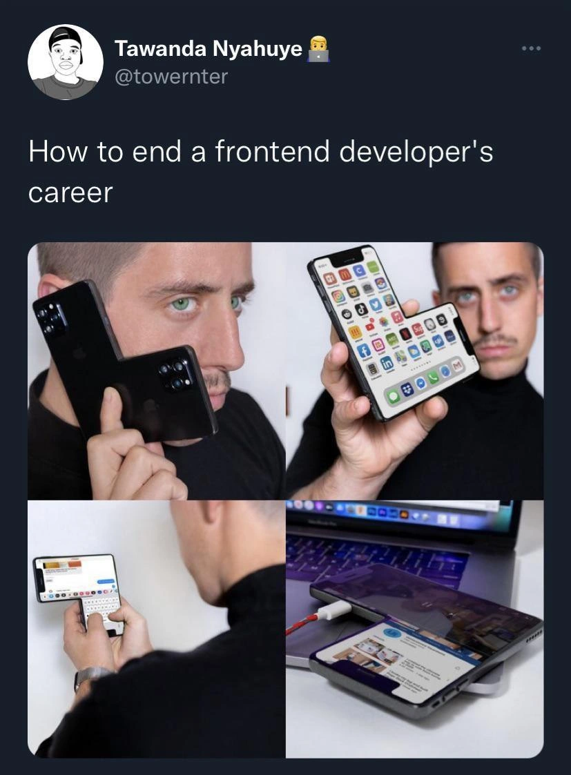
In the pictures, phones are being used in really mixed-up ways – like a phone screen that’s split in half at an angle, or a phone that’s stuck halfway into a laptop. It’s like a cruel prank on the person who made the app or website, because nothing would show up where it’s supposed to. It would be so frustrating – kind of how you’d feel if your favorite game suddenly jumbled all the controls, or if your crayons started drawing in a different color than the one you picked.

So the joke is that a frontend developer (the person who designs how an app looks and feels) would see these crazy, wonky phone situations and just give up, saying “I can’t do this anymore!” Of course, it’s an exaggeration – they wouldn’t literally quit their job over it. It’s a funny way to share the feeling that sometimes making things look right on every device can be overwhelming.

In simple terms: the meme is funny because it shows a bunch of really silly phone mistakes that would make any app or website act totally crazy. It’s like a puzzle that’s impossible to solve – so the person who’s supposed to solve it (the developer) jokingly runs away. Even if you’re not a tech person, you can laugh because you know things aren’t supposed to be upside down or sideways, and seeing them that way is both silly and a little stressful.

So, it’s humor with a dash of “oh no!” – we laugh imagining how scrambled and broken everything would look, and we feel for the poor soul who’d have to fix it.

Level 2: Phones Behaving Badly

Alright, let’s dial down the complexity and break this situation into digestible pieces. This meme is poking fun at how frontend developers (the folks who build what users see on websites and apps) struggle when devices do unexpected things. In web and app development, we talk a lot about responsive design – meaning your UI should adapt to different screen sizes and orientations (portrait vs. landscape). We have tools like CSS media queries (special rules in your stylesheets) that say “if the screen is this wide, do X; if it’s narrow, do Y.” We also worry about things like viewport meta tags (which control how a webpage fits on a mobile screen) and safe areas (margins to avoid things like the notch on iPhones so your content isn’t hidden under it).

Now, in the real world, supporting various devices is already tricky. There are thousands of Android phone models, iPhones of different sizes, tablets, etc. This variety is known as device fragmentation. Developers test their UI on as many as possible, but there’s always that one weird device that behaves differently. Usually, though, the differences are within reason – maybe a taller screen here, a notch there.

This meme imagines ridiculously outlandish devices that no one would ever reasonably design (we hope!). Let’s go through each panel of the image and explain what’s going on and why it’s a nightmare for a frontend dev:

  • Panel 1 – Upside-Down Phone Internals: The man holds a modern smartphone to his ear upside-down (the camera cluster, which is normally at the top/back, is at the bottom near his mouth). It’s as if someone assembled the phone wrong or rotated the entire guts 180 degrees inside the case. Normally, when you hold a phone call, orientation doesn’t matter much because the screen is off, but if the phone’s screen were active, the OS would likely flip the UI. A developer typically assumes “top of device = top of app.” If a phone had its screen orientation permanently inverted relative to the hardware, all our layouts would render upside-down unless we put in a special case. There are orientation settings (you can lock an app to only portrait, etc.), but no one plans for a phone that is physically inverted by design! This would be like an ultimate UX failure – the user’s experience would be super confusing (imagine swiping up and seeing content go downwards because the screen’s coordinate system is flipped). For a junior dev: think of it like drawing a chart on paper normally, but someone is holding the paper upside down; to them, everything looks inverted. You’d have to account for that in code, which is wild.

  • Panel 2 – Diagonal Split Screen: Here we see a phone whose screen content is split diagonally. Half the icons are aligned one way, half another, creating a zigzag cut across the display. There is no existing phone that does this (thankfully!). But it parodies issues like foldable phones or split-screen modes. For example, some new phones can fold in half; when open, they have a big square screen, when folded, two smaller screens. Developers have to adapt their UI to those by maybe rearranging elements. But a diagonal division is completely bananas – it doesn’t follow the standard rectangle shape at all. If a device had such a screen, how would a website even know? Today, we use CSS queries like orientation: portrait or orientation: landscape, which assume a clear division (vertical vs horizontal). There’s nothing for “orientation: diagonal” because no normal device does that. The meme basically takes the idea of “designing for every screen” to a silly extreme. It’s showcasing a rotated_screen_prank: an impossible angle that no current frameworks handle. A junior dev can imagine this by picturing a tablet screen that’s been cut into two pieces and glued back at a 45° angle – any app would look completely wrong without special coding.

  • Panel 3 – Sideways UI Bug: In this one, the man holds the phone in landscape (sideways) orientation, but what’s on the screen (the texting app, keyboard, etc.) is still locked in portrait orientation. That means he’s looking at the UI rotated 90° relative to how he’s holding the phone. This is something that can actually happen as a glitch: for example, if an app doesn’t support rotation and you turn the device, the display might stick in one orientation. Or think of when you watch a video, sometimes you have to turn your head if the video was recorded rotated. For developers, handling rotation is a common task. Mobile apps fire events when you rotate the device, and responsive web apps might adjust layout via CSS or JavaScript on window resize. If those systems break down, you get a situation like this panel – the hardware and software orientations disagree. It’s a bit like if you turned your game controller sideways but the game didn’t realize it – all your controls would feel wrong. To fix this, devs might use something like:

    window.addEventListener("orientationchange", () => {
        // adjust layout, maybe swap width/height dimensions
    });
    

    But no one expects to handle “orientationchange to a weird tilted state.” This panel is comical to devs because it’s a super amplified version of a real bug: it’s showing what happens when an app stubbornly refuses to rotate while the user is physically rotating the device. For a user, this would be infuriating (imagine tilting your phone and the keyboard stays sideways – you’d probably think your phone is broken). For a developer, it’s that goosebump moment: “Oh no, did I forget to test orientation changes? Did I lock orientation by mistake?” It highlights a very common FrontendPainPoint: making sure the UI responds correctly when devices switch between portrait and landscape.

  • Panel 4 – Phone Trackpad Hybrid: This one is pure silliness: a phone is slid under a MacBook’s trackpad area, with its screen on, and the phone’s notch overlapping the laptop. There’s no real-world scenario where you embed a phone into a laptop like this (at least not yet – who knows with future tech 🤷). But it’s riffing on the challenge of multi-device experiences. Apple has features where an iPhone can be used as a webcam for a Mac, or iPads can be second monitors. Those require developers to think about how their app might spread or hand off between devices. This image exaggerates it: what if the phone was literally part of the laptop? The notch (which is a very phone-specific thing) showing up on the laptop’s surface is like worlds colliding. For web developers, each environment (mobile vs desktop) usually has separate considerations. We design a mobile layout and a desktop layout. Here they’re mashed together in one odd device. It’s a joke that says “look, the lines between devices are so blurred that our poor web app wouldn’t know how to display correctly at all.” For instance, suppose your website tries to detect if the user is on mobile or desktop to adjust the UI. What would it make of this Frankendevice? The code might do something like:

    const isMobile = /Mobi|Android/i.test(navigator.userAgent);
    

    But if a phone is acting like a laptop accessory, that detection might be wrong or confused. This scenario would be a new kind of UX failure where your site or app might show the wrong interface (mobile version on a laptop or vice versa) because the environment is so mixed up. For a junior dev, consider it like trying to use a board game piece (the phone) as part of another game’s board (the laptop) – none of the rules prepared you for that, so you’d be utterly lost without inventing entirely new rules.

In simpler terms, each image in the meme shows a weird_phone_orientation or device usage that breaks normal design rules:

  • Upside-down phone hardware -> breaks the basic alignment assumptions.
  • Diagonally split screen -> breaks the shape assumptions (screen is no longer a nice rectangle for your content).
  • Sideways UI -> breaks the interactive assumptions (the app’s not responding to how you hold the device).
  • Phone merged with laptop -> breaks context assumptions (what even is the device here?).

The tweet caption "How to end a frontend developer's career" is obviously an exaggeration – it’s joking that these problems are so tough that a developer would just quit rather than try to fix them. Frontend work involves dealing with numerous UI design puzzles, and it can be stressful when new devices or use-cases pop up because it means more late-night coding to make things look right everywhere. The meme resonates with common experiences:

  • Maybe you made a site look perfect on Chrome and Firefox, but then QA opens it on some oddball mobile browser and everything is off-kilter.
  • Or you thought you handled rotation, but a user finds that rotating three times in a row upside-down causes a glitch.
  • Or you never even considered that a screen could have a notch on the bottom, and suddenly a new phone model does, and now your app’s menu is cut off.

It’s both humorous and a little cathartic. Even less experienced devs (and students learning web design) can relate to the frustration of their layout “looking weird on my friend’s phone.” This meme basically says: imagine the most extreme “looks weird” scenarios possible. You’d probably throw your hands up and say “I can’t deal with this!” That’s why it’s funny – it acknowledges the FrontendHumor of those moments when the code you wrote doesn’t anticipate a new device’s quirk, and you feel momentarily defeated.

So, if you’re a junior dev or just learning about UX design, take this meme as a tongue-in-cheek warning: Mobile development can be messy and full of surprises. One day you’re just making a button blue, next day you’re trying to figure out why that button flies off the screen on a rotated foldable tablet running an outdated Android fork. It’s challenging but also what keeps things interesting (and meme-worthy!). And remember, when things get too crazy, the developer community copes by joking about it – as seen here.

Level 3: Orientation Abomination

At the highest technical tier, this meme is a frontend developer's worst nightmare come to life. It satirically combines every bizarre device fragmentation edge-case into one chaotic collage. Seasoned developers see the humor: each panel violates fundamental UX/UI assumptions, pushing responsive design logic beyond its breaking point. It's a responsive_design_hell scenario that triggers war-flashbacks of quirky bugs and endless CSS tweaks.

Let's unpack the calamity lurking in each image (and why it’s funny in a painfully real way to experienced devs):

  • Inverted Hardware (Panel 1): The phone is held normally, but the camera bump is at the bottom – implying the screen internals are mounted upside-down. In reality, mobile OSes use accelerometer and gyroscope data to decide orientation (portrait vs landscape). But here, the hardware itself is flipped 180°. The OS might think it's upright, while the physical display orientation is reversed. This is a UX nightmare device for any app: all your carefully placed navigation bars and tab bars would render on the wrong end of the phone. It’s a cruel twist on the usual safe area problem: web developers already struggle to avoid the iPhone notch at the top, now imagine needing a safe-area-inset-bottom because the notch decided to be a chin! Seasoned devs laugh (and cry) because we’ve been burned by lesser versions of this – like apps accidentally rendering upside-down or status bars covering content due to orientation lock mishaps. This panel basically screams: “Hey CSS, meet hardware you absolutely weren’t ready for.”

  • Diagonal Split Screen (Panel 2): A phone showing a home screen diagonally split in half, with app icons skewed at conflicting angles. This one is wonderfully absurd: there's no “diagonal” mode in any UI framework. The image exaggerates the concept of foldable phones or dual-screen devices gone rogue. Real-world analogies might be the LG Wing or other experimental phones that rotate parts of the screen. In practice, supporting foldables and weird aspect ratios has already sent developers into fits – e.g. handling a screen that's part 90° rotated requires custom UI logic. Here, the meme takes it further: the screen itself is cut into two triangles, each with different orientation. How would a CSS media query even target that? (@media (orientation: sideways??) { ... } – not a thing!). A senior dev sees this and jokes about needing transform: rotate(45deg) on the entire UI just to align the content. It’s poking fun at how responsive design can feel like covering infinite odd cases. This diagonal horror is like the final boss of FrontendPainPoints – beyond even the wildest edge cases we’ve seen in device labs.

  • Mismatched UI Rotation (Panel 3): The man is typing on a phone held sideways (landscape), but the on-screen keyboard and message thread are oriented 90° off, as if still in portrait. This looks exactly like a sensor glitch or OS rotation bug. Imagine tilting your phone, and the UI doesn’t rotate to follow – or worse, it rotates the wrong way. Seasoned mobile devs know that feeling: you rotate the device, and for a split second, the interface might lag or get confused, especially if the app locked orientation. This panel embodies that bug permanently. It’s reminiscent of when an app’s rotation-lock goes awry or when using an emulator that doesn’t auto-rotate. Technically, this is a synchronization failure between hardware orientation events and UI rendering. Maybe the accelerometer said “we’re landscape now” but the UI didn’t redraw properly, so you get a sideways keyboard. The humor hits senior devs who’ve chased down such elusive bugs—like the infamous one where iOS UIWindow coordinates get stuck or Android’s onConfigurationChanged doesn’t fire as expected. It’s frustratingly real: you’re mashing your phone, yelling “rotate, darn you!”, while the interface stubbornly sits at a 90° angle. The meme exaggerates it to a permanent state of wrongness, which is equal parts hilarious and terrifying. Responsive design hell, indeed.

  • Notch Trackpad Fusion (Panel 4): A phone is half-inserted into a MacBook, with its screen on and the phone’s notch overlapping the laptop’s trackpad area. This visual is pure absurdist humor, an impossible hardware-software chimera. But it hints at real complexities like multi-device interaction (think using an iPad as a second display with Sidecar, or continuity features between phone and laptop). Here it’s as if the phone became a makeshift touchbar or trackpad. For a web developer, this raises the question: what’s the viewport here?! Is the phone screen now part of the laptop display? Does our website stretch across two devices at an odd angle? It ridicules the idea of viewport and media queries by presenting a scenario no developer is prepared to handle. We typically design for a single rectangular canvas; this is a career_ending_ui insanity where the canvas itself is merged with another. The notch (a mobile concept) appearing on a laptop’s input device breaks all mental models. It’s like the ultimate cross-device bug — one that would make a developer throw up their hands and say “I quit!”. Seasoned devs chuckle because we’ve felt a slice of that pain whenever a new device blurs lines (like phones with projectors, or laptops with detachable screens). This panel is essentially the meme’s mic drop: an impossible hardware configuration that parodies how new gadgets sometimes force us to rewrite our CSS for the millionth time.

Collectively, these panels lampoon the ever-growing complexity in MobileDevelopment. The tweet caption “How to end a frontend developer’s career” is gallows humor. Experienced engineers have seen how a seemingly minor design change or a weird new device can introduce dozens of new bugs. It’s not that a dev literally gets fired on the spot; rather, it’s the feeling of utter defeat when confronted with something so outlandish that all your painstaking work falls apart. DeveloperHumor often exaggerates like this to vent frustration. The meme resonates because it stacks absurdity on top of actual FrontendPainPoints:

  • We started with simple desktop vs mobile layouts.
  • Then came myriad screen sizes, requiring fluid grids.
  • Then high-DPI screens, various aspect ratios, and the cursed notch (hello, iPhone X).
  • Next, foldable phones and devices with multiple displays or odd hinges. Each step added new CSS hacks, new JavaScript listeners, new testing headaches.

Every time devs thought they’d seen it all, hardware manufacturers said “hold my beer” and introduced something like a circular watch display running HTML, or a phone that’s also a tablet. This meme just takes that to the extreme for comedic effect.

Why is it funny to a senior dev? Because it’s satire grounded in truth. We’ve battled “Orientation Abominations” before, albeit not this insane. We know the device fragmentation struggle is real – testing on dozens of emulators and devices, only to have a random user report “hey, your site looks broken on my brand new WeirdPhone X.” It’s the shared exasperation of the Frontend community that even when you follow best practices (use flexible layouts, test orientations, add safe-area CSS for notches), the universe can still surprise you with a configuration that blows up your design. The meme is basically saying: “Here are four new device layouts. Good luck, CSS. This is how you break a developer’s spirit.”

In true cynical veteran fashion, one might joke: If these devices hit the market, I’d finally fulfill my threat of switching to backend development. The humor carries an edge of truth about burnout: facing such endlessly bizarre requirements can make even a passionate UI developer consider a career change (or at least a stiff drink). It’s a comedic way to acknowledge UXFailures and ridiculous UIDesign challenges that plague our field. After all, we laugh so we don’t cry. This meme gets an untold number of retweets because every experienced frontender who’s wrestled with CSS quirks at 2 AM sees this and thinks, “Thank goodness I don’t actually have to support THAT… right?”

Description

Screenshot of a tweet in dark-mode Twitter UI. Display name reads “Tawanda Nyahuye” with handle “@towernter” and a laptop-emoji. Tweet text says: “How to end a frontend developer's career.” Below the tweet, a four-panel collage shows bizarre smartphone orientations: (1) a man holds a phone to his ear but the camera bump is at the bottom, implying the screen is mounted upside-down inside the chassis; (2) he presents a phone whose home screen is diagonally split, displaying rows of app icons at conflicting angles; (3) he types on a phone held sideways, where the on-screen keyboard and message thread are rotated 90° relative to the hardware buttons; (4) a phone is half-inserted under a MacBook, its display still on, with the notch overlaid on the laptop’s track-pad area. Each visual intentionally violates orientation, safe-area, and viewport expectations, satirizing the nightmares responsive-design, device-fragmentation, and CSS media queries inflict on frontend engineers

Comments

6
Anonymous ★ Top Pick Our new device supports portrait, landscape, and “Escher” mode - orientationchange fires on every tilt, safe-area-inset returns imaginary numbers, and PM logs it as a one-line CSS fix
  1. Anonymous ★ Top Pick

    Our new device supports portrait, landscape, and “Escher” mode - orientationchange fires on every tilt, safe-area-inset returns imaginary numbers, and PM logs it as a one-line CSS fix

  2. Anonymous

    The real nightmare isn't testing on all these devices - it's explaining to the PM why the CSS grid that works perfectly everywhere suddenly thinks it's 1999 on the iPad their CEO uses

  3. Anonymous

    The modern frontend developer's descent into madness: starts with 'mobile-first', ends with a desk full of devices running BrowserStack in parallel while praying that one obscure Android 8 device with a notch doesn't break the entire layout in production. The real kicker? After testing on 47 devices, the CEO will still view it on their ancient iPad Mini and ask why the button is 2 pixels off

  4. Anonymous

    PM: “Just make it responsive.” Me: “Cool - after I reconcile env(safe-area-inset-*) with dvh, set viewport-fit=cover, and prove our layout survives a QA engineer rotating a notched phone like a Kubernetes liveness probe.”

  5. Anonymous

    That phone turns “safe area” into a distributed-systems problem - every edge is a potential partition

  6. Anonymous

    Emulator lied, iPhone didn't - viewport meta tags weep during live client demos

Use J and K for navigation